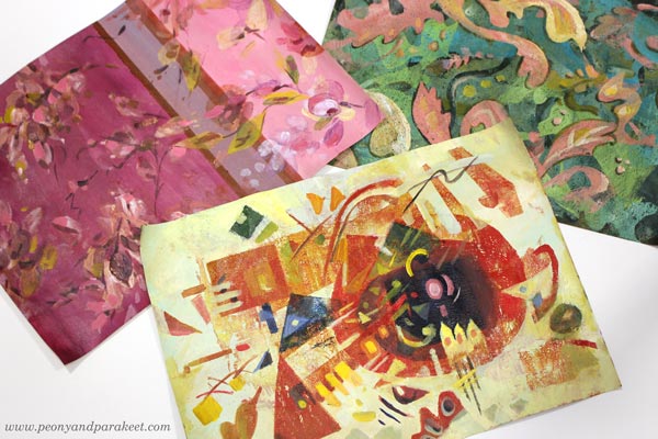
Three Design Styles, a Gelli Plate, and a Brush
One of my goals for this year is to learn surface pattern design. I want to move back and forth between art and design, and add more design to this blog as well. This week, I picked three of my favorite designers and played with Gelli Plate to imitate their style. These don’t replicate any of their work, just their style.
Three Designers from Three Centuries
My three favorite designers are Tricia Guild, William Morris, and Wassily Kandinsky.
Tricia Guild a designer from the UK, and she has a company Designer’s Guild, and I have been her fan since the 1990s when I discovered her book Design and Detail. It’s been my interior design guide for 30 years, and all my homes have got ideas from that book.
William Morris is also English, but he lived earlier, in the 19th century. Two rooms of our home have curtains designed by his company, and I regularly admire their clever repeats and ornamental shapes.
Wassily Kandinsky was more of an artist than a designer, but he taught designers in a famous Bauhaus art school in the early 20th century. For me, he is the father of modern design. I see his paintings in the works of most midcentury modern designers. Lately, he has felt even closer, when I have been built a class Floral Freedom that is based on his and Paul Klee’s teachings.
Who are your favorite designers?
Three Designers – Three Color Palettes
I have always liked making hand-decorated papers. Actually, my most popular blog post is this ancient one: How to Make Your Own Patterned Paper from 2010. So let’s get back to basics and make some!
First, I painted the backgrounds with acrylic paints and a flat brush. This set a color palette for each paper.
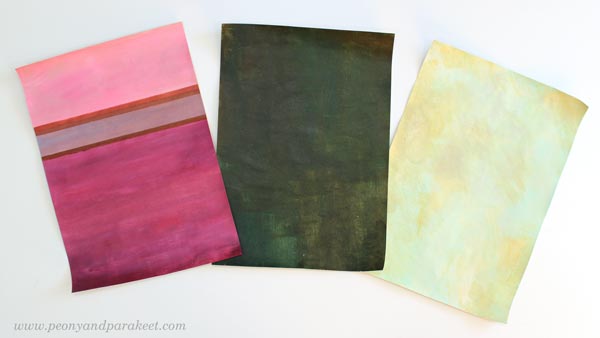
Muted pastels and rich darker tones remind me of Tricia Guild. She often uses stripes or checks too. William Morris has greyish colors and many of his designs have dark backgrounds. Wassily Kandinsky often had a very light background in his paintings.
Three Design Styles – Three Kinds of Shapes
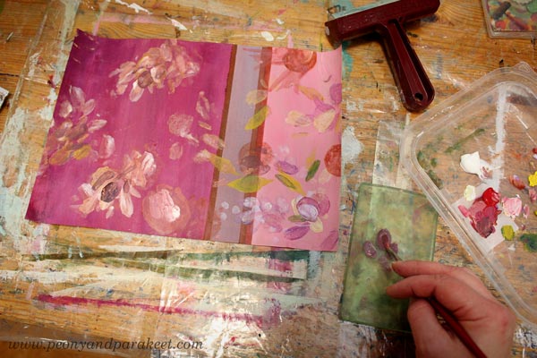
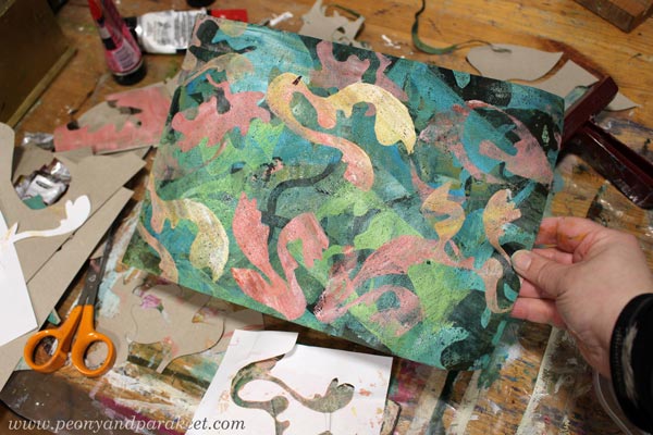
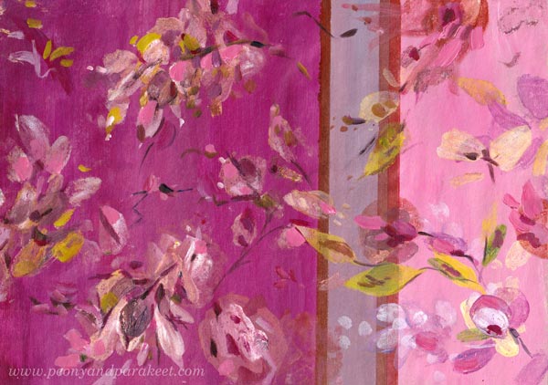
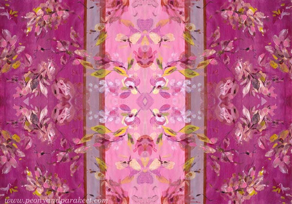
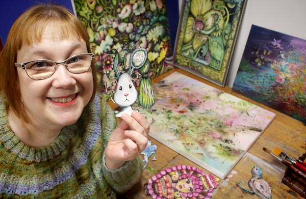
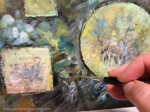
I continued each of the papers by mono-printing motifs with a Gelli Plate. For Tricia Guild’s style, I used a small plate and painted the motifs with a brush on a plate, then pressed the plate on the paper. Because Tricia’s style is often quite relaxed, there was less pressure for perfect outlines.
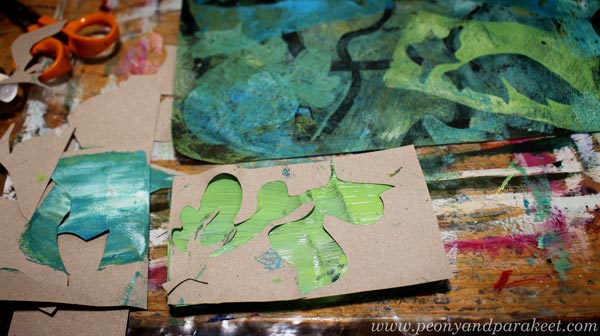
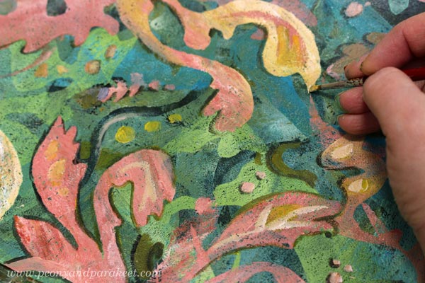
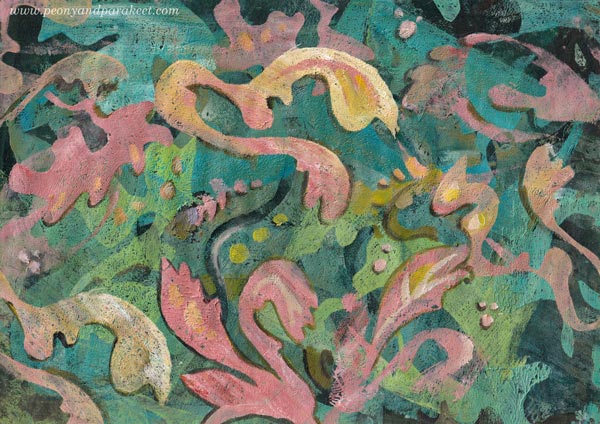
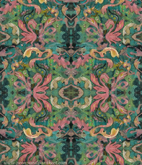
William Morris’s designs are very sharp and ornamental. I cut out ornaments freehand from paper and used both negative and positive shapes. I used both a big Gelli Plate and a small one.
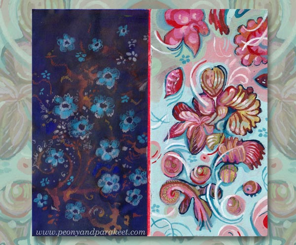
Here’s how the paper looked after mono-printing.
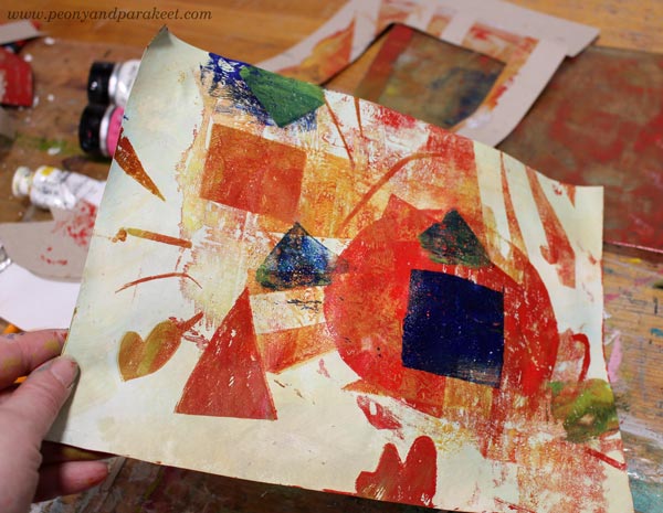
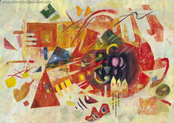
Wassily Kandinsky’s shapes are mostly geometric, so I cut templates that had circles, lines, squares and triangles.
Here’s how the paper looked after mono-printing.
Three Design Styles – Three Levels of Detail
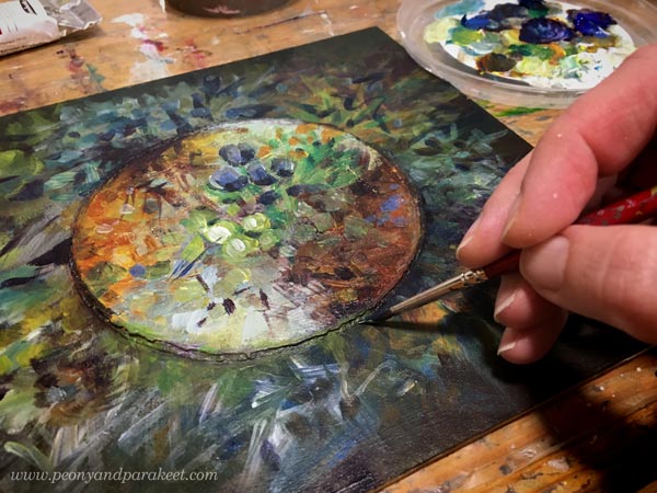
After mono-printing, I finished the papers by painting. I used a narrow brush and made small tweaks only.
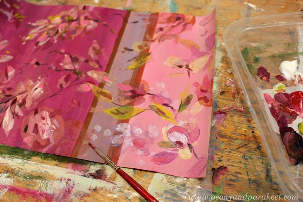
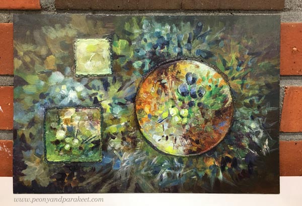
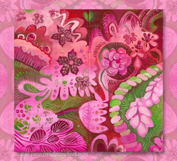
I like Tricia Guild’s designs because there modern meets classic and historical. They feel luxurious, but still comfortable. They don’t require similar perfection from the space than William Morris’s designs. So I didn’t perfect every shape or line, just added a bit more realism to the floral motifs. Here’s the finished paper.
William Morris’s designs are full of outlined motifs, and I connect them with books. “For people who have a library,” I wrote in a notebook that I keep for studying. But I quite liked my mono-print, and didn’t want to stiffen everything. So I only outlined a part of the motifs, and added some small dots and thin lines inside the shapes.
Here’s the finished paper. I really like the big yellow motif! Maybe that could be a part of my future designs.
Wassily Kandinsky’s work didn’t lack details either. But if William Morris is for bookworms, then maybe Wassily is for systematic thinkers – for more scientific than humanistic introverts, and for those who love mathematics.
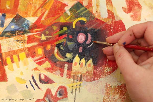
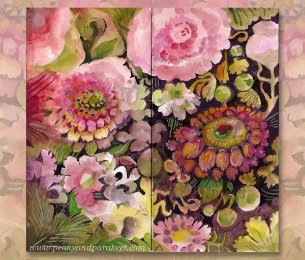
I used the monoprint as a foundation for the composition of shapes and followed Wassily’s advice and ideas from his book Point and Line to Plane, the book that I teach in the class Floral Freedom as well. Here’s the finished paper.
Three Wallpapers
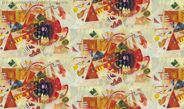
I wanted to see how these papers could work as repeats. I didn’t have time to play with the repeats properly, but here are some quickly made images to demonstrate how the motifs would look in a smaller scale, for example, as a wallpaper.
It was a full day, but I had fun making these! Tell me, which three designers would you pick?
About Playfulness and Spirituality in Art
This week, I talk about spirituality in art and claim that you also need humor and playfulness to become a spiritual artist.
I like to gather my work – big and small – together and mix and match them like they would be pieces in a puzzle. It also helps me to see if my classes support each other and ponder if I have approached imagination and art-making from all angles.
Paul Klee and The Power of a Child
My newest class Floral Freedom is the most schoollike of all. It is based on Paul Klee’s and Wassily Kandinsky’s teachings of abstract art. In the class, I have tried to focus on two books – Paul Klee’s Pedagogical Sketchbook and Wassily Kandinsky’s book Point and Line to Plane. But the books’ teachings have inspired me to search for background stories – find what enabled these artists to invent the abstract methods and theories.
One of the things that needed an explanation was that Paul Klee’s book is full of diagrams like it would be written by an engineer, and yet, his artworks are often playful, some even childish. Look at this painting, for example!
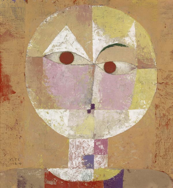
During the first world war, Paul wasn’t a soldier for a long time but transferred to a safer job where he was in the middle of aircraft engineers. But earlier, when he started a family, Paul wasn’t very successful in art at all. His wife worked to support them, and Paul practically took care of their only child, Felix. It wasn’t usual to be a stay-at-home dad in the early 20th century!
When Paul was taking care of Felix and struggled with art-making, he found humor and playfulness that later became a part of his signature style. But it’s not only that! When Paul became close friends with the masterful Wassily Kandinsky, he also made Wassily less serious and more playful. So here’s to all stay-at-home dads and mums!
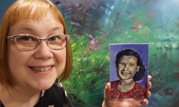
There’s a recent finished painting in the background.
From Product Play to Spirituality
I believe that art happens when one extreme meets another. When my organized mind watches the snowstorm. When I want my art to be about happiness and life and realize that taking it deeper requires confronting fear and death.
In my experience, when you want your art to be more serious and spiritual, humor and playfulness must have some role too. And vice versa, the longer your walk in the path of play, the more serious and spiritual it gets.
When I started my blog over ten years ago, my art-making was very product-based. I bought new supplies almost weekly and experimented with all kinds of techniques and effects.
But the more I created, the more I wanted to move from materials to ideas and imagination. Instead of discovering ten new ways to produce circles on paper, I wanted to learn how to make the circles interact and transform into other shapes. This way, my art has gradually become not only more playful but more spiritual as well.
Paul Klee said:
“Art does not reproduce what we see; rather, it makes us see.”
Rethinking Spirituality in Art
Nowadays, I connect playfulness with spirituality. It has also made me rethink how I approach spirituality in general. Here’s what I wrote this week on Peony and Parakeet’s Facebook page and on my Instagram feed:
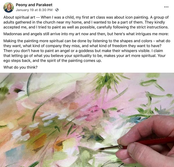
It would be interesting to hear what do you think. Does spirituality have a role in your art?
Impressionistic Floral Painting on Structure Paste
This week, I show how I made an extraordinary floral painting with acrylics and structure paste. See how I achieved the historical look!
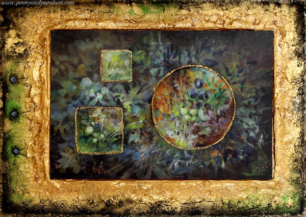
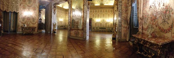
I call this piece “Old Art Yearning” because I desperately miss Europe’s palazzos and museums. It would definitely be the time to pack the bags for a few-day trip to Vienna or some other old city, but I chose differently because of the pandemic. But first, look at the interior of Palazzo Doria Pamphilj in Rome. My husband and I visited the place on June morning in 2017, and it was pleasantly quiet, just suitable for dreaming about living there in the middle of luxury.
So, what luxurious can you do when you are asked to stay home and be safe? I decided to create something that’s like a soft drink for the old art thirst: fake but sweet and consolating!
The idea of using structure paste is from the summer, but back then, I didn’t quite see as far as I did this week.
Structure Paste Inspiration from Clay
This summer, my friend Johanna Rytkölä, a ceramic artist ran a flower pot class for a small group. My husband made a stylish and minimalistic bonsai pot, but mine came out quite different!
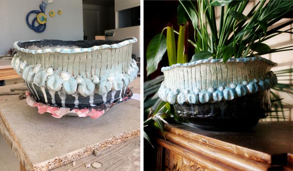
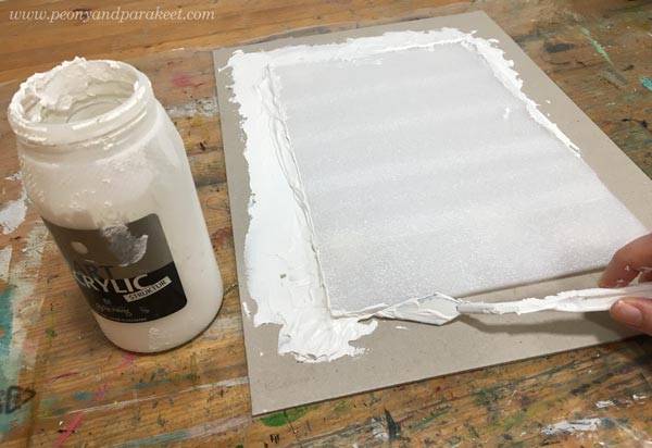
Even if my pot was not perfect, I wanted to experiment with a 3-dimensional surface for a painting right away. I dig out a jar of structure paste that some call molding paste as well. I have blogged about the paste twice before. In 2014, I made cardboard templates to create reliefs for a mixed media piece and in another project, I made surface textures with a variety of tools.
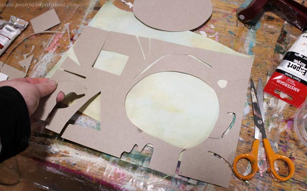
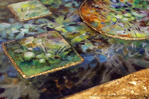
I decided to try the template technique again, and cut simple geometric holes to a thick cardboard.
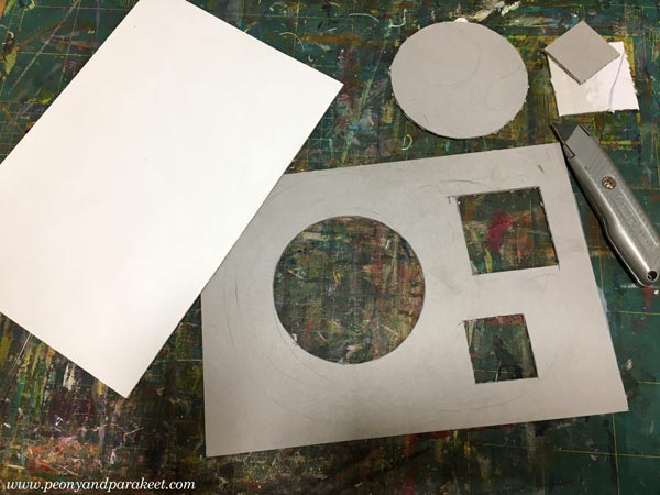
Then I placed the template on the top of the painting board and filled the holds with structure paste.
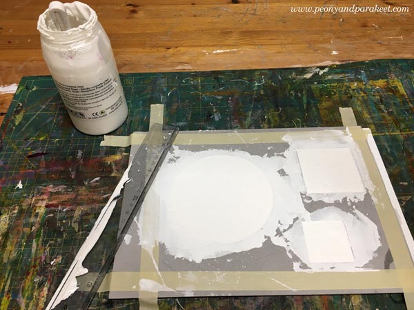
I wasn’t completely satisfied with the edges of the structure paste shapes and put the board away.
Acrylic Painting on Structure Paste
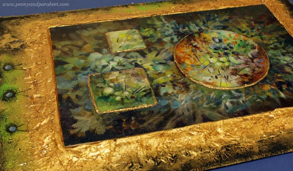
But now, when I wanted to create something with historical feel, I remembered the board, and started painting on it. The small imperfections didn’t bother me so much anymore. All pieces can’t be so serious anyway. There has to be some room for creative play too!
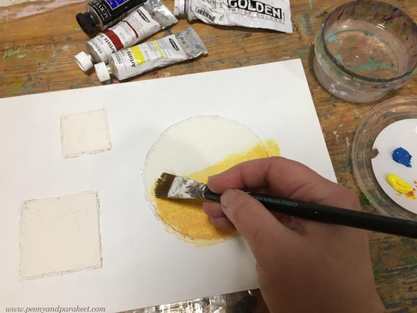
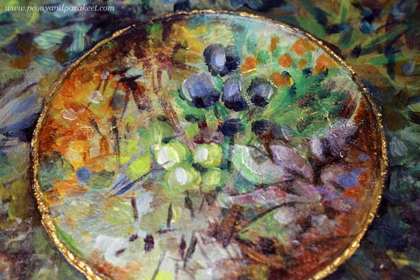
I decided to paint something loose and impressionistic that would still look decorative.
On the reliefs, the strokes were sharper and more controlled than on the background.
But before I made the finishing touches, the piece looked too bare to me.
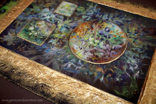
It needed a frame!
Making a Frame from Structure Paste
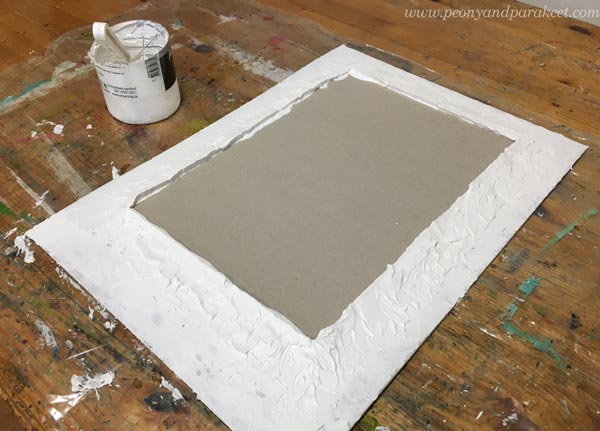
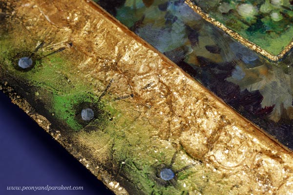
I still had some structure paste left and I found a piece of cardboard too. I traced the outline of the painting on a soft foam board and used that as a template for the center.
It’s not easy to make a smooth surface of the paste so I didn’t even try. Historical frames had all kinds of textures so the hills and valleys would look ok when painted.
I painted the outer edge of the frame black and the inner edge with gold paint.
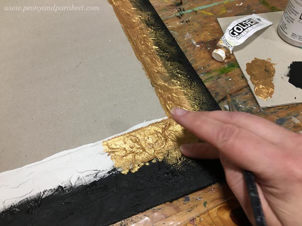
The transition from black to gold became lovely when smudging the paint with fingers. I also added some gold mica flakes on the top of the gold parts and near the edge.
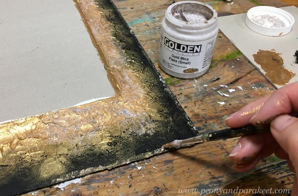
Then the painting got some finishing touches and gold paint too.
I also added some acrylic paint on the frame.
A Mini-Monet for Old Art Yearners!
The finished piece is a bit clumsy, but I love the historical feel.
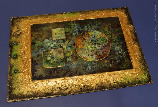
It’s my mini-Monet!
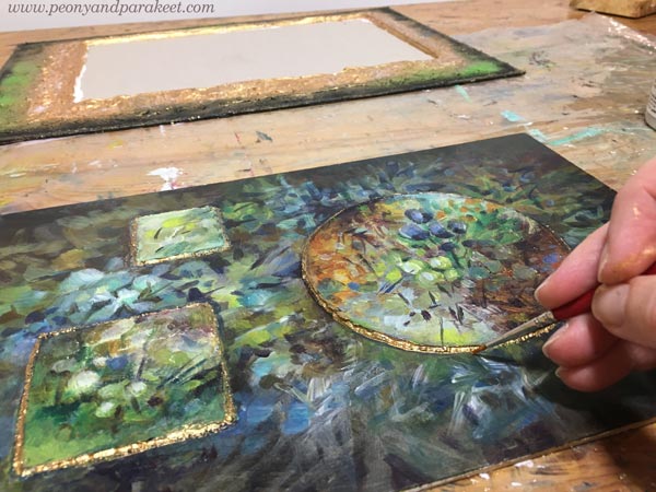
The unevenness of the structure paste in the edges looks quite good with the gold paint.
The frame was intentionally placed so that it’s not quite in the middle. This way I could make the piece more interesting. I really like how these painted spots look like nails or blueberries!
Just cardboard, structure paste, fake gold, acrylics, but I enter the gentle world of old art by looking at it!
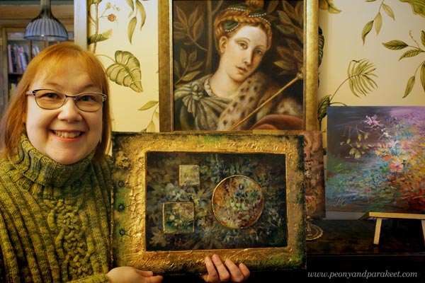
I display this piece in our library room which has more old-fashioned style than my studio.
My painting has simple strokes but it’s still romantic. I have bent the principles of abstract art to serve the impressionistic style. It’s so much fun to paint freely like this!
Paint Dreamy Florals to Free Your Spirit!
Floral Freedom – the floral class based on Paul Klee’s and Wassily Kandinsky’s insights on abstract art – will begin on Dec 4, 2021. In this class flowers are not just passive decorations, but they fly, sing, and dream! >> Sign up Now!
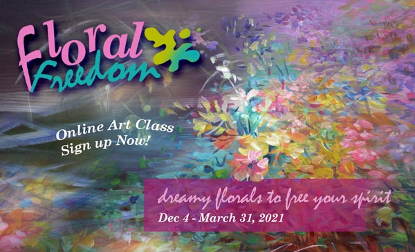
Floral Freedom is 20% off for the rest of November, so now is a good time to sign up!
>> Sign up now!
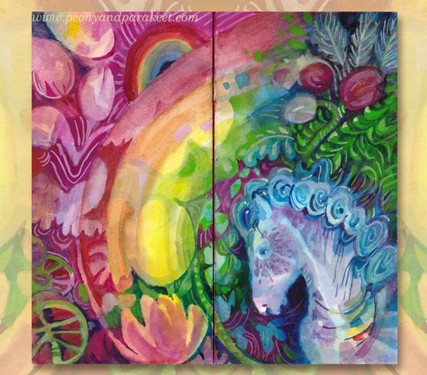
Rainbow Journal – Fill a Small Notebook with Happy Art!
This week, I get back to the project that I started earlier this spring. It’s a small notebook that I have filled with happy art. I call it Rainbow Journal because it has brought me both joy and hope. Here’s a quote from the video below:
“When working on this journal, I have been able to live inside a happy bubble momentarily. It’s been refreshing, and my inner critic has got gentler. I have gained new inspiration for my paintings and classes.”
Watch the video to get inspiration for yours!
Creative Prompts for Your Rainbow Journal
Use the following prompts to make yours!
Cover – Make It as Decorative as You Can!
Use a limited color palette and let the colors and shapes flow.
Spread #1 – Get Inspired by Happy Interiors!
Think about textiles, wallpapers, and painted motifs on wooden furnitures and dishes.
Spread #2 – Embrace the Good and the Innocence!
Once you have set the style of the world you are building, who could be wandering there, full of happy thoughts with an innocent mind?

Spread #3 – Paint Something Juicy!
Show how it feels when the glass is full, even overflowing.
Spread #4 – Grow the Flowers of Imagination!
The dark soil makes flowers grow and shine.
Spread #5 – Show the Bright Future!
Get creative with rainbows, how many can you fit in?
I hope this lifted your spirit and inspired you to keep creating!
Get a free mini-course when you subscribe to my inspirational weekly emails!