Mixed Media Drawing Tutorial – Create Step by Step!
With this blog post, I want to encourage you to
… draw from imagination
… fall in love with the combination of water-soluble media and colored pencils
… find inspiration from art that has been created hundreds of years ago
Inspiration from Old Still Lives
A few weeks ago, I visited a small art museum called Sinebrychoff Art Museum in Helsinki. I have visited it many times because it’s a cozy old building and small art exhibitions are refreshing more than overwhelming. One more reason is that in Finland you can buy a museum card for about 65 EUR and it gives you free access to most of the Finnish museums for a year. It became available in 2015, and since then I have visited museums more than ever before in a year.
The exhibition at Sinebrychoff Art Museum was about old still lives, painted in the 16th to 18th centuries. I have admired those old, elegant paintings with beautiful flowers and fruits of all sorts for a long time. I have a Pinterest board dedicated to the most luxurious still lives, and I often bring up little things that I have learned from watching them in my classes. So no wonder, I was very inspired after seeing the exhibition, and I had to create a small drawing just to let my imagination play with the memories of beautiful paintings.
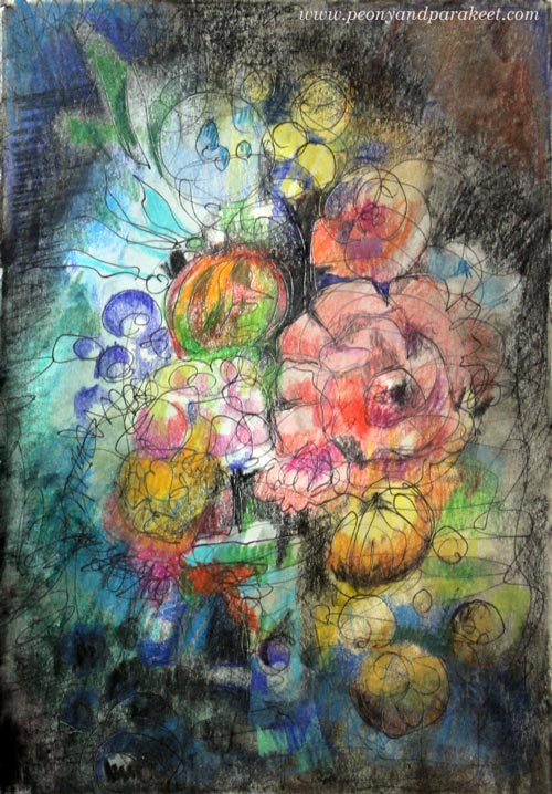
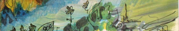
Mixed Media Drawing with Imaginative Fruits and Flowers
I picked one of my art journals, a Daler-Rowney’s Graduate Sketchbook, and a black thin-tipped drawing pen that has permanent ink. I prefer sketching with a permanent pen rather than with a pencil. Not being able to erase anything makes me more creative. Using permanent ink allows me to play with wet media as well.
First, I started doodling from the edges towards the center. Then I added some watercolors on the top of the doodling leaving the center blank.
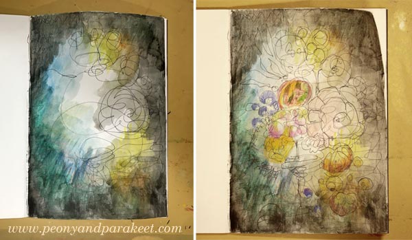
Once the watercolor was dry, I added more doodling in the center and finished the page with colored pencils. The dark background makes the colorful flowers and fruit stand out.
This process was so simple that I wanted to make a small tutorial for another page inspired by old still lives. So here it comes!
Mixed Media Drawing – A Tutorial
1) Set the composition with simple shapes. Draw a big shape and then a smaller one. The shapes can intersect.
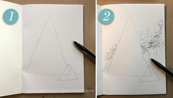
2) Add the horizon by doodling. I wanted to make the drawing dynamic by giving the horizon a diagonal direction.
3) Paint the background leaving most of the shapes blank. I used watercolors, but you can use any water-soluble media like inks or watercolor pens. Just make sure that your lines will show through because it’s part of the visual appeal. Use more than just one color so that your painting inspires you in the next step. Let dry.
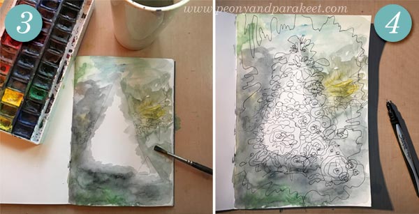
4) Doodle your heart out! Without raising your pen from the paper, doodle over the painted background and on the center too.
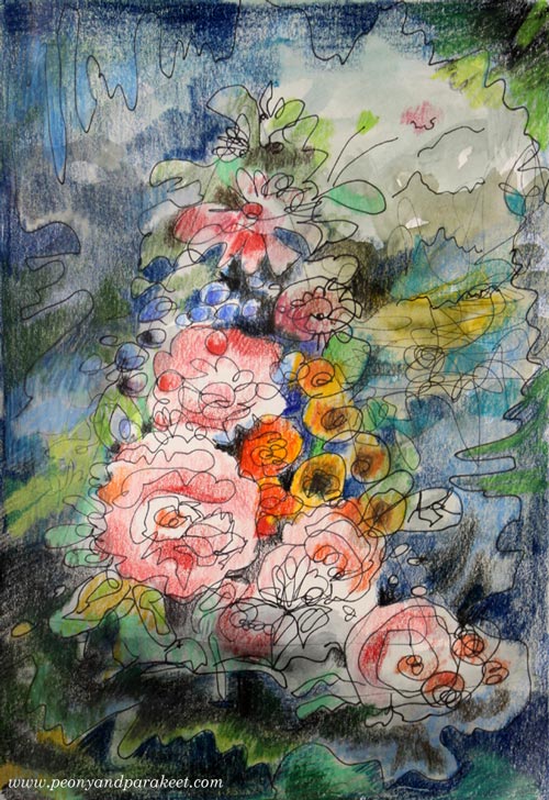
5) Color the drawing with bright colors and dark shadows. I used colored pencils, but you can use almost any media for coloring. For example, felt-tipped pens work great. You can also continue to use water-soluble media for coloring. Add dark colors between the flowers and the leaves. Leave some of the painting made in Step 3 visible so that your drawing breathes.
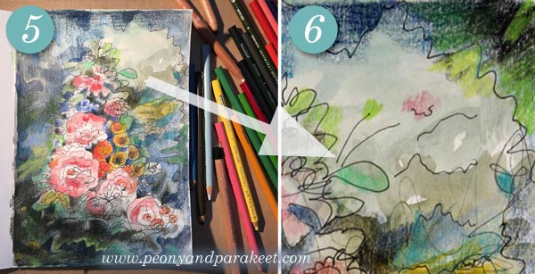
6) Add the final touches to balance the drawing. I added some lines to make the elements in the background more explanatory and a tiny flower that looks like it’s reaching them. I also made the top right corner look similar to the bottom right corner to highlight the diagonal composition in the background.
Mixed Media Drawing – Say You Want to Explore More!
1) Enjoy Drawing from Imagination!
At Inspirational Drawing 2.0, you will quickly get in touch with you living line and lively imagination. You will also get personal help to finish your pieces so that they are meaningful and appealing to other people too.
>> Sign up for Inspirational Drawing 2.0!
2) Practice Merging Painting with Drawing!
Learn to merge drawn areas with painted areas and play with shadows! Flowing Greenery is a self-study class with two projects, a small still life, and a bigger landscape.
>> Buy Flowing Greenery!
3) Get Creative with Colored Pencils!
Coloring doesn’t have to be stiff or boring. Learn to color freely whether it’s coloring a drawing or creating intuitive art directly on a blank page!
>> Buy Coloring Freely!
What Any Artist Can Learn from Old Masters
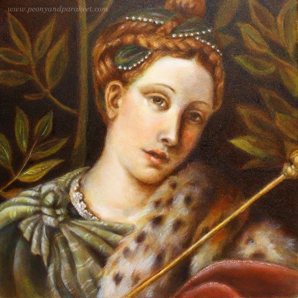
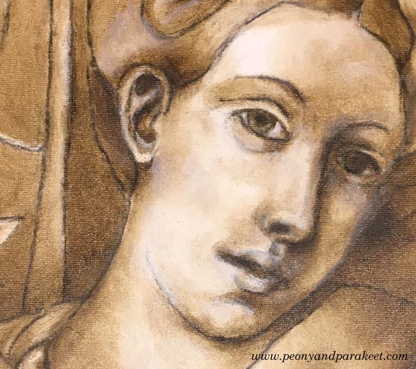
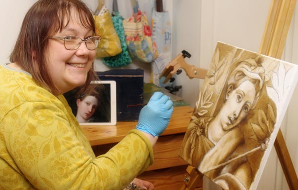
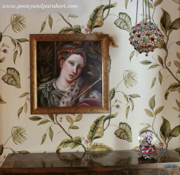
If you have followed me on Instagram or Facebook, you’ve already seen that I have had a special project in November. I have been painting a replica of an old painting and learning techniques that artists used already hundreds of years ago. These are called old master painting techniques. Famous old masters like Leonardo da Vinci and Johannes Vermeer used them when creating their masterpieces. My painting is a copy of a detail from Moretto da Brescia‘s painting “Portrait of a Lady as Salome.” I call mine “Dreaming Salome” because I gave her a more dreamy look and different meaning. The portrait was painted in the course organized by The National Museum of Finland. The teacher of the course was Emmi Mustonen.
5 Tips You Can Learn from Old Masters
After painting my first oil painting, and the first one that uses these techniques, I feel that there is still a lot to learn. So I will be painting another one with these techniques during the spring. However, I have already found out a lot of things that can be used with any supplies, and I wanted to write a blog post about what you can take from my experience. These tips can be applied to any themes, even to abstract art. At the end of this post, there’s also a short video (watch it on YouTube) that shows more images from the process.
1) Don’t Get Discouraged in The Beginning!
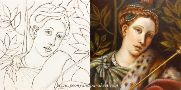
My process of making the painting started with a charcoal sketch. While sketching, I felt I was just making a big mess. I pressed too hard, and the drawing wasn’t detailed enough. The image shows the sketch once it was cleaned with an eraser – just before the first layer of paint. If you compare it with the finished painting, there’s a huge difference between the two. The expression of the lady looked sad in the drawing, but she has a half-smile in the finished version. I understood that the facial features and characteristics are so subtle that it takes a long time to get them right.
When sketching, I hadn’t the persistence to finish her hair and shawl, but still, I was able to make them quite detailed during the painting process. If I had made the original sketch without attending the course, I would have called it a failure and lost my hope of achieving something that would look like an old painting.
I often talk about raw ideas (see this blog post) and that applies to realistic art too. The first lines are just the beginning of understanding what the final work will be. When I was sketching, I only had a rough idea of how my lady should differ from the original version. But once I continued the painting process, my vision got clearer. So, stay curious about the insights that you will get during creating, and don’t get discouraged in the beginning!
2) Before Diving Deeper, Limit Your Supplies!
In my painting, the first layers were made with just two colors: burnt umber and zinc white. These first layers form a so-called underpainting that shows where the shadows and lighted areas are. It enforces the painter to look for contrasts, and on the other hand, it enables working with details without making color choices. The philosophy of underpainting can be applied to any media and style when it’s seen as a phase where you limit your supplies and add more content to the piece. When you go through every area in your work and make sure that it connects well with the next one, you will control the big picture through details. I find this much more enjoyable than trying to see everything at one glance all the time.
3) Slow Down to Maintain a Gentle Focus!
I was surprised by the positive feelings I went through while painting with old masters’ techniques. I thought that there would be a lot of demanding voices in my head, but the process surprised me. Even if I was stretched out from my comfort zone, I realized that there could be “a gentle focus,” where you put all your energy into work so that it improves your self-image too. I believe that this kind of new self-acceptance was based on two things.
First, I knew that it would take a long time to finish the painting. Six sessions in the classroom weren’t enough. I also had to do homework. Each of the layers had to dry before adding a new one, and drying took several days. This slow pace felt old fashioned but good too. It made me think how much gentler we would be in general if weren’t so busy all the time. I also noticed how I became less worried about mistakes. When the progress is slow, mistakes start small, and it’s easier to correct them.
The second thing that helped me was that we were using a finger to remove the brush strokes. When I gently caressed the canvas with paint, it affected my whole thinking. It felt like the beauty created and seen by Moretto da Brescia caressed my brain.
4) Don’t Try to Make Your Middle Look Like the End
Before attending the course, I made one decision: I would do my best to follow the teacher’s advice. Because I was not familiar with the techniques, I didn’t know beforehand how the painting should look after each layer. When I teach art, I often see people worry over details that will look gorgeous once they just move on to the next steps. It’s human to compare your middle to the desired end. But if you can set your criteria according to each phase, it will lead to better quality.
So, when laying the colors one by one, I tried to quench my worries about how yellow the dress looked or how red the fur was. When using old masters techniques, colors are not mixed on a palette. The pigments from the tubes are laid in thin layers as they are. So if you want green, you will start with yellow, let it dry for few days and then move on to blue. The transparent layers with soft edges result in mixed color and a realistic look.
When painting these thin layers of color, I couldn’t help thinking that the skin was too uneven. But my teacher advised me to continue creating color differences to get the painting ready for “a white wash.” A thin layer of zinc white made the skin more even, and all the previous layers made sense. Try this approach of seeing layers and elements as building blocks to new ones!
5) Sharpen The Soft, Not Vice Versa!
I was often reminded to make every area and detail softer. Even most of the tiny spots were softened with a finger to make them more translucent and blurry without sharp edges. As a result of that, the painting looked blurry and untidy. But when finishing, sparingly added sharp lines and dots did the trick. It felt magical how suddenly the whole painting looked accurate. I learned that it’s very easy to sharpen the softness. Adding few strokes finished the fur. Adding a tiny sharp dot finished the eye. The nose didn’t need sharpening at all because I wanted to bring the eye to the mouth where I added a small white spot.
When you add softness, you will also make your work look more dimensional. Leonardo da Vinci has said:
“The beginnings and ends of shadow lie between the light and darkness and may be infinitely diminished and infinitely increased. Shadow is the means by which bodies display their form. The forms of bodies could not be understood in detail but for shadow.”
After painting my “Dreaming Salome,” I have become fascinated by watching the edges of items and how soft they are. I know that today’s world is sharp. We aim for sharp photos, a clean graphic look, and turn on the fluorescent lighting. The things we use are industrially made and as perfect as they have been designed on a computer. But try visiting Leonardo’s softer world! Light a candle and observe the lights and shadows. Let everything soft inspire you when you are creating art and reflect that softness towards yourself too!
Bonus: Make it Meaningful – Watch the Video!
My “Dreaming Salome” is now framed and she has a special place in our library room. I was so happy to be able to finish her before Christmas.
This painting is my first exercise when learning from old masters, but it also has other symbolic meanings. I have made a short video showing the images from the class and how she was painted layer by layer. At the same time, I also explain what Dreaming Salome symbolizes to me.
Learn old masters’ techniques and more!
>> Sign up for Floral Fantasies!
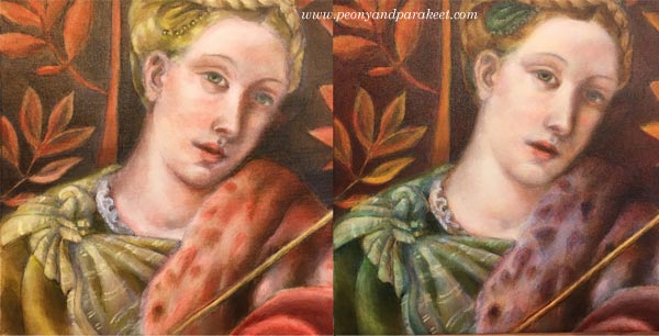
Pointillism – A Quick Way, Step by Step!
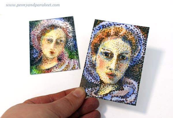
I am honored to be one of the guest artists in Documented Life Project this month. I was given a theme (pointillism) and a project type (artist trading card, ATC). As long as I followed those, I could do anything with any supplies. These kind of challenges are fun because you get such enough restrictions to get started but can still create freely. However, I have one fixation with artistic trading cards. I like them to be portraits, either humans or animals.(See ATCs in this post, for example!) So I chose a very traditional subject, women from the past.
Pointillism Can Be Tedious!
Like most of us, I have always admired Georges Seurat‘s paintings. In the 1980s, a Finnish illustrator made images that were composed of small points. It might have been an artist called Osmo Omenamäki. As a teenager, inspired by him and Seurat, I decided to be a pointillist artist too. I picked my felt-tipped pens and started to draw dots. Oh my! I was barely able to finish a postcard size drawing. I couldn’t believe how many small dots are needed to fill even a small blank area! I was almost traumatized by that experience!
So now, over 30 years later, I didn’t even think about creating the project with felt-tipped pens only. ATCs are small, but not that small! However, with felt-tipped pens, it is easy to make intentional tiny dots in a variety of colors. But I also needed something else to make the coloring faster. Colored pencils leave the spots visible, and they are easy to control. So I chose them to fill the blanks between the dots.
Practicing – Spots with Many Colors
Before the actual project, I practiced my ideas. I made the dots using a variety of colors and then added more colors with colored pencils.

Because the colors in dots weren’t as important as coloring with colored pencils, I got an idea of using brown shades only. It would be like an underpainting, a technique that old masters often used in portraits. They painted shadows with umber and then applied the rest of the colors so that the shadows showed through. So I will show you how you can do a similar kind of “under-dotting” and then apply the actual colors with colored pencils!
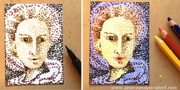
1) Under-Dotting with Felt-Tipped Pens
You will need four shades of felt-tipped pens for this step. I use Faber-Castell PITT Artist Pens in colors “Light Flesh”, “Green Gold”, “Raw Umber” and “Caput Mortuum”. I didn’t use any model like a photo but just created intuitively, making the features more accurate color by color.
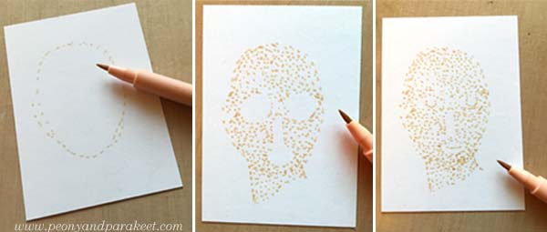
With the palest of color, sketch an oval using small dots. The liberating thing here is that when you start with a pale color and make little dots, you can make many “mistakes” and correct them as you go. One spot in a wrong place can be easily changed! Fill the oval with dots so that you leave blank space where you plan mouth, eyes, and nose to be. When they seem to be in place, add some dots for details. Don’t worry if your woman looks pretty ugly. This is just the first layer!
Change to darker shades and add shadows to the face. Then sketch the hair and clothes using little dots only.
Every shade adds a little bit more to the image.
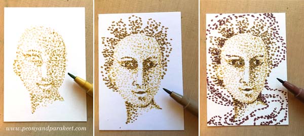
2) Basic Coloring with Black and Colored Pencils
Now add black spots to the darkest of details. Old portraits often had a dark background, so I added black spots there too.
Using colored pencils, color the card so that white shows only where you want to have it in the end. I used Caran d’Ache Pablo pencils in blue, red and yellow. Remember that you can mix colors by layering. You can get many beautiful tones from the primary colors.
3) More Liveliness with Colored Pencils
Finally, add shadows so that the details look 3-dimensional. If you only have primary colors like I had, you can get a dark background by adding blue, red and yellow layers there. If your portrait looks too dark, use an eraser to lighten and soften the colors.
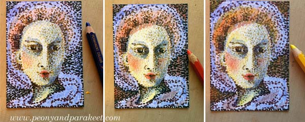
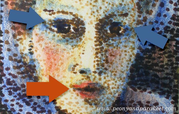
In the end, check the facial features of your woman. Add small lines where you want to turn the attention. Don’t draw the lines near the nose but on the lips and the eyes.
Celebrating Blurriness
Here are my finished cards again. I think they look delightfully blurry!
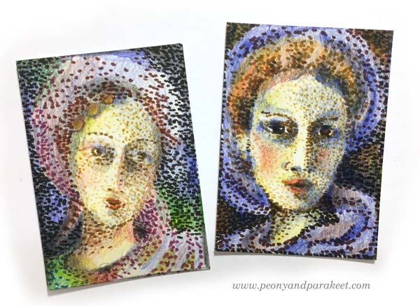
The more I want to reduce stiffness in my art, the more I feel the need to embrace blurriness. With blurriness, I also feel more self-acceptance, more ease with errors, more open to possibilities.
Reducing stiffness is one of the main themes in my newest class too. The class is called Inspirational Drawing 2.0 and it’s about drawing from imagination and inspiration. Watch the introductory video below!
Inspirational Drawing 2.0: Liberate your line and sign up now!
Tribute to Georgia O’Keeffe

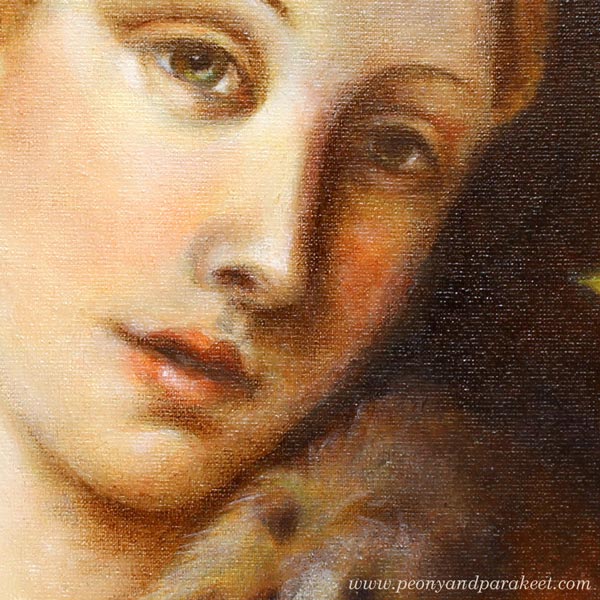
When walking the dogs, I wondered what could I take with me for the next painting. I saw a fallen oak leaf and felt a bit melancholic; it’s time to say goodbye to summer. Then I did exactly what Georgia O’Keeffe, an American artist (1887-1986), would have done: I picked up the leaf and once got home I painted it! Here’s how I got to know more about her and her painting style.
Portrait of an Artist: A Biography of Georgia O’Keeffe
When so many of the participants of Imagine Monthly, my monthly art journaling class, named Georgia O’Keeffe as a favorite artist, my project during the summer was to get to know her better. I only knew that she had painted large flower paintings and some abstracts. But I didn’t know anything specific about her background and about her way of working. So I purchased a book about her life. It’s written by Laurie Lisle, and it’s called “Portrait of an Artist: A Biography of Georgia O’Keeffe.” I bought an audio version so I could listen to it while I paint. I don’t recommend the book to anyone who wants to read an entertaining novel. I think it’s more like a historical study. But for anyone, who wants to learn the facts, it’s excellent.
Georgia O’Keeffe’s Mindset
There are two things that I have thought a lot after reading the book. First is Georgia O’Keeffe’s personality. Apparently, she was not a very social person and quite straightforward in her sayings. Second is how her photographer husband supported her both by being her manager and her muse. I don’t think Georgia would have discovered her painting style without the discussions with her husband related to photography. These two facts make me believe that her mindset was very analytical. Even if she was a visual artist, she also was a scientist in her closed personal world. She examined plants like they were scientific specimens. It was like she could measure beauty and then create a new version of it. The more I listened to her life story, the more fascinated I became about her.
Those who live in the UK or are visiting the UK: There’s a big exhibition of Georgia O’Keeffe at Tate Modern until October 30!
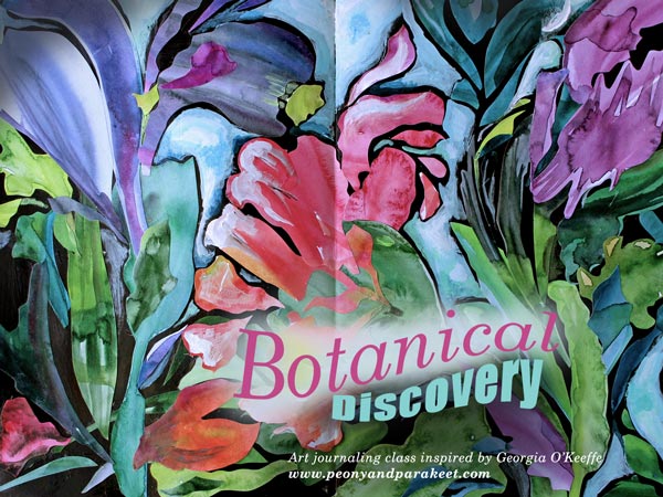
Botanical Discovery – Create Unique Collage Art!
As a part of Imagine Monthly Fall 2016, I have published a class where you can create botanical art inspired by Georgia O’Keeffe. It has directions on how to cut organic shapes from watercolored papers and build a painted collage out of them. Sign up for Imagine Monthly and get this class immediately after registration!
Painting an Oak Leaf – Watch the video!
The oak leaf shown at the beginning of the page is an acrylic painting on an art journal. I made it as a tribute to Georgia O’Keeffe and recorded a short video of the process. In the video you see me painting with a broad brush and flowing strokes. This is one of the techniques that I’ll show more in depth in my upcoming workshop Nature in Your Mind. I hope to see you there too!
Create collage art inspired by Georgia O’Keeffe:
>> Buy Art Journaling Bundle 2!