How to Stay Motivated – Colored Pencils and Free Video!
This week, I have a free video for you! I hope it helps you to stay motivated and keep creating.

In the video, I am creating this small spread for my colored pencil diary and talking about how colored pencils help me to stay motivated. I share some thoughts about taking a break and getting back to making art. There are also lots of visual examples and an idea about Modern Me and Ancient Me. Imagining these two sides can help too.
How to Stay Motivated – Watch the Video!
I hope you enjoy the video. Let’s keep creating!
Drawing Swirls with Colored Pencils
This week, let’s make a summery drawing by coloring ornamental swirls!
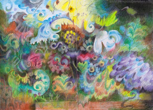
Here’s the latest spread in my colored pencil journal. I have been recovering from painting a big series of oil paintings, so I wanted to create something small and experiment with the idea that I got in mind while cleaning the studio for the next paintings. Because I like to create freely and intuitively, my colored pencil journal is not a direct sketchbook for paintings, but more like a study book of ideas – a place to ponder and practice at the same time. This time, I wanted to focus on ornamental swirls so that they flow freely on the page. The elements themselves have stiffness but the overall impression is dynamic when the ornaments are layered on top of each other.
Drawing Swirls is a Good Art Practice
Practicing swirls makes all your drawings more beautiful because it develops both the hand and the eye. Try to make a perfect curve that ends with a perfect little circle, then widen parts of the curves so that they grow broader gradually. Observe not only the swirl itself but also the shape that it creates besides it.
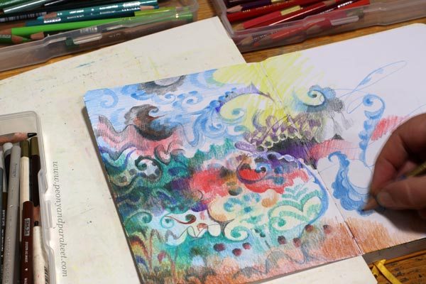
If you tend to place the swirls stiffly row by row, draw some free lines as guides for their placement. You can also turn the page in different directions and color ornaments that are directed differently from each other.
Shadows Can Be Swirls Too
I like to color many layers and make some swirls disappear into the background. When layering, you can make everything ornamental: the background, the shadows, and the actual elements.

There are lots of swirls in my drawing but I also included some simple scallop shapes and circles to make the visual language more diverse.
Darkening a Little More Than You Would Normally Dare
If you want to make your drawing atmospheric, cover most of the white spots.

Darken the drawing gradually by coloring thin layers over most of the elements.
Add Something Angular to Go With Swirls
When my drawing progressed, it started to remind me of old still live paintings, for example, those that Riks Museum in the Netherlands has. There the vase was often placed on a tabletop. The rectangle on the bottom works as a contrast to the organic flowery shapes.
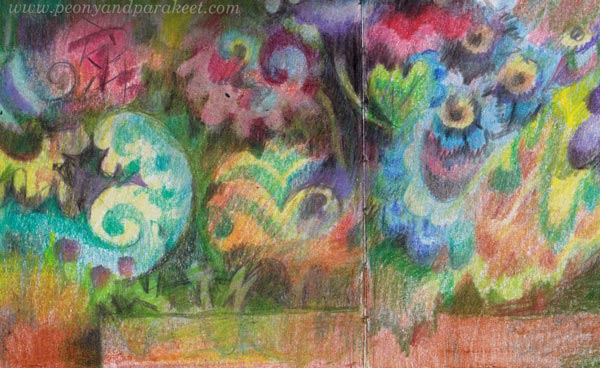
Add some shapes that break the rectangle, like the leaf-like one in my drawing. This way the result looks less strict and more layered.
Summer Coloring – A Little Bit Now and Then
I like and need this easiness of colored pencils when I slowly rebuild and restrengthen my creative core. Colored pencils are easy to grab for short sessions and you can color outside too. It’s now summer in Finland, and the weather has been fantastic. I think it shows in my drawing.
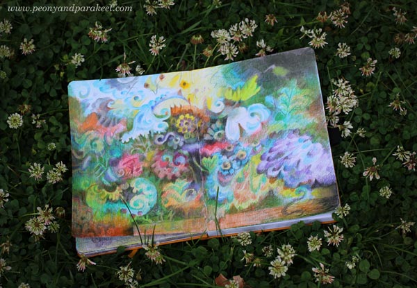
This journal has quite many colored pages already. It brings me joy to browse them. I am dreaming of the day when the journal is full even if it may be far away.
P.S. Check the class Fun Botanicum for more journal inspiration!
Painting and Drawing Fruits
This week, I share my love for fruits and give inspiration for fruit-themed paintings and drawings.
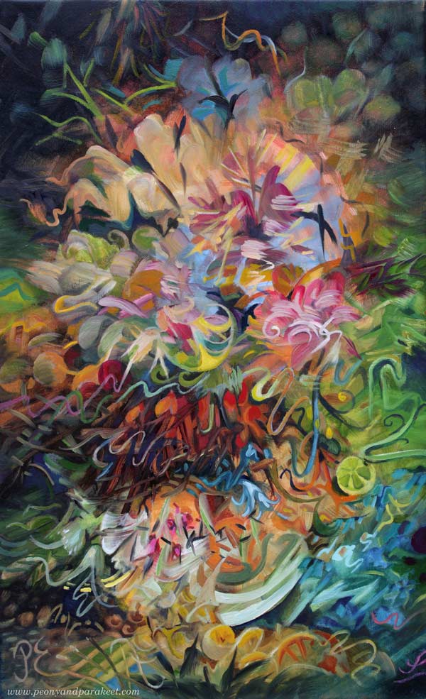
Here’s one of my newest paintings called Jupiter’s Bowl. This oil painting is a part of my series Linnunrata – Milky Way, where I explore planets and outer space. (See previous work: Uranus here, the Moon here, Mercury here, Neptune here, Pluto here, the Earth here, Venus here, and the Sun here!)
Fruit Storm in a Magical Bowl
The idea for this painting started from the orange storm that the planet Jupiter has. But then I thought about the Finnish saying “myrsky vesilasissa” which is “storm in the water glass” in English and similar to the saying “storm in a teacup.” It felt playful and funny to compare the planet to a small bowl and make a still life that doesn’t look still at all.
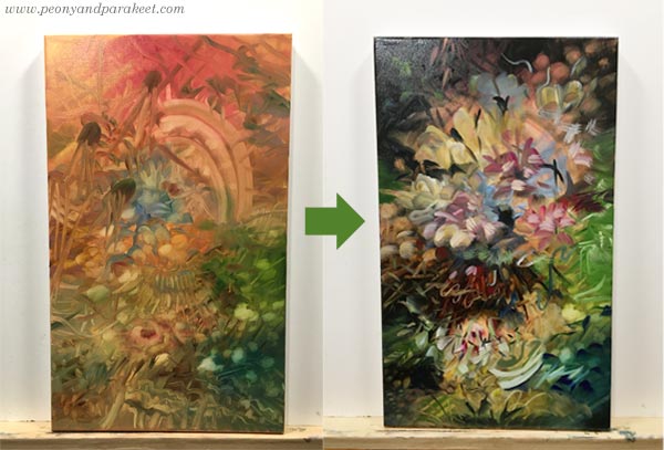
The first layers were very different from each other, and it felt like there was still more to come. The final version has brighter colors and juicy fruits that burst everywhere. Here’s a closeup of some:
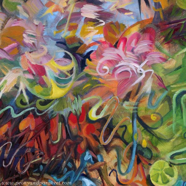
I love lemons and oranges. I think they are one of the most attractive things in the world. Their smell, taste, and look captivate me. And they are not difficult to paint or draw either!
Decorative Slices in Black and White Drawing
Here’s a line drawing from 2018 when I participated in Inktober for the first time. The slices were fun to draw, especially because I treated them like Faberge eggs: filled with jewelry and other decorative elements.
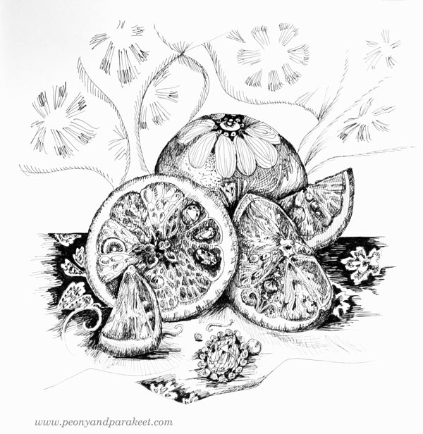
Back then, I was finding out things that I really like and bringing them together in my drawings.
Intuitive Fruit Painting in Gouache
In 2019, I made a gouache painting (see the video!) that reminds me of Jupiter’s Bowl. It has fruity and fresh colors and some stormy vibe too.
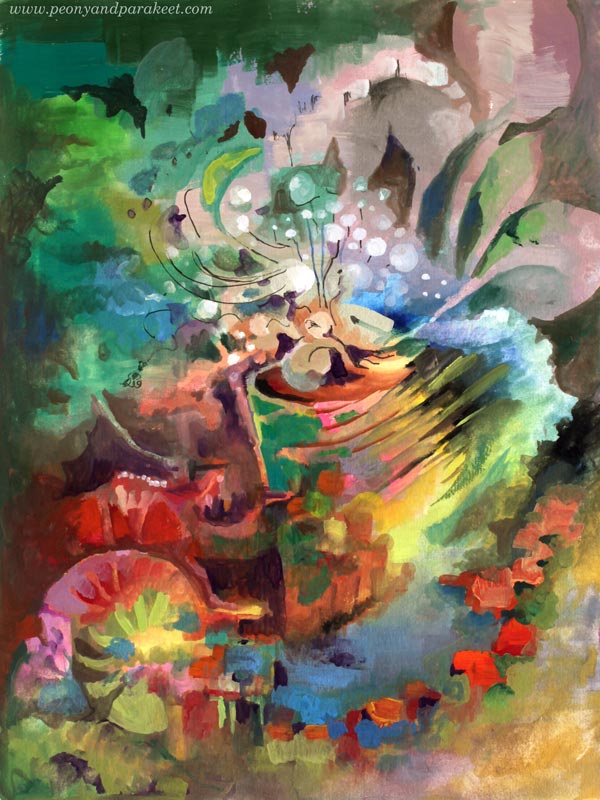
I was a bit clumsier painter back then, but the idea of refreshing fruity burst is evident.
Fantasy Fruits in Colored Pencils
This year started by making a new class called Fun Botanicum. The second lesson of the class is about fruits and berries. Here’s my example from the class, made with colored pencils.

I wanted the spread to look juicy with my own fantasy fruits. Practically, you can draw a circle, add shadows and decorations, and it will look like a fruit!
Juiciness vs. Fruits
When I took pictures of Jupiter’s Bowl, it was late May and grass and tulips were in full bloom. There’s a lot of juiciness in summer colors.
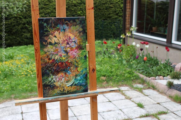
My suggestion is to focus on the juiciness when drawing or painting fruits. If you think about how the fruits look in reality, the result gets stiff more easily. If you let go and focus on the juicy part, creating is much more fun and the result more expressive. Anything can have the spirit of the fruit, and art can be juicy without presenting the actual lemons and oranges.
Tell me, which are your favorite fruits? Do they appear in your art too?
Expressing Moonlight Magic
This week is about the moon and expressing the magic!
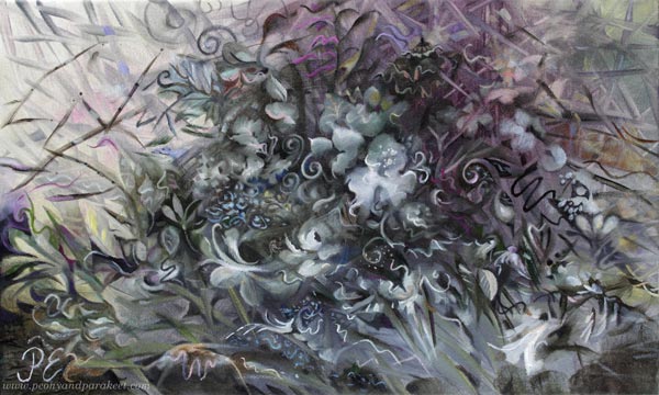
Here’s one of my newest paintings called Kuutamon Taika – Moonlight Magic. This oil painting is a part of my series Linnunrata – Milky Way, where I explore planets and outer space. (See previous work: Mercury here, Neptune here, Pluto here, the Earth here, Venus here, and the Sun here!)
Experiencing Moonlight Magic
One night in April, after a long workday, my spirit was low, and I felt tired. But after stepping outside to take the dogs out one more time, I saw a beautiful moonlight. I even took a picture but just with my phone camera, and the photo doesn’t do justice to the sight.
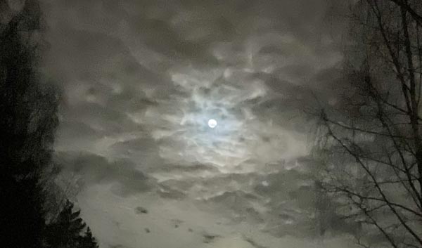
Everything looked black and white at first, but after a while, my eye saw a subtle variety of tones. It was like a message from the moon: “Paint me next! Let me be a part of your galaxy!”
Fantasy Art Connects Imagination and Past
This was not the first time expressing the moonlight magic. A few years ago, I started to feel that my art needed more fantasy. I had begun to follow many fantasy artists, for example, Jasmine Beckett-Griffith and Annie Stegg. Imaginative realism – as the genre is called – felt inviting. In 2018, I participated first time in the Inktober challenge, and in 2019 I made a class called Magical Inkdom.
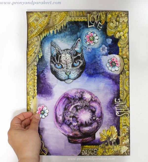
The world of Magical Inkdom is playful and colorful, but so that some elements look historical, just like in imaginative realism, where the story often happens in the past.
I wanted fantasy art to be present in my upcoming show too. So I wanted to make a painting with a similar historical yet fantasy-oriented look. My goal was to create a traditional floral but still include something that would tickle the imagination and feel magical.
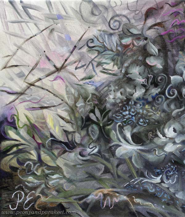
A slightly extraordinary composition and a combination of both decorative and more abstract elements make this painting stand out.
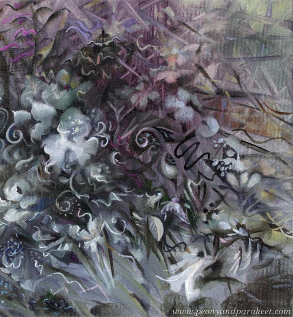
I am also surprisingly fond of the color scheme and it was much more fun to paint than I expected.
Expressing Magic and the Ability to Disappear
A part of the magic is that something almost disappears and then appears again, just like the moon in a cloudy sky. There are lots of blurry elements in this painting, even if you might not notice them right away. A sharp line and some dots on a blurry spot make the flower.
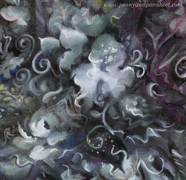
Old master painters of the 16th to 18th centuries used this technique a lot.
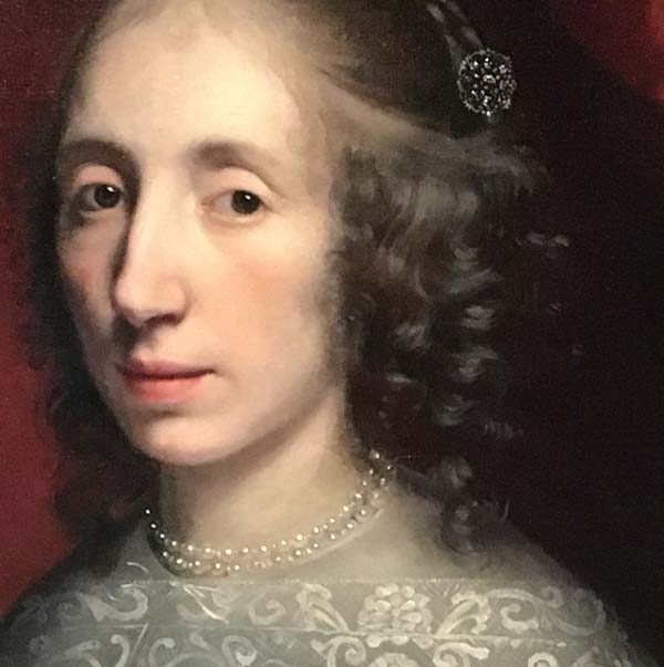
For example, look at the hair and the pearls in this portrait. Just blurry spots that have been sharpened with lighter and sharper strokes and dots. Don’t they look magical!
Preparing for the Show
This painting is small, 30 x 50 cm. Here’s a quick snapshot where you can see the size better.
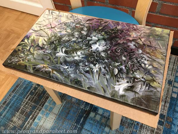
I am currently varnishing paintings for my upcoming solo show in June. All the tabletops are full and the not-so-pleasant odor is in the air. I hope to have photos of the show next week.
P.S. Magical Inkdom is for sale until June 16th! >> Buy here!