Art Inspiration from Lucas Cranach the Elder
This week, I gather inspiration for the next painting of a series, enabled by the grant that I got from Arts Promotion Centre Finland. This is the third blog post of this project, see the first one here and the second one here!
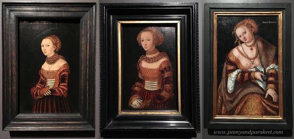
German Renaissance Portraits by Lucas Cranach
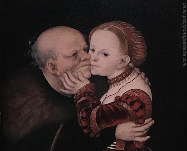
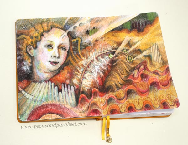
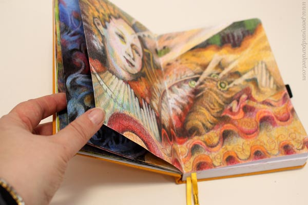
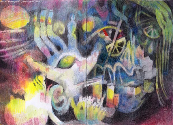
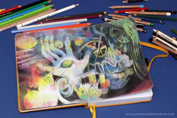
The first painting of my series (The Empire of Light) was inspired by Sandro Botticelli, Italy. Now I move further up in time and on a map and go to Germany to meet Lucas Cranach the Elder (1472-1553). Here’s a spread in my colored pencil journal inspired by Cranach’s style.
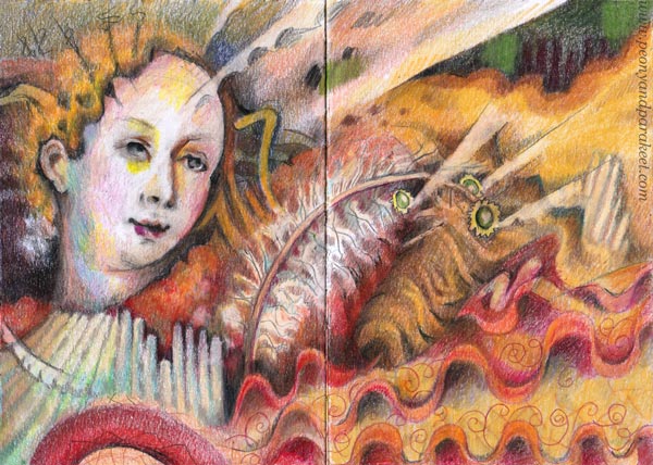
She is a weird-looking little woman but so are Lucas’s portraits too.
Their faces are small and not so pretty at all, at least according to today’s standards. Are these two even smiling at all? Is that boredom or irony?
Cranach’s women seem so arrogantly materialistic that it doesn’t feel suitable for a series about spirituality at all. But because expressing light is impossible without painting the darkness, I have decided to explore spirituality’s ultimate opposites as well. Like insolence, materialism, and money.
Lucas Cranach’s Super Production
Lucas Cranach the Elder wasn’t just a painter. He was a businessman who ran a workshop and a pharmacy too. His unusually large workshop wasn’t just for fine art. Printing presses produced religious images for people who had less money.
Lucas Cranach surely knew how to run a business. When he needed pigments, he decided to found a pharmacy at the same go. He got friends with prestigious people like Martin Luther. I can imagine Lucas whispering to Martin at a dinner: “What kind of images does your religious movement need? I can produce thousands of them!”
He must have had a sense of humor too. And yet, his figures and the way he painted the clothing, are a bit stiff and clumsy.
From Cranach’s Bluntness To Sharp Pencils
When Botticelli made an elegant curve, Cranach added a straight like like saying: “That’ll do. They won’t notice it anyway.” So my Cranach imitation was built around similar angular lines and weird proportions.
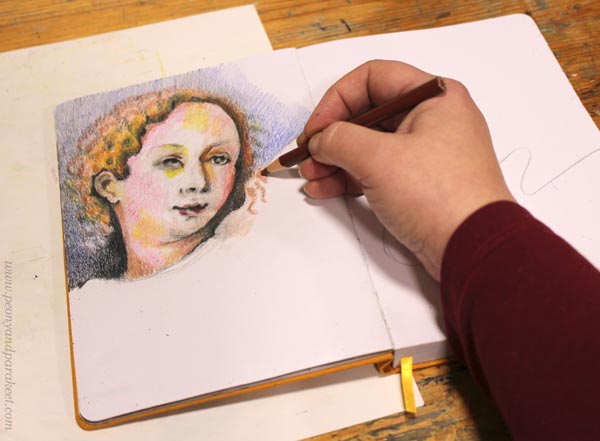
But the more I worked with the face, the more real it felt. The woman wasn’t just an angel but had vices as well. She felt so relatable and maybe because I was glancing at my new sharpener. In the middle of the spirituality project, I had become very materialistic and spent almost 150 EUR on it.
Botticelli’s goddesses wouldn’t be even willing to touch it. But Cranach’s women would grab the handle without hindrance. They would crank fast and smile quietly, and it would all look a little immodest.
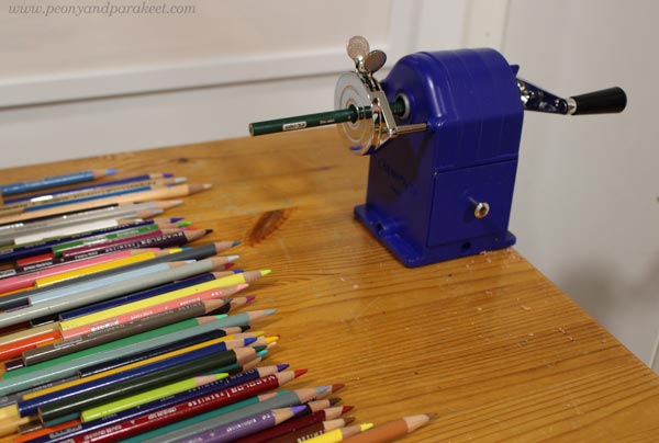
My workshop has produced a lot of pencil shavings lately.
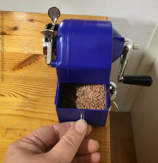
I can assure you that all my pencils are sharp!
Long Live the Spirit of Lucas Cranach!
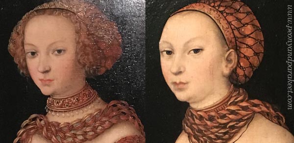
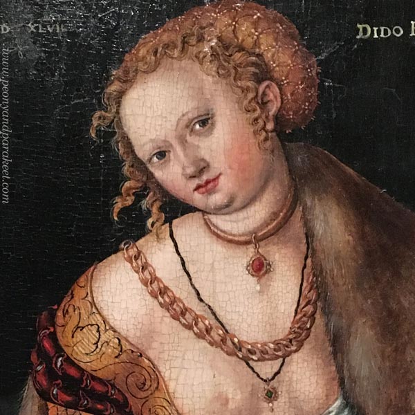
Queen Dido’s smile in Cranach’s painting is deceiving. She had made a decision to leave the materialistic world.
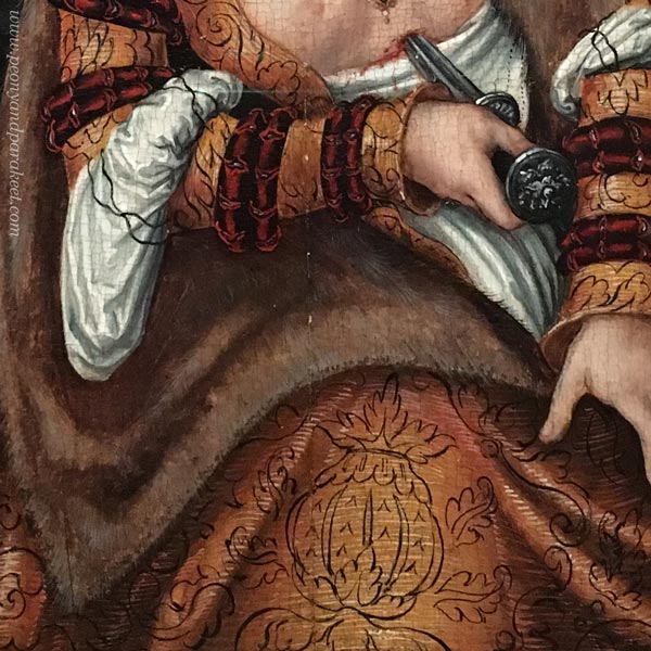
Her story goes like this: Dido founded the city of Carthago after her husband died. Then her lover, a Trojan hero Aineias was taken away and in agony, she killed herself.
Black and white always go together. Dido was not just a wealthy royal, but a sensitive woman too. Maybe Lucas Cranach and Martin Luther had deep discussions over dinner. Perhaps my sharpener will live longer than I do and serve many enthusiastic colorers after me.

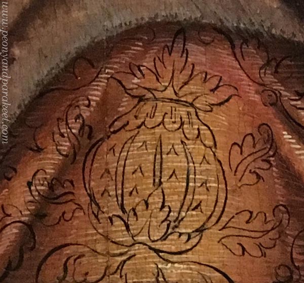
The most inspiring detail in Dido’s clothing is this carelessly painted ornament on the hem. It just floats there! It doesn’t follow the folds of the fabric at all. But its living line documents Cranach’s spirit.
No matter what the subject is, art always carries a spirit with the way we draw lines.
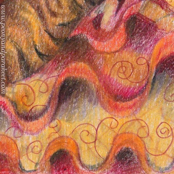
Like Cranach, I made two layers of lines, first x-shapes, then swirls.
Colored Pencil Journal
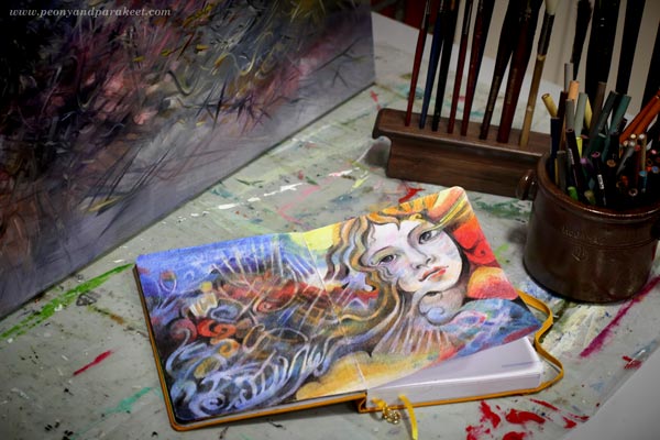
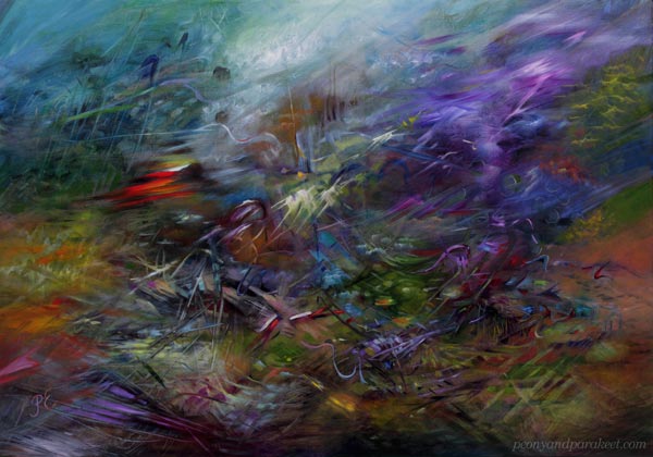
This journal spread will be my inspiration for a new abstract oil painting.
My little journal has quite many drawings already. I browse it often and it brings me joy.
Do you also have an art journal, a visual diary, or a sketchbook that you like to browse and fill? Can you find your living line there?
P.S. My photos of Lucas Cranach the Elder’s paintings are from an exhibition in 2019, see this blog post for more pics!
Art Journey to Spirituality – Let’s Begin!
This week, we will begin a journey to express spirituality through art. Think about this and the upcoming blog posts as an interactive diary that you can adapt to your own work. The idea is to question and examine first and then intuitively find more truths.
Introduction to the Journey
As I wrote last week, I have got a grant from The Arts Promotion Centre Finland to create a series of paintings and write about the process.
In the series, I will dive deeper into Wassily Kandinsky’s idea of unleashing the inner sound of form (check the class Floral Freedom). I will also examine the art of the 16th and 17th centuries and get influences from there. My paintings will express spirituality, but they won’t be subject to any particular worldview or religion.
I will work both systematically and intuitively. I will create studies in my colored pencil diary that help me to build a formal language for each intuitive painting (check the class Intuitive Coloring).
I hope this 3-month project inspires you to start an art journey to your spirituality! Take a bit of time for it every week, have a sketchbook or an art journal, maybe create a few paintings too. You can also write down names, quotes, and personal thoughts. The idea is to keep ideas and associations flowing while art gets created!
I hope to hear your thoughts in the comments! If you want more social support, purchase any of my classes and you will get to my community Bloom and Fly for the rest of the year. We will have discussions about this project in the Facebook group of the community.
Ok, let’s begin!
How to Define Spirituality
First, let’s ask what spirituality is! Google replies:
“the quality of being concerned with the human spirit or soul as opposed to material or physical things.”
But as artists, we don’t have to obey any general answer. Rather, it’s expected that our art expresses our personal points of view. I also believe that any word can start a journey. The first answer is just a ticket, and the answers get deeper piece by piece.
Connection, empathy, and understanding – I imagine squeezing these three words in my hands like they would be paper tokens. I want to connect with artists in the past, empathize with their shapes, and understand how to go deeper. But instead of getting overly serious, I also want to learn to play. The goal is to create a spectrum rather than one truth.
What three words would you pick as your tickets to a spiritual journey?
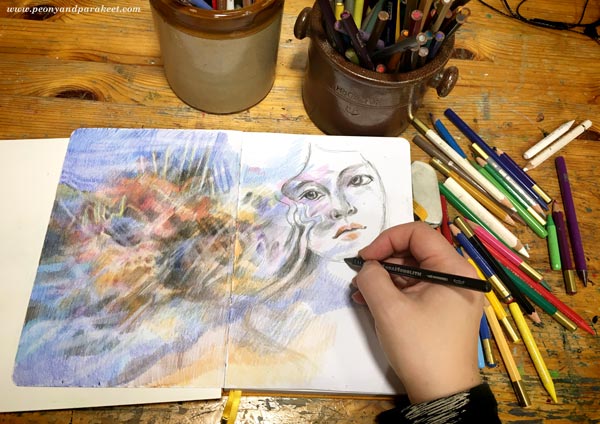
Meeting Sandro Botticelli
The first painting of the series will be the one that started last July. It was then black and white, an underpainting only.
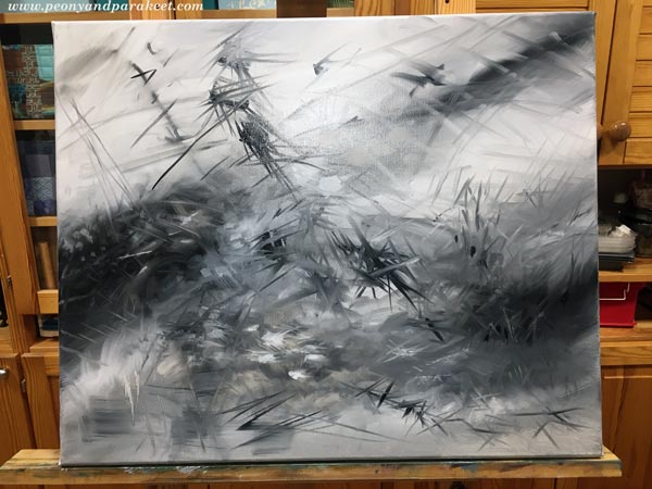
This week I got back to it and brought in more colors.
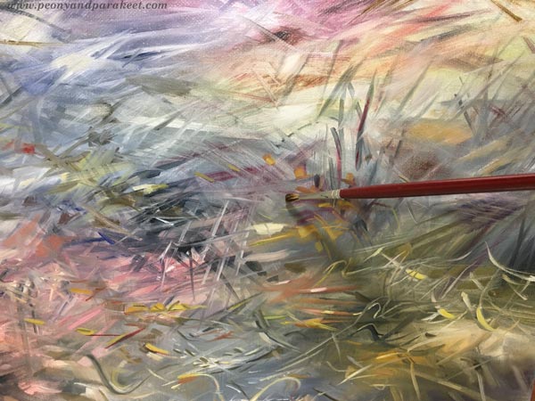
Even if the painting is not finished yet, the colors took me to meet the first companion of my journey – Sandro Botticelli.
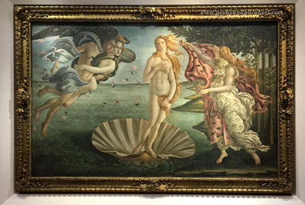
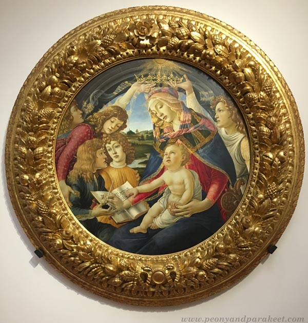
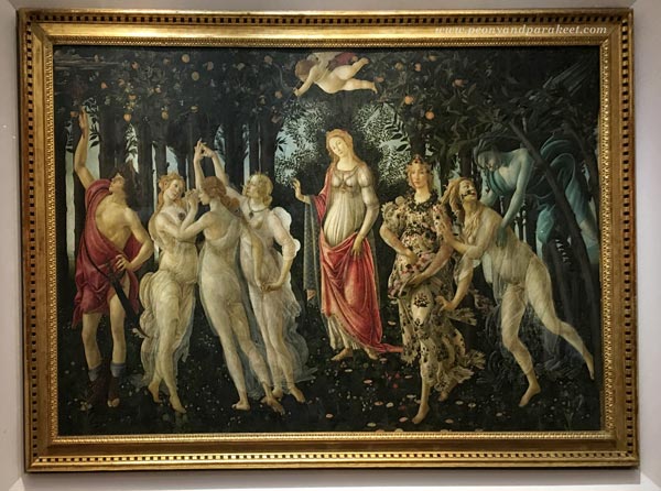
Sandro Botticelli (1445-1510) was an Italian painter. I have seen his famous paintings Primavera and The Birth of Venus in the Uffizi Gallery, Florence, but many other pieces inspire me too.
Botticelli equals perfection in many ways. His shapes and lines are so flawlessly beautiful that they make me shiver. He didn’t paint alone but had apprentices. I wonder what it would be like to work in his workshop – trying to paint a curvy line that would get his approval! Botticelli was born again in the 1850s when the Pre-Raphaelites found him. The easy way to fall in love with Botticelli’s work is to look at, for example, Evelyn de Morgan’s (1855-1919) romantic ladies. After those, it’s easy to greet Sandro too.
Botticelli’s Spirituality
I made this little study of Botticelli’s style in colored pencils to examine how his shapes are. It’s often good to let the hand think instead of using only the mind.
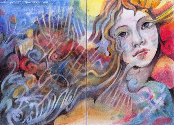
When I imagine discussions with Botticelli, he whispers out romantic mysteries. “Your stories would make great plays,” I tell him. But what interests me most is not the characters themselves, but how ornamental their speech is and how much in detail he describes their clothing and the overall setting.
I think the spiritual in Botticelli is the way he empathizes with things. For example, how a thin vail looks like the extension of the soul. Or how the flowers that are on the ground continue on the dress and fly in the air. Sandro’s people look immersed in their surroundings.
Like Wassily Kandinsky would say, they seem to be not watching something as outsiders but being an integral part of the overall experience. I hope that this understanding will somehow help me to finish the painting!
Tell me, who is the first companion in your art journey to spirituality? Botticelli or somebody else?
Art is a Lemon Tree – How’s Your Lemonade?
This week, I talk about art and lemonade and share some news about the rest of the year!
I was going to make a cheerful spread on my colored pencil diary, celebrating a beginning of a period that I have never experienced so far in my life. But I started the drawing intuitively, and here’s what came up: a murky image with a bittersweet impression!
“When life gives you lemons, make lemonade,” they say.
I have never been fond of that kind of forced optimism, but I guess there’s also a seed of truth. In art, you have to make most of what you have.
What Kinds of Lemons Does the Tree Produce?
In 2014, when I became a full-time artist, I thought about growing my skills and how that would naturally lead to something good. But nowadays, my leap has felt more like changing a long CV in technology and service design to a very short, almost non-existent, CV in art.
Art is like a lemon tree. You can nurture it, but you can’t change its variety. Over the years, I have learned not only to teach but also to illustrate, make surface designs, and even draw ornaments and logos. But my heart has always been in fine art, and especially in intuitive abstracts.
In my opinion, fine art makes the best lemons. But the weather is harsh, and the harvest becomes too small to be enough for the lemonade. So my passion for teaching has often been the lemonade maker, not the actual paintings.
But now, things change for a few months. I have got a grant from The Arts Promotion Centre Finland to create a series of paintings and write about the process. I will publish the art and most of the writings here in my blog, so you will also get to drink this lemonade!
The project has a set theme that also includes a background study. I will also continue the colored pencil diary and document a part of the process in colored pencils. Later posts will reveal more.
I hope that my project will also inspire you to create – grow more lemons and make your kind of lemonade!
P.S. You can still sign up for Intuitive Coloring! You will get the published lessons immediately after signing up, and can start having fun right away. >> Sign Up Now!
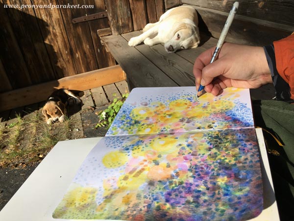
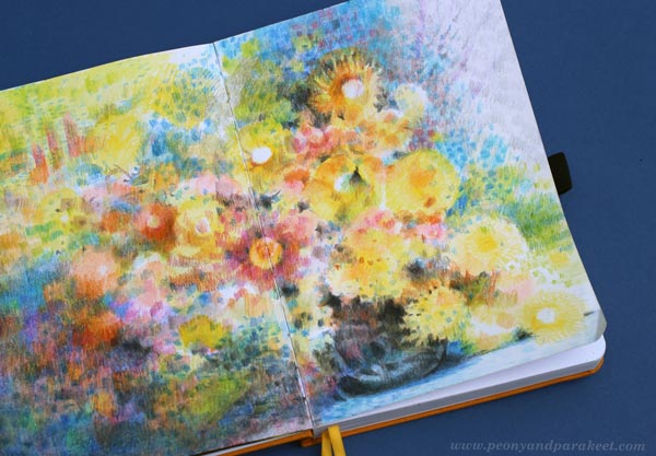
How to Color like Monet – Step by Step Instructions
This week, I share the newest spread in my colored pencil journal and show how to make pages in Claude Monet‘s style.
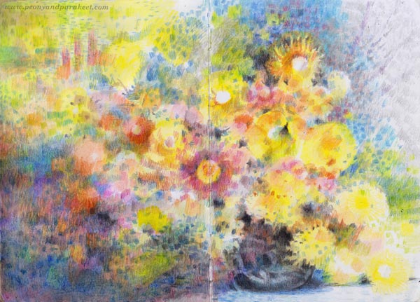
This project is just simple flowers in a vase, but the layering of colors in an impressionistic style makes it special.
Supplies – Colored Pencils and Paper
I used watercolor pencils but mostly dry, so you can have any colored pencils for this project. My selection has some fancy Caran d’Ache Museum Aquarelle pencils, but mostly old Staedler Karat watercolor pencils.
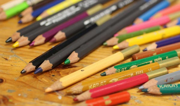
Karat pencils are getting so short that I need an extender for convenient coloring, but they look endearing and I want to give them a long life!
Step 1 – Color Circles Across the Page
Let’s begin with circles. Color a variety – full circles, half-circles, hollow and filled ones, big and small! Pick only a few colors first, and only fill a diagonal that goes across the paper.
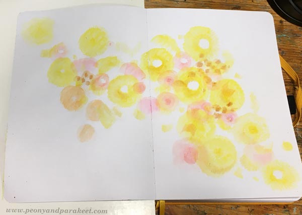
Color lightly so that you can add more layers on the top later. If you have watercolor pencils, you can spread the colors with water.
Step 2 – Color Short Stripes on the Top
Color short stripes over the circles. Now you can use a wider variety of colors and enlarge the size of the colored area.
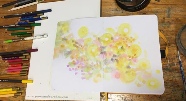
I arranged my pencils so that they are grouped by color families. It helped a lot in this project, especially for the color areas in the next step.
Step 3 – More is More!
Continue coloring circles and stripes in various sizes and colors so that they fill the paper.

You can have so short and tiny stripes that they are more like spots. Stripes can go in different directions. Change the orientation of the paper once in a while.
Even if you color tiny elements, divide the page into big areas. The diagonal in Step 1 is one of them. Each area can have many layers and colors but decide which color will dominate. For example, I have a blue area on the left bottom corner.
Step 4 – Color a Dark Vase
Color dark stripes on either side of the centerline to form a vase. Leave some space between the stripes so that it looks like it’s dark glass.
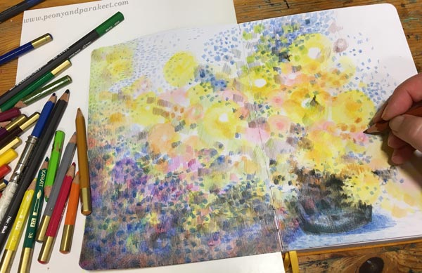
You can also add some shadows below the vase to make it look more like Monet’s work. I used blue for them.
Step 5 – Highlight the Best Flowers
Add more bright colors and details to make a few flowers that catch the eye more than others.

I don’t draw any outlines, but continue to color freely in short strokes.
Step 6 – Make Sure That You Have Enough Variety
Color more so that you have a wider variety of colors and shapes. See how I have used both vertical and horizontal stripes on the left top corner. They look a bit like windows or trees. Monet often had abstract elements like these in his work.
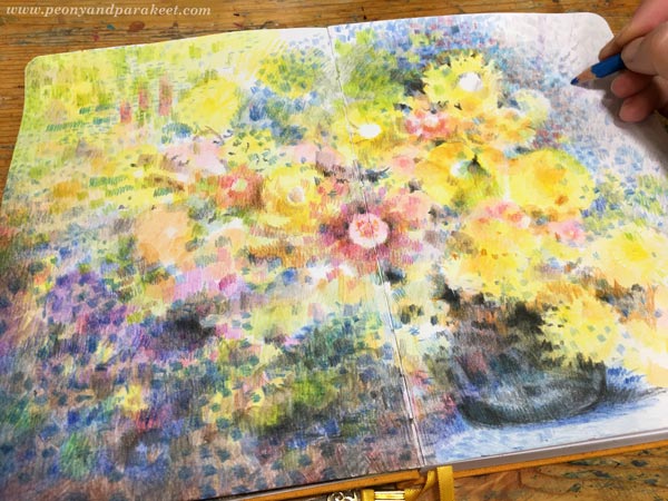
When you color more, make sure that blank paper isn’t visible everywhere. Color lightly over the areas that are less important. When they don’t have any bright white, the overall impression is less busy.
Step 7 – Finishing Like Monet
Go through your colorings one more time. Color lightly over large areas to make them look more unified and add dark spots near the best details so that they become more noticeable.
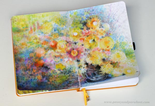
Here’s a closeup of the finished work – lots of small dots, stripes, and layers!

Colored pencils are very versatile. You can really color like Monet! I like this painterly look a lot.
P.S. For more colored pencil inspiration, sign up for Intuitive Coloring!
P.P.S. Thank you all who have signed up already, we will have a lot of fun!