
Freedom and Fear of Drawing – with Students of Peony and Parakeet
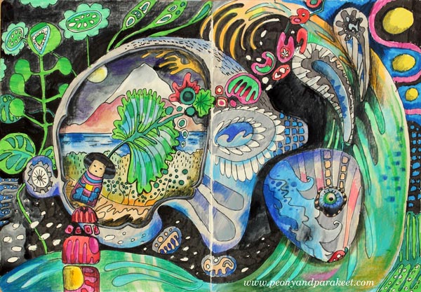
I dedicate this blog post for drawing, but I want to talk about cross stitching first. It’s one of my long-time hobbies, and I find it relaxing. I don’t have to make any decisions, use any imagination, just follow the chart, and the result will be just like I wanted it to be. Cross stitching is like a simple house plant. If you give a little bit of time for it fairly regularly, it will grow even if it doesn’t feel like so at first.
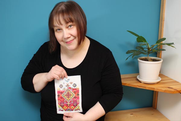
I can choose complicated charts or simple ones, and easily adjust the attention required for stitching. But there’s one problem that always remains: pixelation. Each image is made from single square-shaped stitches. No matter how complicated the design is or thick the fabric is, the pixelation is there.

Working with single stitches is not only a visual problem. It’s also a problem if we want to create more freely. Then we need a medium that allows faster and more flexible thinking. Like drawing. There are many kinds of drawing styles. When I want to experience creative freedom, I don’t do sketching using a pre-made model. (The photo shows a recent Renaissance-style painting in progress. I have designed it first in Photoshop.)

A Fear for Freedom – A Fear of Drawing
When I want to feel free, I don’t want models. Then it’s just a blank paper and a pen and a wish for a glimpse of imagination.
But freedom and fear are strangely connected. About three years ago, when I planned to leave my day job and start an art business, I warned myself. I told how I would no longer be anyone noticeable. I would have no office, no place to go every day, no colleagues to discuss with, no job title, no respect from others, no self-esteem. I would live in the darkest edge of the society and completely against the way of life I was taught. With these stories, I tried to prevent myself making the life change, and at the same time, I knew I had to try it. I had to turn the page and start a completely blank one.
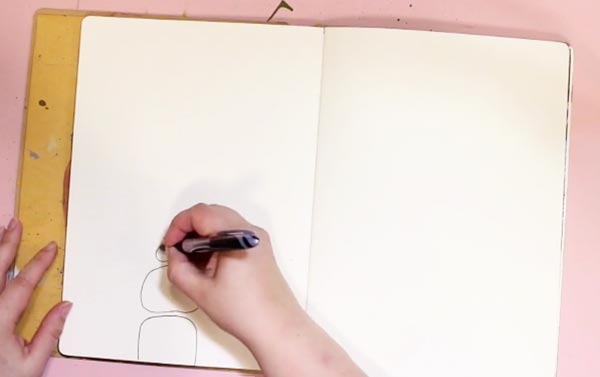
I often connect with the same fear when I start drawing. That I am no one, that I have no power, that it is overwhelming and I don’t know what to do. But then, it’s the same gate that leads to the most wonderful feeling: the feeling of freedom.
Before I left my day job, I started to follow other self-employed women online. I listened to podcasts where they told their stories, and they all had one thing in common. They had put what they already know into use and then learned more. It made me list all the skills that I had and be more content about the decision I had made.
Drawing Factory Teaches You to Draw from Stick Figures
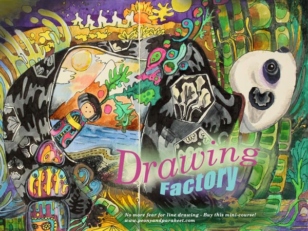
Still, on this day, I find it both assuring and inspiring to acknowledge what is already there before starting something new. So last year, I wanted to create a mini-course about line drawing, using the same philosophy. That was how Drawing Factory was born. It teaches you to start from stick figures and then move on to flowing lines and more imaginative illustrations.
Student Artwork
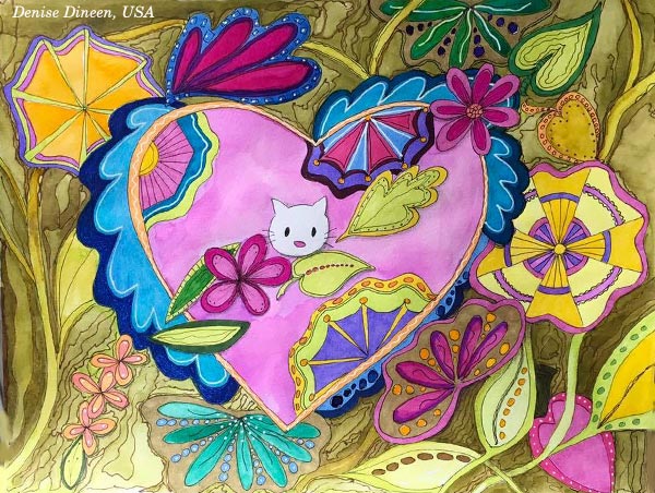
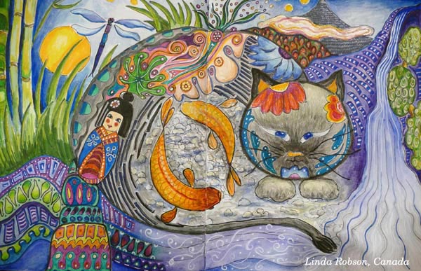
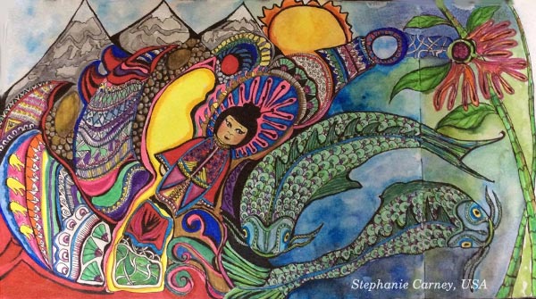
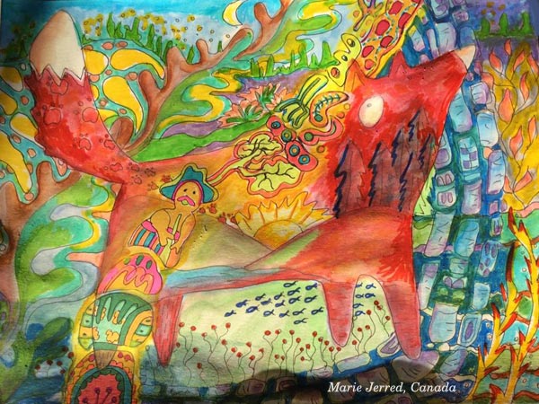
I offered Drawing Factory as a part of Imagine Monthly Fall 2016, the series of monthly mini-courses. See some of the gorgeous pieces that my students have made of the course! Another central theme in the course is Japan, the land of pretty details and high productivity and that has inspired Denise Dineen, Linda Robson, Christie Juhasz, Stepanie Carney, Marie Jerred, and Kathy Gallant, too.


Overcome Your Fears for Line Drawing – Buy Drawing Factory!
Drawing Factory is now available as a single self-study class. >> Click here to buy!
You can also buy the whole bundle of five art journaling classes, published last year as Imagine Monthly Fall 2016.

Thank you for supporting my journey now and during the last three years!
Year 2016 in Review – In Terms of Art Supplies
I am not usually so keen on “year in reviews,” but I thought it would be interesting to look back regarding art supplies used in 2016. When people ask me what supplies do I use, my quick response is: “Acrylic paints, watercolors, and colored pencils.” If I get detailed questions, I often refer to these blog posts: What Art Supplies Do I need? and What Acrylic Colors to Buy?
But it hit me that I have used a more diverse selection of supplies in 2016. And then, there are all kinds of necessary stuff that we don’t often mention but still use all the time. So, I dedicate this blog post to supplies. It’s not so much about the single pieces created in 2016. If you want to have a look at those, go to 2016 Gallery!
Must-Haves for Collage Art
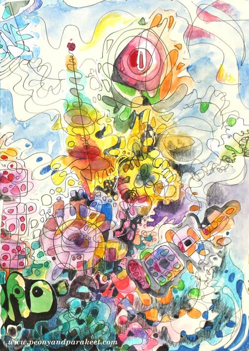
The image that is at the beginning of this post is a collage made for January’s lesson at Inspirational Drawing 2.0 while teaching how to create unique collage pieces and enjoy freehand drawing. I have been blown away by the beautiful art created by my students, and I am more certain than ever that introducing the ideas for drawing piece by piece makes freehand drawing and the use of imagination easier than trying to build a bigger illustration in one piece. (You can still sign up for the class and get the first lesson immediately after the purchase!)
I like to create collage art to my biggest art journals. I have two of large Dylusions Creative Journals. The first one is almost full, so I hope I can fill it in 2017 and make a flip-through video of it. I purchased the second one last year because I love the quality of the paper. It’s perfectly smooth for colored pencils and sturdy enough for collage art.
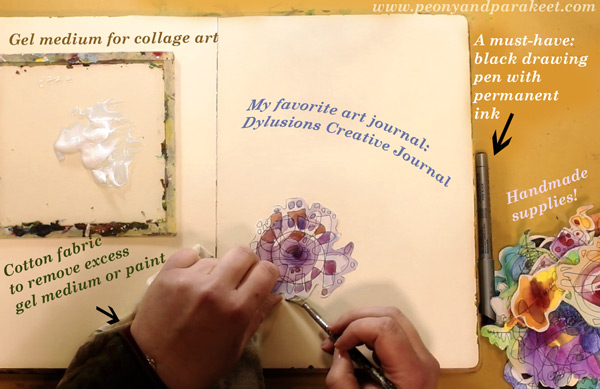
Like in the previous years, I have used “Golden Soft Gel Gloss” gel medium for attaching the collage pieces and Tim Holtz’s non-stick scissors for cutting the pieces.
A new discovery is to use a piece of cotton cloth to remove excess gel medium. First, I started using old t-shirts for finger painting. But when learning old masters painting techniques at a class, we used old linens for cleaning the brushes and realized that they work well for wiping off too. Since then, I have been a collector of old cotton fabric pieces. A fellow artist told me that she has several plastic bags filled with waste cotton fabric for art making!
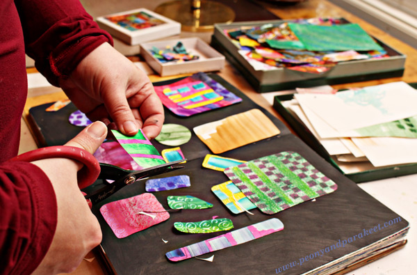
Speaking of collecting, I am still a collector of the best handmade supplies: hand drawn and hand painted paper pieces! If you have never tried creating collage pieces, see Step by Step page for basic instructions! I also have a mini-course called Doodled Luxury, that shows how to combine doodling with collage techniques.
Colored Pencils – Not for Art-Making Only!
Because I create a lot with colored pencils, I often get questions about which colored pencils to buy. Many contemplate between regular and water-soluble pencils. I love regular colored pencils because they are easy to carry and easy to use when you only have a minute or two. I use regular colored pencils also outside my art-making. I love to use them to make written notes more visual and add visual ideas to my notebooks and planners.
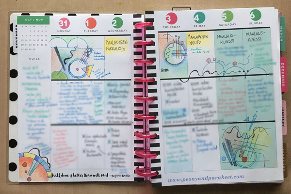
It’s why I always have colored pencils in my reach, and I think it’s also why I find it so easy to create with them. If I have to create something quickly that isn’t very big in size, it feels natural to choose them. I use Prismacolor Soft Core pencils when I create art pieces and a selection of old pencils for more mundane purposes. My e-book Coloring Freely focuses on regular colored pencils and shows easy techniques for creative coloring.
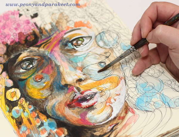
I also have a mixed selection of watercolor pencils, and I enjoy using them too, especially in the beginning of coloring. Using water makes it quicker to fill a paper with a soft mix of colors. It is the technique I use a lot at Inspirational Drawing 2.0: starting the coloring with watercolor pencils, inks or watercolors and then moving on to dry supplies like colored pencils and felt-tipped pens.
Using Watercolor Paper – and Not!
This is a supply that makes my heart sing – I only have to touch it: a good quality watercolor paper! My absolute favorite: St Cuthberts Mill’s Saunders Waterford HP watercolor paper. It’s smooth and thick (300 gm2/140 lbs), and it’s perfect for both watercolors and colored pencils. I especially enjoy creating intuitive still lifes on the thick paper. I often cut the paper to a square to enable easy changes in orientation. See this blog post to watch me creating the intuitive mixed media painting below on a watercolor paper!
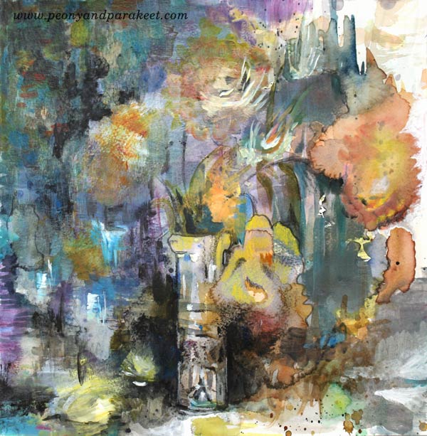
Even if I love smooth watercolor paper, I don’t want to limit the use of watercolors. I use watercolors constantly and often with paper that is not designed for it. I like to carelessly splash watercolors on any paper because there are a lot more opportunities to use watercolors than to use watercolor paper. For example, watercolor paper is not good for collage pieces because it’s too thick. I like to use sketching paper instead.
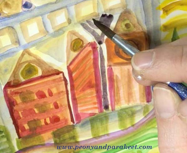
The best exploration with watercolors so far happened in 2016. I studied Friedensreich Hundertwasser’s way of using watercolors and created a mini-course about imaginative painting style. This painting style uses only a little water, and it’s easy to apply on almost any paper. See the mini-course Painter’s Ecstasy!
The Year of Canvas
If I had to name one supply that marks 2016, it would be canvas. I have created more canvas pieces than ever before. I have painted five small acrylic paintings and two medium-sized paintings. “Human Nature” was not a wall-sized, but so far the biggest that I have painted. See this blog post: 5 Lessons Learned When Painting on Big Canvas
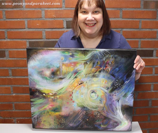
I always take the canvas more seriously than if I create a painting on a watercolor paper or an art journal. A blank paper syndrome is nothing compared to a blank canvas syndrome! But I enjoy larger projects between smaller ones, and I have two blank canvases waiting for 2017 creations.
Experiments with New Supplies
Oil paints
I would have never guessed that I would be 47 years old before trying out oil paints for the first time, but that was how it went. I started painting as a young teenager and my parents purchased acrylic paints to me. They explained that using oil paints would require all kinds of liquids that would not be safe and acrylic paints were better in that way. They were so right! Not to mention all the smells! I live in a house built in the 1960s, and the smell stays there for some time. It would be impossible to me to use oil paints daily just because of that.
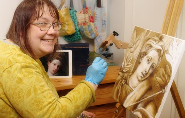
But I have signed up for an art class and will start my second oil painting next week using the old masters’ techniques. (See this blog post to read what any artist can learn from old masters!) I love the pigment and gloss of good quality oil paints. We are using Schminke’s Mussini oil paints, and they are the best quality paints that I have ever experimented with.
Soft Pastels
During 2016, I saw quite a lot of art that was created with soft pastels. I almost bought Unison soft pastels to treat myself but then realized that I already had a small set of Rembrandt soft pastels. I had purchased them many years ago for industrial design studies, but we had been using them very differently than how people use them usually. We scraped them to get powder and used the powder to create soft shadows.
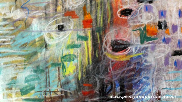
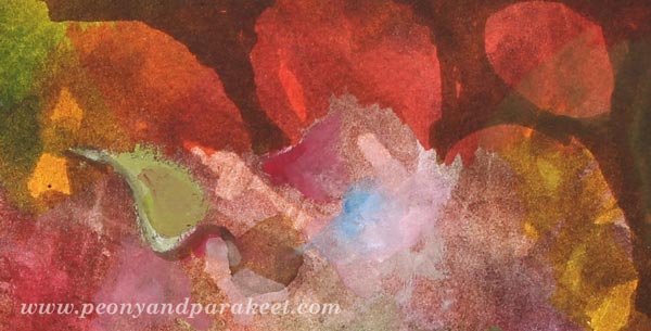
I created an art journal page (see the full image in the middle of this blog post) to try them out. Now I just grabbed the sticks and drew with them, but it felt like there was powder everywhere. And then, in the end, I had to use fixative, of course. It felt tedious even if it was not. I had no desire for new pastels anymore, but afterward, I have wondered if I gave up too easily. Maybe I should try the soft pastels again sometimes in 2017.
Liquid Watercolors and Watercolor Markers
In the late fall, I got a couple of surprise packages from one of my students! I got to use liquid watercolors and watercolor markers for the first time, and I liked both of them.
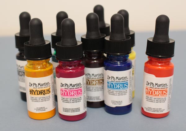
I like the intensity of color in liquid watercolors. Mine are Dr. Ph. Martins’s Hydrus watercolors.
Watercolor markers seem to be very versatile because you can use them with or without water. I also received a set of gouache paints, and they encouraged me to dig out my old gouache tubes as well. To see what I created with the new supplies, watch this video blog post!
Going Digital?
Based on 2016, my answer is both yes and no. Yes, I have created digital art, see this blog post especially! I have used Adobe Photoshop CS5 for so many years that it feels very intuitive and I don’t have to think about the commands and such, I can just focus on the fun stuff.

But when I create digital art, I like to use my hand-drawn and hand-painted pieces as building blocks. I know that many buy stock photos, but it feels much more exciting to me to use my art as a starting point. Sometimes when I don’t work I buy a digital kit and have fun with it, but that’s just playing in my spare time (Sometimes I do wonder, how much do I have to create, to stop creating …)
I have a student at Inspirational Drawing 2.0 who is adapting the exercises to work with her iPad mostly. I look forward to seeing more of this happening because I see a potential of more people going into creating art. However, I don’t want to spend all of my time with devices, so I enjoy creating pieces by hand and as long as I can do it, I think I will, also in 2017!
What about you? What supplies were new to you in 2016, and what supplies are you going to continue using in 2017?
Pointillism – A Quick Way, Step by Step!
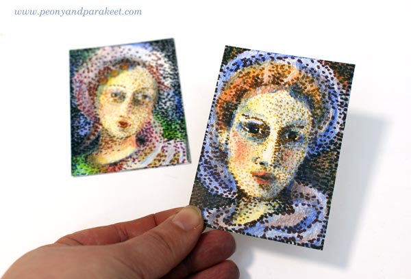
I am honored to be one of the guest artists in Documented Life Project this month. I was given a theme (pointillism) and a project type (artist trading card, ATC). As long as I followed those, I could do anything with any supplies. These kind of challenges are fun because you get such enough restrictions to get started but can still create freely. However, I have one fixation with artistic trading cards. I like them to be portraits, either humans or animals.(See ATCs in this post, for example!) So I chose a very traditional subject, women from the past.
Pointillism Can Be Tedious!
Like most of us, I have always admired Georges Seurat‘s paintings. In the 1980s, a Finnish illustrator made images that were composed of small points. It might have been an artist called Osmo Omenamäki. As a teenager, inspired by him and Seurat, I decided to be a pointillist artist too. I picked my felt-tipped pens and started to draw dots. Oh my! I was barely able to finish a postcard size drawing. I couldn’t believe how many small dots are needed to fill even a small blank area! I was almost traumatized by that experience!
So now, over 30 years later, I didn’t even think about creating the project with felt-tipped pens only. ATCs are small, but not that small! However, with felt-tipped pens, it is easy to make intentional tiny dots in a variety of colors. But I also needed something else to make the coloring faster. Colored pencils leave the spots visible, and they are easy to control. So I chose them to fill the blanks between the dots.
Practicing – Spots with Many Colors
Before the actual project, I practiced my ideas. I made the dots using a variety of colors and then added more colors with colored pencils.

Because the colors in dots weren’t as important as coloring with colored pencils, I got an idea of using brown shades only. It would be like an underpainting, a technique that old masters often used in portraits. They painted shadows with umber and then applied the rest of the colors so that the shadows showed through. So I will show you how you can do a similar kind of “under-dotting” and then apply the actual colors with colored pencils!
1) Under-Dotting with Felt-Tipped Pens
You will need four shades of felt-tipped pens for this step. I use Faber-Castell PITT Artist Pens in colors “Light Flesh”, “Green Gold”, “Raw Umber” and “Caput Mortuum”. I didn’t use any model like a photo but just created intuitively, making the features more accurate color by color.
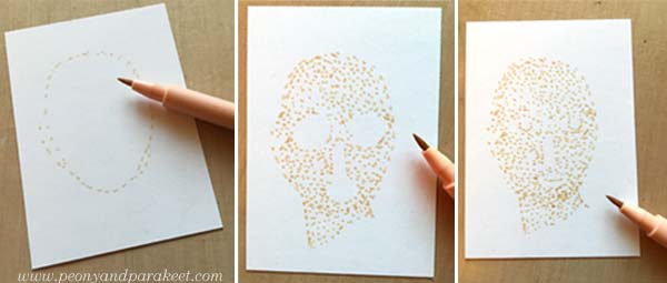
With the palest of color, sketch an oval using small dots. The liberating thing here is that when you start with a pale color and make little dots, you can make many “mistakes” and correct them as you go. One spot in a wrong place can be easily changed! Fill the oval with dots so that you leave blank space where you plan mouth, eyes, and nose to be. When they seem to be in place, add some dots for details. Don’t worry if your woman looks pretty ugly. This is just the first layer!
Change to darker shades and add shadows to the face. Then sketch the hair and clothes using little dots only.
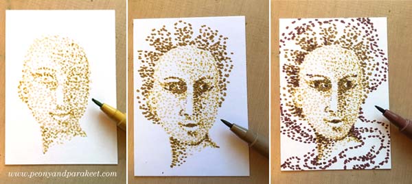
Every shade adds a little bit more to the image.
2) Basic Coloring with Black and Colored Pencils
Now add black spots to the darkest of details. Old portraits often had a dark background, so I added black spots there too.
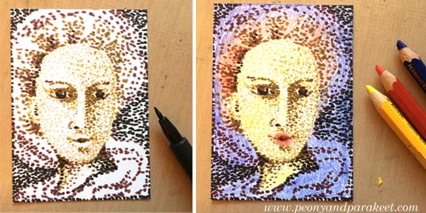
Using colored pencils, color the card so that white shows only where you want to have it in the end. I used Caran d’Ache Pablo pencils in blue, red and yellow. Remember that you can mix colors by layering. You can get many beautiful tones from the primary colors.
3) More Liveliness with Colored Pencils
Finally, add shadows so that the details look 3-dimensional. If you only have primary colors like I had, you can get a dark background by adding blue, red and yellow layers there. If your portrait looks too dark, use an eraser to lighten and soften the colors.
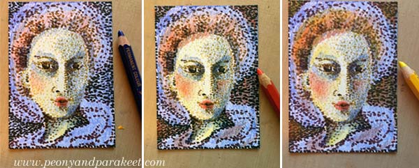
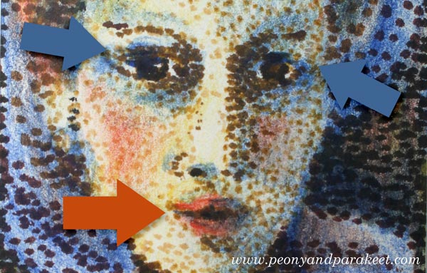
In the end, check the facial features of your woman. Add small lines where you want to turn the attention. Don’t draw the lines near the nose but on the lips and the eyes.
Celebrating Blurriness
Here are my finished cards again. I think they look delightfully blurry!
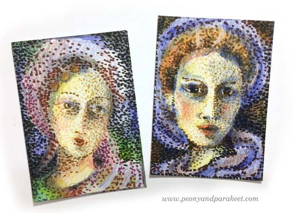
The more I want to reduce stiffness in my art, the more I feel the need to embrace blurriness. With blurriness, I also feel more self-acceptance, more ease with errors, more open to possibilities.
Reducing stiffness is one of the main themes in my newest class too. The class is called Inspirational Drawing 2.0 and it’s about drawing from imagination and inspiration. Watch the introductory video below!
Inspirational Drawing 2.0: Liberate your line and sign up now!
Moleskine Sketchbook – Another Full Art Journal!

I just finished my red Moleskine Sketchbook. It always feels like an accomplishment when an art journal gets full. So I’m happy to show a couple of photos and a flip-through video of all the pages!
Moleskine Sketchbook as an Art Journal
Moleskine Sketchbooks are one of my favorite books for art journaling. The paper is sturdy, and it can be used with a variety of supplies. I use mostly watercolors, acrylic paints, colored pencils and PITT artist pens. But I also use inks, gel pens, hand-decorated papers for collages, etc. The small size is handy for quick pages and easy to put in a bag. However, sometimes the size is a little bit too small, especially for acrylic paintings. So I also use other journals, especially large Dylusions Creative Journals. The paper is very smooth, so it’s not ideal for watercolors. But I don’t mind that too much, I use a little less water to make watercolors work with the paper. Some prefer coarser paper for colored pencils but I love how effortless it is to color the pages in Moleskine Sketchbook.
The Purpose of an Art Journal
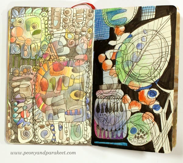
For me, art journals are little more than just sketchbooks. I like to call them “idea books” as I often process my ideas further when I am working on the page. I don’t always make one page on the same go, but work with it several times, adding more ideas as the page progresses. However, I have quite low expectations on how my pages will look. They are not pieces of art but more like collections of ideas to me.
As you can see from the flip-through video, my ideas are often connected to art history and different styles. The first photo of this blog post shows a spread inspired by Rococo. The second photo shows a spread that I made after browsing designs from the 1960s. Even if I sometimes write short stories or make notes about my current thoughts, I mostly write about beautiful things that I have seen and visualize the ideas I have gotten from it.
My art journals are not chronological diaries but random visual notes that I process to full images. I can make a quick sketch of a rose one day and then continue the page with painting on the other day. When I am working with a new art class, I use art journals to record my visual ideas and practice the techniques. I also see creating art journal pages a route to bigger paintings. When I paint on canvas, I use the ideas that I have come up with when making the pages. Every artist should also be an art journaler!
Flip-Through Video
Create Step by Step!
I have gathered all the most popular free step-by-step instructions and all my flip-through videos on a separate page. Go to Create Step by Step!