
Creative Start – A Watercolor Edition
This week, we celebrate watercolors. I have a new painting and great news: You can now purchase the watercolor module of the class Floral Fantasies separately. >> Buy here!
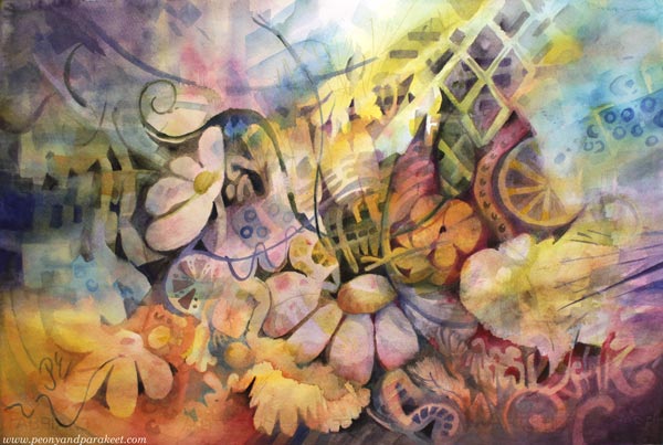
This painting is about living at maximum, embracing the visual richness of our surroundings, and having the courage to show up and reach high.
My Rusty and Shy Watercolor Set
Why did I choose watercolors for this kind of grand subject? Those timid little pans! “Hey, Paivi,” they whispered to me. “We doubt if we can dance anymore.”
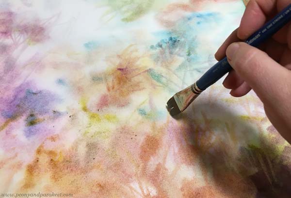
We humans are like watercolors. It takes some time to handle a new element. When a part of us gets washed away, we first become bland and unclear.
Layer by Layer Towards The Maximum
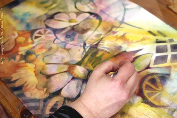
But the mildness changes when layers begin to build up. The colors get brighter and the depth becomes more evident. Like a painting, a life that had no energy begins to breathe and sing.
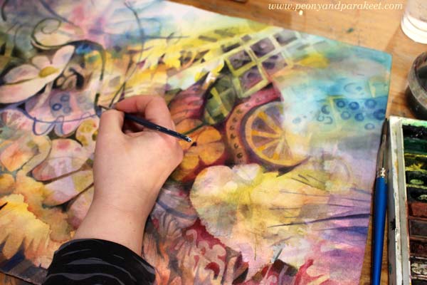
What first felt uncontrollable, can lead to openness.
The failures of the beginning become background music, and the true identity is revealed layer by layer.
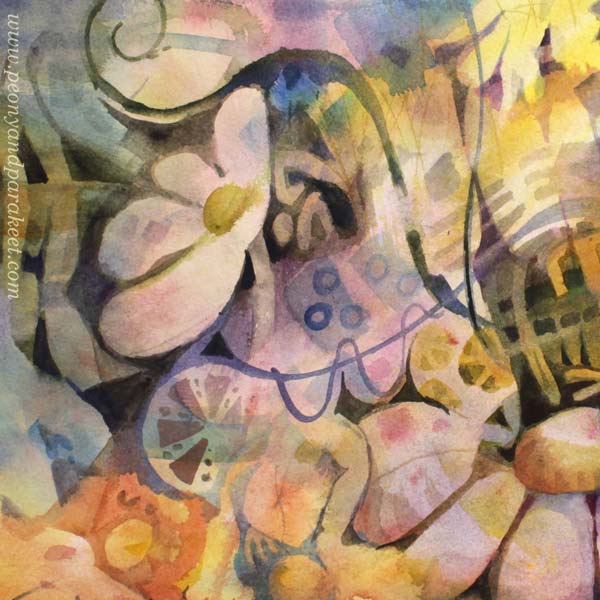
When the outer world is at a minimum, we have a chance to turn the inner world to a maximum. So why paint like a minimalist when the soul’s natural essence is a maximalist! Isn’t this the best time to let the inner artist out?!

Floral Fantasies – Watercolor Edition
By popular request, the watercolor module of Floral Fantasies is available separately from the rest of the class. The watercolor edition has four projects. There’s one small beginner project, two are slightly bigger but fun projects, and the last one is an in-depth project. You’ll start simple, but paint more richness and layers project by project. >> Buy now!
Floral Fantasies – both the watercolor edition and the full edition are on sale this weekend! The sale ends on March 7, 2021, at midnight PST. >> Buy now!
Artistic Growth – From “Huh” to “Wow”
This week, we’ll talk about changing artistic direction and how the first reaction doesn’t always matter as much as the second one.
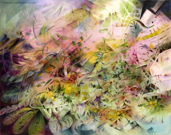
My seed idea for this painting was slightly different from usual, and I wanted to see how it would grow on canvas. It took many sessions and lots of struggles with finishing. “There’s still something wrong with this painting, Paivi,” I said to myself after correcting a couple of shapes that my husband pointed out. Last night, I had a dream that I walked an ugly dog on a thin leash. The breed was an odd choice, but the dog was still mine.
“Huh” and “Wow” – First and Second Reactions
Isn’t it so that we want to change, but as soon as we begin to see the results, we are likely to bounce back? It’s so easy to say: “No, this is not for me, I’ll try something else. I’ll try a different style, a new technique, another art class, or find other artists to follow and admire.” And this is not only a bad thing. In the long run, bouncing back is about integrating the new stuff into our natural self. But in the short run, it can prevent the growth we want and need.
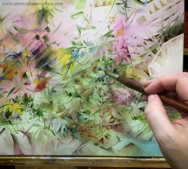
I have been reading James Victore‘s Feck Perfuction as an audiobook. It’s a book about creativity and easy listening about things that are really tough in practice. It’s more like a two-hour inspirational speech than a down-to-earth guide, but it feels current with this painting. In the book, James Victore refers to an American pop artist Edward Ruscha. He has said: “Good art should elicit a response of ‘Huh? Wow!’ as opposed to ‘Wow! Huh?'”
This week, my favorite video podcast, One Fantastic Week, talked about “Instagram art” – pictures that the Instagram algorithm likes. It’s colorful, easy to consume and comprehend, but its exposure doesn’t ensure the artistic quality.
Artistic Growth and New Truths
When a painting is not for a class or a specific exhibition, I try not to think about the audience too much. I trust that you will pick what you like, and forgive me those you don’t.
But with this painting, I realized that I have played in the “Wow! Huh?” category, and this one tries to be more “Huh? Wow!” And that change makes me uncomfortable. It’s like I have been written a revealing story but in a code language, being afraid that anyone who stops to look will see to the core of me. And at the same time, worrying about that anyone who doesn’t, only sees a mess.
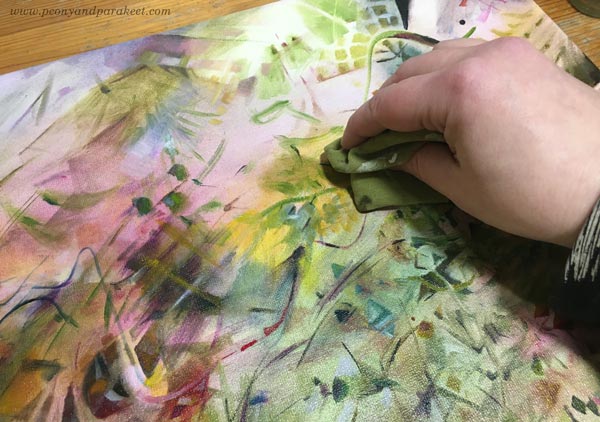
An Outside View to the Inside World
Teaching art has helped me to grow as an artist a lot. For example, when I get to see a student sharing a wonderful painting saying: “I don’t know about this one,” my gut reaction is then: “What!? This is beautiful!” But what’s “huh” for them is “wow” for me because I see the painting in a context that’s still new to them. They haven’t got used to seeing themselves like that. They are in the middle of a change, and it’s tempting to get back to the same old thing.
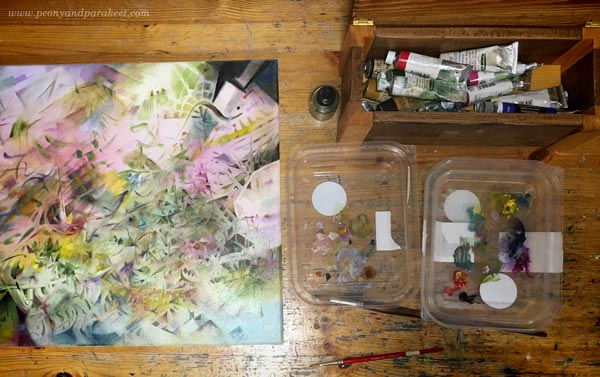
I recycle plastic lids and use them as palettes.
But when we do something regularly, it’s natural to miss the change. Floating on the surface isn’t enough anymore, and we get curious what’s deeper – “behind the glass” as we say in Floral Freedom, referring to Wassily Kandinsky‘s teachings. Then we need to learn, stretch, and redefine. Accept new truths.
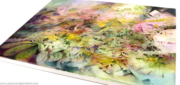
When looking at the mirror, I see more wrinkles than before. What was “huh” some years ago would be “wow” now. But with this wisdom, I hope long life for this painting. That the “huh” that it causes now will be “wow” someday. Maybe after I have fully accepted that my artistic growth is towards more and more abstract art.
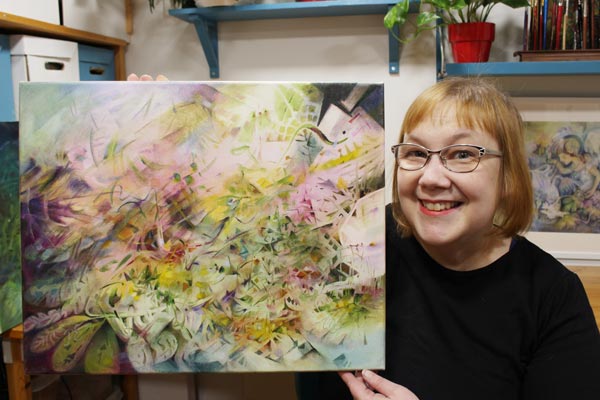
It’s also good to accept that some paintings are just “huh-huh” and a few manage to be “wow-wow,” and what’s “huh” for some is “wow” for another. What do you think?
About Playfulness and Spirituality in Art
This week, I talk about spirituality in art and claim that you also need humor and playfulness to become a spiritual artist.
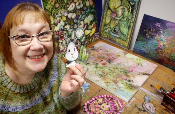
I like to gather my work – big and small – together and mix and match them like they would be pieces in a puzzle. It also helps me to see if my classes support each other and ponder if I have approached imagination and art-making from all angles.
Paul Klee and The Power of a Child
My newest class Floral Freedom is the most schoollike of all. It is based on Paul Klee’s and Wassily Kandinsky’s teachings of abstract art. In the class, I have tried to focus on two books – Paul Klee’s Pedagogical Sketchbook and Wassily Kandinsky’s book Point and Line to Plane. But the books’ teachings have inspired me to search for background stories – find what enabled these artists to invent the abstract methods and theories.
One of the things that needed an explanation was that Paul Klee’s book is full of diagrams like it would be written by an engineer, and yet, his artworks are often playful, some even childish. Look at this painting, for example!
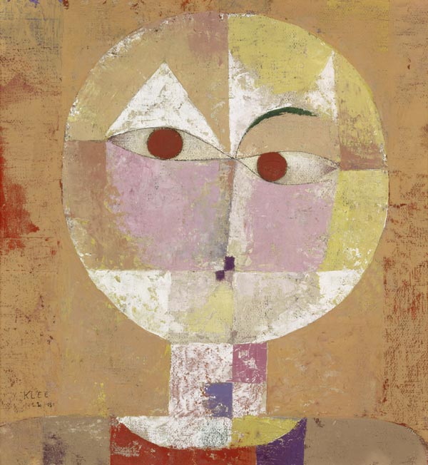
During the first world war, Paul wasn’t a soldier for a long time but transferred to a safer job where he was in the middle of aircraft engineers. But earlier, when he started a family, Paul wasn’t very successful in art at all. His wife worked to support them, and Paul practically took care of their only child, Felix. It wasn’t usual to be a stay-at-home dad in the early 20th century!
When Paul was taking care of Felix and struggled with art-making, he found humor and playfulness that later became a part of his signature style. But it’s not only that! When Paul became close friends with the masterful Wassily Kandinsky, he also made Wassily less serious and more playful. So here’s to all stay-at-home dads and mums!
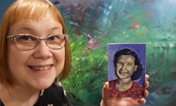
There’s a recent finished painting in the background.
From Product Play to Spirituality
I believe that art happens when one extreme meets another. When my organized mind watches the snowstorm. When I want my art to be about happiness and life and realize that taking it deeper requires confronting fear and death.
In my experience, when you want your art to be more serious and spiritual, humor and playfulness must have some role too. And vice versa, the longer your walk in the path of play, the more serious and spiritual it gets.
When I started my blog over ten years ago, my art-making was very product-based. I bought new supplies almost weekly and experimented with all kinds of techniques and effects.
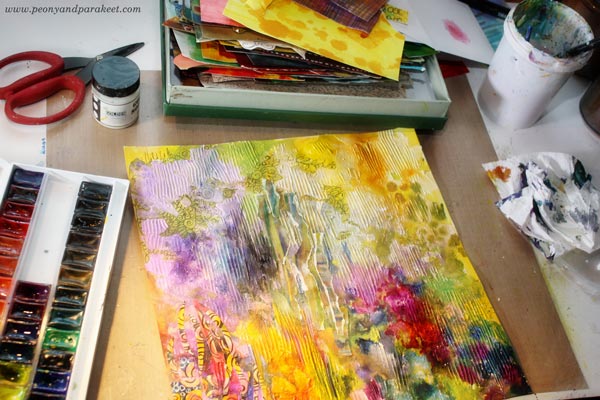
But the more I created, the more I wanted to move from materials to ideas and imagination. Instead of discovering ten new ways to produce circles on paper, I wanted to learn how to make the circles interact and transform into other shapes. This way, my art has gradually become not only more playful but more spiritual as well.
Paul Klee said:
“Art does not reproduce what we see; rather, it makes us see.”
Rethinking Spirituality in Art
Nowadays, I connect playfulness with spirituality. It has also made me rethink how I approach spirituality in general. Here’s what I wrote this week on Peony and Parakeet’s Facebook page and on my Instagram feed:
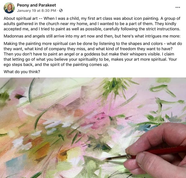
It would be interesting to hear what do you think. Does spirituality have a role in your art?
Impressionistic Floral Painting on Structure Paste
This week, I show how I made an extraordinary floral painting with acrylics and structure paste. See how I achieved the historical look!
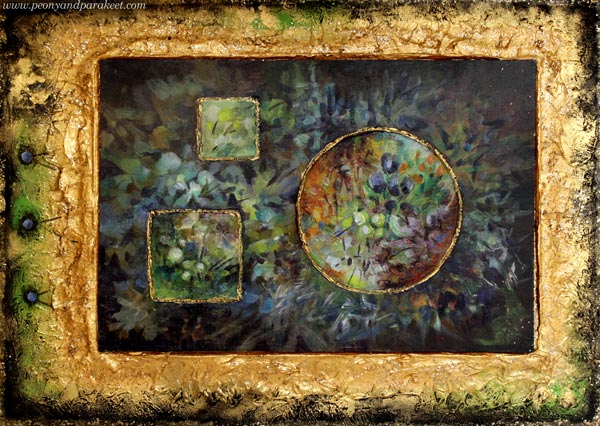
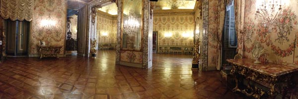
I call this piece “Old Art Yearning” because I desperately miss Europe’s palazzos and museums. It would definitely be the time to pack the bags for a few-day trip to Vienna or some other old city, but I chose differently because of the pandemic. But first, look at the interior of Palazzo Doria Pamphilj in Rome. My husband and I visited the place on June morning in 2017, and it was pleasantly quiet, just suitable for dreaming about living there in the middle of luxury.
So, what luxurious can you do when you are asked to stay home and be safe? I decided to create something that’s like a soft drink for the old art thirst: fake but sweet and consolating!
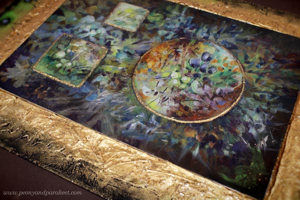
The idea of using structure paste is from the summer, but back then, I didn’t quite see as far as I did this week.
Structure Paste Inspiration from Clay
This summer, my friend Johanna Rytkölä, a ceramic artist ran a flower pot class for a small group. My husband made a stylish and minimalistic bonsai pot, but mine came out quite different!
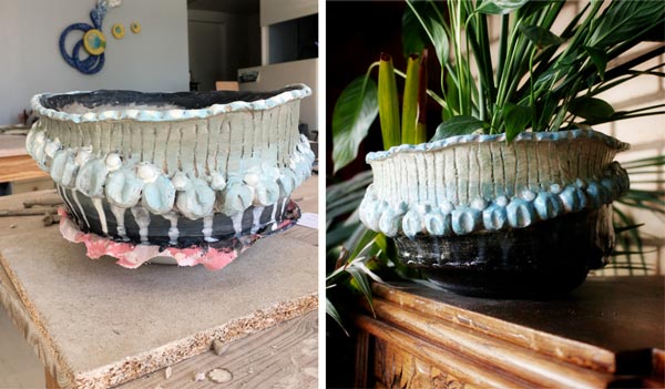
Even if my pot was not perfect, I wanted to experiment with a 3-dimensional surface for a painting right away. I dig out a jar of structure paste that some call molding paste as well. I have blogged about the paste twice before. In 2014, I made cardboard templates to create reliefs for a mixed media piece and in another project, I made surface textures with a variety of tools.
I decided to try the template technique again, and cut simple geometric holes to a thick cardboard.
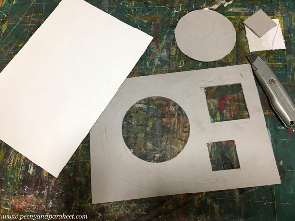
Then I placed the template on the top of the painting board and filled the holds with structure paste.
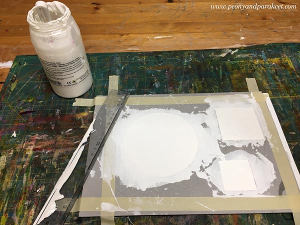
I wasn’t completely satisfied with the edges of the structure paste shapes and put the board away.
Acrylic Painting on Structure Paste
But now, when I wanted to create something with historical feel, I remembered the board, and started painting on it. The small imperfections didn’t bother me so much anymore. All pieces can’t be so serious anyway. There has to be some room for creative play too!
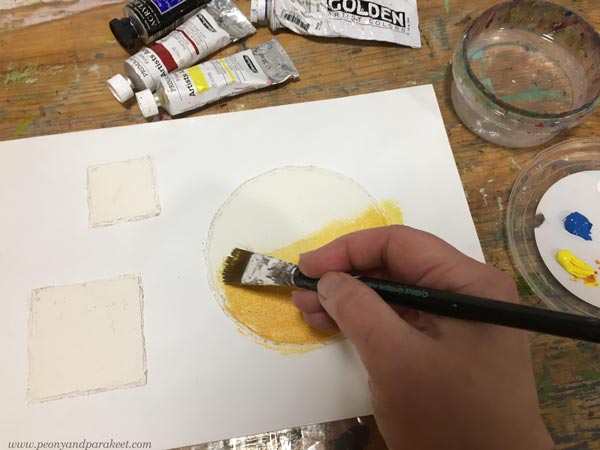
I decided to paint something loose and impressionistic that would still look decorative.
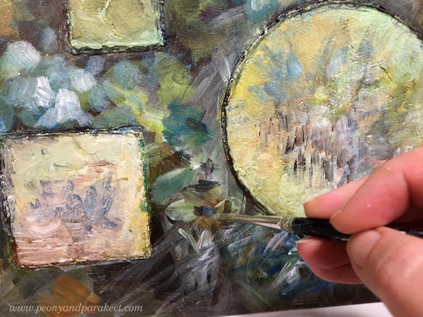
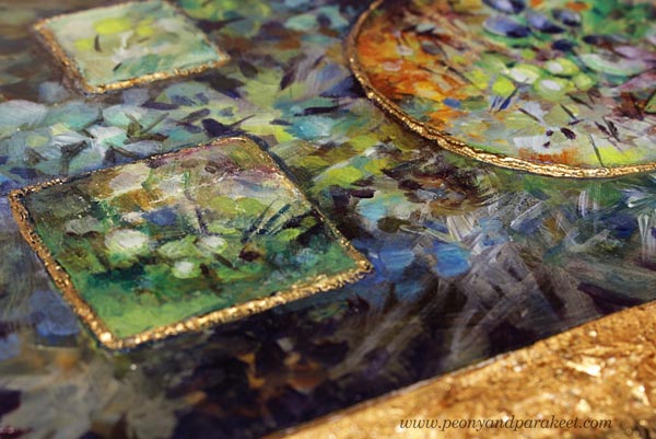
On the reliefs, the strokes were sharper and more controlled than on the background.
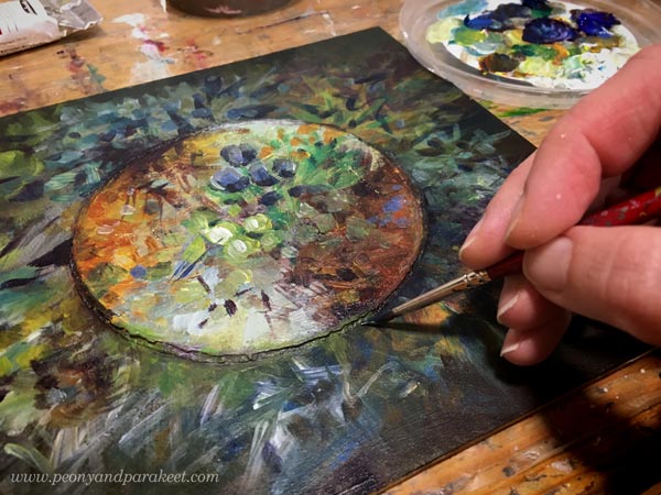
But before I made the finishing touches, the piece looked too bare to me.
It needed a frame!
Making a Frame from Structure Paste
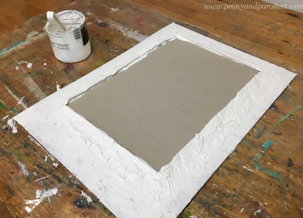
I still had some structure paste left and I found a piece of cardboard too. I traced the outline of the painting on a soft foam board and used that as a template for the center.
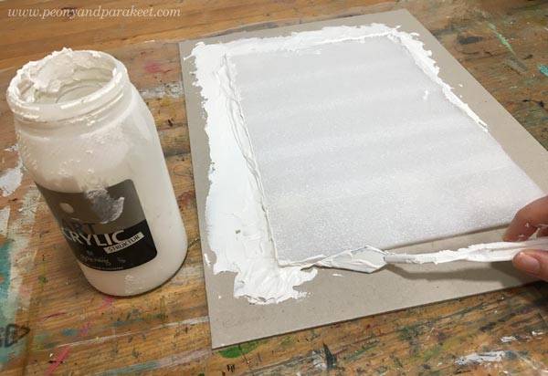
It’s not easy to make a smooth surface of the paste so I didn’t even try. Historical frames had all kinds of textures so the hills and valleys would look ok when painted.
I painted the outer edge of the frame black and the inner edge with gold paint.
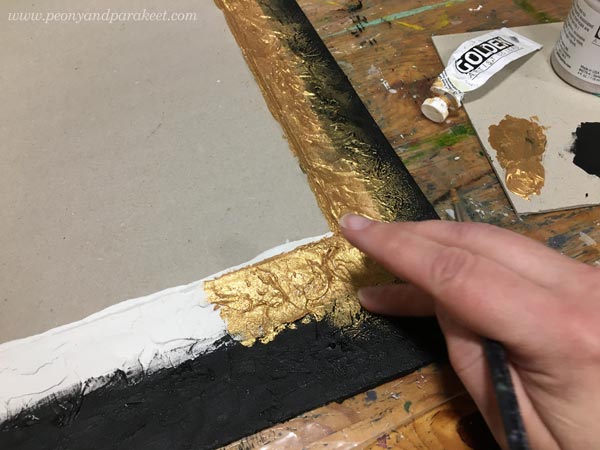
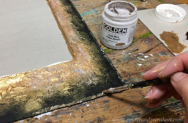
The transition from black to gold became lovely when smudging the paint with fingers. I also added some gold mica flakes on the top of the gold parts and near the edge.
Then the painting got some finishing touches and gold paint too.
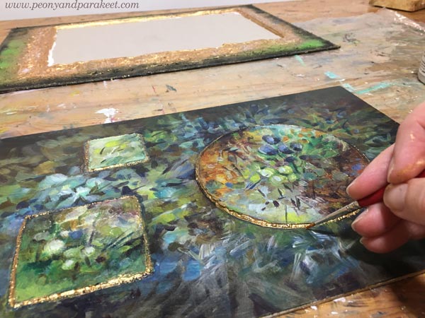
I also added some acrylic paint on the frame.
A Mini-Monet for Old Art Yearners!
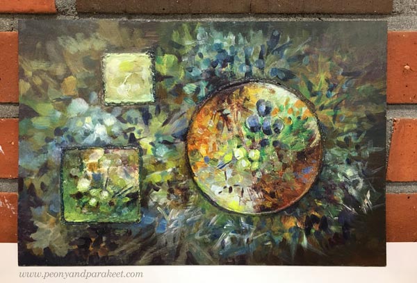
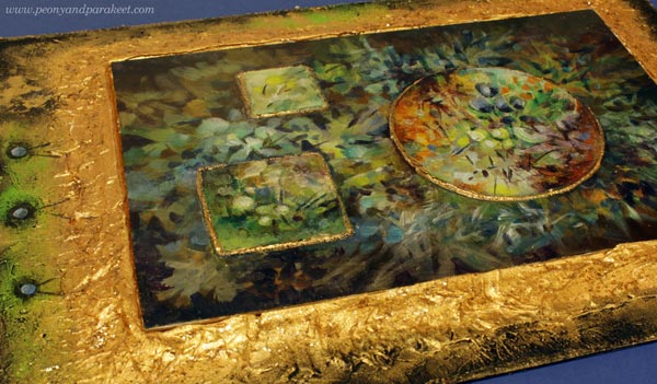
The finished piece is a bit clumsy, but I love the historical feel.
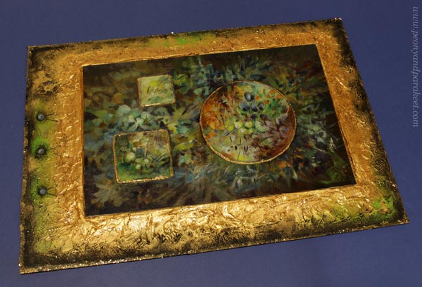
It’s my mini-Monet!
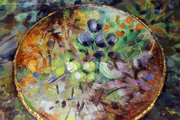
The unevenness of the structure paste in the edges looks quite good with the gold paint.
The frame was intentionally placed so that it’s not quite in the middle. This way I could make the piece more interesting. I really like how these painted spots look like nails or blueberries!
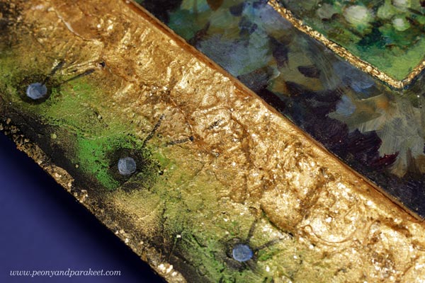
Just cardboard, structure paste, fake gold, acrylics, but I enter the gentle world of old art by looking at it!
I display this piece in our library room which has more old-fashioned style than my studio.
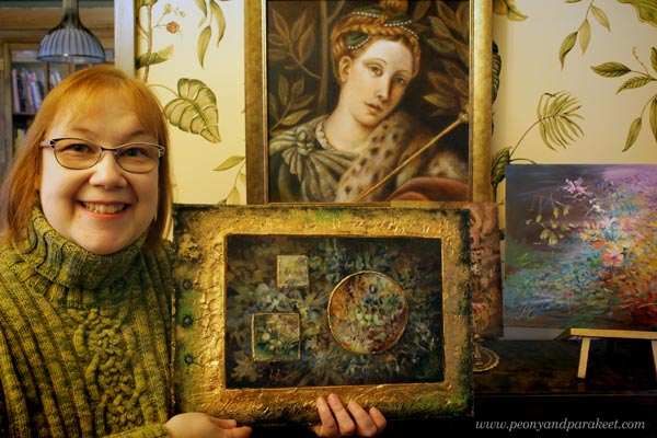
My painting has simple strokes but it’s still romantic. I have bent the principles of abstract art to serve the impressionistic style. It’s so much fun to paint freely like this!
Paint Dreamy Florals to Free Your Spirit!
Floral Freedom – the floral class based on Paul Klee’s and Wassily Kandinsky’s insights on abstract art – will begin on Dec 4, 2021. In this class flowers are not just passive decorations, but they fly, sing, and dream! >> Sign up Now!
Floral Freedom is 20% off for the rest of November, so now is a good time to sign up!
>> Sign up now!