
Intuitive Painting with a Reference Image
Intuitive painting with a reference image – can it be possible? Let me show you how!
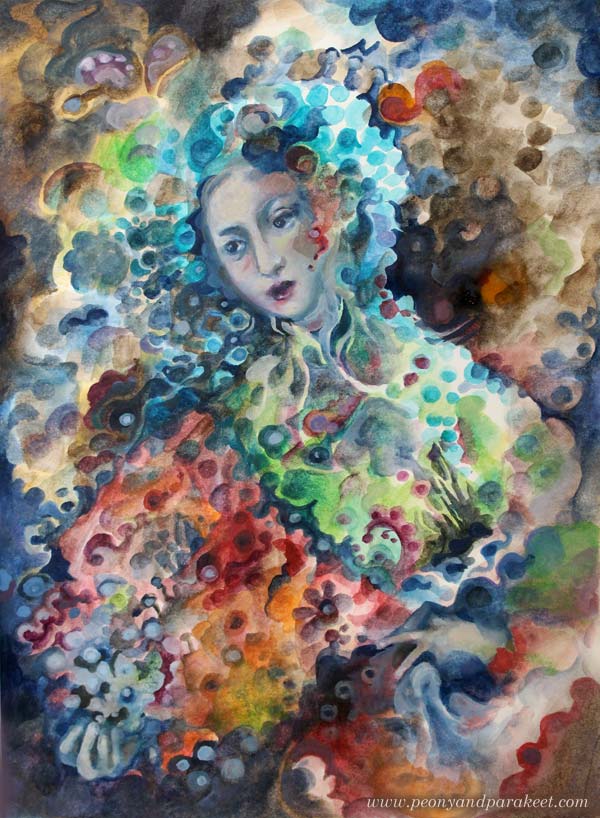
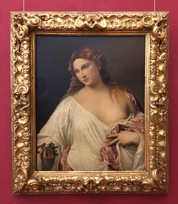
Here’s a painting from my sketchbook. It’s called “Madama Butterfly.” My reference image was this Renaissance painting called “Flora” by Tiziano Vecellio, 1515-1520. I took the photo last summer when visiting Uffizi Gallery, Florence, Italy.
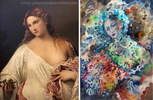
There are very little similarities in these two pieces. The pose is fairly similar, the composition and the facial features have some similarities, but that’s it. The style, the theme, and the technique are all different.
The Supplies And the Setting
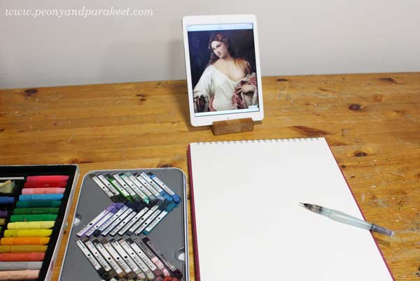
I like to do fairly quick paintings on my big A3-sized sketchbook. For this sketchbook, I often use Derwent Artbars, a water brush, and Faber-Castell Gelatos because they are easy to layer and I am more relaxed than when working with tube paints. I use acrylic or oil paints for canvas paintings, and working with them is more serious. This time I wanted to demonstrate a concept or a method rather than creating a 30-hour painting.
1) From Intentional to Intuitive Painting
The first idea was to pick the pose and the composition loosely from the reference image and then add geometric shapes to fill the space.
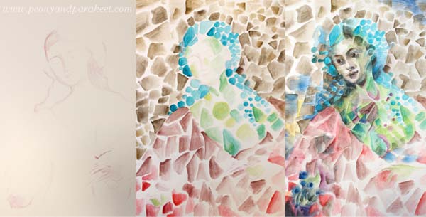
After sketching the foundation of the figure, the triangles, rectangles, and circles were fun to paint without looking at the reference at all. I painted the face roughly, and then I used the reference image as a guide. But because at this early stage, I didn’t know what I want to express and what kind of person the figure could be, I didn’t bother to spend time perfecting the facial features. At this point, my painting resembles cubistic pieces from the early 20th century.
2) Changing the Style
When creating art for the sketchbook, I like my style to be a bit more illustrational than when I make bigger paintings. Even if I love cubism, I wanted my piece to be a bit more current.
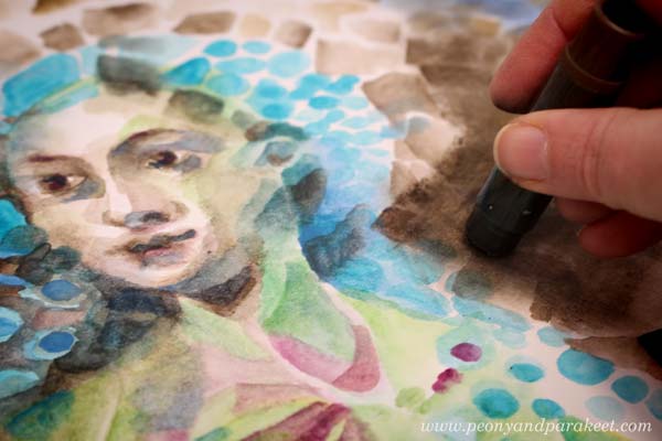
Nowadays, illustrations often use geometric shapes but rather than triangles or rectangles, the shapes are often round, and scallop edges seem to be a bit hit. So I started changing the painting by altering the shapes. This routine work gave me plenty of time to connect with my inner world and work intuitively from one association to another. I tend to be both nostalgic and romantic, so I thought how portrait painters often spend time with the clothing even if they are just a shell. Why not use it as a canvas for the memories, the ideas, and the achievements of the person?
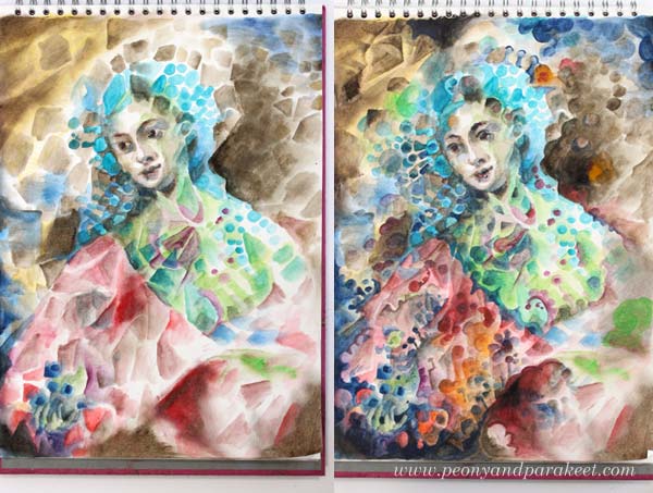
3) From Intuitive to Intentional
After rounding hundreds of triangles and rectangles, I realized that I was painting Madama Butterfly, the opera that I just saw last Saturday! I finished the face after this realization and adjusted other elements so that they fit with the theme.
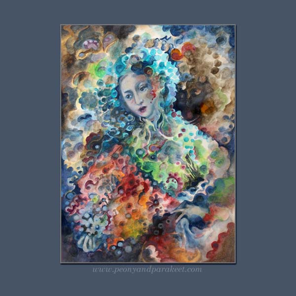
More Intuitive Inspiration from Opera
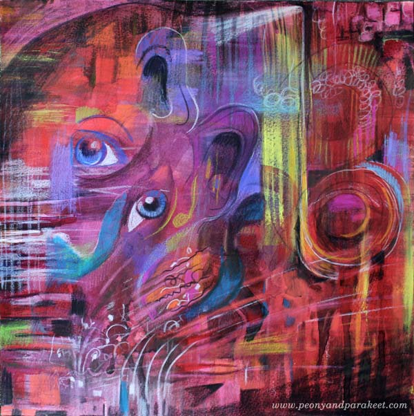
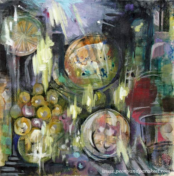
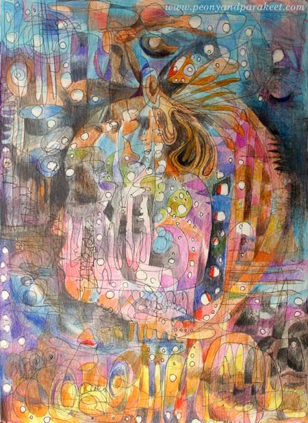
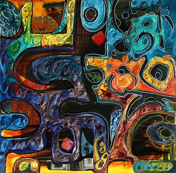
This is not the first time I have been intuitively inspired by opera!
>> Tosca
>> La Traviata
And there’s also a video about
>> Kaija Saariaho’s Emilie
More About Simple Shapes
>> What to create from simple shapes – 6 ideas
Self-study classes:
>> Planet Color – release your mind by focusing on color!
>> Modern Mid-Century – put a modern twist to simple shapes!
Let me be your mentor in creating: Subscribe to my weekly emails!
Altering a Flower Painting – Inspiration from Vatican Museums

About three weeks ago, I quickly painted a small flower painting while sharing my thoughts about painting softly (see this blog post, which also includes a video).
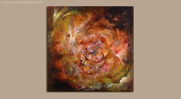
During the past weeks, I have been wondering what to do with the painting. I thought it could be a little more detailed and tell a bit more glorious story. So this morning, I decided to work more on it. Some artists are always afraid of “over-working” their paintings. But I belong to the group who thinks that the painting is almost never fully finished. There seem always to be more ideas I could add and more adjustments I should do.
1) Painting a Decorative Frame
This time I decided to use a selection of old decorative art as an inspiration source. I picked photos that I took from the visit to Vatican Museums in June. I often work like this: letting images spark ideas that I will add to my work. It’s not so much “copying” but picking concepts or generic ideas. My first inspiration came from these decorative panels.
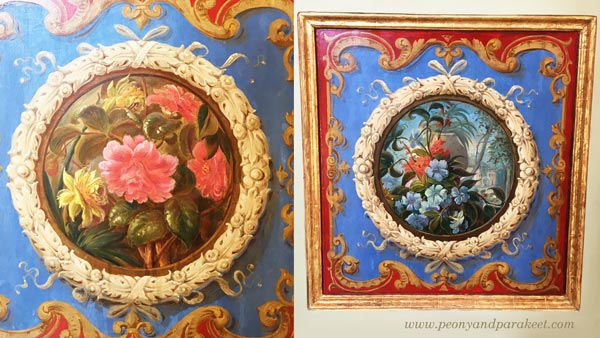
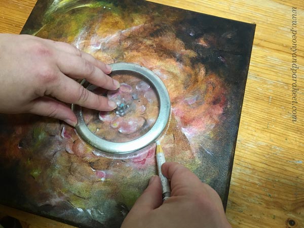
By using a Chinese marker, and a lid of a jar as a template I drew a circle on the center.
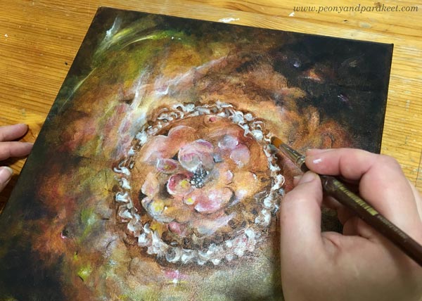
A huge porcelain piece and a beautiful ceiling inspired me to paint a frame with lots of swirls.
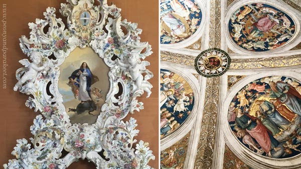
I just added some burnt umber around the drawn line and then painted the swirls in white. I added several translucent layers to make the shapes look more three-dimensional.
2) Playing with Colors and Shapes
The next ideas came from this picture. It’s one of the many beautiful ceilings, so full of images and details that it’s almost overwhelming.

The ceiling inspired me to add more color variation to the painting. I used mostly ultramarine blue, ochre, and cadmium yellow on the center, and quickly some elements with white on the bottom left corner. While waiting for each thin color layer to dry, I pondered what to do with the rest of the painting.

I almost heard a voice saying: “Stop right here, don’t ruin the painting!”
3) Letting Go – More is More!
While browsing the photos taken from Vatican Museums, I remembered the astonishment that came from the number of visitors there were. It was Friday afternoon, but the area was packed. Each huge corridor was filled by us, tourists walking and staring at the beautiful ceilings. The Sistine Chapel was even more crowded. Frescos, mosaics, statues, paintings and decorative textiles covered the surfaces. Everything was full in every possible way. And now in Finland, I was sitting in my half-empty studio with my half-empty painting.
So I said to myself: “Go for it!” And took some extra boost for my confidence by examining a photo of a wonderful wall textile. If men can be this decorative, why not just continue the painting!
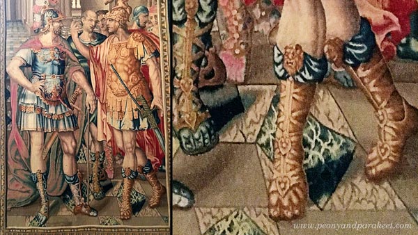
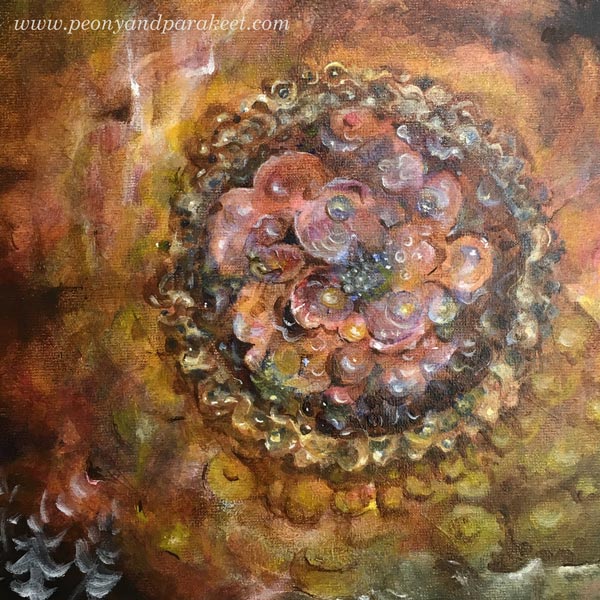
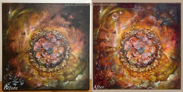
I worked more with the center of the painting, making it grow towards the edges.
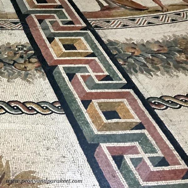
A detail of a mosaic floor gave me an idea to combine geometric shapes with curvier lines.
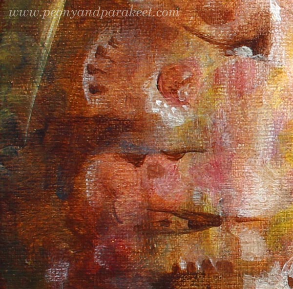
Here’s a close-up showing tiny additions on the left:
4) Bringing up the Expression – Highlighting the Visual Message
Before the final touches, I still had some stiffness in expression. To me, it’s often difficult to fully trust my intuition unless I know what I am expressing. I was almost finished when I realized that my painting is about being a queen of the fantasy, ruling every little detail, making ships change their direction on the sea, and wearing a crown that shines further than anyone could imagine.
Some Close-Up Photos of the Flower Painting
Ships sailing:

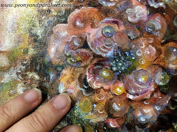
The center. This is a very small painting, only 12 by 12 inches total:
Floral Fantasies
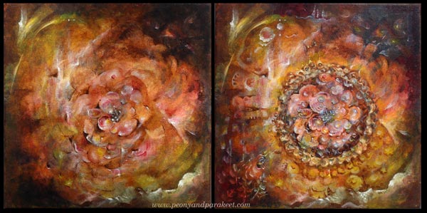
Lately, I have been more and more aware of the fact that I want to paint fantasies. To me, the first version of the painting was too bland. I dress modestly, I hate wearing too much jewelry, my home is not full of stuff, and still, I want my art to be full, to go beyond what’s expected and accepted.
I am currently preparing a new online workshop about painting flowers … If all goes well, it will take begin in October.
Let me be your art teacher: Subscribe to my weekly emails!
Rebuilding Art – Using Reference Images for Self-Expression
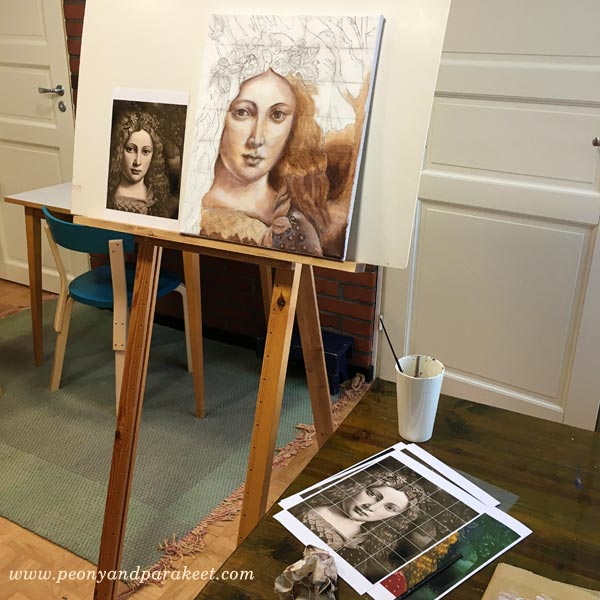
This blog post is about composing new art by using reference images. At the moment, I have a couple of paintings in progress that are based on reference images, and I also show other examples as well.
Why Don’t Artists Always Tell About Using Reference Images?
While painting my first oil painting at The National Museum of Finland, the visitors of the museum were able to visit the studio and watch us paint. Many people asked why we paint copies of the old paintings. The teacher Emmi Mustonen replied that it’s a good way to learn the old painting techniques and develop the understanding of formal elements. But I got the feeling that some of the people didn’t get it. Their facial expressions were imprinted on my mind, and it made me ponder why using reference images raises conflicting feelings.
Even if most artists who create realistic art or include realistic elements in their art, use reference images, many are not very open about it. I think that one reason is that many artists believe that people know that already and another reason that the process is not interesting. My experience is that there are surprisingly many people who assume that artists don’t take photos or use other than live models. And to me, the process of composing a new image from old ones is fascinating. I always stop to see an article where an artist shows how the reference images were used. I am especially interested if it’s about choosing the photos and combining several reference images into one piece.
Strawberry Madonna – Combining Several Reference Images to Tell a Story
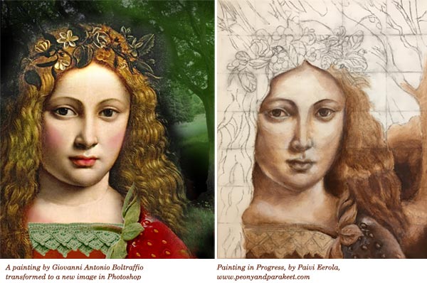
I am currently painting an acrylic painting on canvas that I call “Strawberry Madonna.” It’s my first using old masters’ painting techniques with acrylics instead of oil paints. The idea for the painting started differently than usually. I invented the title first and then started to think how Strawberry Madonna would look. I wanted to find a young woman who would have lips like she had just eaten a strawberry. By googling Renaissance paintings, I found Giovanni Antonio Boltraffio‘s painting. After that, I moved to building a story around the original idea.
Strawberry Madonnas are young girls who enjoy life without worries, have long summer holidays, eat strawberries, learn to crochet and read books like Emily of the New Moon or Anne of Green Gables. I have been one of them, and I feel quite nostalgic about it. I wanted the painting to include surrealistic elements. It has a big strawberry that is placed so that it could be a sleeve of the madonna’s dress. I am also going to change the flowers in the hair wreath to strawberry flowers and play with green and red paint. It will happen when I move on from underpainting to adding colors. In the background, there’s a photo that I took last summer. I am going to make it a little less detailed.
I used Photoshop to compose the reference image and made the sketch on canvas with charcoal. I drew a grid to make the sketching quicker.
Girl with a Ferret – Changing the Meaning with a Simple Trick
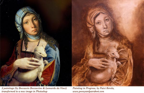
I have also started a new oil painting under the guidance of Emmi Mustonen. I got to pick the reference image freely. I wanted to pick an old Renessaince painting, but I couldn’t find any that would have a couple of my favorite features when painting with old masters’ techniques. I love to paint fur and fabric, and I wanted to find a face that would include openness. I fell in love with Boccaccio Boccaccino‘s portrait of a gypsy girl, but it didn’t have any fur. So I remembered Leonardo da Vinci’s “Lady with an Ermine” and created a new image by combining the two in Photoshop. I have several stories about this one.
The first one is about today’s society and how the pets have become more human in our eyes. I want to show the similarities in the wild gypsy girl and the tame ferret. Another story is about young girls and their love for taking care of animals. They might not know the wildlife, but they help to rescue animals and are ready to work hard when taking care of them. They are against fur clothing and not afraid to show it. The third story goes back to the 16th century. I imagine that the gypsy girl was hired to dress up and hold the ermine because the lady didn’t have the patience to pose for the artist. In the end, she never showed. The artist became frustrated and painted the girl instead. I can imagine the magical moment when the girl realized that she would be in the final painting instead of a lady.
I would like to talk with Boccaccio Boccaccino about my version. I also wonder, how he was able to paint the portrait of the gypsy girl when the artists mostly painted for churches and aristocrats back then.
At Monet’s Garden – Including All the Good Stuff to the Same Image
Last spring, I published a mini-course called Strokes of Energy as a part of the Imagine Monthly Spring series. I asked my students to name their favorite artists, and Claude Monet was among most popular ones. But when I thought about Claude Monet, I didn’t want just to serve those who love the garden or those who adore his way to paint the sky or those who want to express the windy scenes. I wanted to have all the good stuff in one image and then some more.
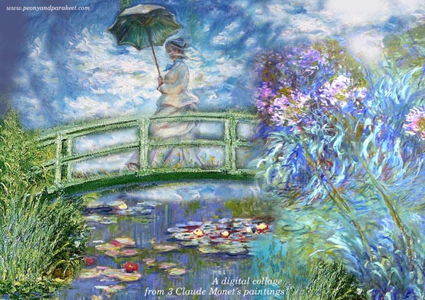
So I created a reference image in Photoshop combining three of Claude Monet’s paintings: “Woman with a Parasol” and a couple of paintings from the water lily series. Then I invented a technique where you can paint some of the elements as collage pieces so that you can adjust the overall composition before making the final decisions. This way it is possible to add more details one by one and improve the image during the actual creative process.
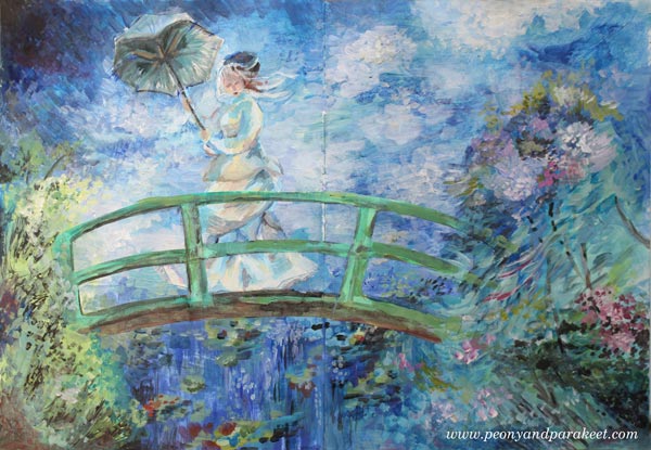
So this painting is about a woman who is experiencing strong wind. She doesn’t mind wind catching her parasol. She enjoys the fresh air and the beautiful scene around her.
Ulla’s Take
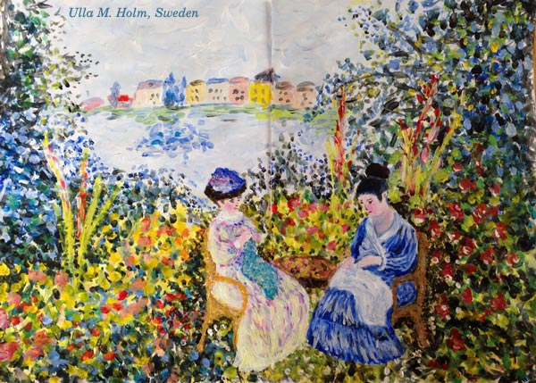
One of the students, Ulla M. Holm, made a Photoshop sketch from another set of Monet’s paintings and then painted the image with short impressionistic strokes. I love how the result also reminds me of her home country, Sweden!
Using Reference Images More Intuitively – From a Story to an Experience
I admit having mixed feelings about following the reference images carefully. With my art, I want to express freedom, and I don’t think that following reference images too closely helps with that. On the other hand, I don’t want to restrict myself doing abstracts only or creating similar paintings one after another. Many artists create the same again and again and become better and better with that. To me, art is about exploring and the hook there is to widen my perspective continuously.
So even if you would prefer abstract art, it doesn’t mean you can’t have reference images. Instead of connecting with the actual story, you can connect with an emotional experience.

I picked colors and ideas from Emile Vernon’s painting and imagined what it would be like wearing that soft dress. The dress felt like a dream, so I wrote: “Muisto unelmasta” – “a memory of a dream” in the image.
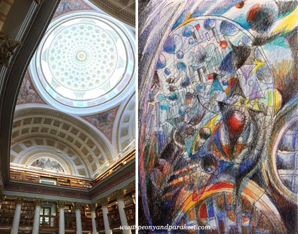
Here’s another example from my class Inspirational Drawing 2.0: a photo from The National Library of Finland and my interpretation, “The Power of Knowledge.”
Do yo want to experiment with this approach using your personal reference images? >> Sign up for Inspirational Drawing 2.0!
For the Fans of Monet – Strokes of Energy
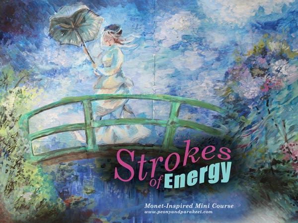
My Monet-inspired mini-course Strokes of Energy is now available as an individual self-study course. >> Buy Strokes of Energy!
Geraldine’s Take
I want to end this blog post with a skilled artist Geraldine Norris from Australia who created her version of Monet in my class. She had just seen an art exhibition showing Monet’s work, and I think it shows how deeply she connected with the experience.
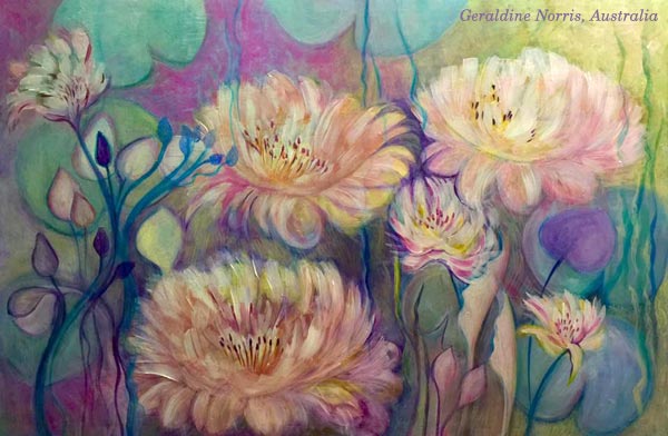
But wait, there is more beautiful Monet-inspired art from my students, see the presentation page of Strokes of Energy!
Until next time!
What Any Artist Can Learn from Old Masters
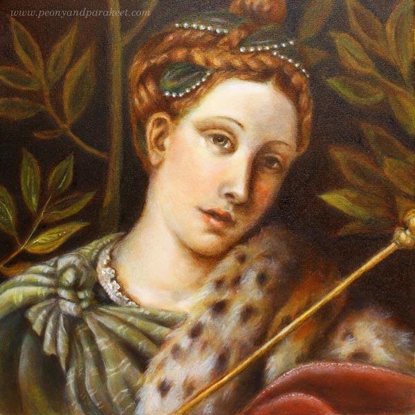
If you have followed me on Instagram or Facebook, you’ve already seen that I have had a special project in November. I have been painting a replica of an old painting and learning techniques that artists used already hundreds of years ago. These are called old master painting techniques. Famous old masters like Leonardo da Vinci and Johannes Vermeer used them when creating their masterpieces. My painting is a copy of a detail from Moretto da Brescia‘s painting “Portrait of a Lady as Salome.” I call mine “Dreaming Salome” because I gave her a more dreamy look and different meaning. The portrait was painted in the course organized by The National Museum of Finland. The teacher of the course was Emmi Mustonen.
5 Tips You Can Learn from Old Masters
After painting my first oil painting, and the first one that uses these techniques, I feel that there is still a lot to learn. So I will be painting another one with these techniques during the spring. However, I have already found out a lot of things that can be used with any supplies, and I wanted to write a blog post about what you can take from my experience. These tips can be applied to any themes, even to abstract art. At the end of this post, there’s also a short video (watch it on YouTube) that shows more images from the process.
1) Don’t Get Discouraged in The Beginning!
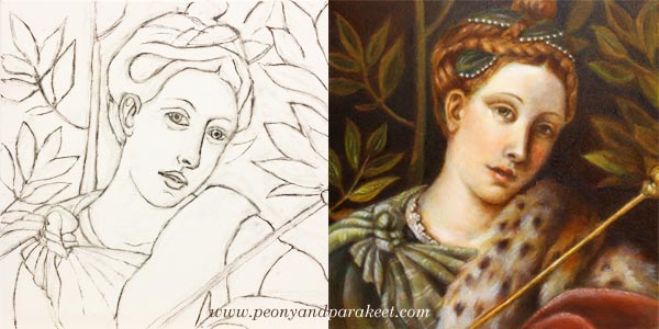
My process of making the painting started with a charcoal sketch. While sketching, I felt I was just making a big mess. I pressed too hard, and the drawing wasn’t detailed enough. The image shows the sketch once it was cleaned with an eraser – just before the first layer of paint. If you compare it with the finished painting, there’s a huge difference between the two. The expression of the lady looked sad in the drawing, but she has a half-smile in the finished version. I understood that the facial features and characteristics are so subtle that it takes a long time to get them right.
When sketching, I hadn’t the persistence to finish her hair and shawl, but still, I was able to make them quite detailed during the painting process. If I had made the original sketch without attending the course, I would have called it a failure and lost my hope of achieving something that would look like an old painting.
I often talk about raw ideas (see this blog post) and that applies to realistic art too. The first lines are just the beginning of understanding what the final work will be. When I was sketching, I only had a rough idea of how my lady should differ from the original version. But once I continued the painting process, my vision got clearer. So, stay curious about the insights that you will get during creating, and don’t get discouraged in the beginning!
2) Before Diving Deeper, Limit Your Supplies!
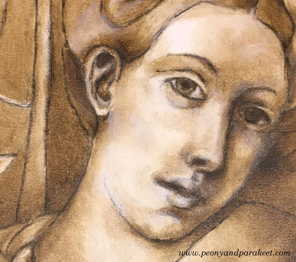
In my painting, the first layers were made with just two colors: burnt umber and zinc white. These first layers form a so-called underpainting that shows where the shadows and lighted areas are. It enforces the painter to look for contrasts, and on the other hand, it enables working with details without making color choices. The philosophy of underpainting can be applied to any media and style when it’s seen as a phase where you limit your supplies and add more content to the piece. When you go through every area in your work and make sure that it connects well with the next one, you will control the big picture through details. I find this much more enjoyable than trying to see everything at one glance all the time.
3) Slow Down to Maintain a Gentle Focus!
I was surprised by the positive feelings I went through while painting with old masters’ techniques. I thought that there would be a lot of demanding voices in my head, but the process surprised me. Even if I was stretched out from my comfort zone, I realized that there could be “a gentle focus,” where you put all your energy into work so that it improves your self-image too. I believe that this kind of new self-acceptance was based on two things.
First, I knew that it would take a long time to finish the painting. Six sessions in the classroom weren’t enough. I also had to do homework. Each of the layers had to dry before adding a new one, and drying took several days. This slow pace felt old fashioned but good too. It made me think how much gentler we would be in general if weren’t so busy all the time. I also noticed how I became less worried about mistakes. When the progress is slow, mistakes start small, and it’s easier to correct them.
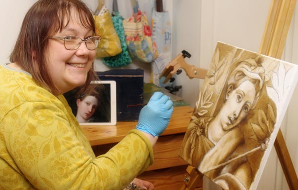
The second thing that helped me was that we were using a finger to remove the brush strokes. When I gently caressed the canvas with paint, it affected my whole thinking. It felt like the beauty created and seen by Moretto da Brescia caressed my brain.
4) Don’t Try to Make Your Middle Look Like the End
Before attending the course, I made one decision: I would do my best to follow the teacher’s advice. Because I was not familiar with the techniques, I didn’t know beforehand how the painting should look after each layer. When I teach art, I often see people worry over details that will look gorgeous once they just move on to the next steps. It’s human to compare your middle to the desired end. But if you can set your criteria according to each phase, it will lead to better quality.
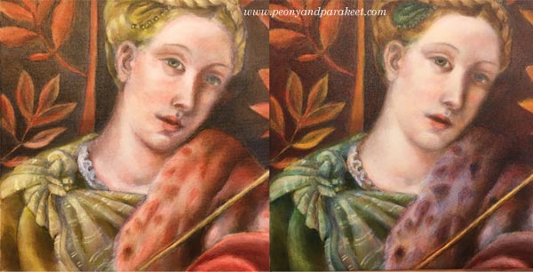
So, when laying the colors one by one, I tried to quench my worries about how yellow the dress looked or how red the fur was. When using old masters techniques, colors are not mixed on a palette. The pigments from the tubes are laid in thin layers as they are. So if you want green, you will start with yellow, let it dry for few days and then move on to blue. The transparent layers with soft edges result in mixed color and a realistic look.
When painting these thin layers of color, I couldn’t help thinking that the skin was too uneven. But my teacher advised me to continue creating color differences to get the painting ready for “a white wash.” A thin layer of zinc white made the skin more even, and all the previous layers made sense. Try this approach of seeing layers and elements as building blocks to new ones!
5) Sharpen The Soft, Not Vice Versa!
I was often reminded to make every area and detail softer. Even most of the tiny spots were softened with a finger to make them more translucent and blurry without sharp edges. As a result of that, the painting looked blurry and untidy. But when finishing, sparingly added sharp lines and dots did the trick. It felt magical how suddenly the whole painting looked accurate. I learned that it’s very easy to sharpen the softness. Adding few strokes finished the fur. Adding a tiny sharp dot finished the eye. The nose didn’t need sharpening at all because I wanted to bring the eye to the mouth where I added a small white spot.
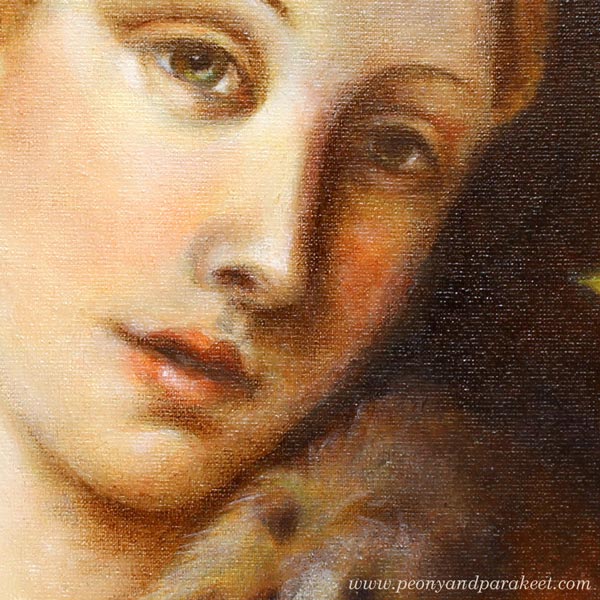
When you add softness, you will also make your work look more dimensional. Leonardo da Vinci has said:
“The beginnings and ends of shadow lie between the light and darkness and may be infinitely diminished and infinitely increased. Shadow is the means by which bodies display their form. The forms of bodies could not be understood in detail but for shadow.”
After painting my “Dreaming Salome,” I have become fascinated by watching the edges of items and how soft they are. I know that today’s world is sharp. We aim for sharp photos, a clean graphic look, and turn on the fluorescent lighting. The things we use are industrially made and as perfect as they have been designed on a computer. But try visiting Leonardo’s softer world! Light a candle and observe the lights and shadows. Let everything soft inspire you when you are creating art and reflect that softness towards yourself too!
Bonus: Make it Meaningful – Watch the Video!
My “Dreaming Salome” is now framed and she has a special place in our library room. I was so happy to be able to finish her before Christmas.
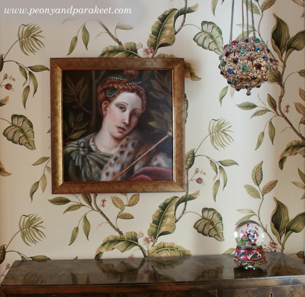
This painting is my first exercise when learning from old masters, but it also has other symbolic meanings. I have made a short video showing the images from the class and how she was painted layer by layer. At the same time, I also explain what Dreaming Salome symbolizes to me.
Learn old masters’ techniques and more!
>> Sign up for Floral Fantasies!