Have Some Vincent van Gogh in Your Life!
When I opened Imagine Monthly Fall 2016 art journaling class for registration, my question to the first participants was: “What is your favorite artist?” The ultimate winner was Vincent van Gogh. So I went to the local library and picked up two huge books showcasing all his paintings. I wanted to create a class that inspires not only playing in his style, but which also makes people relate to him. I wanted to enable people to put their world next to his and see it in full color like he did.
Life in Full Color
Whether you are an actual engineer or not, I think that you too have an inner engineer. She likes the home to be organized and clean. She takes responsibilities seriously. She worries over the practical stuff.

But then, truly, you also have an inner artist. She doesn’t care what time it is or whether she’s hungry or not. She doesn’t have a clue if somebody needs her to be somewhere else. Her world has no linear time. She has no other duties than to explore. She sees colors and textures when the engineer sees dirty laundry and a shopping list. No, she would not stay alive without the inner engineer. But the inner engineer could never live the life in full color without the inner artist.
Vincent van Gogh
Here’s what every inner engineer knows about Vincent van Gogh: He was a poor artist from the 19th century, painting with thick medium. He had mental issues and he sold only one painting.
But the inner artist feels that he was her soul-mate. He saw the yellow sky and blue ground when other people saw the perfect weather to sow the seed. He saw glorious sunset when other people saw withering flowers. For people of that time, his portraits and sketches looked clumsy even if he had caught the essence. Namely, in his world, the essential thing to do was not to engineer but to express. Instead of aiming for objectivity, he was the master of subjectivity.
Van Gogh Moments

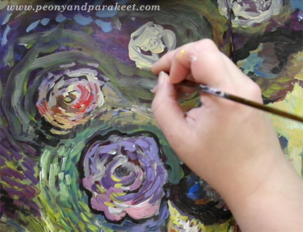
I believe that most people create art because they need “Van Gogh Moments”. In those moments, you can pick any color for any object, not only green for the grass like the inner engineer would suggest. In those moments, you can not only play with colors but also experience the interaction between the hues and shades. Just like van Gogh did! If you look at any detail in his paintings, you will see the interaction of colors.
So while the inner engineer waits for the important phone call, the inner artist hears her colors speaking. While the inner engineer worries if she will ever meet someone again, the inner artist paints him or her right there beside her.
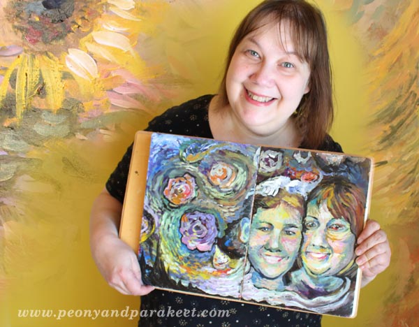
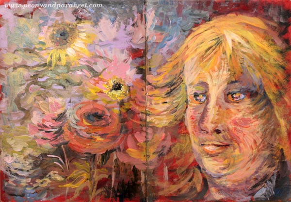
Selfie Fantasy
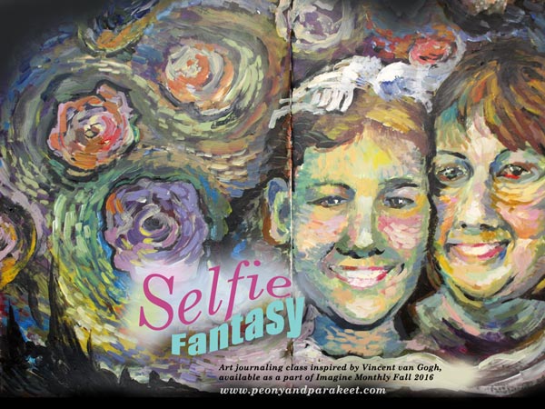
When I browsed through the two big books of van Gogh’s paintings, I realized that a big part of his production was portraits. They were either self-portraits or portraits of other people. So in Selfie Fantasy, you will not only learn easy ways to create a colorful and swirly scene in Vincent van Gogh’s style. You will also get step-by-step instructions for adding some familiar faces onto your art journals. In the class video, I use those methods to paint my mother and me. My mother is there on the spread, glowing on her wedding day, much earlier than when I was born. This time she is in the foreground because in real life she was always the one in the background, supporting my creativity. She truly was my inner engineer until the day she passed away about 25 years ago.
Give some “Van Gogh Moments” for your inner artist!
Sign up for Imagine Monthly Fall 2016
and get an immediate access to Selfie Fantasy – Sign up now!
Build Imagination with the Students of Peony and Parakeet
During the last spring, I have seen gorgeous pieces of art made from the mini-course Painter’s Ecstasy. Like in the previous blog posts (this one and this), I want to share some of them with you.
Build Imagination with Watercolors!
The pieces of this post are made with watercolors mostly. In my experience, watercolors are the supplies to go if you just stare at the blank paper and have no ideas in mind. They are soft and not so exact than pens or acrylics. It’s also easy to see something interesting appearing and start building new details from that. Maintain an open mind and not try to figure the end result beforehand. Instead, start with a general idea in mind.
1) Start with Mixed Emotions
Because creating art should be enjoyable, we often want to express positive feelings. But to get more connected to your piece, analyze your emotion more in detail. It’s often mixed: joy can hold tears of affection, happiness can contain worry, love can include dependency of some kind. This doesn’t mean you have to dwell on negative emotions but pondering about the more complicated nature of emotions can also free up your imagination. When controversial issues are allowed, it’s a sign to your mind that anything is allowed. This, in turn, will build imagination!
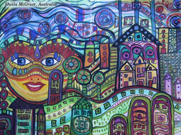
Sheila McGruer’s art journal spread tells a visual story about a woman who has an origin. This would not be so expressive without the teardrops!
2) Get Surreal
People say: “I do only abstracts”, “I focus drawing faces”, “I like landscapes”. Break the rules and combine various approaches. Could abstract contain faces? Could faces include landscapes? Could geometry meet human parts? Could 3-dimensional meet 2-dimensional?
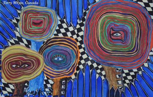
Terry Whyte‘s piece is fascinating. It’s simple if you count the elements but mind-blowing if you examine their relations. A wonderful example of how the surreal can look like!
3) Play with Proportions, Colors, and Abilities
Can houses be smaller than faces? Can trees be red and purple, then change their color and leave off the ground? Anything can be possible in your art journal!
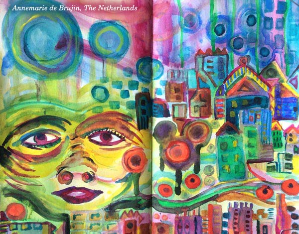
Annemarie de Brujin plays brilliantly with proportions, colors, and dynamics. The painting feels like an experience, more than just an ordinary scene.
4) Envision Your Location
Mind-travel to a place where you would like to go! It can be a real location, an imaginary one or the mix of many! Nothing has to be exact. Get inspiration from the colors and the atmosphere. Make your art journal a mind-traveler’s notebook!
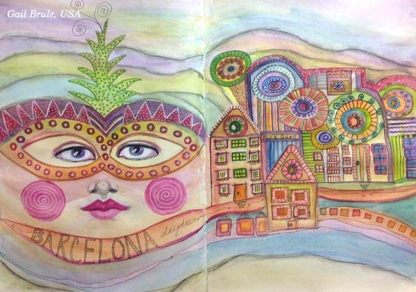
Gail Brule‘s art journal spread is a wonderful interpretation of the city Barcelona. Mountains, the beach, Gaudi, the colorful street life … it’s all there!
5) Treat Inanimate Object as Humans
One of the easiest ways to get the imagination going is to treat anything inanimate as a living object. Can a house have an identity of its own? Can a group of items look like a choir of brilliant singers? How do the trees look like when they are smiling?

Claudia Kern has created more than a landscape. The painting is like a big and inviting party!
6) Merge Everything into One Flow
Instead of adding single elements, build connections and flow to your piece. Connecting lines also connect the viewer to the painting and it all seems to make sense. This way, small elements can be used to build big pictures.
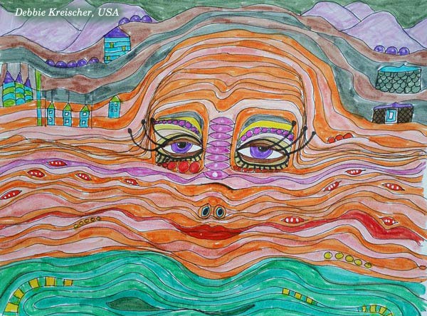
Debbie Kreischer shows it so well: we are all part of the same flow!
7) Express a Conversation
If you always do faces, why not creating more than one and express a connection between them. Then take it even further: what are they talking about, where are they walking, why are they together? Show it all visually!
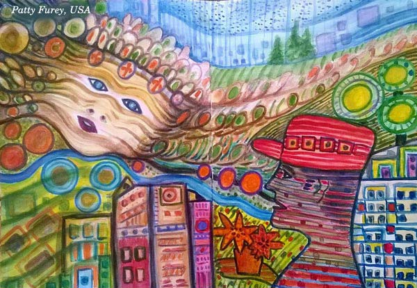
Patty Furey’s dreamy woman and dynamic man is the perfect couple to dive deeper into the story. They seem to live in a city. Maybe the man has brought the flowers for her. She seems to be the country girl in her heart, though! These kind of pages that evoke stories are the best ones. If you like creative writing as well, use your image as a starting point for a poem or for a short story!
8) Get Ideas from Treasured Items
Open your treasure box or shopping wish list and analyze how the single items are constructed. Does your favorite blouse have ruffles? Do you grave for jewelry that holds the beads elegantly? How are the details of your dream handbag? Thinking like a designer can give ideas to an amazing art!
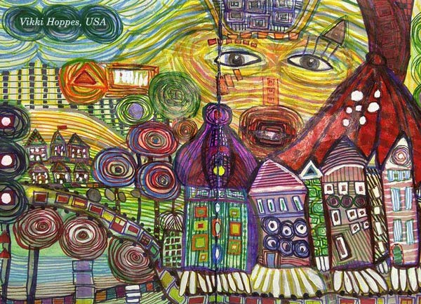
Vikki Hoppes’ painting is a great example of how to build imagination by constructing elements creatively.
Painter’s Ecstasy
When planning Painter’s Ecstasy, I spent weeks examining the paintings of Friedensreich Hundertwasser. He had students but to my knowledge, they didn’t get much guidance, only a green classroom:
– “I tell them nothing. I just put the plants there and leave them alone together.”
My first sketches were made with few bold strokes but they didn’t catch the essence. Sketch by sketch, I slowed down and toned down. Hundertwasser called his way of working “vegetative painting” as it develops slowly. It doesn’t start with drum rolls but with little bell sounds. The techniques that I discovered with trial and error
make starting easy but stopping almost impossible when you reach the spheres of painter’s ecstasy!
This mini-course, Painter’s Ecstasy, was published at “Imagine Monthly Spring 2016” art journaling class. It’s now available individually as a self-study class – Buy here!
You can also buy all the 6 monthly classes as a bundle. I will also release the classes individually one by one later this summer, and show more ideas on how to apply them.
Build imagination, right now!
9 Collage Ideas from the Students of Peony and Parakeet
This spring, I have seen gorgeous pieces of art made from the mini-course Doodled Luxury and I want to share some of them with you. There were so many great pieces that choosing was difficult but this time I thought to share pieces that are very idea-driven. You can never have too many collage ideas, especially if you process several at the same time!
1) Many Variations of One Shape
Gina Meadows shows beautifully how hand-drawn elements are all like from the same family when created by the same person. I also love how it’s full of feather-like shapes. They repeat the idea of a free, observing bird.

2) Solid Ground
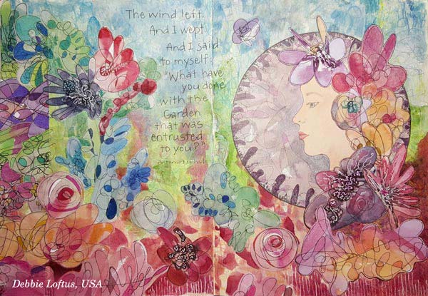
The second art journal spread that I want to show you is by Debbie Loftus. Her work is a wonderful illustration of the quote she has picked. This piece also reminds me of how we can create very free-flowing, beautiful mess that still speaks harmony. This can be done by simply making the bottom of the page strong and solid. This piece communicates how we as humans see nature. It’s full of weeds and still so beautiful!
3) Mystery That Can Be Revealed
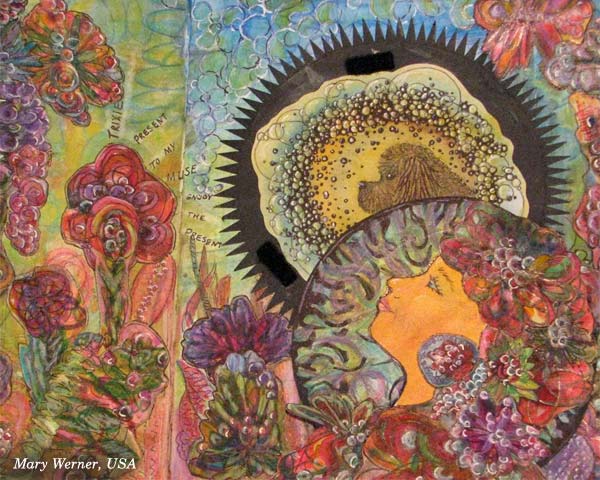
Mary Werner’s lady looks a bit mysterious here – but wait until you see the second picture!
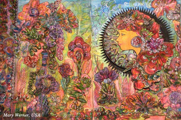
The lady has a secret, a dog who is her muse, making her to relax and take in much more than when walking outside alone. Mary has used velcro to attach the lady above the muse. Isn’t it a great idea to include a hidden mystery!
4) Spiritual Softness
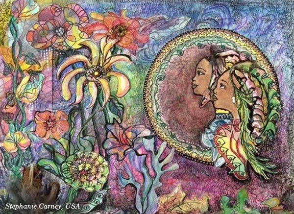
Speaking of true friends, Stephanie Carney has illustrated two sisters. I love the way they look at the flowers, sharing the same experience. Examine how softly the round frame has been decorated and compare it to others! These kinds of little nuances can communicate a lot visually!
5) Real Person in a Fantasy
Terry Whyte made her granddaughter the central person. Isn’t this spread a treasure? Combine your hand drawing with the photos and start building your own fantasies!

6) Many Sides of One Personality
Satu Kontuvuori included her cat who is a very wild character. Even if she stays still in the image, it’s like the wildly flying bird is one of her many lives. If you are expressing a personality or any subject that has many sides, you can scatter it into various elements of the same piece. That way you will focus on one theme but still express it in a free-flowing and rich manner.

7) Focal Point Balances Richness
Speaking of focus … Christie Juhasz has a trick for creating a clear focal point. See how her mermaid is sitting on a white frame! Even if the work has full of details, white circle makes sure that the main character gets noticed.

8) Movement + Space to Breathe
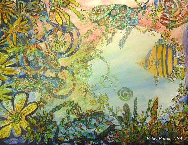
Another great example of using circles: look at Betsy Eaton’s fish and how there’s a circular space around it. Brilliant! Another thing which makes this so appealing is the movement of elements. That dynamic feel has been created by adding swirly shapes.
9) Rainbow Softness
Kathy Lewis (a.k.a KjAllison) made a gorgeous spread full of multicolored elements, like mini-rainbows. This makes me think about macro photography and dew drops! Soft transitions of colors – why not use them in your next art journal page?

Doodled Luxury
This mini-course, Doodled Luxury, was published as a part of Imagine Monthly Spring 2016 art journaling class. It’s now available individually as a self-study class – Buy here!
You can also buy all the 6 monthly classes as a bundle. I will also release the other 5 classes individually one by one later this summer, and show more ideas on how to apply them.
Start doodling and collaging, right now!
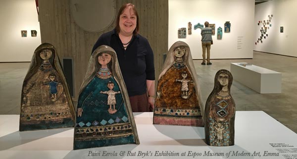
Painterly Collage in Rut Bryk’s style

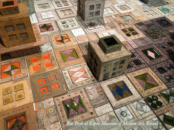
Here’s my recent art journal spread, inspired by a Finnish ceramic artist Rut Bryk (1916-1999). Espoo Museum of Modern Art Emma is currently showing her work and as a big fan of her work, I had to see the exhibition!
Rut Bryk
Rut Bryk is very known in Finland but not so famous worldwide. However, you might know her husband, a skillful designer and sculptor Tapio Wirkkala. Rut Bryk was an illustrator who got a job at Finnish ceramic factory Arabia in 1940s. Her early work was fairly naive and illustrative. But after working with ceramics for some time, she began adding textures to her work. Her 50s pieces were very mid-century modern.
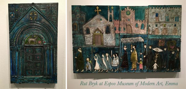
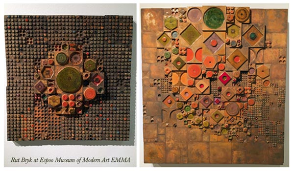
In 1960s her work grew more dimensional and abstract.
The abstract pieces she made are stunning.
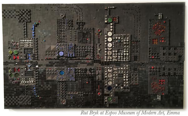
This black city view is one of my favorites.
Many of Rut Bryk’s artworks are composed of small ceramic pieces. They look like quilts or crocheted blankets to me.
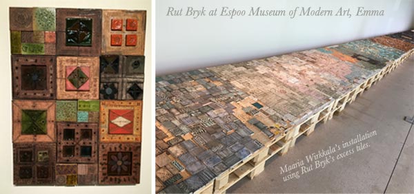
Rut Bryk’s and Tapio Wirkkala’s daughter Maaria Wirkkala is also a well-known artist. She had made an installation of Rut Bryk’s excess tiles for the exhibition.
Collage in Rut Bryk’s Style!
Get inspired by Rut Bryk’s brilliance and create a collage
with these step-by-step instructions!
You will need hand-decorated papers, acrylic paints, marker pens and gel medium or paper glue. See ideas for hand decorated papers: Basic Instructions, Frugal version, Kiwi, Arboretum, Spring Flowers (PDF download)
1) Paint the Background
Paint the background black.
2) Cut Collage Pieces
Cut collage pieces to simple shapes like rectangles, triangles, diamond shapes and circles. Cut big, small and medium-sized pieces. To make the pieces look like handcrafted ceramic plates, round the corners and soften the straight edges so that they are slightly wavy. Don’t worry about the colors too much as you will be painting over them.
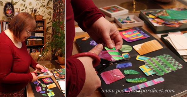
3) Glue the Pieces
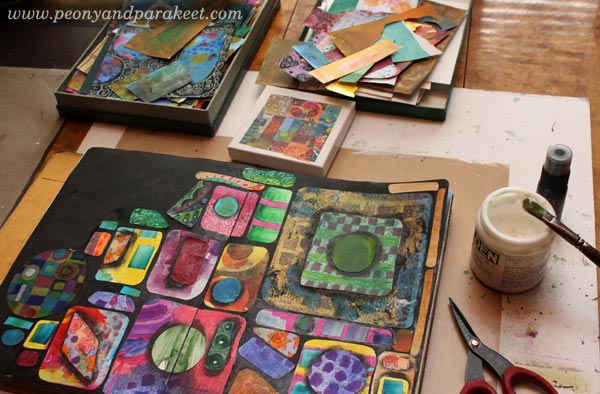
Using gel medium or paper glue, begin gluing the pieces on the black background.
Pile up pieces so that some smaller pieces are glued on the bigger pieces. Before gluing, add black paint so that the piece on the top will have soft black borders. This will make your work look more dimensional.
Don’t fill the whole background but leave some of it black.
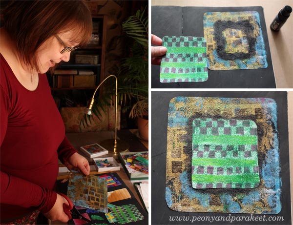
4) Paint Lightly Over the Pieces
To make the pieces look softer and to mute down their colors, add thin layers of acrylic paint over them.
Paint blocks where the black background is visible. Use neutral, fairly dark colors that suit well with the black background.
5) Draw Spotted Grids and Frame Collage Pieces
With marker pens or felt tip pens, draw spots so that they form grids. These grids can continue over the blocks. Also the size of the spots can vary. I use Faber-Castell Pitt Artist Pens as they work well on acrylic paint.
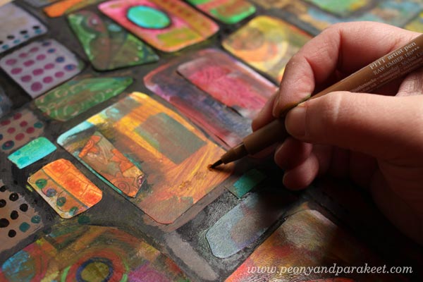
Frame the painted blocks and collage pieces with a black marker so that they look firmly attached to the background. I also used white Chinese marker to add few white lines here and there.
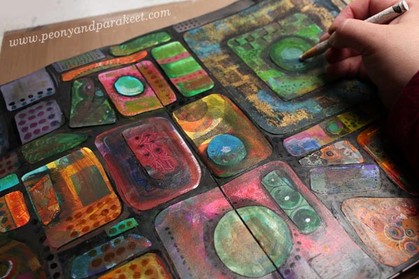
6) Paint Slightly Over Some Areas
To finish your work, add thin layers of paint for some areas. These painted areas represent light and shadows over the overall composition.
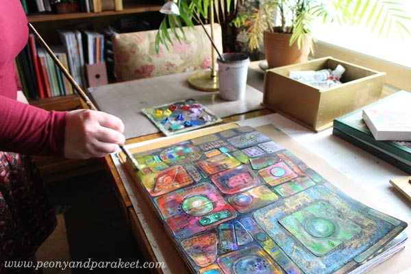
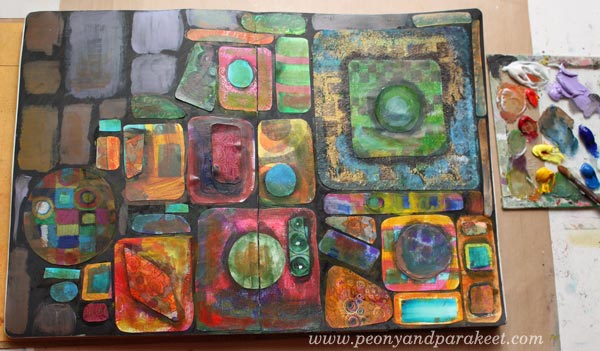
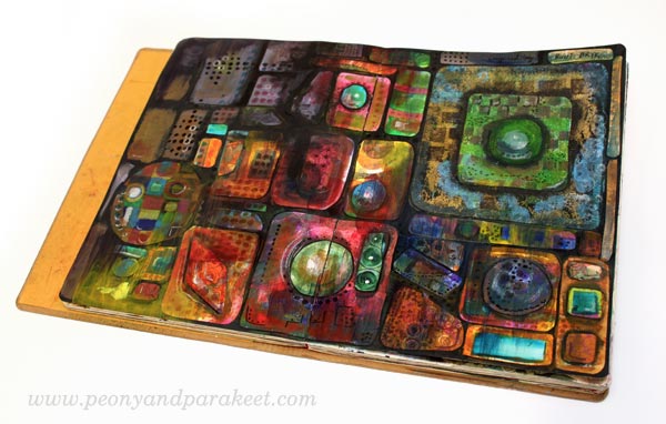
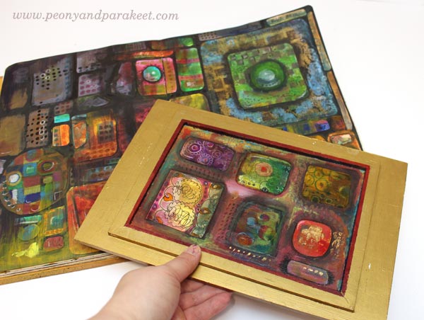
Here’s my finished spread again.
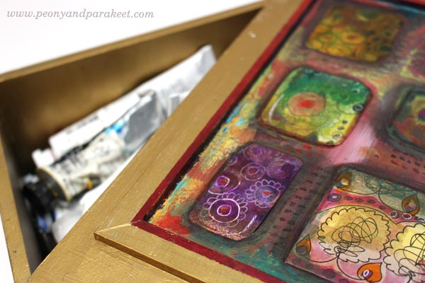
Extra Project – Decorating a Box
My husband has made a wooden box for my paint tubes. I have painted it golden but the bottom part of the lid needed some decoration. I had already painted the framed area red so I just added black paint to the collage pieces.
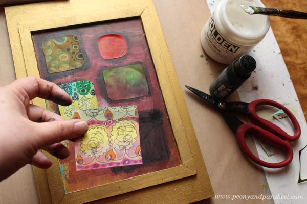
Then I continued the process like in the instructions. Finally, a layer of gel medium was added to protect the paper pieces.
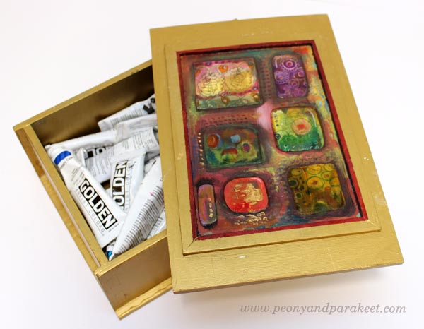
I like the idea of opening the lid and seeing the collage.
Thank you, Rut Bryk!
Expand Your Artistic Imagination!
This blog post is an example of how you can learn and get inspired by famous artists. This is how I see it:
– If want to find your own uniqueness, examine all kinds of artists and styles!
– If you have already found your style, keep on experimenting and expanding your skills!
It’s exactly what my art journaling masterclass is all about. Every month a new artist or style is introduced, and you will get detailed instructions on how to create a project inspired by it.
Move Forward in Art Journaling!
>> Buy Art Journaling Bundle 1
>> Buy Art Journaling Bundle 2