
Artistic Growth – From “Huh” to “Wow”
This week, we’ll talk about changing artistic direction and how the first reaction doesn’t always matter as much as the second one.
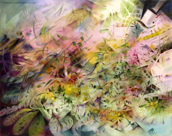
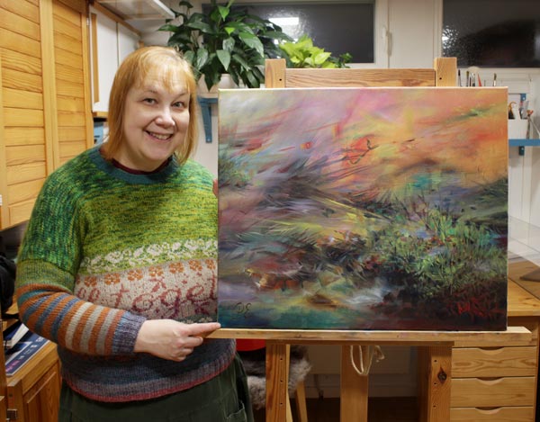
My seed idea for this painting was slightly different from usual, and I wanted to see how it would grow on canvas. It took many sessions and lots of struggles with finishing. “There’s still something wrong with this painting, Paivi,” I said to myself after correcting a couple of shapes that my husband pointed out. Last night, I had a dream that I walked an ugly dog on a thin leash. The breed was an odd choice, but the dog was still mine.
“Huh” and “Wow” – First and Second Reactions
Isn’t it so that we want to change, but as soon as we begin to see the results, we are likely to bounce back? It’s so easy to say: “No, this is not for me, I’ll try something else. I’ll try a different style, a new technique, another art class, or find other artists to follow and admire.” And this is not only a bad thing. In the long run, bouncing back is about integrating the new stuff into our natural self. But in the short run, it can prevent the growth we want and need.
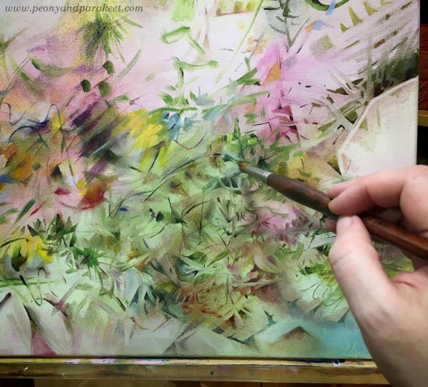
I have been reading James Victore‘s Feck Perfuction as an audiobook. It’s a book about creativity and easy listening about things that are really tough in practice. It’s more like a two-hour inspirational speech than a down-to-earth guide, but it feels current with this painting. In the book, James Victore refers to an American pop artist Edward Ruscha. He has said: “Good art should elicit a response of ‘Huh? Wow!’ as opposed to ‘Wow! Huh?'”
This week, my favorite video podcast, One Fantastic Week, talked about “Instagram art” – pictures that the Instagram algorithm likes. It’s colorful, easy to consume and comprehend, but its exposure doesn’t ensure the artistic quality.
Artistic Growth and New Truths
When a painting is not for a class or a specific exhibition, I try not to think about the audience too much. I trust that you will pick what you like, and forgive me those you don’t.
But with this painting, I realized that I have played in the “Wow! Huh?” category, and this one tries to be more “Huh? Wow!” And that change makes me uncomfortable. It’s like I have been written a revealing story but in a code language, being afraid that anyone who stops to look will see to the core of me. And at the same time, worrying about that anyone who doesn’t, only sees a mess.
An Outside View to the Inside World
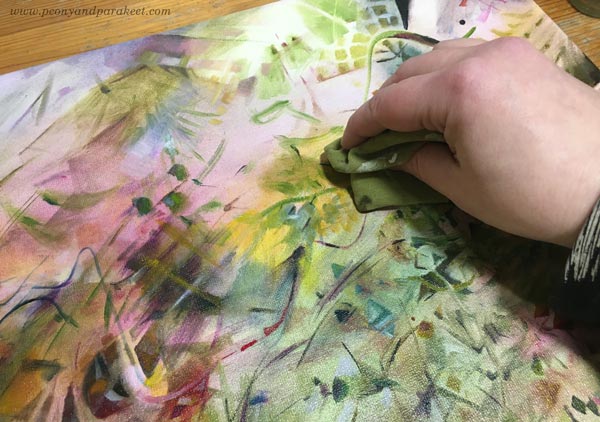
Teaching art has helped me to grow as an artist a lot. For example, when I get to see a student sharing a wonderful painting saying: “I don’t know about this one,” my gut reaction is then: “What!? This is beautiful!” But what’s “huh” for them is “wow” for me because I see the painting in a context that’s still new to them. They haven’t got used to seeing themselves like that. They are in the middle of a change, and it’s tempting to get back to the same old thing.
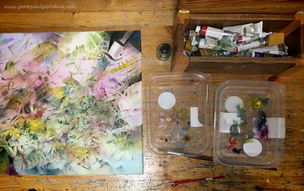
I recycle plastic lids and use them as palettes.
But when we do something regularly, it’s natural to miss the change. Floating on the surface isn’t enough anymore, and we get curious what’s deeper – “behind the glass” as we say in Floral Freedom, referring to Wassily Kandinsky‘s teachings. Then we need to learn, stretch, and redefine. Accept new truths.
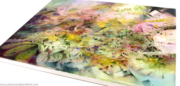
When looking at the mirror, I see more wrinkles than before. What was “huh” some years ago would be “wow” now. But with this wisdom, I hope long life for this painting. That the “huh” that it causes now will be “wow” someday. Maybe after I have fully accepted that my artistic growth is towards more and more abstract art.
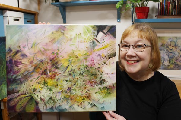
It’s also good to accept that some paintings are just “huh-huh” and a few manage to be “wow-wow,” and what’s “huh” for some is “wow” for another. What do you think?
What to Paint on Canvas?
This week, I invite you to think about what you should paint. It’s a general question and applies to any medium, but if you have purchased a canvas, the pressure is even higher. My story starts with dogs, and even if they don’t seem to match with the painting, they do. Read the story!
Childhood Without Dog of My Own
If I had to choose one thing that dominated my childhood, it would be the yearning for a dog. When my sister was pushing me in a stroller, I was pointing and screaming “hauva,” which a Finnish word for “doggie.” “How could you instantly recognize a dog from any other animal no matter how it looked,” she wondered.
My father was a policeman, and he had trained two german shepherds a long time before I was born. But a family photo album had a few photos. “Jumi,” was the name of the more handsome one, and I must have drawn him hundreds of times with a trembling hand of a toddler. I pictured the dog standing on the top of the mountain in a sunset. It was an exotic view because there weren’t any mountains in the countryside of eastern Finland. I only saw them if I kneed down, looked up, and stretched my imagination.
Walking in Nature with Imagination
My envy and admiration for all people who had dogs grew steadily, and at the age of five, I had several that were in constant observation. One of them was Kaisa, a vet whose mother lived in a big apartment building next to our house. She had a Finnish spitz and sometimes kindly invited the children of the neighborhood for a forest walk. We were a small and noisy crowd. Everyone had their turn to hold the leash, and even if it was only a few minutes, I still remember how powerful I felt.
So even as a young teenager, I imagined dogs around me whenever I went for a walk. The boring life in a small town became much more bearable when I didn’t have to look around, but only to a close distance. There they were, two brown labrador retrievers that behaved exceptionally well no matter where I took them.
I preferred labradors because the royal family of England bred them. I had always wanted to be the queen of England, so my labradors certainly originated from Sandringham. My friend Anne had got a hold of a catalog of the Crufts dog show, and I excitedly picked the parents for mine. Every time I drew or knitted a dog, I tried to invent the best kennel name for me. “Starway’s” was one of my favorites. By then, my sister had married a man who had a spaniel, and from the spaniel club magazines, I found a new favorite breed: an American cocker spaniel.
Goodbye, Boredom!
The older I got, the more evident it became that I would leave my home town. Instead of frustratedly strolling in the fields and woods of the east, I would be happily hurrying on the busy streets of the south. And not alone, but with an American cocker spaniel of my own!
I would gladly say goodbye to lazy hot summer days when there was nothing else to do than examine the tussocks. When I once pointed them to my mother, she quietly said that our grass wasn’t proper like the apartment building had. But I found it much better. Instead of staring at individual blades, my imagination made wonders from the tussocks. They were luxurious carpets, cushions, and chairs, and when they looked up, I greeted them back. My grass tussocks were like dogs who had them – a flock that was always around and willing to join whatever I did.
When I got my first dog, I was already living in the south. It was an American cocker spaniel, of course. I lived in a flat, but between high buildings, there was a small wood. Unlike me, Anja had been born in an urban environment, and everything in nature wondered her. When she jumped back in surprise after seeing an ant, I realized that I was a country girl – no matter how much I loved palaces!
My next dogs have been beagles. With them, I am back in the world where looking down and examining closely is highly appreciated. Tussocks, hays, wildflowers, and brooks have returned.
What to Paint on Canvas?
In my artistic path from childhood to this day, I have thought that I should create the luxury that I don’t have. That my creativity is at its best when it produces what I miss. But in 2020, when the world quieted down, humble tussocks saw their moment. “Stop haunting me, you don’t even have a voice,” I whispered to them. “We have – and you used to listen, remember?” they responded.
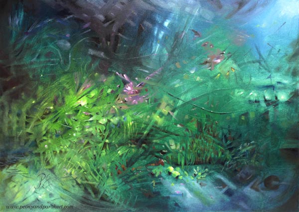
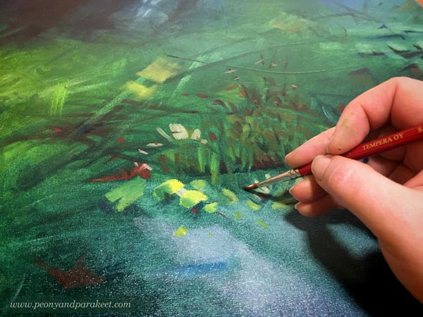
And yes, when I pick the brush, I hear them again. Instead of trying to master the visual state of what I know very little of, I am painting the sounds in the deep. All that time when I wanted to be the queen of Sandringham labradors, I was, and I still am – a herder of mixed-breed tussocks!
How about You – What Should You Paint?
What you need to paint is not what you want to get and be, but what you have always got and been. The solution is not to find and paint what you love but to look in the opposite direction, find what’s been the most ordinary for you, even if it wouldn’t be that for others. The solution is not to paint how things look, but how they sound, smell, taste, and feel. In the book Point and Line to Plane, Wassily Kandinsky talks about releasing the inner sound of a shape.
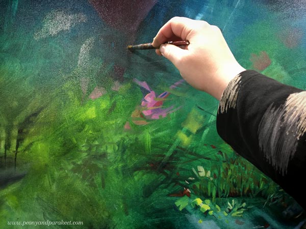
With the tussocks, the teachings of the abstract masters Paul Klee and Wassily Kandinsky have been groundbreaking to me. They have enabled me to paint more freely than ever and I have also built a class Floral Freedom from these teachings. Floral Freedom is especially for you, who wants the painting to look loose and naturally abstract, but who hasn’t find satisfactory results from “just making a mess.”
Good Accidents – When to Improvise
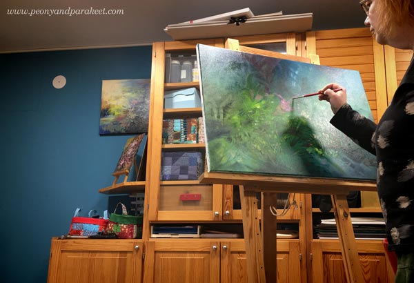
Art is never about just making a mess. Artists who say so are just unable to put it into words. Wassily Kandinsky and Paul Klee were not only exceptional painters but also exceptional teachers. They defined abstract art in methods and diagrams. In Floral Freedom, you get their theories in an easily understandable form and use them to paint flowers.
In this video (after the first two minutes), Helen Mirren talks about Wassily Kandinsky’s art. She first assumed Kandinsky’s work was just improvisation – “instinctive and improvisational and wild and of the moment,” but later learned that his work is constructed with care and thought.
Here’s how she says this:
I can also relate to what Helen Mirren says about acting – that you have to give the impression of the improvisation and naturalness and learn what’s a good accident. But I also have the definition of a good accident in visual art: it’s what you have used to see and know.
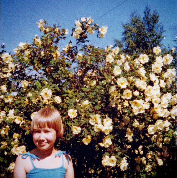
I feel that I know everything about the soul of grass tussocks. When I paint them, I don’t have to worry about people not liking them, not even if someone can paint them better. This grass is not any grass but how a 5-year old Paivi saw it, walked on it, and what she imagined from it.
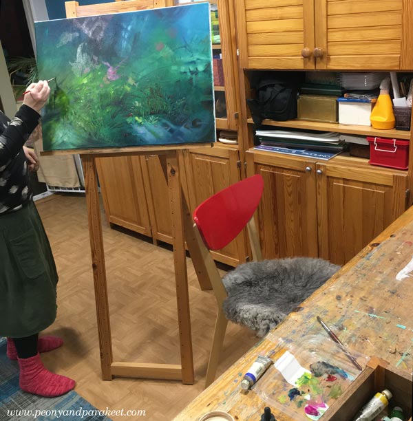
I paint sounds of plants as I hear them, freely and without references. I don’t plan what to paint on a canvas, and I don’t follow any image of my mind. It feels like improvisation, but the process is technical and systematic. One shape follows another and I dive deep into the painting, creating and releasing tensions.
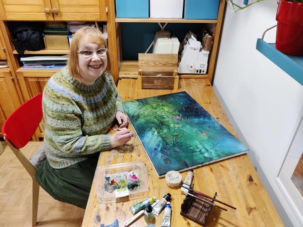
I am filled with excitement and emotion, but work systematically and intentionally, translating from spiritual to visual.
I really enjoyed painting this one – the first one of the new year! It’s called “Syvällä soi” which is a bit difficult to translate in English but it means that some are playing instruments or singing in the deep so the translation could be “Sounds in the Deep.”
Floral Freedom – Paint Dreamy Florals to Free Your Spirit
Come to learn the theories behind abstract art, and paint flowers with me – Sign up for Floral Freedom! We use acrylic paints for the projects. The class has already started, but you can still hop in. You will get the published lessons right away, and you have plenty of time to catch up and connect with me and the community. This class is comprehensive, and suitable for self-study too. Sign up now!
No Creative Blocks – Painting Grief and Loss
Even if I want these blog posts to be a celebration of art-making, I also want to paint and write from the heart. This week’s post is about sadness and its’ effects on creativity.

Here’s my latest acrylic painting called “If Grief Smoked.” Like many of the recent paintings, this also has a connection to a poem. The title is from Eeva-Liisa Manner’s poem “Jos suru savuaisi.” But this time, I didn’t follow the poem but used the title as a prompt only.
Missing Cosmo
I have been very melancholic this fall, and to be honest, building a new class Floral Freedom, has been my savior. It’s been a captivating escape from a life that feels emptier than before. My loyal companion Cosmo died in September, and it’s like a part of me has lost a purpose.
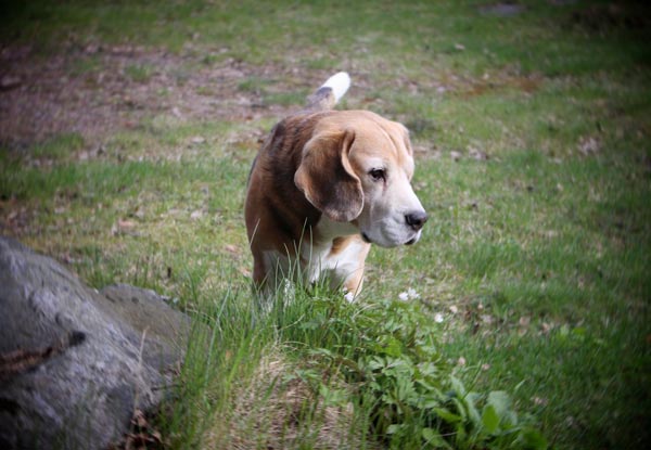
Cosmo was our family member for over 15 years, and there’s a lot I miss about him. Small things, often quite insignificant ones, like how he used to pick a sock when he wanted attention. My heart breaks when I remember how softly he did that, not leaving a single mark. In the end, he was a good dog and didn’t want to behave badly.
So yes, my grief has been smoking and burning. A wind of time has taken some away but also spread it further. When it started to feel that the grief would scorch my brushes, destroy the paints, and make the studio a smoky place, I knew it was time to paint. Not that it would take the grief away, but force me to deal with it.
Persuasion Can Replace Inspiration
Art is not always about inspiration. You know Picasso’s saying that the inspiration has to find you working. I find self-persuasion especially useful. “After this, you can paint whatever you want,” I said to myself.
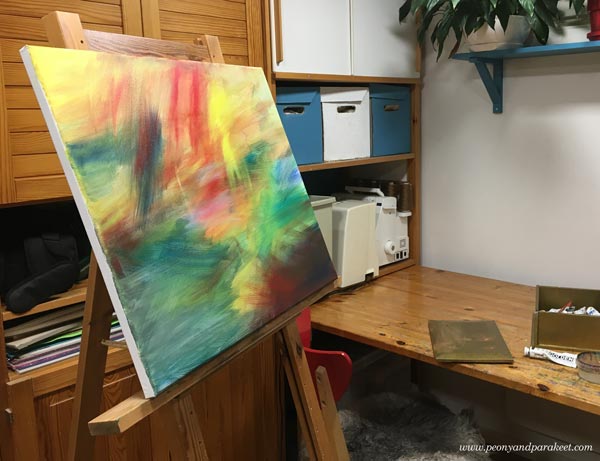
If we don’t paint these paintings that need to come out, it can cause a creative block. I have had some major ones in the past, and I didn’t want that to happen now.

“Follow the color,” I said to myself like many times before. It’s a quote of my own that boosts my confidence when I am working.
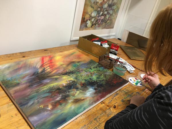
Stepping Into The Painting
This scenery had been in my mind for weeks. It was like an overdue baby, pushing through the brush.
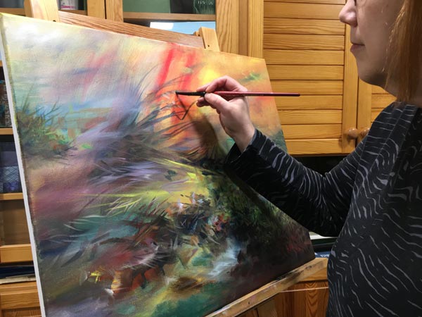
I just had to open my heart and welcome it.
Wassily Kandinsky talks about a glass between the artist and the painting, and how to remove it. It’s one of the hardest things when in grief, but also the most impactful one.

When we paint without the glass, the image becomes more personal. It doesn’t matter what other people think about it because you are living and breathing it. But oddly so, removing the glass also makes the image more general. My loss gets connected to everybody else’s losses. We are all behind the same glass, under the same blanket.
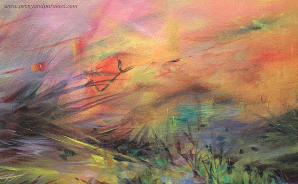
If grief smoked, we would all be covered in it. Even if it’s the saddest thing, it’s also beautiful to let go of someone or something you love. You can no longer help them, and it’s time to give them away.
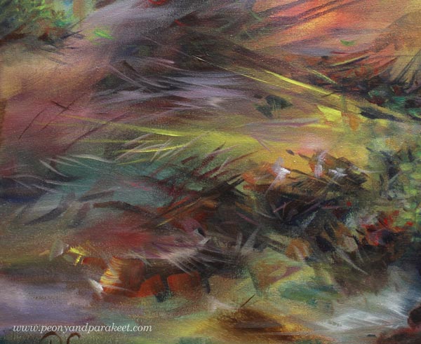
Mental Queue – Images That Need to Get Painted
Art helps us with things that can’t be solved intellectually. I also think that artists have a mental queue. If we try to jump over the hard images, we don’t have the energy for the more cheerful ones that come next.
I hope this inspires you to pick the brush and paint the image that has been waiting for its turn.
Paint a Poem!
This week, we’ll talk about poems and how to turn them into paintings!

This acrylic painting is called “Terät liitävät kirsikkapuista,” and it’s my interpretation of Valter Juva’s poem from 1902.
The Finnish name is a bit difficult to translate. Terät liitävät have a double meaning: 1) blades flying in the air 2) petals falling freely. Namely, a petal – terälehti – is a compound word in Finnish. Terä is a tip or a blade. Lehti means a leaf.
This is not the only language-related thing in the poem, and I struggled with the translation. But here’s the best I could do!
English Translation of Valter Juva’s Poem
| Terät liitävät kirsikkapuista, ja virta vieno ne vie. Se tyynine suvantoineen mun onneni kymi lie. | Edges fall from cherry trees and are caught by a gentle stream. The river and its pools are the well of my serene. |
| Suviyössä, mi tuoksuu ja värjyy, veet kultahan sulautuu; se lekkuu lännessä päivä ja idässä kuultaa kuu. | In the summer night, that smells and glows, waters melt in gold; in the west, the day is stirring, and in the east, shines the moon. |
| Niin hiljaist’ on ja tyyntä! Ja koskien alla veet ne ahtaassa piirissä viipyy, mut siinä on syvenneet. | It’s so quiet and calm! And under the rapids, waters dwell in a tight round but have become deeper and deeper. |
Passion for Poetry
When I was a teenager, poems were my passion in the same way drawing and painting have been. I used to read poetry, and almost daily, wrote my own. I even entered competitions, and some poems have been published. Later, this love for poems have reappeared occasionally: I have read or written some. In 2014, I even wrote a blog post about illustrating poems in art journaling.
But now, it feels that poetry has come to stay. Every time I open a big book (Runojen kirja – Book of Poems) that I won in a poem-writing competition in 1981, I see something that I want to paint. The book has over 800 pages filled with four centuries of Finnish poetry, but it’s not just that. With the book, I remember many poets that I used to read. My mind is blowing, and my brushes are jumping! “Paint paint paint,” they cry!
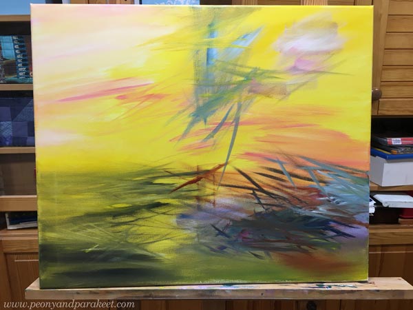
Valter Juva’s poem was new to me, but I got inspired right away. This painting has a lot of yellow in the background!
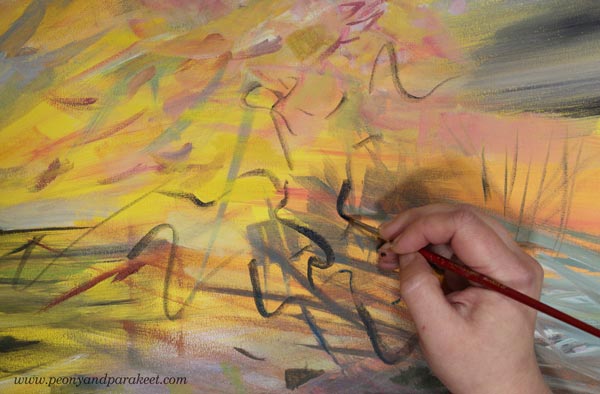
It was a joy to paint those sharp petals and curvy cherry trees that so willingly release the flowers. The size of this painting is 50 x 60 cm (about 19,5 x 23,5 inches) so I was able to paint the details more roughly and quite quickly.
Paint a Poem – Trust the Inspiration!
Painting a poem doesn’t have to be about illustrating every word. It can be more about finding a personal view – how the poem loosely explains your current life and often past experiences too.
In Valter Juva’s poem, the connection between Japan (cherry trees) and Finland (bright summer nights) blew my mind. You who have read my blog for a long time, know that both my husband and I love everything Japanese, and we also have a Japanese garden.
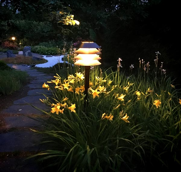
White nights were magical last summer! East and west meet like in the poem!
Paint a Poem – Color the Words!
Poems are filled with interesting words that can have a double meaning or a specific nuance. We don’t even have to know what strange words actually mean. It can still have a certain feeling to us, and we can express that with colors and shapes.

In Valter Juva’s poem, there’s a Karelian word lekkuu which means moving or stirring. To me, it has a relaxed undertone which makes me think about yellow-orange curves floating in the air, just above the water.
Paint a Poem – Break Borders!
In art, whether it’s poetry or painting, we can break borders. We don’t have to stick with one geographic location but create one that has characteristics of several places. Similarly, we are allowed to freely travel in time, from childhood to ancient history, and from the current moment to fantasy.
By changing the rules of reality, we can make representational elements symbolize more abstract things. They can be inanimate objects or nature’s elements, for example. In Valter Juva’s poem, waters have deep knowledge, In my painting, static trees take off and timid flowers jump from the plane.
Also, we can be magicians and make any material change its state. In the poem, water becomes gold, and in my painting, light is less immaterial and more touchable and concrete.
Poems are filled with metaphors, so why not let them in your paintings too!
Which poem would you like to paint?