Vintage Style Flowers Step by Step
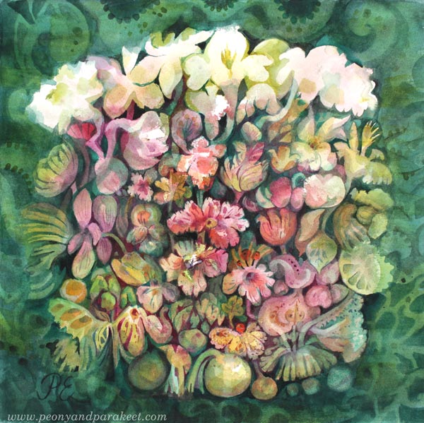
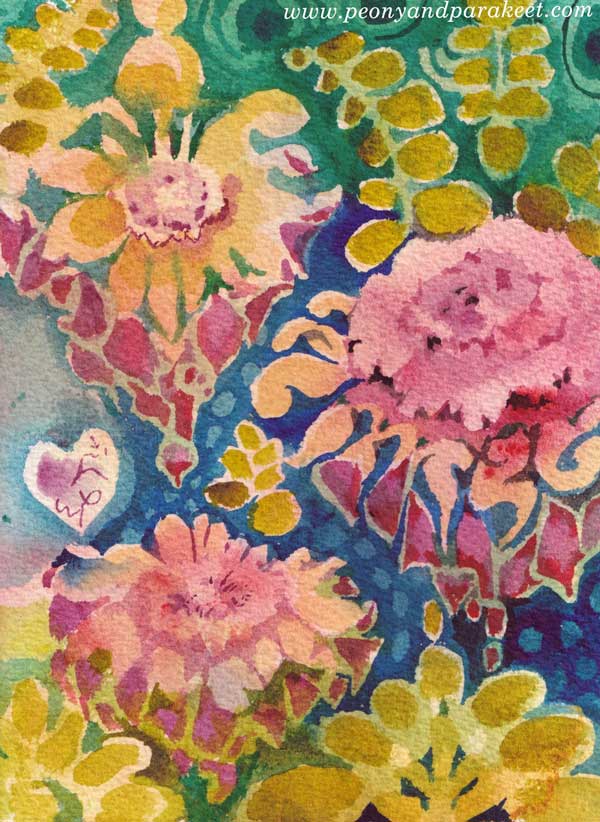
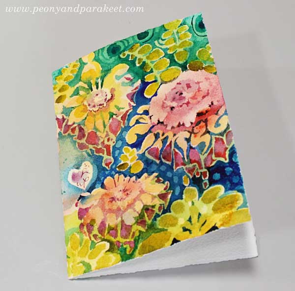
My latest watercolor painting has lots of vintage style flowers. I call it “Lemonietta,” and it’s inspired by home decor, afternoon tea, cream cakes, piano music, and of course, my favorite fruit – lemons!
Vintage Style Flowers in Three Colors
I have always liked old art and not just masterpieces, but decorative die cuts, vintage postcards, and all the more kitschy stuff too. So this post is dedicated to vintage style flowers, and I show how to make a cluster of vintage style flowers to your box of joy – any box that you fill with handpainted and hand-drawn collage pieces!
The tutorial is for watercolors, but you can use any paint for it. Just make sure to keep the color layers transparent. I use a piece of smooth watercolor paper, but almost any paper will do. And you only need three colors: yellow, pink, and green!
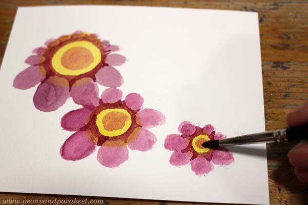
Step 1 – Three Yellow Circles
Start with yellow and paint three circles.
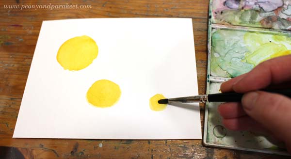
I painted the circles in three sizes: large, medium, and small. They form a curve rather than a straight line. This way, the composition will become more elegant than if you have similar sized flowers in a straight row.
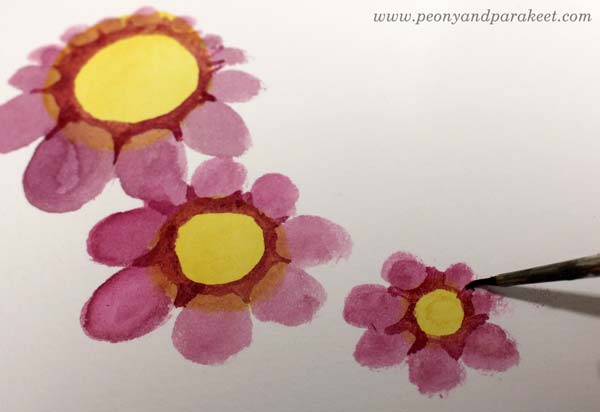
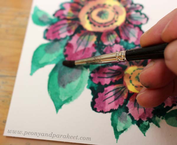
Step 2 – Pink Petals
Add pink circles or ovals around the flowers.

Some petals can be smaller than others, so that the orientation of the flowers varies a bit. Compare my biggest flower to the medium-sized one!
Step 3 – Darken the Centers
Continue with pink, but use a little less water so that it’s darker. Make the centers and petals clearer by painting around the center and the top parts of the petals.
I use a thinner brush to get sharper points near the petals.
Then mix some more water to pink paint, and add small circles to the centers.
I use a bigger round brush for round shapes.
Step 4 – Green Leaves
Paint green ovals around the flowers.
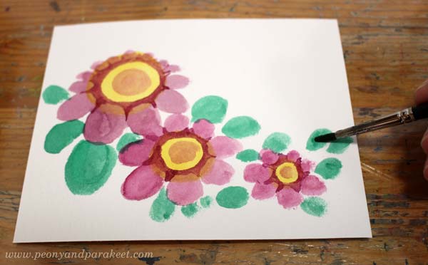
Again, my ovals have a variety of sizes so that the composition looks more lively.
Continue with green, but now use a thicker color. Make the leaves sharper and a bit more elegant. Only paint a part of a leaf with a darker green.

See how pointy my darker shapes are, and how they don’t cover the whole leaf!
Step 5 – More Details to Flowers
Start with thick green paint and a thin brush. First, add green triangles between the petals to make the flower look more three-dimensional.
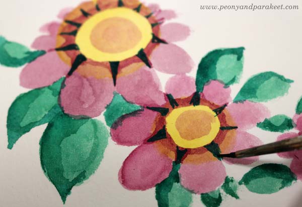
Second, paint around the petals so that they look more frilly.
Then change to a bigger brush and add more water to make the paint transparent. Paint pale green spots on petals and on the centers.

With a thinner brush, add green lines to the petals and centers. Finally, change to pink, and paint centers and petals so that they are partly darker.

The nostalgic look comes from the contrast colors and the color variation.
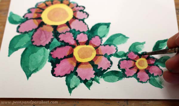
Step 6 – More Details to Leaves
Add pink shadows to the leaves.
With thicker green and the smaller brush, paint think lines on the leaves.

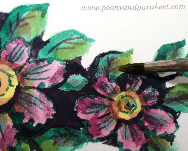
Step 7 – Dark Background
Mix thick paint from green and pink, and paint the background areas between the flowers.

I also check all the edges around the cluster so that it’s easy to cut.
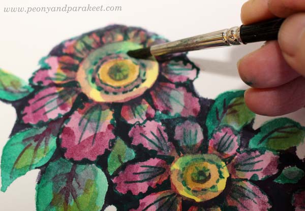
Step 8 – More Color Variation
To make the flowers glow, add more color variation. Use thin paint, and add yellow to the leaves. Only paint each leaf partly.
Similarly, add green to the centers.
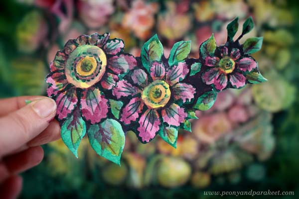
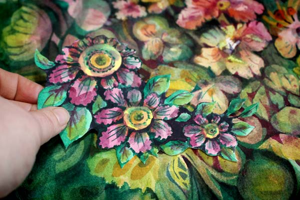
Here’s my finished cluster before cutting.

Step 9 – Cut It Out!
You can still change the shape of your cluster when cutting around it.

It’s so much fun to make and find backgrounds that come alive with these little flowers.
And of course, they bring more joy to the box of joy too!

Vintage Style Flowers – Starting More Intuitively
Painting small pieces is fun, but my bigger paintings are born more intuitively and they take a longer time.
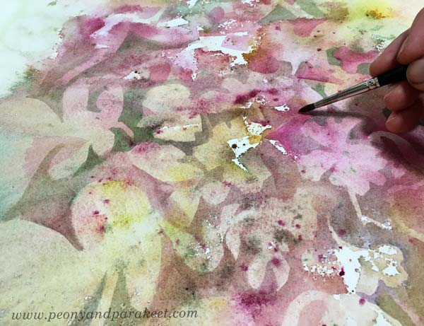
I love to dig out flowers of random blooms and spatters, and then move on to paint them more intentionally.
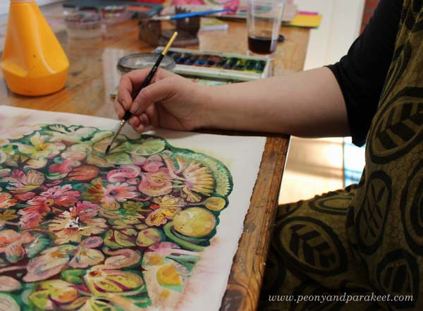
When the paper is full of details, it’s sometimes hard to decide which ones can take the central role and remain bright, and which ones get more background color so that they don’t stand out so much.
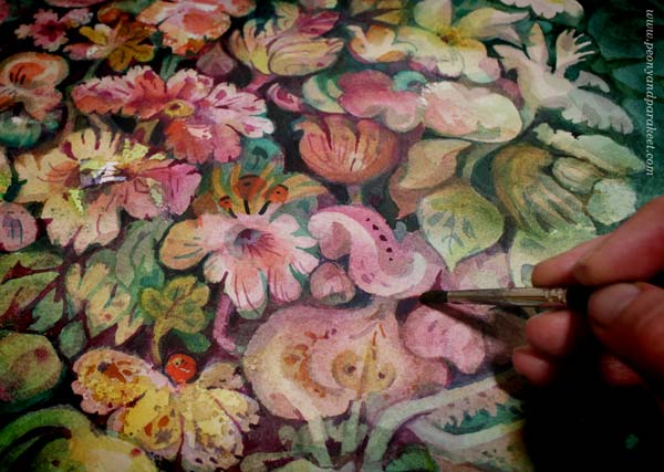
Here’s the finished piece again. It took about two days to complete.
Even the smallest single flowers are still part of the same world.
I hope this post inspired you to create, whether it’s a project of two hours or two days!
Inspiring projects for flower lovers: Buy my class Floral Fantasies!
Ornamental Flowers – Paint with Me!
This week, I have a video tutorial for you! Let’s paint a watercolor card that’s like a piece of beautiful floral wallpaper. Watch the video!
Flowers have always been my favorite, but now even more than ever. I hope you’ll enjoy painting this!
Floral Fantasies – Weekend Sale!
I am also happy to announce that Floral Fantasies – my flower painting class is now available again!
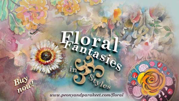
Honestly, this is the class to take when you want to become a floral painter + it’s for sale April 23-26 (PDT)! >> Buy here!
Paint Spiritual Energy – Step by Step!
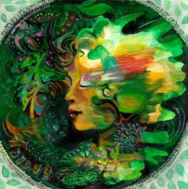
When there is a big crisis in the outer world, it’s important to protect and strengthen the inner world. In this project, we paint spiritual energy with loose strokes, continue it to form a face, and then add a protecting frame around the painting. I find this project soothing and healing. I hope it makes you pick the brushes again too!
A) Where to Paint?
I have made these paintings on my newest art journal which is a black Dylusions Creative Journal. It is my third Dylusions Creative Journal, and I really like this product. It’s durable, the paper is thick, and it can be closed with an elastic band.
My first two Dylusions Creative Journals were large ones, but the newest one is a bit smaller, the page size being 8 by 8 inches.
The links above are Amazon.com affiliate links to product pages.
Watch the flip-through videos of the first two art journals! See these journals in practice and to get more inspiration:
Journal 1 Flip-Through
Journal 2 Flip-Through
B) Collage or Painting?
This project can be made as a painting or as a collage where you paint the figure separately from the rest of the image.
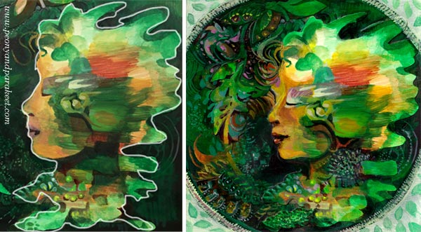
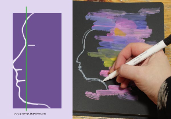
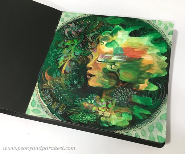
When I did this project the first time, I made a collage. I painted the profile on a paper, cut it out, and glued on the art journal page, and then continued painting the background and adjusting the facial features. In the photo below, the white line shows how I cut the face.
If you choose the collage technique, it’s good if the paper is not too thick. I used Bristol paper, which is fairly sturdy but thinner and easier to attach than thick watercolor papers.
C) Pick the Colors that Bring Energy!
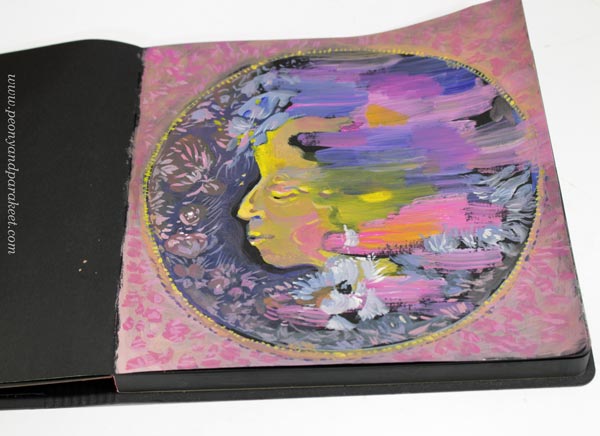
I painted the second version directly on an art journal page.
Both versions have a limited color palette. By picking only a few colors, they come alive and express energy more effectively than if you work with all the possible colors. So, choose the colors that energize you – that you feel drawn to at the moment.
I recommend choosing three different tubes of acrylic paint and adding white to the mix as well. If none of your colors is dark, pick black or another dark color so that you get a strong image with good contrasts.
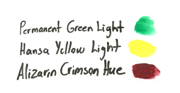
For the first version, my colors were these (+ Titanium White):
For the second version, my colors were these (+ some Mars Black for finishing)
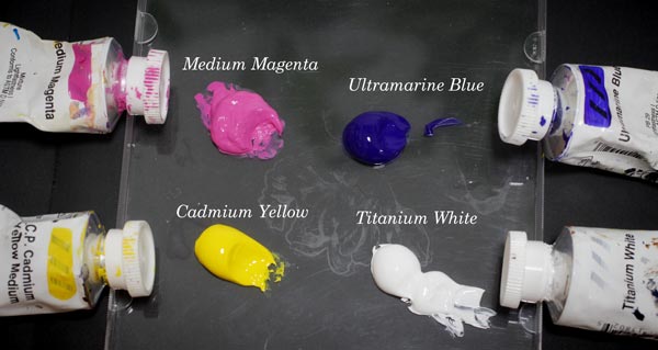
My acrylic paints are Golden Headybody Acrylics.
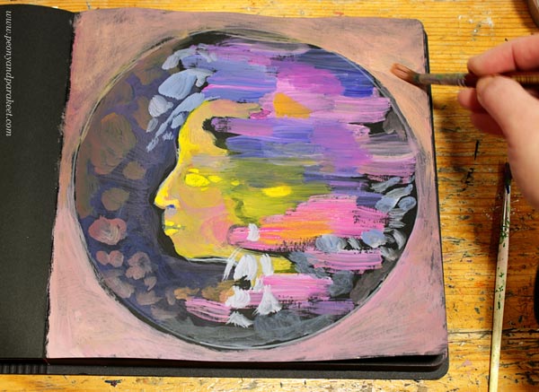
D) Paint Spiritual Energy!
Let’s create some abstract art! Use selected colors and paint with horizontal strokes. Mix white to get lighter strokes and make muddy mixes to get tones that make the pastels shine. Enjoy the colors and making most of the narrow selection.
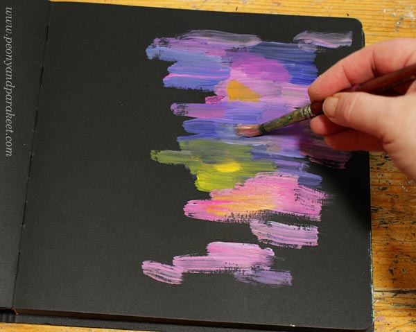
If you paint directly on a page, mentally divide the page in half, and paint on the other side only. This way, you will have enough room for the face.
E) Sketch the Face!
Pick a pencil and sketch a profile. You can adjust it later by painting, so focus on the location of the face more than the actual look. I used a white pen in the photo below so that you can see my sketch clearly.
F) Draw a Frame!
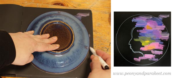
Take a round object, for example, a plate, and draw a protective frame around the person.
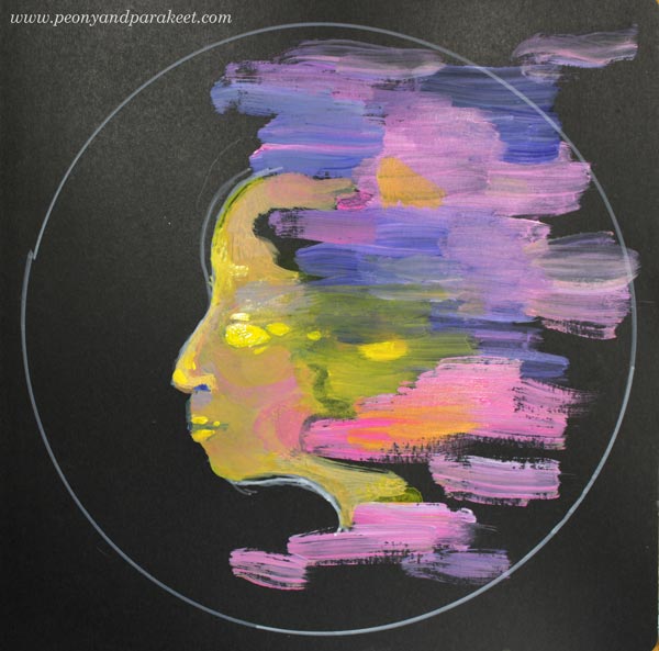
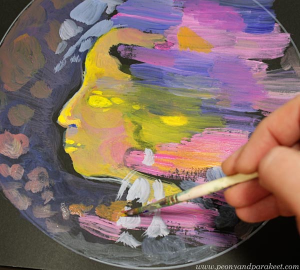
G) Paint the Face!
Paint the skin and facial features. Instead of outlines, paint shapes. Allow yourself to be more unconventional. Don’t paint bright white scleras or red lips but shapes that connect the person with the abstract part of the painting. In this project, the energy that the strokes represent is more important than the person herself.
H) Paint the Background!
Surround the person with everything that soothes and heals. At this point, it can be just subtle strokes that will be more defined later, when you finish the painting.
Paint the frame too. Use muted colors so that the frame doesn’t take the energy away from the person.
I) Finishing: Give Her All the Beauty She Needs
Paint details with a thin brush so that she will get all the softness and beauty she needs. Again, prevent using intense colors for the details on the background.
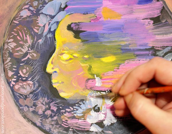
Connect her forehead with the beauty so that she is in the middle of the energetic strokes and more delicate and soft fillings.
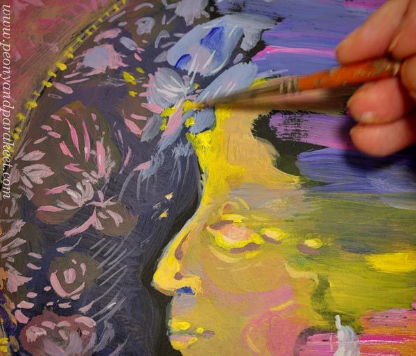
I also added some decorations on the frame.
Less Control – More Energy and Expression
Art is freedom! In this project, we started with wild strokes and then built a portrait around them. These kinds of less-controlled uses of supplies are an important part of self-expression.
On Thursday, March 26, 2020, I will be talking about doodling and how to expand it to various supplies and styles in my art community Bloom and Fly. The session will be recorded too. If you have bought my class this year, you are invited! I have sent an email to the members yesterday.
How to join Bloom and Fly for 2020?
>> Buy any of my classes!
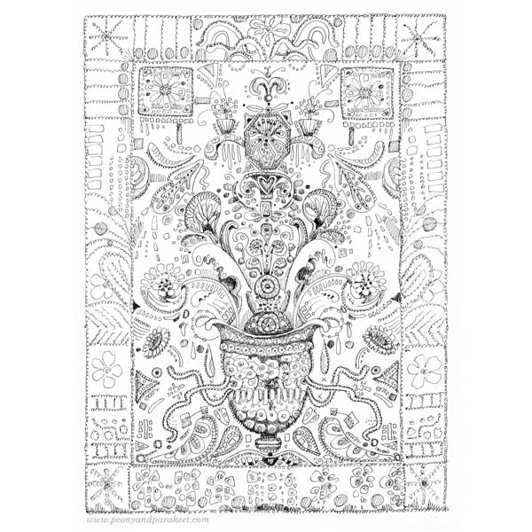
Doodler’s Sampler Step by Step
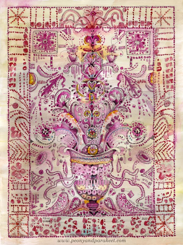
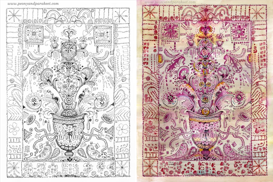
I have always loved antique embroidery, and it inspires my art too. This week, I invite you to treat your pen as a needle and doodle the look of the precious hand-stitched fabric. My drawing – I call this Doodler’s Sampler – is 9 by 12 inches but you can make a smaller or bigger piece with these instructions. The best paper for this is Bristol paper. It’s smooth and nice to color with watercolors.
Step 1 – Draw a Grid
Because we aim for ornamental stiffness, a grid helps to place the elements. Use a pencil so that you can erase the lines before coloring. Start by outlining a space for a frame. Then divide the rest of the paper so that they help to place the main elements.
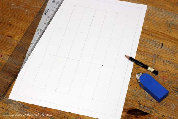
I wanted my Doodler’s Sampler to be symmetrical, so I drew a vertical centerline, and then divided the two halves into three parts. Another idea that I had was to have a vase of flowers. So I drew horizontal lines that mark each third, and the lowest third is reserved for the vase.
Step 2 – Sketch the Structure
Old samplers are filled with decorations but at the beginning, it’s enough to sketch the places for the biggest elements and their shapes.
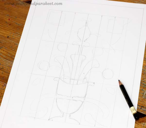
I wanted to have something rectangular on the top corners, the vase on the bottom, plant-like organic shapes coming out of the vase, and then an angular jewel-like thing on the top of the ornament.
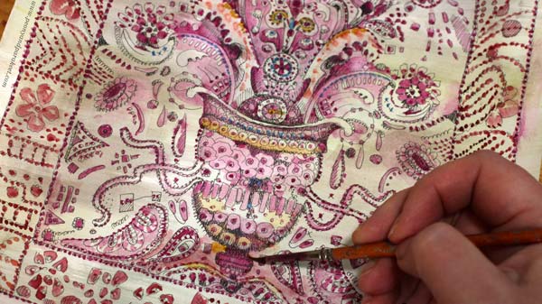
Step 3 – Doodle and Decorate
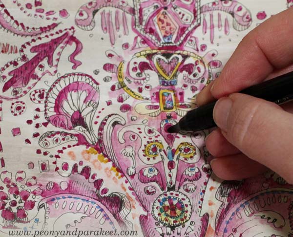
Pick a thin-tipped drawing pen, that has permanent ink, and start doodling! Make more shapes and fill them with circles, rectangles, flowers, hearts, anything you can think of!
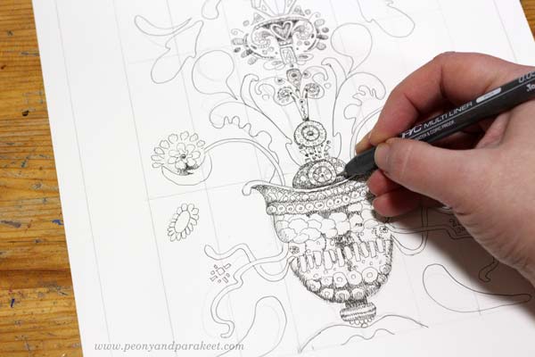
My pen is Copic Multiliner, tip size 0.05. I add shadows to my doodles so that they don’t just outline the shapes but there are darker parts too.
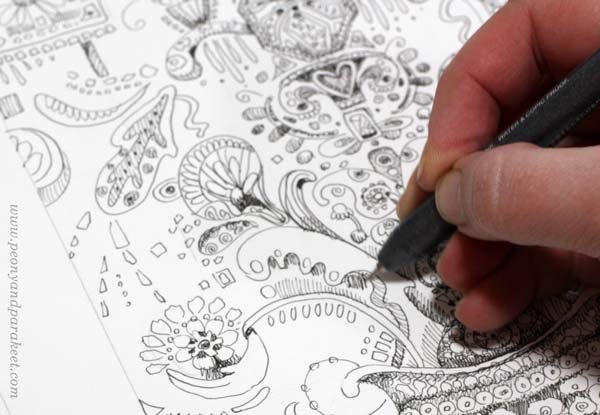
I make the decorative border simpler so that it doesn’t take the power away from the centerpiece. Trembling lines look more decorative than straight ones.
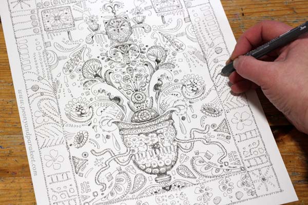
Here’s my Doodler’s Sampler after Step 3, ready for coloring.
Step 4 – Color the Background
You can use any supplies for coloring, but in my opinion, the softness of watercolors complements the sharp black lines best. Start the coloring by adding some color to the background.
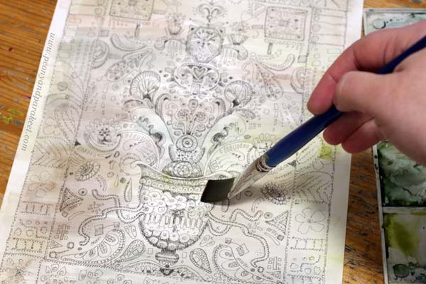
I use very little pigment and many tones so that the background looks like old antique linen.
Step 5 – Color the Doodles
Pick one main color for the sampler. My choice is cool carmine red. When coloring, add more decorations like dots and other decorative shapes. You can also color around a shape instead of inside the shape.
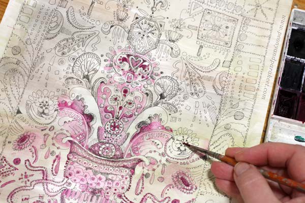
Pick slightly different tones for the frame. I use warmer red and a little bit of orange.

When you have colored the sampler with a very narrow color scheme, make it more lively with some new tones.
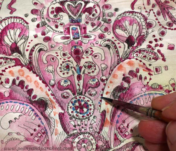
I added blue and yellow, but very sparingly.
You can also highlight the main elements by making the darkest areas pitch black.
Here are the black and white version and the colored version side by side. Click the image to see it bigger!
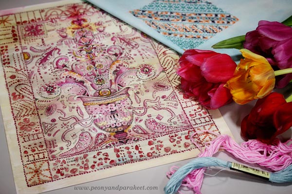
Doodler’s Sampler – For the Love of Flowers and Hand-Stitching
Henri Matisse has said: “I don’t paint things. I only paint the difference between things”. I think that to me, it goes like this: “I don’t paint things. I only paint the similarities between things.” So here’s for the love of flowers and hand-stitching!
Draw more with me – Check the courses Animal Inkdom and Magical Inkdom!