New Beginnings in Art-Making
Let’s think about new beginnings and give one to our art-making!
In recent months, I have felt that a new era has begun in my life. It has been surprising. I have thought that I am already too old for anything new – that the new beginnings in life have already been experienced, at least in terms of working life. But it just so happened that my work as an artist has a new beginning thanks to the grant for creating digital art.
At the same time, I have gained a new perspective on the past and my artistic development. Now, it feels that life with its changes is full of new beginnings, and art, too, is full of them! There are big beginnings and then smaller beginnings within them.
Valuing Randomness and Intuition
I developed the latest course Liberated Artist Revisited, because I wanted to relive the idea of the old course Liberated Artist. I wanted to relive that time in 2015 when a new beginning meant letting go of excessive control and surrendering to happy accidents and intuition. Because isn’t it the case that whenever a new era begins, we need faith in chance and intuition – so, the art of letting go!
At the current new beginning, I have been thinking about what I have to give up. Because, couldn’t you say that life with its changes is full of not only beginnings, but endings, and ask if the same applies to art? While making the course Liberated Artist Revisited, I listened to Paivi from 2015.
Younger Paivi was very prompt: Step A and Step B and so on. If I compare her and I, I am partly different and partly similar. I would do some things differently now but in many ways., I am still quite the same artist. The new course Liberated Artist Revisited is a dialogue between the old and the new. You could also say that I have changed as an instructor a bit. Nowadays, I want to open up your artistic thinking, not so much to exclude options.
Life is so grand that everything that once had a beginning, stays in our hearts for a long time, even if it has ended. It’s the same in art. I can smile at Päivi after more than eight years, but not ironically, but warmly. “It’s wonderful to create something new with you again,” I say to young Päivi, and it’s also wonderful to invite you all to a new course again!
Liberated Artist Revisited – Buy Now!
Liberated Artist Revisited is a limited edition – only available for purchase until the end of March 2024! >> Buy Now!
Liberated Inspiration – Painting Freely
This week, I talk about liberated inspiration and share what I discovered about 8 years ago.
>> See more pics at the Taiko art store!
Liberated Inspiration from 2015-2016
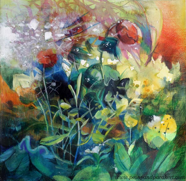
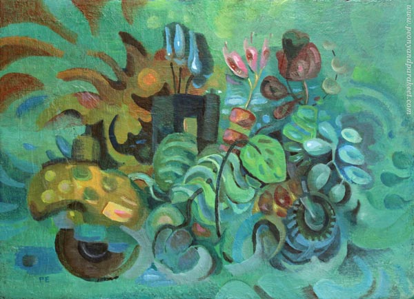
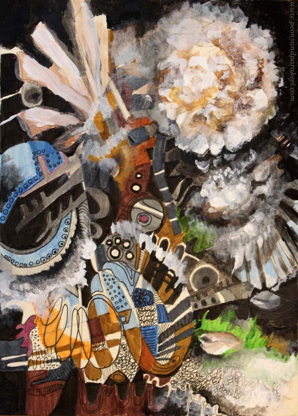
Recently, I have been thinking a lot about the years 2015 and 2016. Then I combined watercolors, acrylic paints, and colored pencils for intuitive still lives. At the same time, I thought about how complex the forms of nature are and how I could create a more finished impression with nuances.
I have those pieces saved in an album. Watch a short video of me browsing the folder! Here you can see only a small part of the pieces – the album is thick!
Liberated Inspiration
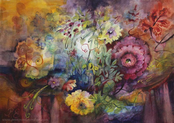
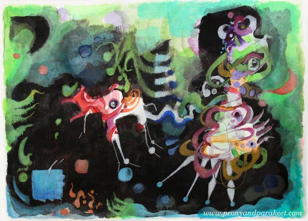
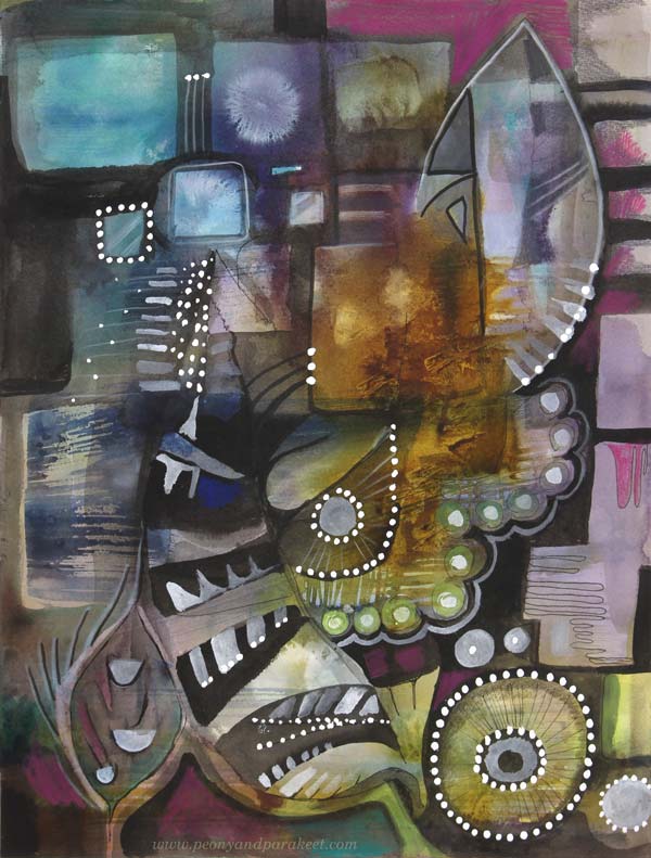
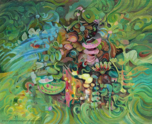
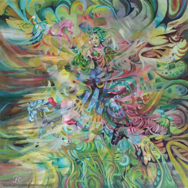
These last couple of pieces shown in the video have stuck in my mind. This one:
See the blog post about making this!
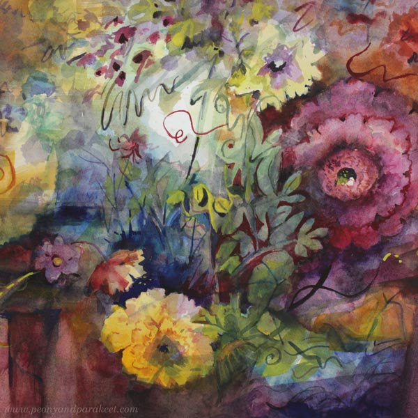
And this one:
See the blog post about making this!
Both of these have a dark and romantic atmosphere that can be seen often in historical paintings, but there’s also liberated inspiration – meaning that no one dictates what that kind of painting should or shouldn’t have.
You can be inspired by what you have seen, but only pick the atmosphere from it.

I like this kind of inspiration the most. That you are inspired by something, but don’t take it too literally. Liberated inspiration boosts your enthusiasm but doesn’t tell what the final image should be.
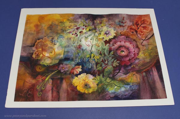
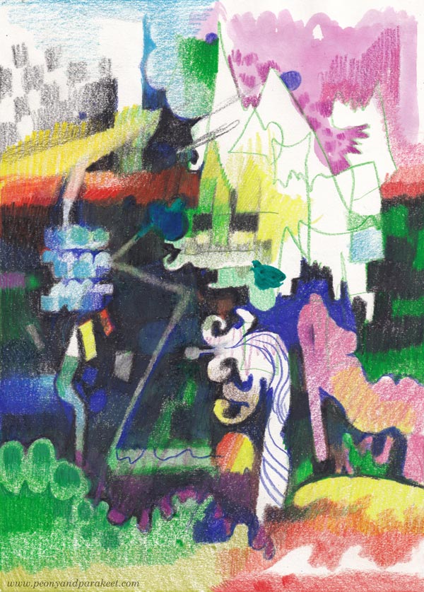
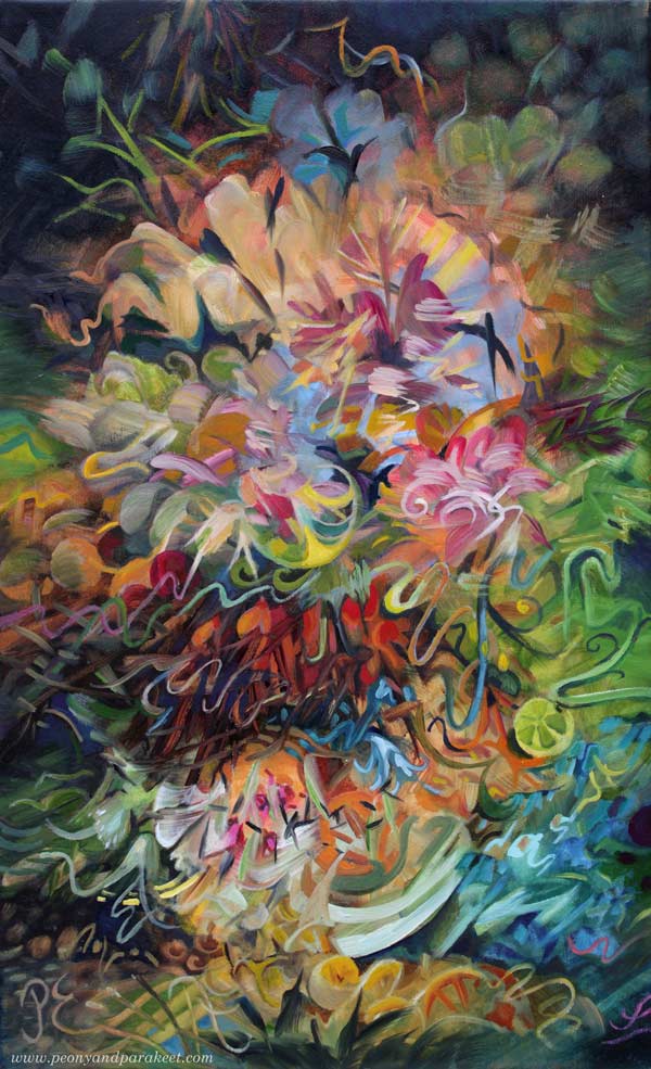
I wanted a similar romantic yet liberated feel for this watercolor painting.
Imagine someone saying: “dinner is served” and bringing you to a table where good company and classical music would make the world look like it’s full of possibilities.
Painting Freely in Watercolor
It has always been important for me to paint freely without models and let randomness meet my imagination. In 2015, I developed a course called Liberated Artist. It was about creating a mess first and then solving it. It was a fun course.
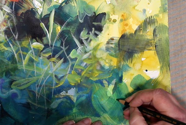
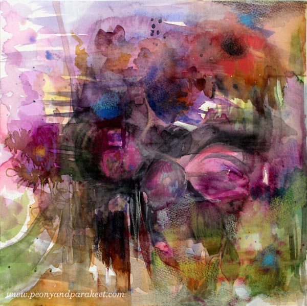
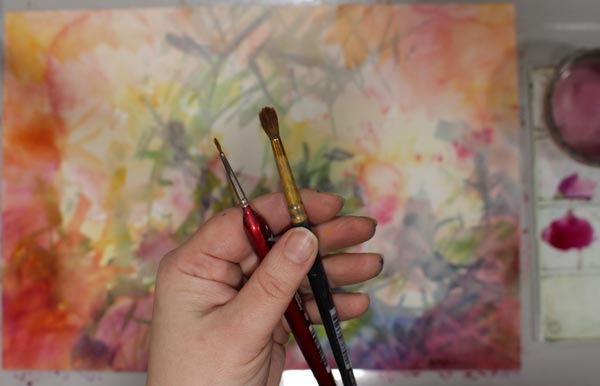
I started this watercolor with a similar mess.
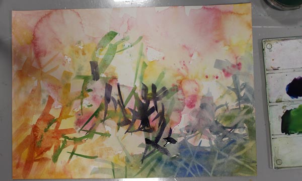
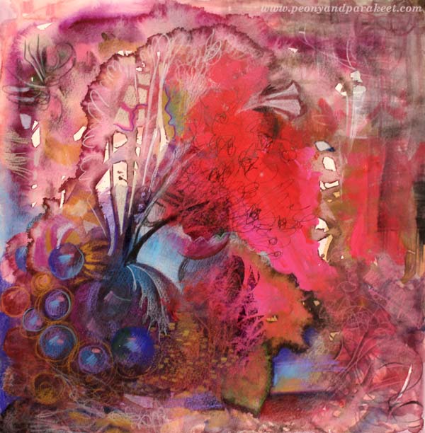
Then I switched to thinner brushes to finish the image.
I like the way the imaginative scenery, flowers, ornaments, and the table came all together into one image.
Coming Up: Liberated Artist Revisited
The Liberated Artist course is no longer available, but I got the idea to redo a small part of the course. In that, Päivi from 2015 will teach Päivi from 2024! I will follow the old instructions again, but like an experienced student, I also offer a bit of my current knowledge.
Here’s a sneak peek at the new mini-course called Liberated Artist Revisited.
Liberated Artist Revisited will be published within a few weeks, but it’s likely to be a limited edition – only available for a limited time – so stay tuned!
Enrich Your Art – Play with Shapes!
This week it’s time to get inspired by shapes and start playing with them!
My dear reader, I guess you follow my blog because you love colors. And yes, isn’t it wonderful to choose, for example, a colored pencil from among several different colors: “Should I pick pink or red, hmm?“
I have a degree in industrial design and maybe that has influenced me to think like this:
A color is a child. A form is a mother.
Colors take spurts freely on the paper while forms set limits. But you can play with form too!
See more about making this in this blog post!
There is no need to turn the mother into an old woman who only sees the reality.
The soul of any shape is abstract and yet, even a simple shape has an expression. It’s fun to draw random shapes and then carefully alter them.
See more about making this in this blog post!
Shapes form a design language that you can constantly enrich. Don’t just draw isolated geometric shapes, but combine them to get more interesting ones!
More about making this in this blog post!
When you have a shape on paper, give your full attention to it.
Art Play with Shapes
Talk to the shape! Interview it!
Don’t ask what she represents, but what kind of world she would like to create around herself.
See more about making this in this blog post!
Ask where she belongs, and what kind of shapes she would like to meet.
See more about making this in this blog post!
Shapes can take you to imaginative places where realistic and abstract meet. Once you have been traveling for some time, you will notice that the delicacy of art is in the form, and the color – the child – is there only as a spice.
See more about making this in this blog post! – See more pics on the Finnish Art Store Taiko!
Art play with shapes – What are your thoughts? Tell us in the comments!
How to Paint a Fantasy Horse Figurine
This week, we apply art to something different than usual. We use our skills to transform a Schleich horse or other plastic figurine into a fantasy animal.
I have a soft spot for plastic horse collectors, and I follow many of them on Instagram. One of the most inspiring accounts is Lightning Leoo (@lightningleoo). Leo has organized community challenges on Instagram and Discord. I have participated in them a couple of times. Like Leo, most of those who customize collectible miniatures aim to make the animal look more realistic. However, I want to be more playful with colors and ideas.
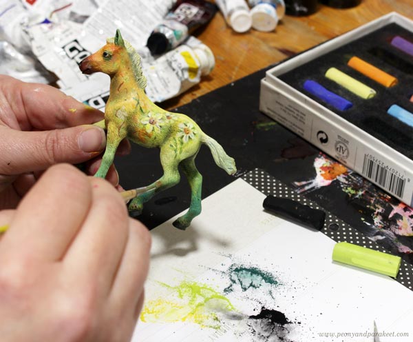
Step 1 – Choose a Theme and Paint the First Layer
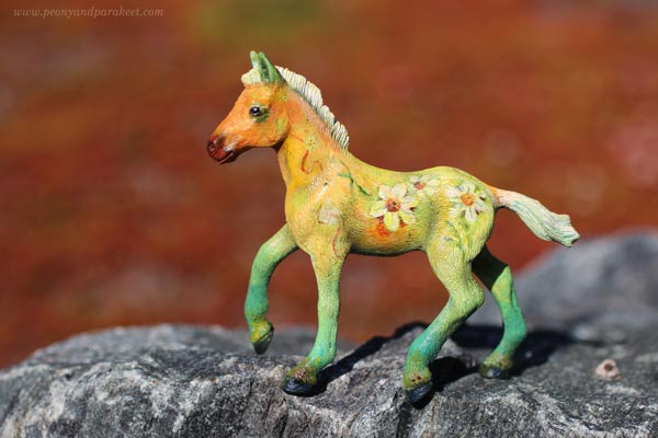
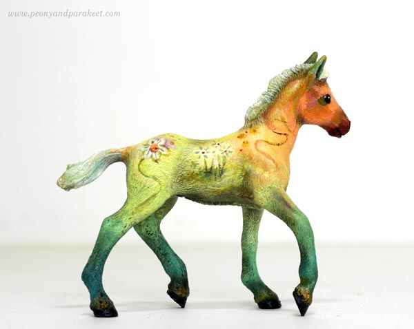
Start by choosing a theme that gives ideas for the coloring. The animal figurine here is a brown Schleich foal and my theme is daffodil. I used acrylic paints to make the legs green, the body yellow, the hoof orange-red, and the tail and the main white – just like the flower!
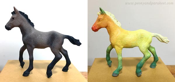
At this point, the animal doesn’t look nice at all, but that’s ok. The idea is just to cover the original paint and make a simple foundation for the decoration.
Step 2 – Add More Tones and Decorations
After covering the original color with the theme colors, mix more tones of those colors. For example, if you have used one green in the previous step, now mix more green tones – cooler and warmer, darker and lighter, brighter and more muted. Add slight variations of tones on the top of the first color layer so that what used to be one solid color has now a gradient of tones. This makes the color more natural. Note: you can use this technique in any art!
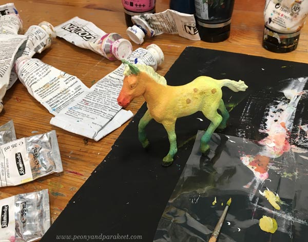
In this project, I created color mixes of all kinds of greens, oranges, yellows, and whites.
At this point, you can also start decorating the figurine and use these color mixes in decorations, eyes,You and other details.
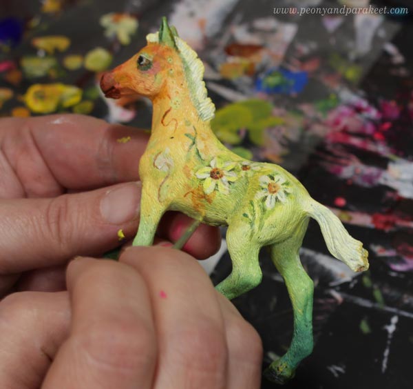
Get ideas for decorations from the theme! I painted small daffodils.
Step 3 – Optional – Add Shadows with Soft Pastels
Soft pastels make the figurine look more real and highlight the best parts. First, scrape them with a sharp blade to get color powder. Use a small brush to spread it where the shadows are, for example, where the leg meets the belly. You can also soften the color changes with pastels.
Attach the powder more permanently by spraying the fixative over it. Notice that after attaching the powder, you can continue with the finishing touches in acrylics!
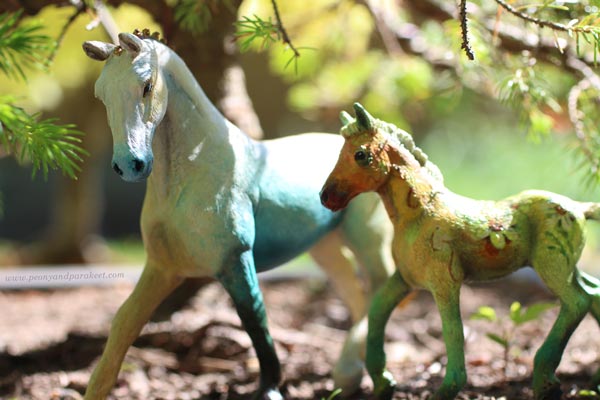
Step 4 – Take a Fantastic Photo!
We always should take a good photo of the finished work, but with a fantasy horse, it is very rewarding. Find a place where you can fool the eye about the scale and bend down to take a photo a bit upwards.
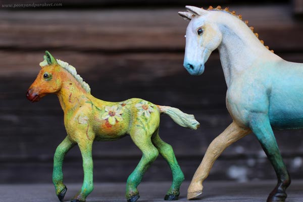
Another option is to make a gallery set up so that the background is white and the figurine is photographed like a piece of art.
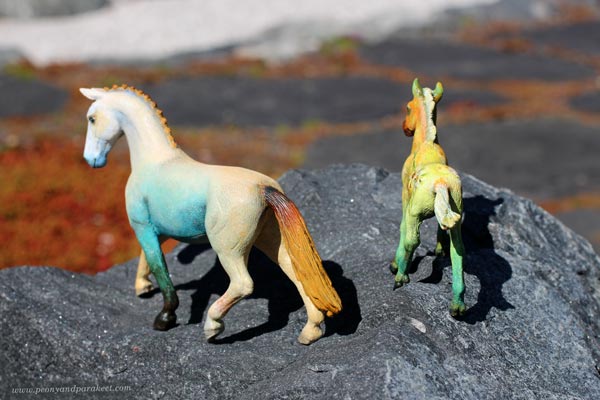
Another Example of a Fantasy Horse Repaint
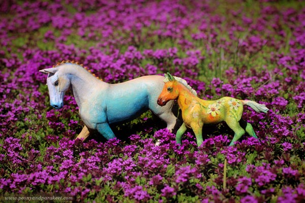
Here’s a Schleich horse that is bigger than the Daffodil fowl. My theme for this one was peach. The decorations are simple, but there are many tones and lovely gradients.
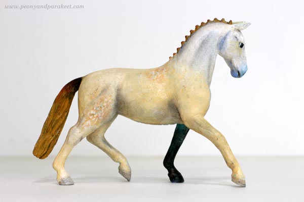
Making one foot in a different color adds drama and a bigger horse is easier to paint.
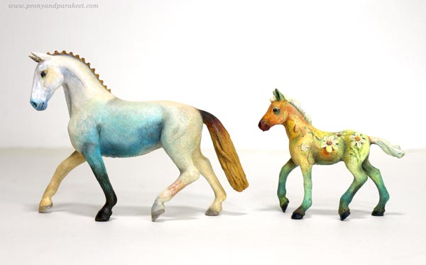
It was fun to photograph these two together!
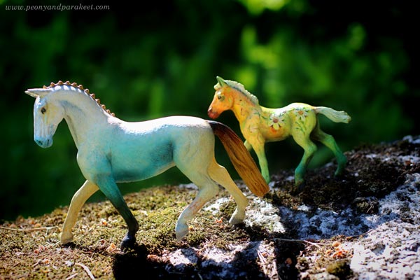
Natural light creates its own effects and makes the fantasy look real.
Horizontal lines in the background make the movement look more real.
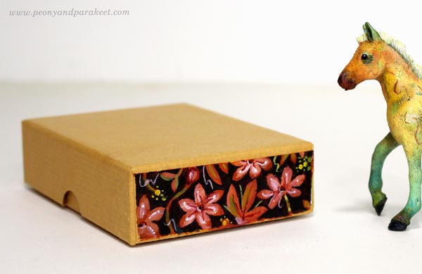
Gift Box for Fantasy Horse
These small fantasy horses are great for presents. I gave the fowl to my friend who owns not just a collection of plastic figurines but a real horse too. I found a sturdy box that I had got when ordering paint tubes.
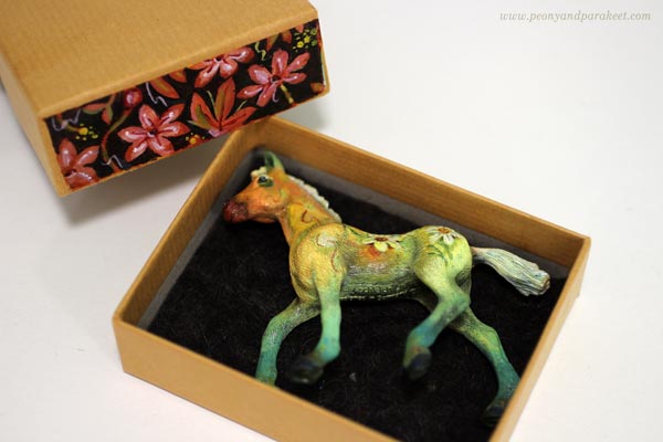
One side had writing on it, but I painted a floral decoration over it.
Creative Play as an Art Form
Playing has always been important to me. When I play, I get ideas that go beyond the ordinary and that combine different fields. In 2020, I even made a painting about the power of play called Steppe Wind.
In the course Magical Inkdom, we draw and decorate paper horses and other animals.
By playing we can enjoy the beauty and be comforted. It’s like we enter the same big hall of art but from a different door. Then when it’s time to get more serious, we have new energy and new power to overcome our fears.
That’s why I want to bring up topics like painting and photographing figurines in this blog.
What do you think?