Bringing Old-World Feel to Abstract Floral Painting
This week, let’s dive into the old-world feel and get inspired by the opera singer Edita Gruberová!
Ideas Behind the Painting
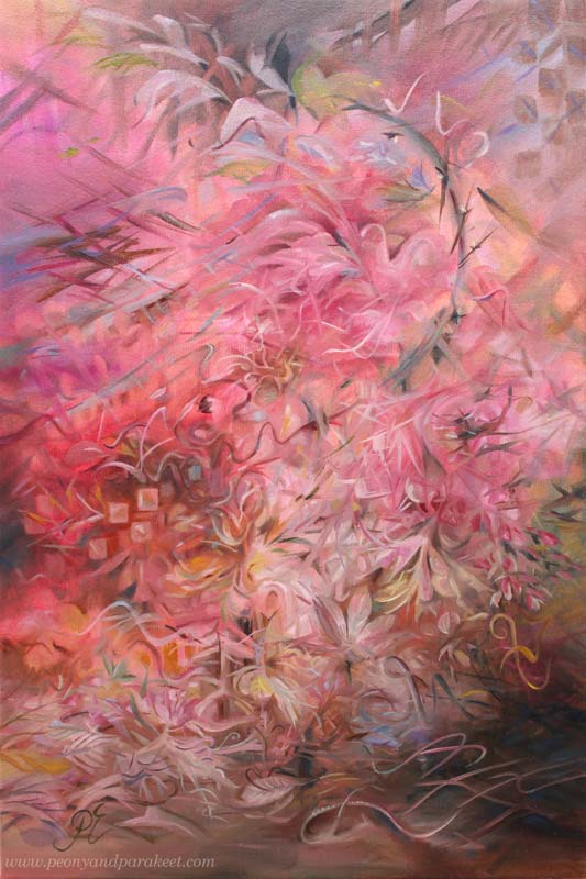
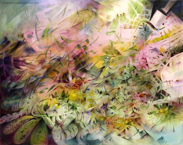
I listened to the opera singer Edita Gruberová (1946-2021) while working on this painting. Her version of the famous aria Queen of the Night from the opera Magic Flute is exquisite. Gruberová’s voice is partly like a bird’s not a human’s voice at all, and the aria brings that up well. The music editor Outi Paananen calls her a nightingale of Slovakia.
The transformation from a human to a bird felt inspiring. Maybe I could do a transformation of a painting so that my free and careless strokes would turn into decorative swirls, adding an old-world feel to an abstract floral painting. I had done something similar just recently but in a much smaller piece. See this blog post where I revamped a flower painting! From that experiment, I knew that it would take both time and patience. In a bigger piece, I could also get lost in the details so that the painting becomes confusing.
Before listening to Edita Gruberová, I already had a lot of ideas, collected in the blog post called Pink Inspiration. And now I wanted to add her and her birds to the painting too. I heard Edita’s story from Outi Paananen’s excellent radio program “Narrin aamulaulu” (in Finnish) on the Finnish Broadcasting Company. She had a clear artistic vision and strong willpower, and she demanded a lot of herself. It inspired me to challenge myself too.
Bringing Old-World Feel – 2 Tips!
In the past, painters often started with sketches and made detailed underpaintings with two or three colors. But a looser approach is not an enemy to the old-world feel.
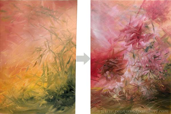
When you want to bring an old-world feel to an abstract painting, two things are the most important:
- Blurry on the bottom! Start from the background with soft transitions from light to dark, add blurry shapes, and paint like you would see the scenery from a far distance.
- Sharp on the top! Add sharp shapes and lines on the top of blurry ones. You can sharpen some blurry shapes but do it only partly, leaving some parts more undefined. But most importantly, let sharp lines and shapes sing the melody of their own. If the background is the orchestra, the top layer is the singer that has a melody of her own.
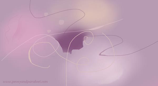
The thickness of the lines can change in places and there can be decorative dots too.
Timelessness Takes Time
It’s always tempting to get the piece finished quickly, but to get the sense of timelessness, the time has to stop while painting. So, I focused on tiny details and immersed myself in building a wondrous world with curves and swirls.
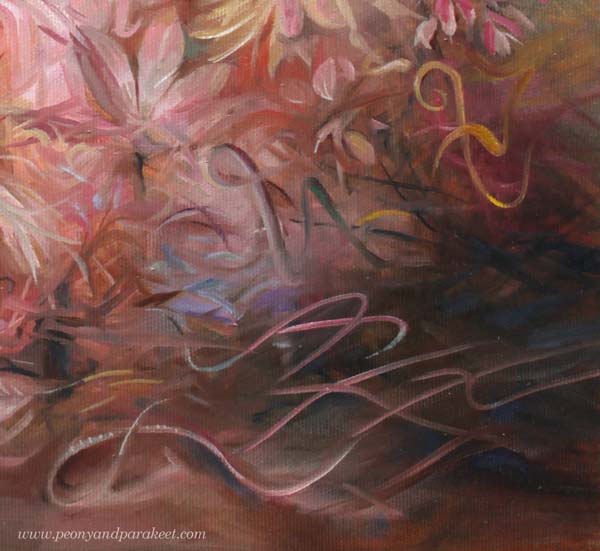
My lines are like old-fashioned handwriting in places. I have practiced them by drawing for a few years. Any note or waste paper can be used for practicing! I often doodled on planner pages.
Intuition and the Ability to (Not to!) See
As usual, I didn’t use any direct reference photos for the painting but worked intuitively. However, I tried to reduce the human ability to see ordinary concrete objects like flowers, faces, or such in simple forms. For a long time, I have thought that the ability to see is a part of creativity. But the more I create, the less I need the ability, at least in the first place. Seeing too soon makes me hurry and my art much less unique. So I try to let the shapes fly free and the big picture appear without too much forcing and seeing.

During the process, a little bird-like mesh appeared on the right. When I was making the final touches, and intentionally made him a partner in the center.

Sadly, Edita died last year, just before I discovered her, so I can’t send her a photo. But I want to honor her with this blog post and ask you to listen to her singing on Youtube. Isn’t that inspiring!
A Series in Progress
I have been painting like mad this month because I have to get everything finished for my solo show in June very soon. So, there are lots of paintings in progress in the studio!
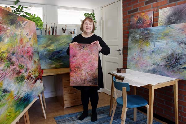
Easter was mostly spent with brushes, and if this wasn’t my ultimate passion, I would be quite exhausted already! Also, seeing the flow of wonderful creations from the students in my community Bloom and Fly energizes me a lot.
Let’s keep creating and inspiring each other!
How to Freely Express Sunshine
This week is about the sun! Let’s dive deeper into how to express sunshine when you want to create freely without reference photos. My example is an oil painting, but you can apply the tips to any supplies.
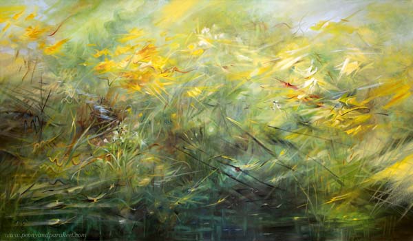
Here’s my newest painting that begins the new series where I explore the stars and planets of the Milky Way. The subject of the first one is, of course, the sun! I named the painting “Runaway Sun” – “Karannut aurinko” in Finnish because I wanted to express sunshine in a dynamic way.
Closed or Open?
Often we paint or draw the sun as a static yellow spot in the blue sky, but I feel that the sun is different. It’s not a closed circle but a very open one. It’s radiating and moving, making things appear and disappear.
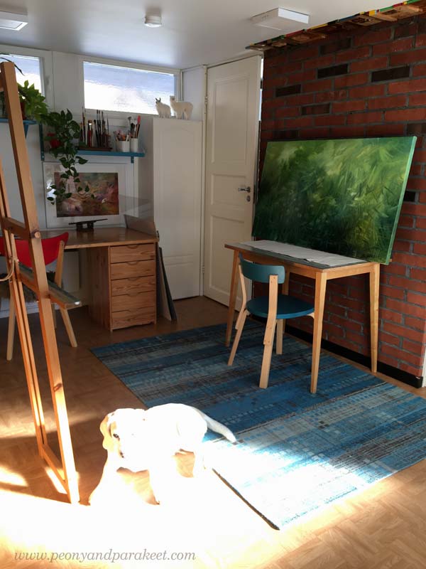
The painting was only a green mess when I took the picture above. “Oh no, the photo of Stella failed badly!” I thought when looking at it. But then, bad photos are the best. They challenge us to see what the world really looks like. Here, the sun has swallowed Stella and entered the room like a giant animal, so it’s not a little closed spot at all.
Isolated or Impactful?
The sun is the star, and the earth belongs to its solar system. The earth could be seen as a toy and the sun as the one who plays the game.
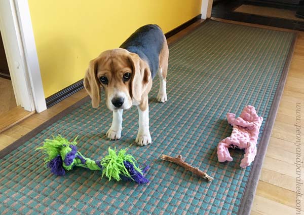
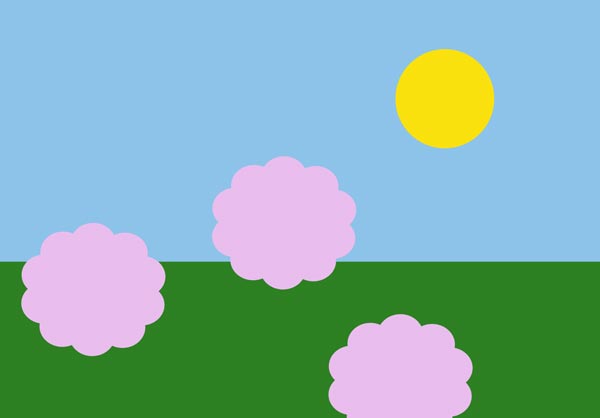
But in our art, the sun often has very little effect on its surroundings. We isolate the sun and keep it far away. For example like this:
But the sun impacts everything. It travels in the scenery like a runaway that goes here and there, but it’s impossible to catch as a single being.
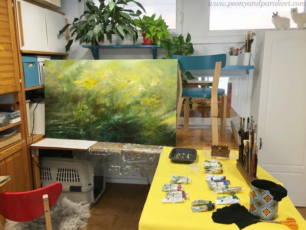
When my painting progressed, it got strong differences between light and darkness. The sunny look requires shadows too!
Is the Sun a Thing or a Person?
Art is only a technical skill as long as you think about drawing or painting things. But if you treat the elements as living beings of some kind, the game changes. When your paper or canvas is filled with people or animals, not just shapes or flowers, everything gets more exciting and it’s easier to express sunshine too.
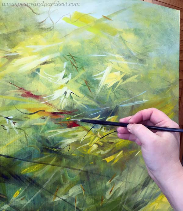
So, ask: Who is this person called Sun? How does she impact everybody in this piece?
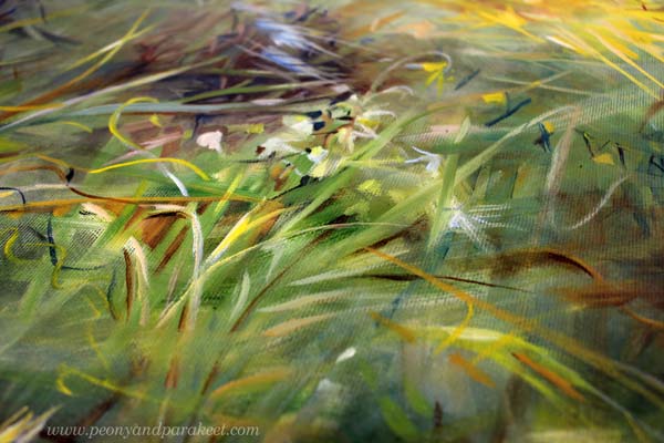
Some will love it, and some will escape from it.
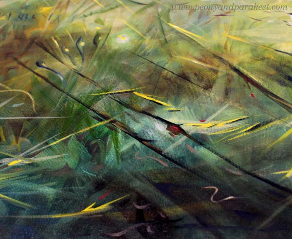
Yellow or White Sunshine?
Some people get any yellow for the sun, and some select their yellow carefully. But I think that one yellow is never enough, and without white, the sun doesn’t shine.
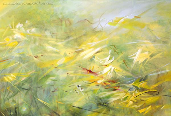
I usually work with a limited set of colors, but I change the tubes every session. So, if I use Indian Yellow in one session, for example, I switch to Lemon Yellow in the next. I do the same for other colors as well. When I create new color mixes from different base colors, my paintings will get a huge variety of tones and look more natural.
I try to always mix some color to most whites so that the variety of pastel tones is present too.
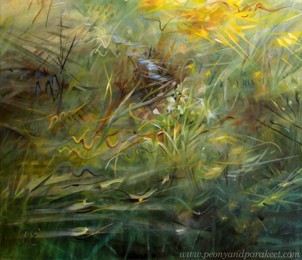
I also add color to blacks or make my own blacks. Browns and blues make wonderful darks!
Does It Express Sunshine? Test!
I like to do a test for all my paintings where I lay them on the table, walk away from the room, and then get back.
I wrote about the test in this blog post too.
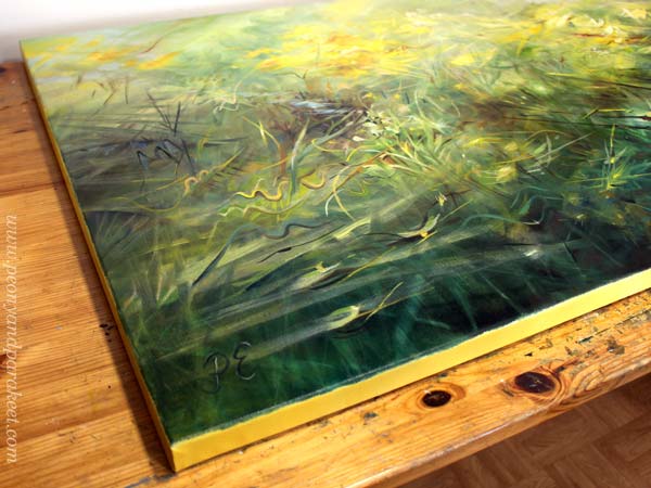
By resetting my mind, I try to get an immediate impact of how the painting affects the surroundings and whether it’s captivating enough. The sunny painting should draw attention and warm the room.
Here’s my little studio one night with other paintings that are still in progress.
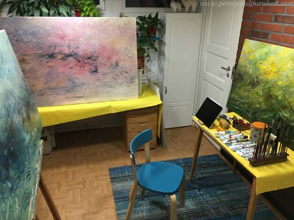
The paintings are too big for my little studio, but I have decided to manage!
Sunshine to Your Weekend!
I hope this post inspired you to bring more sunshine to your art!
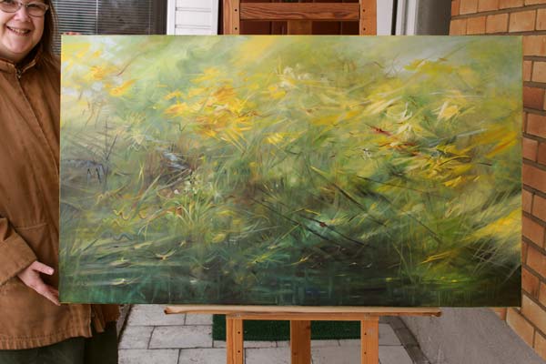
Happy Easter!
Pink Inspiration
This week is full of pink art inspiration. I hope that this post will get you to find your pinks and start creating sweetness!
Dreamy Pinks in Colored Pencils
First, one of the journal spreads that we will create at Fun Botanicum, the newest class.
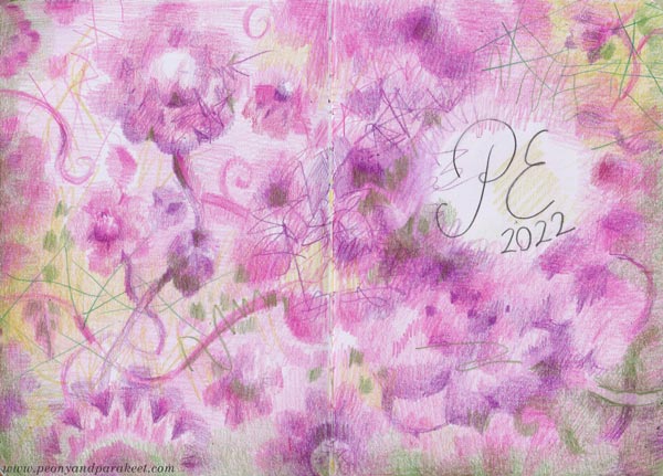
The softness that you can create with colored pencils is divine and you can highlight that with sharp strokes. The versatility of colored pencils always amazes me. With one pencil you can create the whole value range from light to dark so a few pencils go a long way. I like those shelves of individual pencils in art supply stores because it’s like picking candies!
Pink Handdrawn Playing Cards
These cards are from the class Magical Inkdom. They are drawn with a black pen and then colored with watercolors.
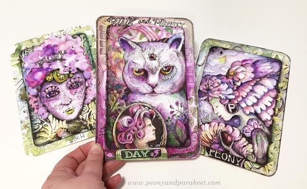
My husband asked when he saw me drawing these:
– “Playing cards? What’s the game?”
– Well, these are like collector’s items! And you can invent the game yourself!
Because if you make more than one, isn’t that like a little oracle deck? You can ask yourself how you feel by picking a card that reflects your mood.
Lots of Pink Petals
I am already waiting for summer and see my pink peonies bloom in June. If I was a small fairy, I could live in those petals!
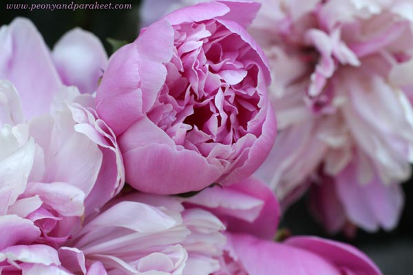
Petals, petals, more pink petals – that’s how the flowers are constructed! These are from the class Decodashery.
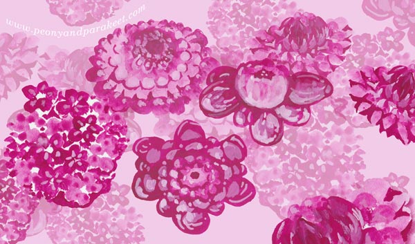
Pick a small brush, some pink gouache paints or watercolors, and paint small spots in layers!
Red and Green are Pink’s Best Pals
Here’s more pink gouache art – a small journal cover that also has reds and greens.
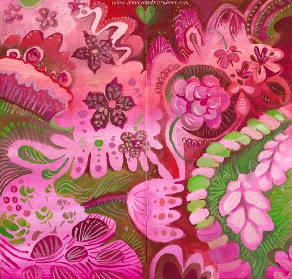
I love this color combination. Each color makes the other shine brighter. I can almost taste the colors when I look at them.
Pink Glow in the Dark
Pink is also a wonderful color with darks. You can paint a pink glow that makes the image look romantic.
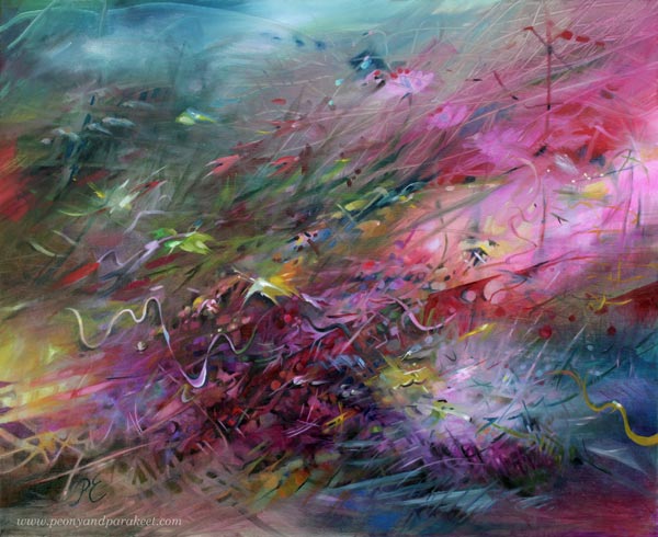
Here’s a blog post where you can see process pictures of this painting.
Powder Pink Inspiration
One night my husband showed me new Swatch watches. I wasn’t so interested at first, but when I saw the photos and got the concept, I got so inspired that I am using that inspiration for the new series of oil paintings!
Here’s the new pink Swatch called Mission to Venus. I am definitely going to somehow incorporate all this into a painting! Not literally, but conceptually.
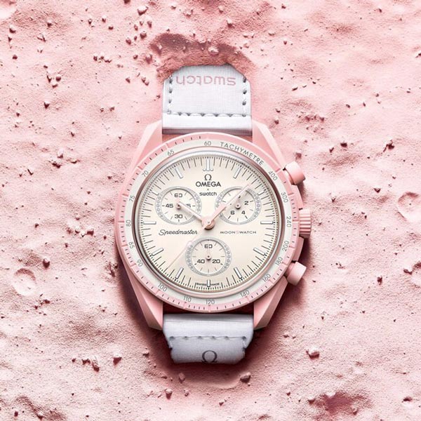
The powder pink with decorative details speaks of a beautiful adventure to me.
This watercolor painting has powder pinks too.
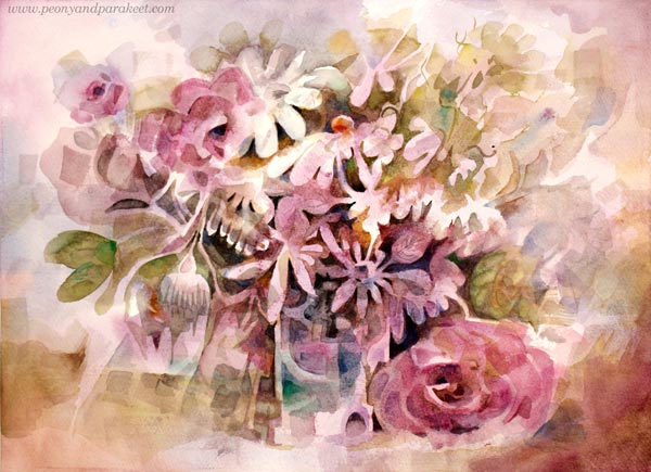
I painted this one a few years ago when my mission was to find the best way to paint flowers freely in watercolors without using a reference. I have a class about it too Floral Fantasies – Watercolor Edition!
Pinks and Other Pastels
What about selecting some acrylic paints and going wild on an art journal?
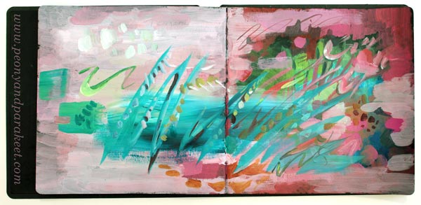
Add darks on the bottom and let dry. Then mix white to the colors and have fun with pastels. Use different brushes to have some variety in strokes as well.
You can be rough like above, or go in a more delicate direction with thinner brushes.
Black with pink is also a great color combination!
Pink Inspiration – How to Go Deeper
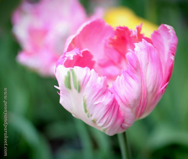
If you are a color-oriented artist as I am, pink is never just one pink. Challenge yourself to make all kinds of pinks from light to dark, from warm to cool, and use them all in one painting. Nature doesn’t select just one pink, so why would you?
The same goes for shapes, lines, and ideas. The more you embrace the variety, the more exciting the art-making becomes, and the more you create. Restrict supplies and increase imagination!
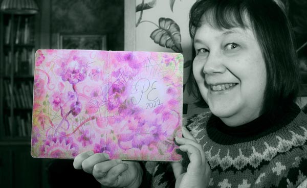
I hope you have an adventurous Pink Inspiration Day!
P.S. You can still sign up for Fun Botanicum and make wonderful colorings of plants!
Creating Hope – Artist’s Mission
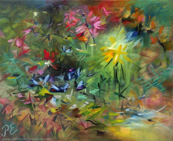
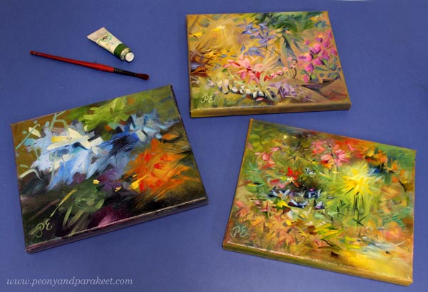
This week, I show three small paintings and talk about my mission of creating hope.
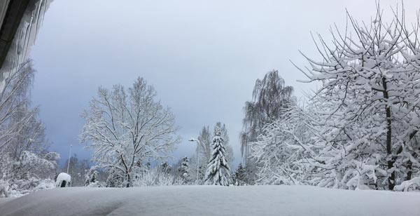
Even if we have had some winter wonderland sceneries recently, the weather hasn’t been so great in Finland – icy roads, rain, darkness … And now, the horrendous news came about the war in Ukraine.
But this post is not about war, but the opposite. Namely, a long time ago, I realized that my word is “hope”. Here’s the story:
I visited a hospital to see my old ant, and another old woman grabbed my hand. She wanted me to say something that would take her pain away.
I still remember her desperate eyes begging for consolation.
We discussed shortly but then I ended the conversation by saying that I am quite young and I don’t have all the wisdom. She nodded, turning off the glimpse of hope she had got when I entered the room. At that moment, I knew that I wanted to do more of that hope thing, but how.
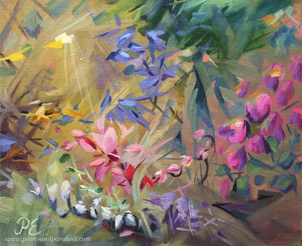
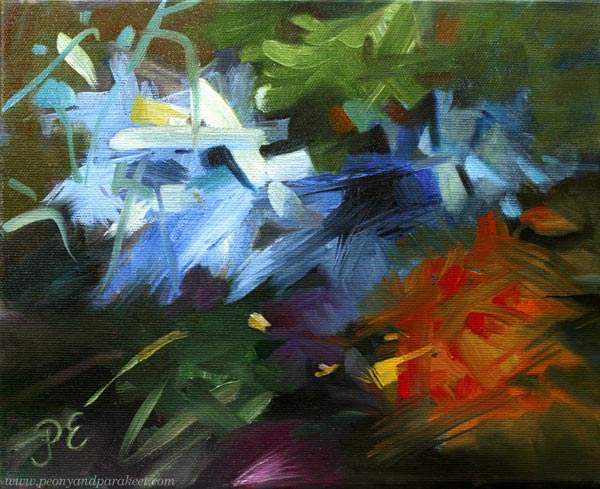
Nowadays, I try to transfer hope to every painting, and to every class as well. Yesterday I dug out small canvases that looked quite hopeless. I had started them last year and used leftover paint from bigger paintings. Then they had looked just ugly paintings that might not ever get finished. But now, all they missed was some hope!
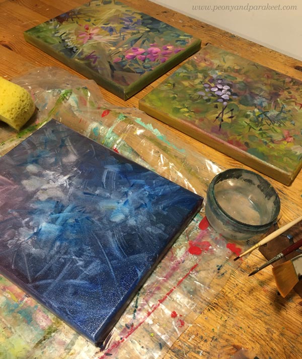
So I painted hope: saturated colors over muted ones, light glow over heavy shapes, rising wings on the top of descending petals – signs of life.
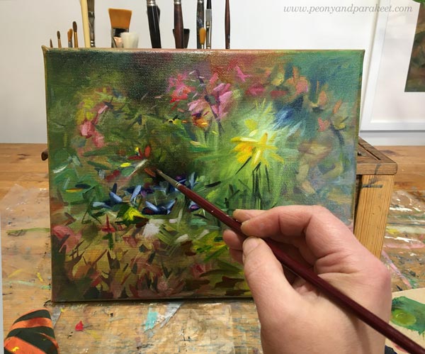
I wanted to remove the harshness and replace it with gentleness.
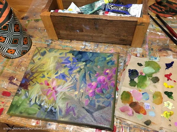
I also added the much-needed drop of utopia as well.
After leaving the hospital, I cursed myself for not giving the old woman what I called false hope. But now I think that the correct word is fantasy.
We all need fantasy to keep going.
Fantasy didn’t come to my young engineer’s mind, and it would have required the kind of bravery I didn’t have. But now, when I paint, I can do brave too.
The qualities that don’t seem to be a part of me, can still exist in my art.
It gives me hope as a human.
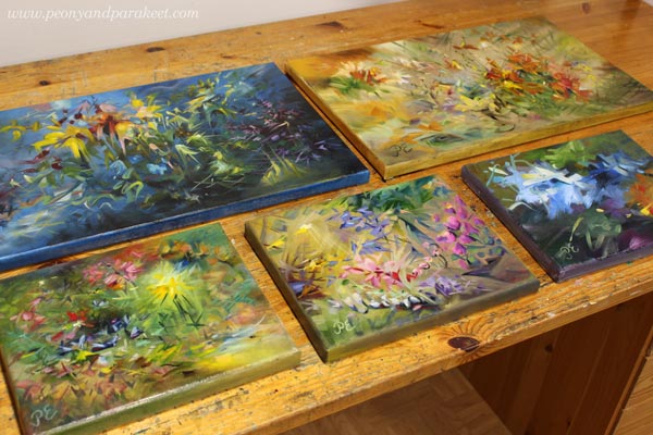
Whether I use oils and canvases or colored pencils in a journal, all I create is hope. A gift that was initiated by a stranger in a hospital bed.
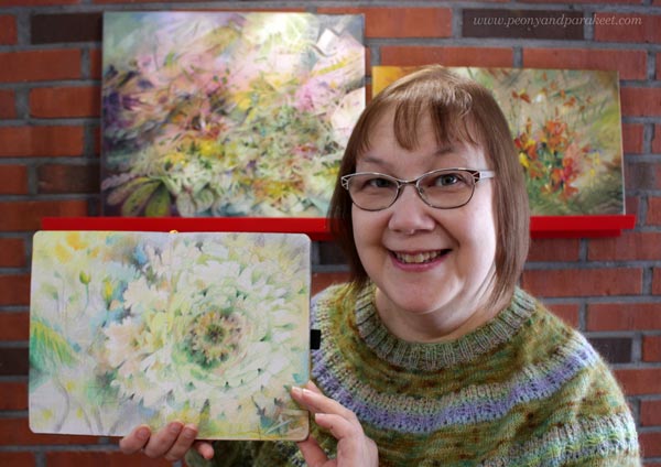
I am looking for March when the new class will begin!