Art On the Wall – Displaying Canvas Paintings
Our home is full of art. Almost all my canvas paintings are displayed on the walls. The arrangements change when old ones are sold and new ones are born. In this blog post, I show some of the paintings and how they are displayed at the moment.
When using stretched canvases, framing is not necessary. I hope this inspires you to create some canvas art. Check out my acrylic painting course Floral Freedom and see more of my paintings at paivieerola.com/gallery!
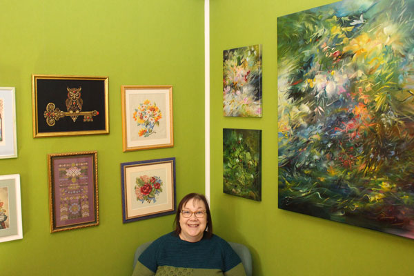
In the Gallery Corner
Our library room is on the darker side of our house, but I think that the lack of daylight and a heavy atmosphere goes well with the books and nostalgic-style paintings.
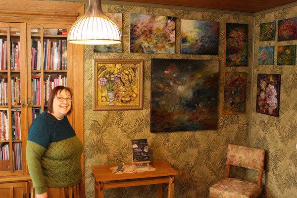
Displaying different sizes of canvas paintings on the same wall looks great but needs planning. I made a plan in Photoshop first, and then we hung them all at once.
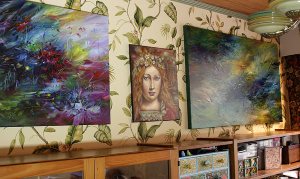
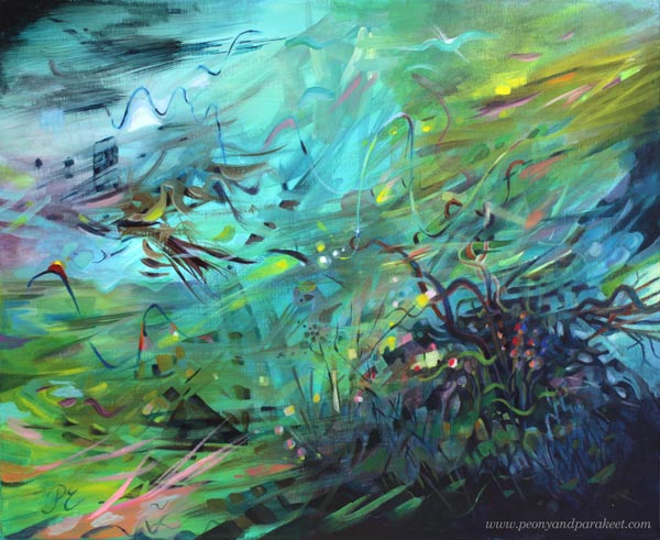
Above the Aquarium
People often say that all my canvas paintings express the underwater world. That hasn’t been intentional because I am actually afraid of deep waters. But my husband has had aquariums for decades, and they must have affected my art.
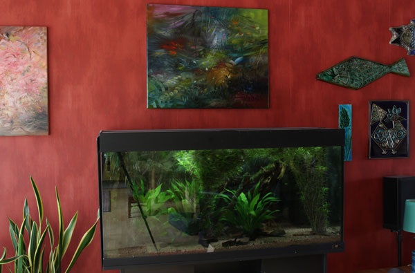
The painting continues the aquarium view. And it was not planned at all!
Best Lit
Our dining area has special lighting for a big painting – LED strips in two directions that have adjustable color and intensity.
The colors of any painting are highly affected by the amount and color of light.
When I Wake Up
The bedroom is our darkest room, but every morning when I wake up, I look at the wall that is filled with my paintings.
There is also a collection of my cross-stitch projects. Stitching is just a hobby but I like the combination.
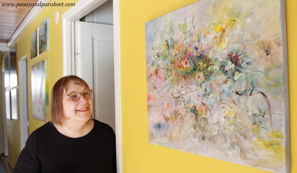
In the Hallway Gallery
I love our yellow hallway and how the color unifies a mixed collection of paintings. Displaying canvas paintings can be this easy!
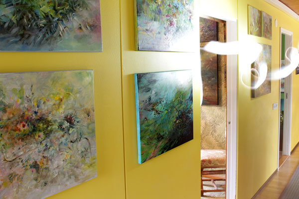
This narrow hallway was super boring before we painted it and added art on the walls.
Entrance Art
Our house has a space right after the entrance where I often change a painting to one that feels current. I also decorate the top of the sideboard cabinet that’s under the painting. Now it’s time for some darker art.
Happy Halloween!
Painting a Childhood Dream
A childhood dream came true when I finally made a painting with my favorite subject.
I’ve always wanted to paint mammalians, but reaching this point has taken a long time. The best must be protected before it comes out exactly as it is meant to be!
“Predators, Right?”

In July, I picked a brush, and said to myself: “Predators, right?”
As a child, my friends talked mostly about horses, but I was a lion girl. I drew a lot of lions and antelopes: predators and prey. I had learned from nature books that the world works that way.
When I went to school, my parents bought a black and white television. Back then, my favorite profession was lion tamer. I wanted to be the new Joy Adamson!
“Paint What You Want!”
It is easy for a child to draw what she wants, but an adult is more critical.
After seeing life and understanding all its complexity, prey and predator are no longer separate, but part of a whole.
And to get hold of the whole, we have to get in touch with our inner self and grow our skills.
Art is like a meadow that grows seed by seed.
Love and sunshine are needed!
I try to speak softly to myself when I paint. Like it would be a child who paints, not an adult. I hope this friendliness also comes through in my classes!
Your Childhood Dream?
Painting big and detailed takes not only friendly self-talk but also patience. That’s why I like to practice with smaller drawings.
Big or small – we are on this journey together!
What was your childhood dream? What subjects did you draw as a child?
Four Art Mediums – Four Projects in Progress
Many Mediums – Many Versions of Style
I am not overly excited about the word “focus.” I have one artistic vision, but I don’t limit art mediums much. I think my style is evident in whatever I do. This year I have allowed myself to stretch even further than before, and embrace the challenges that different art mediums bring to me.
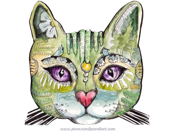
Cross Stitching – A Cat in Progress
Do you remember this cat from the course Magical Inkdom? In April, I asked what drawing should be my next cross-stitch design, and you voted for the cat.
I have now made a design based on the drawing. To make sure that there are no errors in the chart, I have been stitching it myself first, going through every detail. The stitched piece is nearly finished as you can see in the picture!
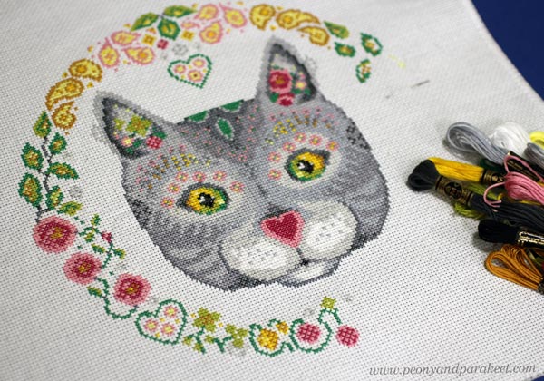
While stitching, I came up with the idea of including different colored versions of the cat to the final instructions. Maybe a black cat at least. What do you think?
I hope to get the chart for sale before December. This is a project I have been working on in the evenings.
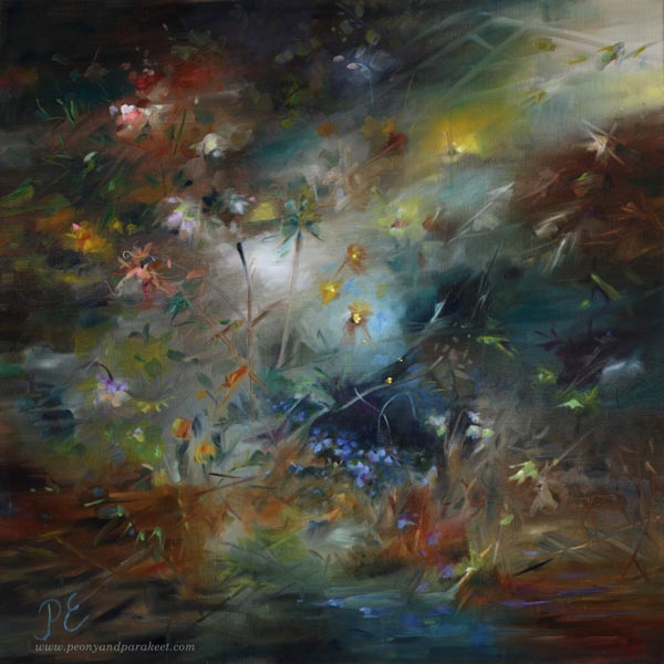
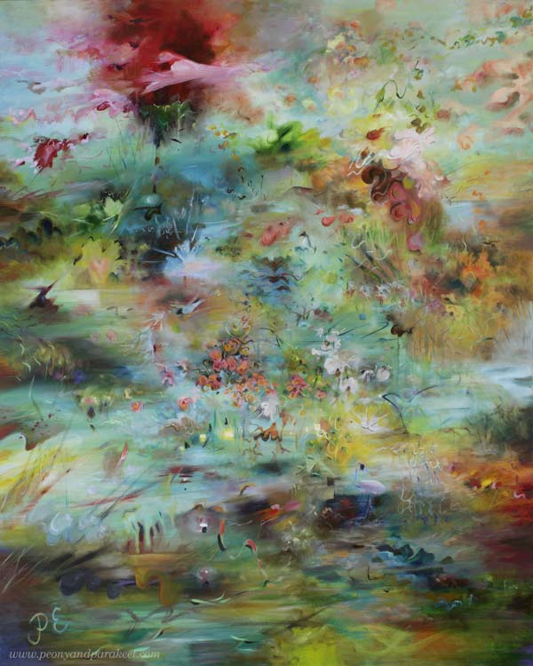
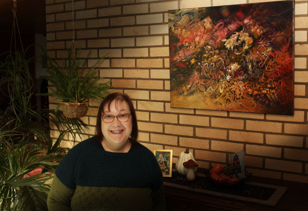
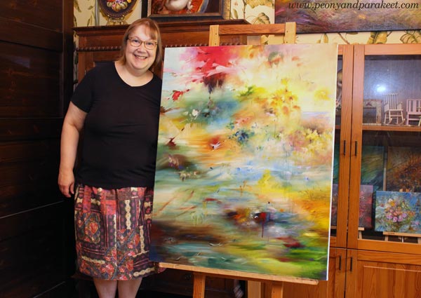
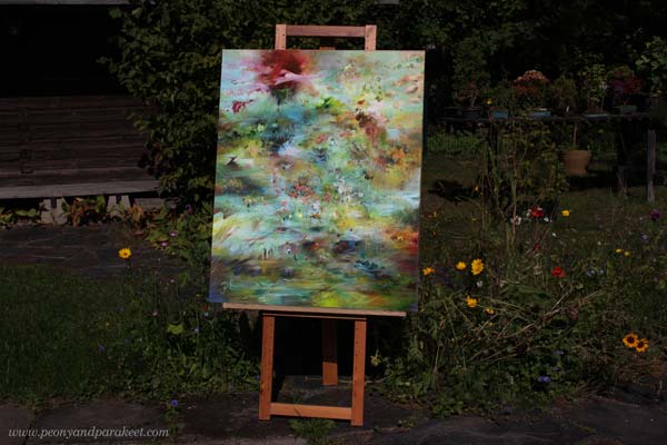
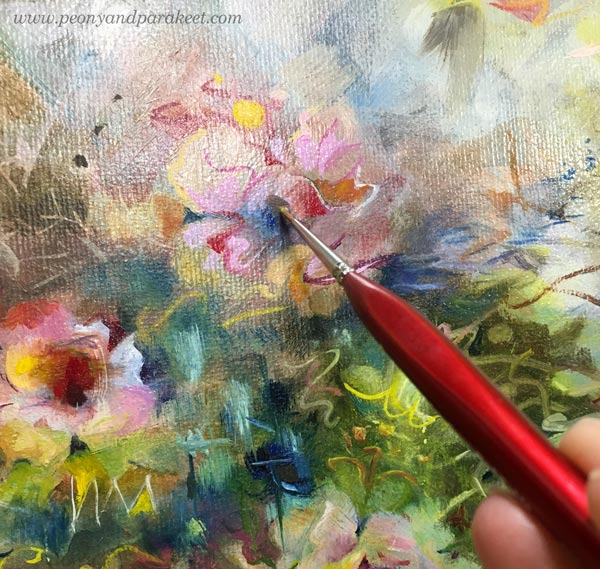
Oil Painting – A Big Painting in Progress
My main medium – oils – were on a break for a few months so it was really nice to get a new painting started in July.
I work slowly from one layer to another, letting the painting dry between the sessions. Here’s where I am now.
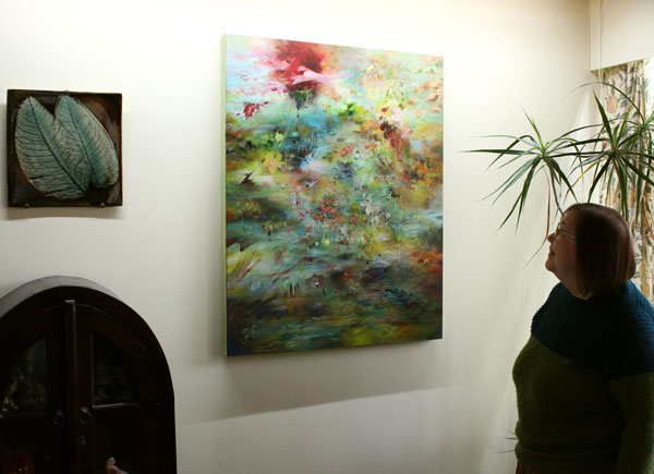
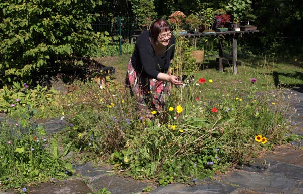
In the photo above, I am wearing a patchwork skirt sewed from the fabrics that I designed many years ago. The motifs are based on my drawings and knits.
I have still quite a lot of work to do with the painting. I hope to get it finished in October.
Digital Art – A Virtual Artwork in Progress
Transferring my painting style to digital three-dimensional modelshas been a year-long project. Watch this video to see what I made last spring for the project. The project is now coming to an end in September. I still have some things to adjust and add, but most of the things have been done.
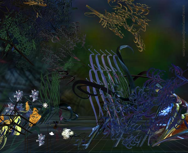
Sadly, the photos are nowhere near the overall experience that can be watched with VR glasses.
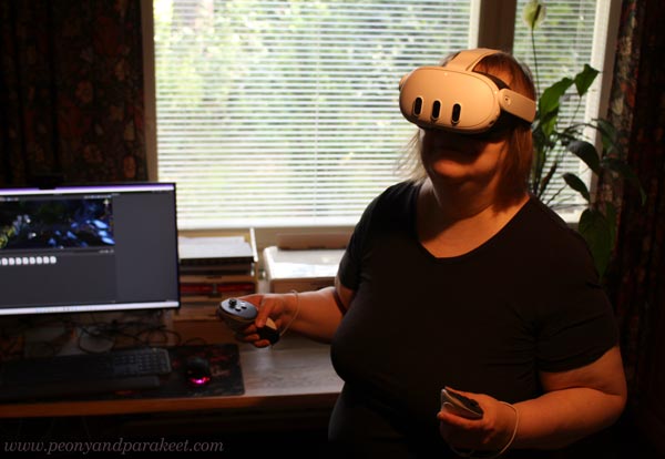
There’s a lot of movement. but also interaction: a user can move around, open a flower, create new objects etc.

Still images are not the same as seeing everything in moving 3D, but at least you get a glimpse of the atmosphere. I will make a separate video in September where I will share more of this project.
Watercolor Pencils – A New Course in Progress!

I am super-excited to announce that a new course will begin in September 16, and the registration will open next week! The course is called Joyful Coloring, and it’s about using watercolor pencils for colorful happy art.

More about the course next week. I hope you will join!
Using White as a Color in Painting and Drawing
In this post, we explore the color white and find ideas on how we could change the way we use it in art-making.
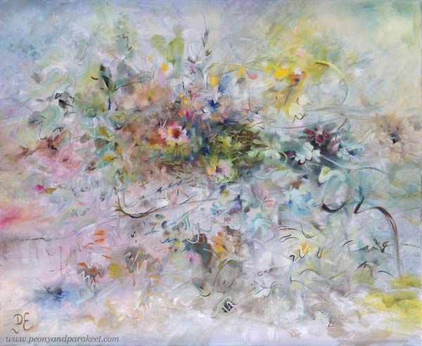
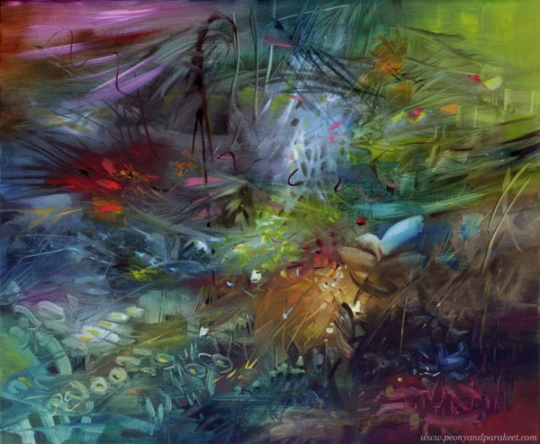
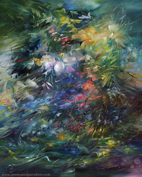
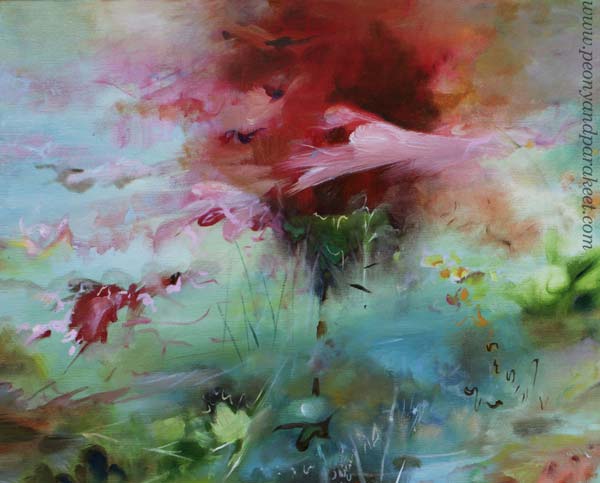
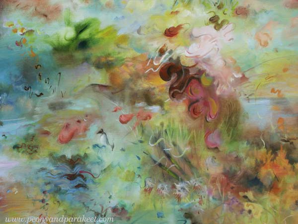
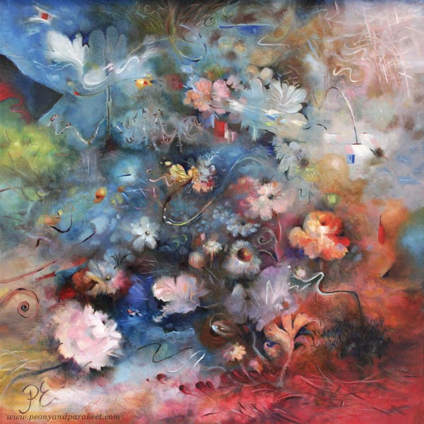
I posted this painting about a month ago, but I still had to fix it! You might not notice the difference, but it matters to me. I have changed the center of the painting so that it is more abstract.
A long time ago I thought that it doesn’t matter if I don’t like some detail of my work or if I don’t like some of my work in general. I thought there would always be someone who would like it.
But the longer I’ve been painting, the more important it has become that I have to be a fan of my own work. When you are a beginner, quantity is more important than quality. But I’ve been working for a long time and the equation has thus turned the other way.
I know some would prefer the more realistic flowers, but I don’t! I have too much reality around me, especially now when the weather has been too cold to be spring.
Living in a White Country
This painting is also special because it has so much color that is difficult for me – white! There is far too much white here in Finland. Even if now is the end of April, we got a lot of snow a couple of days ago!
I think white is a terrible color because it is full of emptiness.
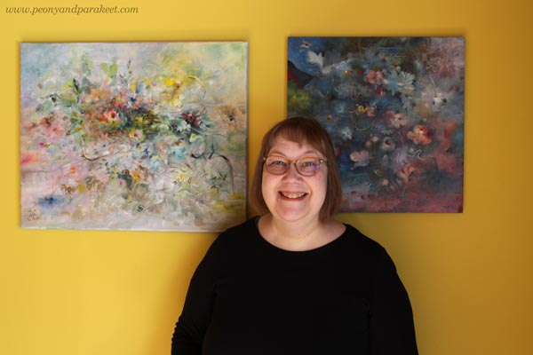
Finnish people usually have white walls and white furniture, but our home is full of colors. I love to display my paintings on this yellow wall.
Not One White But Many Whites
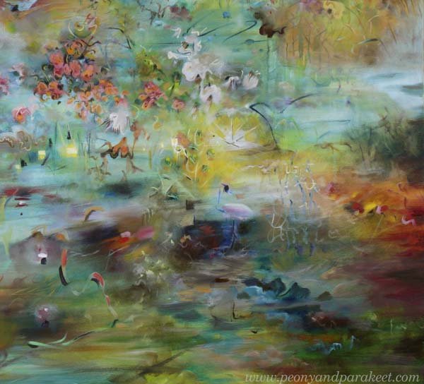
In the recent painting, I wanted to play with pastels and show the side of white that is often not talked about.
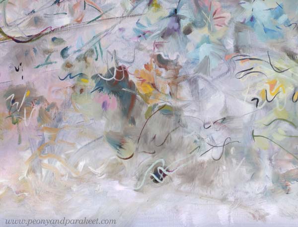
For an artist, there is not just one white. There is a warm white that holds the promise of the sun. There is a purple-toned white that falls in love when it sees a deep cold red. There is a white that allures you with a hint of sweet mint. So, many whites, not just one Finnish white!
It’s exciting to mix various whites and then see how the pastel colors slowly begin to appear. You need a lot of white and just a little bit of color to get the toned whites and pale pastels.
Titanium or Zinc White?
The most common white in paint tubes are Titanium White and Zinc White. In oils, you have to be careful with zinc white because it can cause crackles. I mostly use only Titanium White. I would love to use Zinc White because it’s more transparent. In this painting, I have tried my best to bring the soft transparent effects mostly with Titanium White, but it’s not easy!
In acrylics and gouache paints, you can use Zinc White more freely.
When White is Not Needed
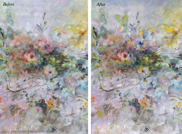
Beginners think that adding white on top can fix everything. Ten years ago, I was madly doodling with a white gel pen. What went wrong, got covered with white circles. But white also can make the piece busy and destroy depth. Here’s a quick example of the small collage piece that I made in 2014 (here’s the old blog post with the video too). The first is the old piece and the second is a photoshopped version showing how I would fix it now.
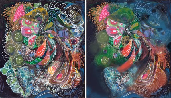
When I tone down the white, the image gets clearer and the depth grows. The highlights in the central parts get more attention and it’s easier to know where to look. I wish someone would have pointed this out to me back then. It took a lot of time to realize this!
If White Were a Person …
I am pretty sure that if White were a person she would say: “I have much more potential than you think. Stop seeing me as a blank background or a quick fix to a piece that lacks contrasts!”
What’s your relationship with White?