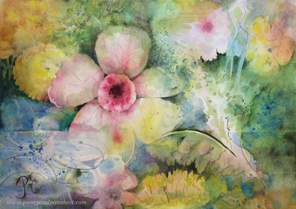
Gentle Morning – Expression Through Watercolor
This week, I share a watercolor painting that has more expression than correct botanical details.
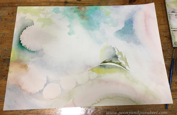
I created a sweet, luminous atmosphere for this delicate flower painting, where the water appears soft, refreshing, and nurturing.
>> See more pics on the Taiko online art store
The gentle water and morning light express new beginnings that are filled with hope.
Life sometimes gives us gentle mornings – wonderful new beginnings. The mere thought of them lifts the spirit.
I feel that the delicacy of watercolors enables us to express in such a lightness that it deeply touches the soul. Real flowers also have a similar kind of comforting lightness.
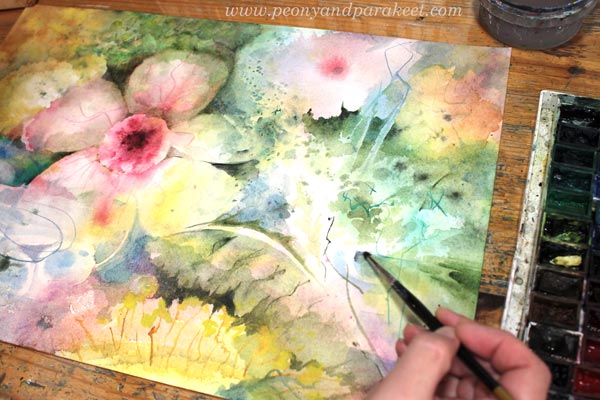
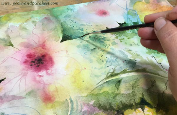
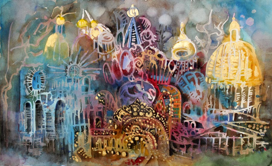
I love to add tiny details and surface patterning on my watercolor pieces.
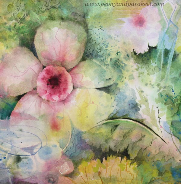
I am not a flower painter in the traditional sense. My flowers can tell stories.
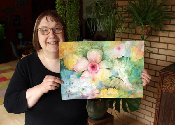
You can express anything with flowers when painting freely. It inspires me so much! For example, when I see a color scheme that I really like, I think: “That could make a great flower painting!” Currently, I am thinking about Gothic-style flowers and dark colors.
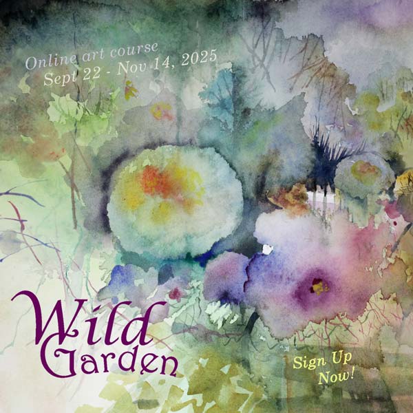
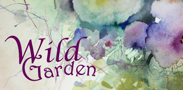
Wild Garden – Paint with Me!
In the upcoming course Wild Garden we will paint flowers freely, intuitively, and expressively in watercolor. Watch the video and sign up now!
Wild Garden will begin on September 22, 2025. The early-bird sale will end on August 24 (at midnight PDT). Sign up here!
Wild Garden – The Early-Bird Sale Begins Now!
Exciting news! The early-bird registration for the new watercolor course Wild Garden is now open!
Watch the video and sign up now!
Wild Garden will begin on September 22, 2025. The early-bird sale will end on August 24 (at midnight PDT). Sign up here!
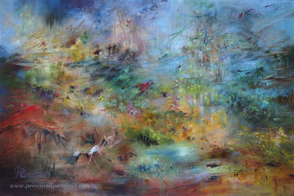
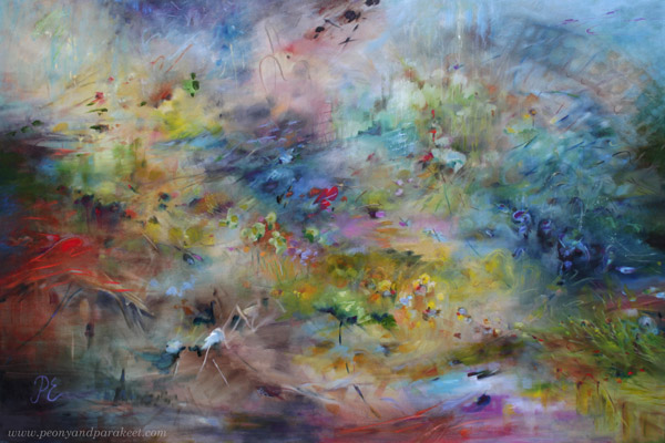
Painting Seascapes – Making The Scenery Look Bigger
This week, we dive deeper into painting seascapes and other big sceneries. In spring, I thought my painting Atlantis was already finished, but after seeing the ship paintings in the Rijksmuseum in Amsterdam in May, I realized that I had made my seascape painting too simple and small-scale, and went back to working on it. Now it’s finished!
Painting a Bigger Sea
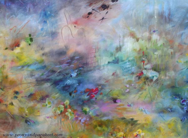
Despite the size of the canvas, you can make the seascape or any scenery look larger by adjusting the composition and the size of the brushstrokes. Compare the finished version with the one below!
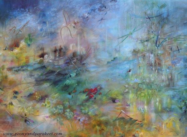
When you want to make a seascape look bigger, add tiny strokes, especially near the horizon, and adjust both left and right edges so that it looks like the seascape continues outside the painting.
The changes may look small when you look at the small photos, but in reality, they make a big difference. Here’s a close-up photo of before and after.
There are so many details that it was easier to make a short video instead of sharing more pics.
Seascapes don’t have to be boring and all blue. They can include all kinds of events and creatures, even buildings like in my painting.
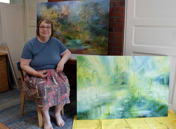
A Series of Big Sceneries in Progress
It’s been a hot July in Finland, and my little studio is really warm in the afternoon. But I have big canvases in a queue, and the next one is already in progress.
New Course Is Coming Up!
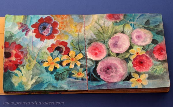
Painting seascapes and other sceneries is exciting, but as you know, I also love flowers. I will be running a new watercolor course called Wild Garden from 22nd September to 14th November. Here’s a small teaser pic …
The early-bird sale of Wild Garden will start next week, so stay tuned!
Art Supplies I Should Not Use Anymore
When I look at my art supplies, there are many that just take up space and don’t bring me joy anymore. Recently, I have tried to use them up, but one crayon, for example, can last a long time. Maybe I should just stop using them and give them away?
This blog post is a little inventory of what art supplies don’t bring me joy anymore.
Arteza Gouache Paints
Arteza sent a big set of their gouache paints to me in 2019, and I made a blog post with a video about them.
>> Intuitive Painting in 60 Colors of Arteza Gouache Set

I prefer Schminke Horadam gouache paints, because they are much better quality.
In general, I like watercolors more than gouache paints because they are livelier and more transparent. In the course Decodashery, I have used both gouache and watercolors.

Gouache is great for decorative-style painting, so I will keep my few Schminke paints, but I should give the Arteza gouache paints away.
Derwent Artbars

I have a love-hate relationship with these crayons. I have used them quite a lot, especially with water. But always when I look at the finished piece, I think that it would have looked so much better if I had used watercolors instead. For example, this recent art journal page would have been quicker to create and much more delicate with watercolors.
On the other hand, I really like many sketchbook pieces from 2017, like the one below.

In this blog post from December 2017, I share many projects where I have used Derwent Artbars.
I bought the Artbars somewhere around 2014, and even if I have tried to use them now and then, they may live longer than I do. I think I should either toss them or give them away. Watercolors easily replace them.
Faber-Castell Gelatos
I often wonder: “What did I think to achieve when I purchased these?”

I bought Faber-Castell Gelatos around the same time as Derwent Artbars. Mixed media enthusiasts thought that Gelatos were fun at that time, around 2010. I was very much into mixed media, and it was not difficult to sell new art supplies to me. Nowadays, I am much more traditional and don’t consider myself a mixed media artist anymore.
However, if you have Gelatos, you may enjoy this blog post from 2014 where I show some color mixing with them. >> How to Mix Colors (with Gelatos)
And this blog post where I work with Gelatos by using inspiration from art history.
>> Consistency and How to Get Inspired by It (with Gelatos)

I try to use gelatos now and then, and managed to use up one stick of the big set. But these are just a nuisance: no accuracy and not enough pigment. I should give these away.
Oil Pastels
I only have a small box of oil pastels. They really suit my art style. They have strong pigments and it’s easy to mix and blend them. Oil pastels look great a a top layer of pencil drawings and work well on top of many other art supplies too.
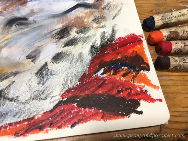
And I love the results! Here, the face has been painted in acrylics, there are regular pencil marks, and then the oil pastels add their flare.

See more images in this blog post from 2018: Oil Pastels and Spicing Up Your Art
I have also used a lot of oil pastels in this recent blog post: Using Up Old Crayons
And I have even made a course that uses oil pastels with other supplies. It’s called Innovative Portraits!
So, why should I not use oil pastels anymore when I seem to be so excited about them? Well, they are messy for sure, but also this: If I make a piece with oil paints instead, I can sell it and get more worth of my time. Oil paints (and acrylics) can do everything oil pastels do. Oil pastels are quicker, but the result is more valuable if I use paint. So, this is related to what kind of artist I am and what I need to get out of my time.
Alcohol Inks and Acrylic Inks
I bought alcohol inks in my mixed media years and loved them.

Alcohol inks are strong and work on any background, even on the top of acrylic paint. I used to use them to make backgrounds too, here’s one example from 2015.
And in 2012, I made many collages in the Collageland style where I also used splashes of alcohol inks, often pinks!

But now, they don’t feel so much fun anymore. Their odor is a bit disturbing too. But I have some pens that can be filled with alcohol inks, and will use the rest of them like felt-tip pens.
I also have some acrylic inks and acrylic watercolor inks.

I prefer to use watercolors instead nowadays. I should just make some art journal pages to use up those few bottles or give them away. I actually found a fun idea from an old blog post: Inktober Warm-Up Exercise (inks + drawing, from 2019)
All That Glows
Gold, silver, pearlescent effects – they are not my thing. I love to imitate glowing effects with regular paints, but glowing surfaces are not what I like to create. I have tried too many times, and made some fun pieces too, like this one from 2020.
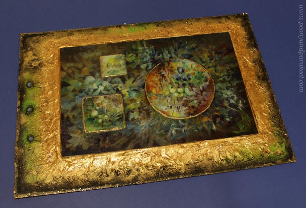
See more images in the blog post: Impressionistic Floral Painting on Structure Paste
And see how lovely glitter glue looks on the box cover, made in the course Doll World!

I have already given away many glittering paints, and I intend to give away the few that I still have.
Special Mediums
When visiting an art supply store, it’s tempting to try a new medium. I have velázquez oil painting medium, masking fluid, granulation medium, fiber paste …
Some of these mediums are for adding surface effects. For example, fiber paste creates a surface that can then be used for watercolors. Velázquez medium is for those who like to paint thickly. The more I have painted in oil, the smoother surface I want. For me, the smooth quality of the surface feels important to achieve. Smooth paintings bring old masterpieces to mind.
I know many use masking fluid and granulation medium for watercolors. I have used masking fluid in the course Watercolor Journey, but have stopped using it. There are ways to avoid it so masking fluid feels unnecessary nowadays. Granulation medium is not a miracle medium either. I like to keep my watercolors with water only. I think they don’t enjoy the makeup!
However, in Watercolor Journey, we use the masking fuild in a fun way – for doodling – and I think the result is fun!
I have some masking fluid and granulation medium left. Maybe I should make some art journal pages with this doodling approach to quickly use them up!
My Basic Art Supplies
These are the basic supplies, I want to keep: oil paints, acrylic paints, watercolors, watercolor pencils, colored pencils, and felt-tip pens. Oil paints and acrylic paints are mainly for canvas paintings. Watercolors are mainly for watercolor paintings. And colored pencils and felt-tip pens are mostly for art journal pages and small drawings.
Mediums
With oil paints, I need painting medium. And with acrylics, I like to use gel medium and glazing medium for thinning in addition to water. I could give up the gel medium if I had to choose, because the glazing medium works better for thin layers. Then comes the question: how minimal to go and what would it serve?
What do you think?
However, nowadays when I want to have a treat while visiting an art supply store, I buy a new color, for example, a new colored pencil or a new tube of oil paint.