Creating Hope – Artist’s Mission
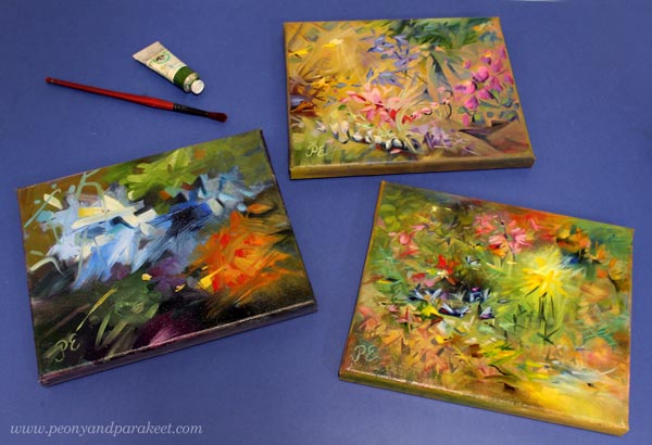
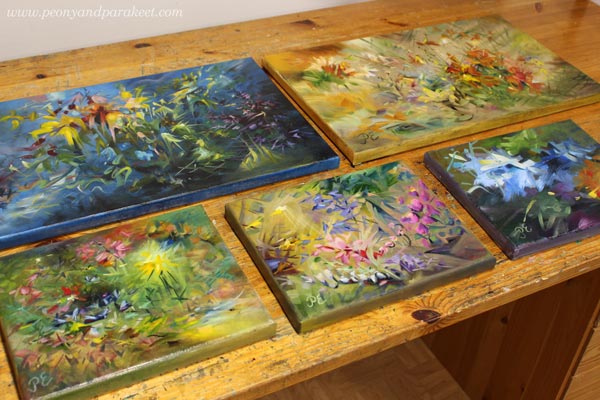
This week, I show three small paintings and talk about my mission of creating hope.
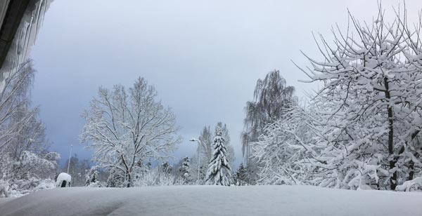
Even if we have had some winter wonderland sceneries recently, the weather hasn’t been so great in Finland – icy roads, rain, darkness … And now, the horrendous news came about the war in Ukraine.
But this post is not about war, but the opposite. Namely, a long time ago, I realized that my word is “hope”. Here’s the story:
I visited a hospital to see my old ant, and another old woman grabbed my hand. She wanted me to say something that would take her pain away.
I still remember her desperate eyes begging for consolation.
We discussed shortly but then I ended the conversation by saying that I am quite young and I don’t have all the wisdom. She nodded, turning off the glimpse of hope she had got when I entered the room. At that moment, I knew that I wanted to do more of that hope thing, but how.
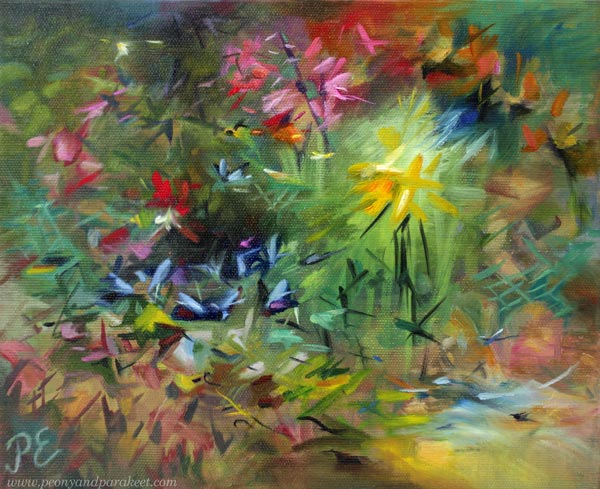
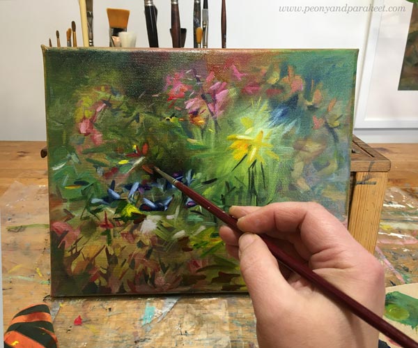
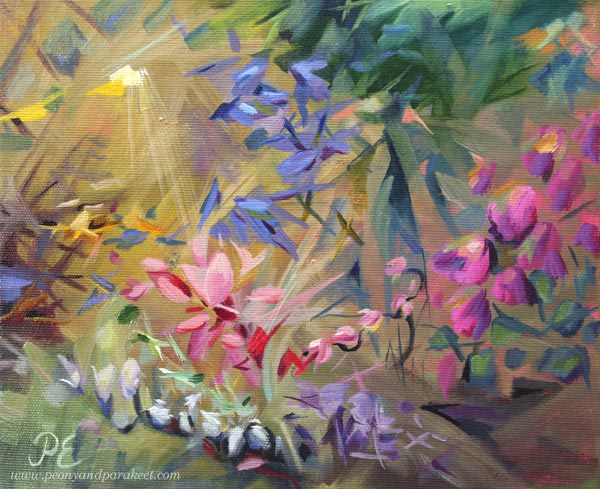
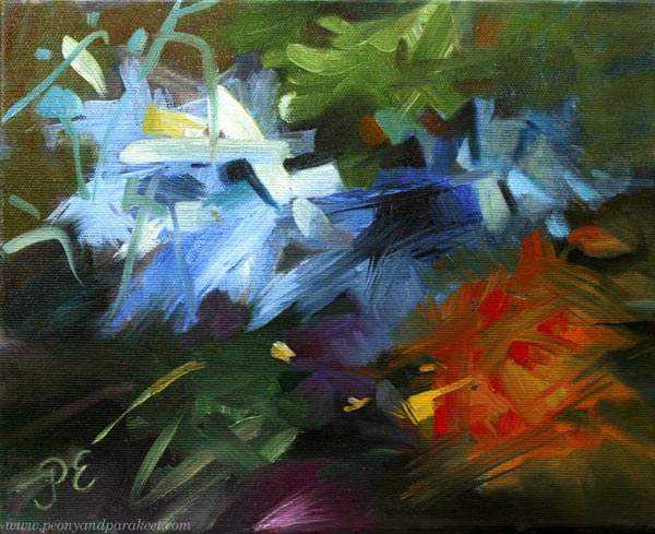
Nowadays, I try to transfer hope to every painting, and to every class as well. Yesterday I dug out small canvases that looked quite hopeless. I had started them last year and used leftover paint from bigger paintings. Then they had looked just ugly paintings that might not ever get finished. But now, all they missed was some hope!
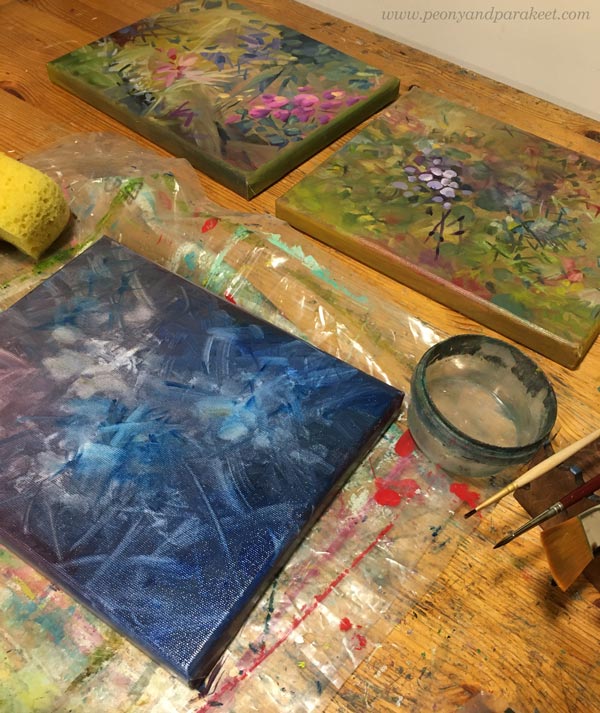
So I painted hope: saturated colors over muted ones, light glow over heavy shapes, rising wings on the top of descending petals – signs of life.
I wanted to remove the harshness and replace it with gentleness.
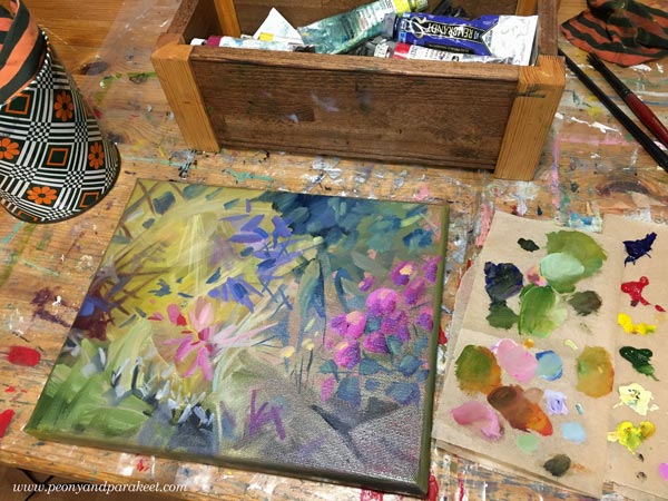
I also added the much-needed drop of utopia as well.
After leaving the hospital, I cursed myself for not giving the old woman what I called false hope. But now I think that the correct word is fantasy.
We all need fantasy to keep going.
Fantasy didn’t come to my young engineer’s mind, and it would have required the kind of bravery I didn’t have. But now, when I paint, I can do brave too.
The qualities that don’t seem to be a part of me, can still exist in my art.
It gives me hope as a human.
Whether I use oils and canvases or colored pencils in a journal, all I create is hope. A gift that was initiated by a stranger in a hospital bed.
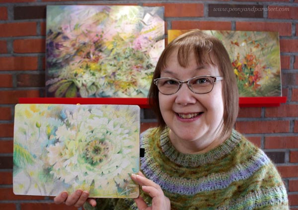
I am looking for March when the new class will begin!
Layering Colored Pencils – Magical Effects Step by Step
This week, I have a new spread for my colored pencil journal, and it’s based on layering colored pencils. I share detailed photos so that you can try this too!
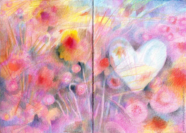
This coloring technique creates magical looseness, even if it begins with very stiff shapes. Because layering the colored pencils is the key here, it’s important to keep the layers light because paper can’t hold color endlessly.
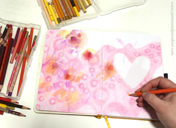
Step 1 – Set Atmosphere
Choose a color that sets the mood for the image. My choice was pink.
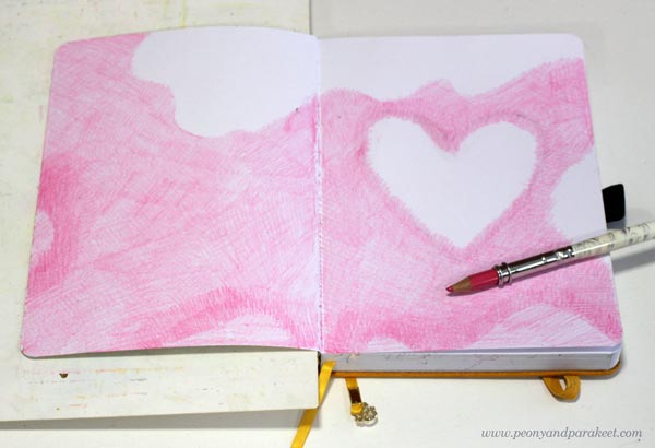
Color the background lightly, but leave some blank areas near the edges and where you want the focal point to be. The heart is my focal point.
The blank parts will allow you to include lovely color variations in the last layers. Color softly and avoid outlines so that the overall feel is magical from the first layer.
Step 2 – Add Pattern
Stick with the same pencil and continue the monotone look by coloring rings on the colored area.
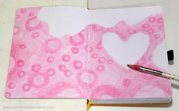
Make sure that the rings are different in size and spread a little unevenly so that the result looks natural and interesting. Think about fabrics but not the easiest polka dots, but a bit more intricate design.
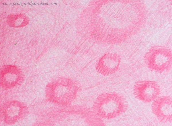
Here’s a closeup of my rings. Again, I don’t use outlines but color them with short strokes that go in many directions.
Step 3 – Destroy
This step could be called “destruction” because now we color random shapes that don’t follow the previous layers at all. Bring in new bright colors. Color stripes, rectangles, random shapes, and lines freely.
You can go over the blank parts too but keep the focal point a little less untouched.
The idea is not to cover previous layers fully but to destroy their rhythm.
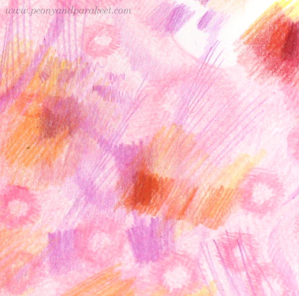
Here’s a closeup of my work. The new shapes and lines have taken over, and the rings are not so well visible anymore.
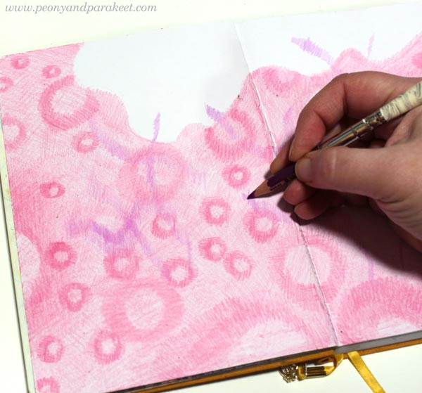
Step 4 – Discover
Keep coloring, but now bring in darker tones too. Keep the layers light and shapes soft, but when you discover something that you like, highlight its edges with a darker color.
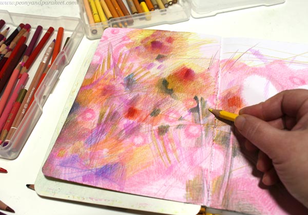
I didn’t use any green pencils in my spread, but it does have some green shades. Mixing black and yellow makes lovely olive green.
Now it’s also the time to bring some rings back to the foreground!
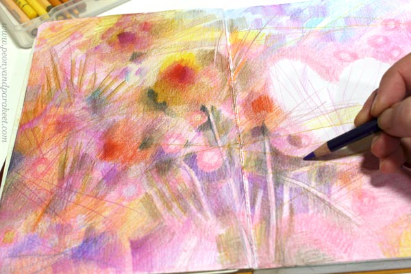
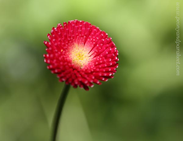
These rings remind me of perennial Bellis flowers!
Here’s a closeup of digging out the rings – now flowers – with dark colors.
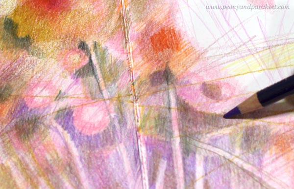
I don’t bring up all the rings, just some! This makes the layered look: some elements are covered and located further in the background, some come up to the foreground. The stiffness of the background pattern looks attractive when it’s combined with looser coloring.
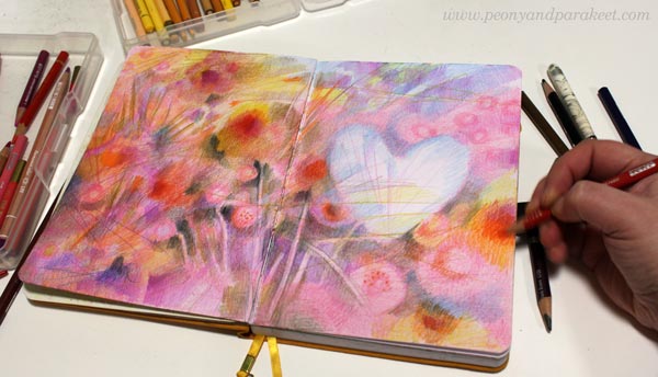
Step 5 – Finish with Message
Your work will be finished when it delivers a message. The focal point, the heart in my case, is essential for achieving this. I like to work intuitively so that I don’t try to define the message right from the beginning but let the insight grow with the coloring. Here, I left the heart light and made it look icy and magical.
First, I thought about this winter, how tough it has been to walk the dogs on icy roads, and how much I want spring to come. And then it hit me how ice must mourn when its life is coming to an ending. How between the first flowers, there’s a little block of ice, looking around, feeling isolated.
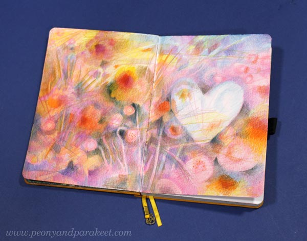
This little frozen heart is like a rare unicorn – reflecting the surroundings, introvertedly, like we all do when we are creating.
I find this kind of pondering an important part of art-making. That’s why I always try to end with a message even if viewers can freely find their explanations as well.
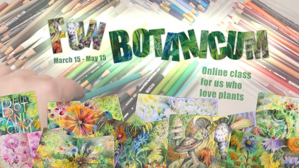
Fun Botanicum – Sign up Now!
From March 15 to May 15, 2022, I run an online class for us who are inspired by nature and fantasy and love plants. The class is called Fun Botanicum and we will draw fantasy plants by scribbling, doodling, and layering with colored pencils. Join us!
The early-bird sale ends soon! Early-bird price: 59 EUR, now 49 EUR. >> Sign Up Now!
The sale ends on Feb 20, 2022, at midnight PST.
Coming Up! – Fun Botanicum
Fun Botanicum is inspired by botanical art, but we will take a much looser and more fun approach.
The early-bird sale begins now and ends on Feb 20, at midnight PST, 2022.
>> Watch the video and sign up!
Pop Music in Art Journal
This week – turn some pop music on and start art journaling!
Since I started working full-time as an artist in 2014, my taste for music has gone wider. Listening to different genres has enriched not only my life but also my art. Music has taken me to all kinds of visual worlds. Even one sound can bring color or a shape to mind.
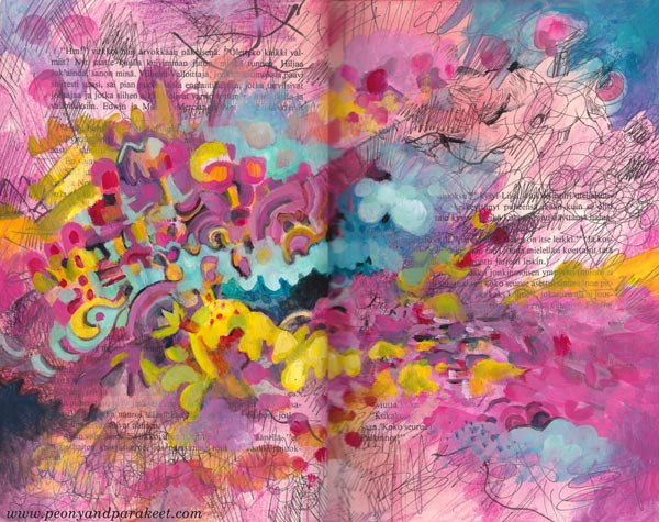
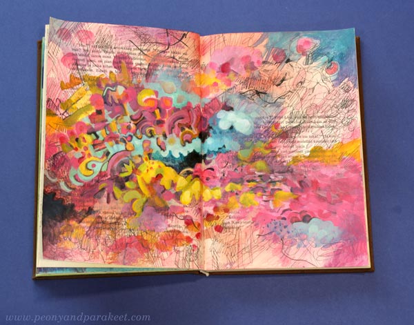
I have an old book as a music-inspired art journal. I like how the variety of music is shown on its pages. Now I wanted to make a spread inspired by Asian pop.
Sometimes Music is a Human, Other Times a Machine
Asian pop music is fun to listen and very easy-going – like an acquaintance who is always ready for a visit to a candy shop and to have a light conversation about current movies.
But when I paint big paintings, I prefer music that’s more like a vehicle – no melodies, only interesting sounds that make me go deeper and deeper in concentration.
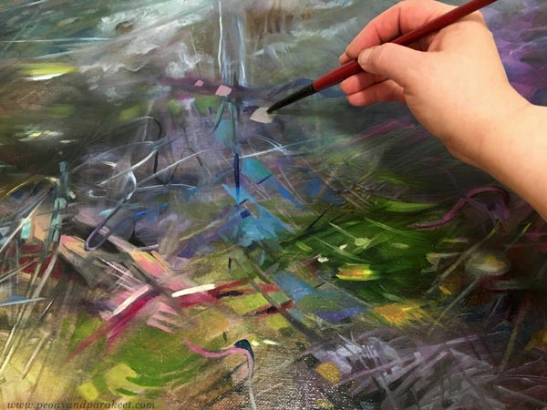
Without a repeating chorus and clear rhythm, I don’t feel the need to express the music or paint at its speed. That’s how I have become a fan of contemporary classics that I used to find too boring.
Pop Music in Art Journal – Playtime with a Friend
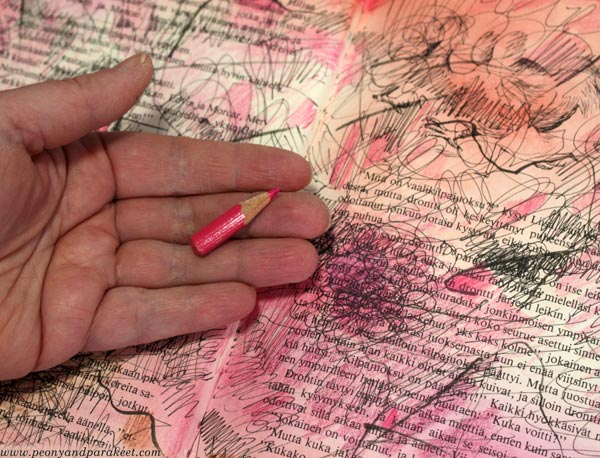
But this week, I wanted my friend back. I went to the Finnish radio website and turned on the newest of “Papananaaman K-Pop Show” which plays current Asian pop. My candy store was the box where I keep my red, pink, purple, and orange colored pencils.
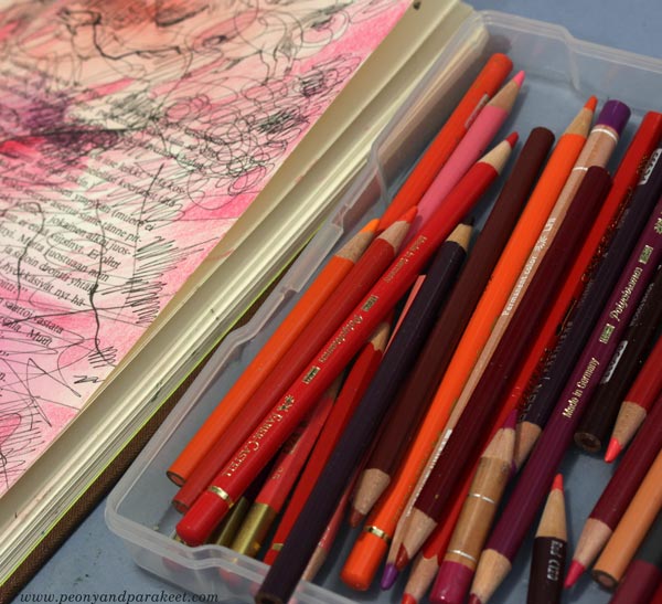
My music-inspired pages are in the “beautiful mess” style that I show step-by-step in an art journal mini-class called Music. It’s relaxing to create step by step and not worry too much about the “proper” supplies. I played with black pens, stamping inks, and the shortest pencils.
When I create canvas paintings, I use oil paints, but acrylics are great for this kind of messy play.
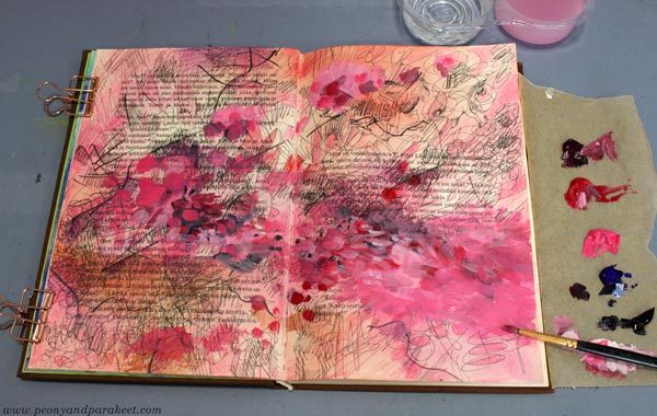
The spread started as red, but I then introduced a wider range of candy colors gradually. This mono-tone approach is great when you want to keep things simple first, and then splash the colors in.
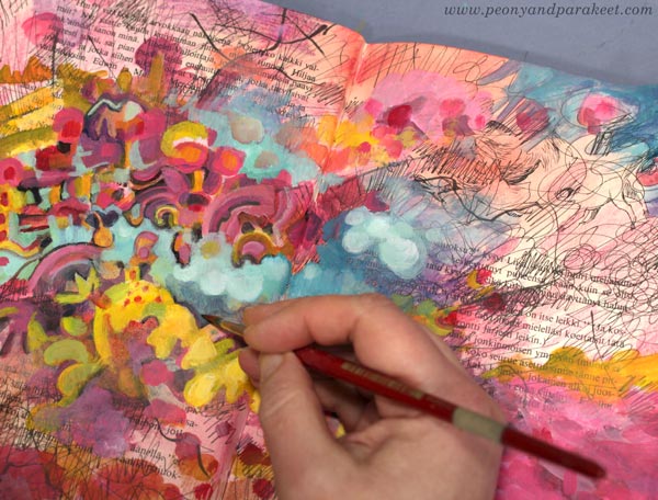
I like the candy colors and the informal look of the finished spread – pop music in an art journal!
I showed the spread to my Blythe dolls and they also gave their approval: “If that’s how you see Asian pop, we can live with that.”
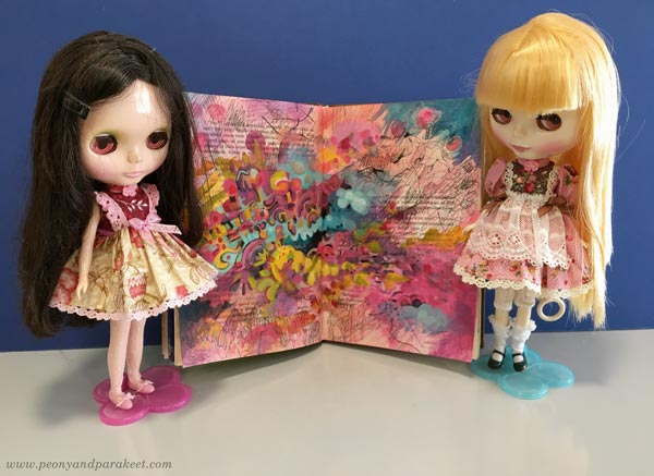
Maybe these dolls have made me listen to Asian pop in the first place! One thing so often leads to another.
Music in Art Journal – Step by Step!
The art journal mini-class Music is now available as an individual class. But you have to be quick – it will go away on Feb 7! >> Buy here!