
Painting a Loose Scenery with Daniel Smith Watercolors
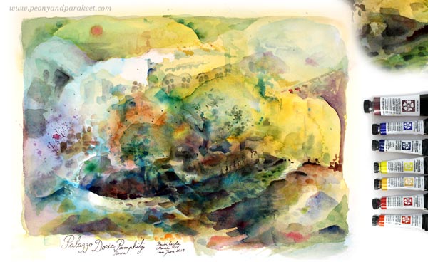
Last week, I did it. I bought some Daniel Smith watercolors because I had heard about them so much and for so long that I had to try them too. I bought the “Watercolor Essentials” set of 6 small tubes and a tube of Iridescent Scarab Red – a brownish red that has a green glow. Exciting!
Inspired by Ippolito Caffi
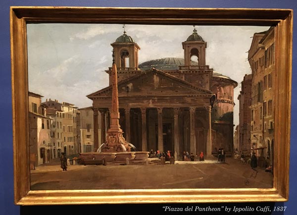
But what to paint? The idea came this week when I went to see Ippolito Caffi’s architectural paintings and landscapes at Sinebrychoff Art Museum in Helsinki. It’s the kind of art that I personally don’t like to create, but I enjoyed the exhibition. Here’s Piazza del Pantheon by Caffi, an oil painting on cardboard.
As said, realistic architectural urban scenes and landscapes are not what usually come to my mind when I start creating. But after watching a lot of scenes from Italy brought memories from my trip to Florence and Rome last summer. So why not pick a random photo of the trip and start painting?
Palazzo Doria Pamphilj
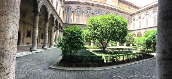
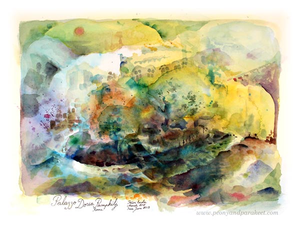
The photo that I quickly chose was taken at the inner court of Palazzo Doria Pamphilj, Rome. The palace has a wonderful art museum that I blogged in July 2017. I thought that I could use it as a loose reference and create something totally different, abstract perhaps. Painting a scenery with watercolors felt too traditional to me. So I just started splashing water and blue paint.
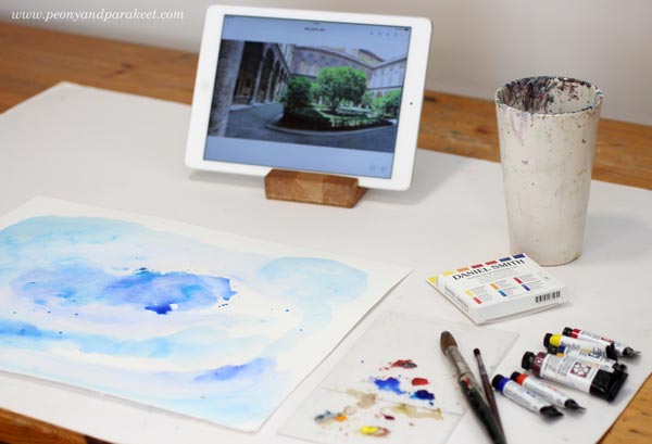
Scenery with Daniel Smith Watercolors
Daniel Smith watercolors are lively. Not only colors are lively but the pigment seems to travel quickly, and it creates wonderful effects.

Here’s my painting after playing with big brushes and water.
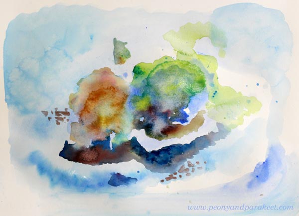
Then I changed to a water brush that is quite narrow. I love using this brush. It’s so easy to paint small details with it.
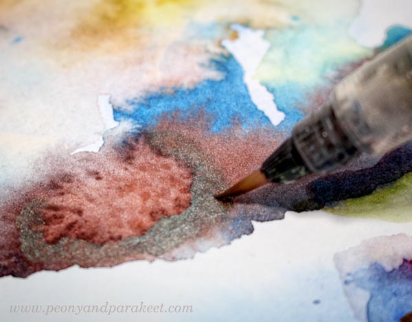
Iridescent Scarab Red looks interesting! Very different from any of the watercolors that I know. At this point, I thought about making a fantasy scene of some kind.

Time to loosen up!
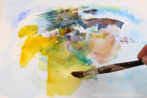
The more I painted, the more tempting it became to paint Palazzo Doria Pamphilj as I experienced it. It was a really hot summer day when I visited it. It’s located in the middle of busy Rome, yet its thick walls seem to isolate the museum from the city.
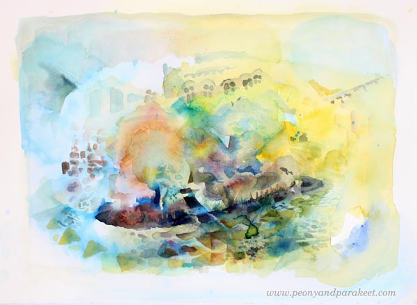
I let the image be visible while I was working but did not follow it to detail.

I found Daniel Smith’s watercolors easy and fun. I don’t like the color selection of the Essentials set so much, and the paints are really expensive compared to any other brand. The owner of the art supply store said that he likes to sell the essentials set at a fairly low price because once you try them, you are hooked and need some more. He may be right! But because I spend quite a lot of money in top quality oil paints, I might not buy more Daniel Smith shortly.
Finished Painting and Signature
The painting of Palazzo Doria Pamphilj became quite loose, but it’s ok. I enjoyed connecting with the memories, and this is a bit like a souvenir from the place.
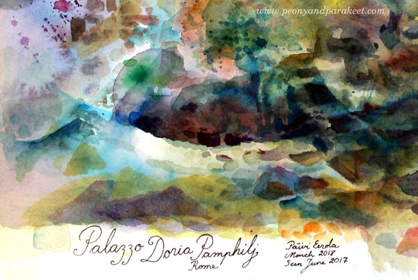
At my recent visit to the museum, I also saw Giovanni Battista Piranesi‘s amazing graphic works. They had beautiful signatures, so I also added one to the watercolor painting. I think it finishes the painting nicely.
This project is a perfect example of how being a bit adventurous can open new ideas. Landscape and architectural painting don’t feel so boring to me anymore! I have ideas for next quick paintings too. This kind of exploration is not only fun but also important for the creativity. If you limit yourself to one theme, to one type of work, creating becomes tedious. To me, this kind of small and quick projects give ideas and energy to bigger paintings.
Create with an Inspiring Community – Join Bloom and Fly!
When you have been creating art for a while, it’s time to let go of step-by-step instructions, get a little looser, and explore the opportunities that art has for you.
Bloom and Fly is a community for you who wants to explore visual and adventurous ideas, get feedback and suggestions for your art, and connect with like-minded art enthusiasts. We have a private Facebook group, monthly themes, live sessions, and weekly opportunities for practical help and feedback.
Registration is now open for Spring season (April – June 2018): Sign up here!
Intuitive Painting with a Reference Image
Intuitive painting with a reference image – can it be possible? Let me show you how!
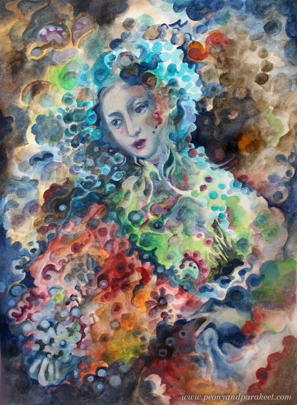
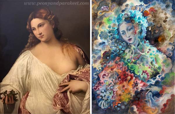
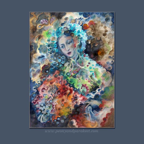
Here’s a painting from my sketchbook. It’s called “Madama Butterfly.” My reference image was this Renaissance painting called “Flora” by Tiziano Vecellio, 1515-1520. I took the photo last summer when visiting Uffizi Gallery, Florence, Italy.
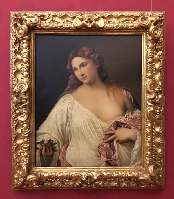
There are very little similarities in these two pieces. The pose is fairly similar, the composition and the facial features have some similarities, but that’s it. The style, the theme, and the technique are all different.
The Supplies And the Setting
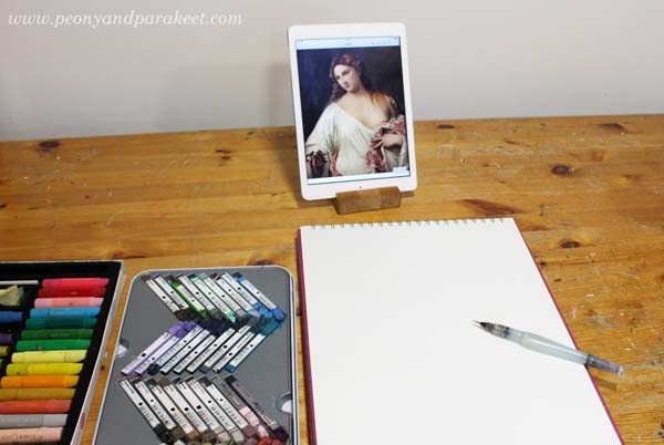
I like to do fairly quick paintings on my big A3-sized sketchbook. For this sketchbook, I often use Derwent Artbars, a water brush, and Faber-Castell Gelatos because they are easy to layer and I am more relaxed than when working with tube paints. I use acrylic or oil paints for canvas paintings, and working with them is more serious. This time I wanted to demonstrate a concept or a method rather than creating a 30-hour painting.
1) From Intentional to Intuitive Painting
The first idea was to pick the pose and the composition loosely from the reference image and then add geometric shapes to fill the space.
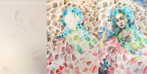
After sketching the foundation of the figure, the triangles, rectangles, and circles were fun to paint without looking at the reference at all. I painted the face roughly, and then I used the reference image as a guide. But because at this early stage, I didn’t know what I want to express and what kind of person the figure could be, I didn’t bother to spend time perfecting the facial features. At this point, my painting resembles cubistic pieces from the early 20th century.
2) Changing the Style
When creating art for the sketchbook, I like my style to be a bit more illustrational than when I make bigger paintings. Even if I love cubism, I wanted my piece to be a bit more current.
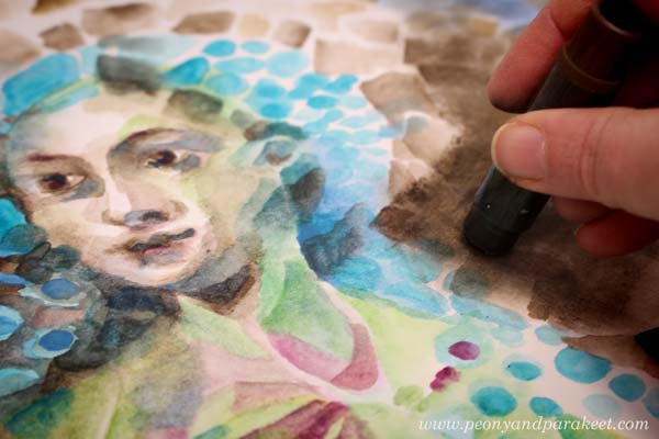
Nowadays, illustrations often use geometric shapes but rather than triangles or rectangles, the shapes are often round, and scallop edges seem to be a bit hit. So I started changing the painting by altering the shapes. This routine work gave me plenty of time to connect with my inner world and work intuitively from one association to another. I tend to be both nostalgic and romantic, so I thought how portrait painters often spend time with the clothing even if they are just a shell. Why not use it as a canvas for the memories, the ideas, and the achievements of the person?
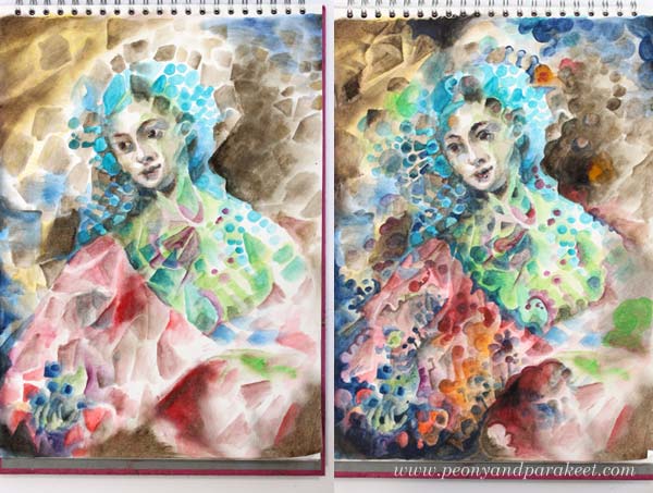
3) From Intuitive to Intentional
After rounding hundreds of triangles and rectangles, I realized that I was painting Madama Butterfly, the opera that I just saw last Saturday! I finished the face after this realization and adjusted other elements so that they fit with the theme.
More Intuitive Inspiration from Opera
This is not the first time I have been intuitively inspired by opera!
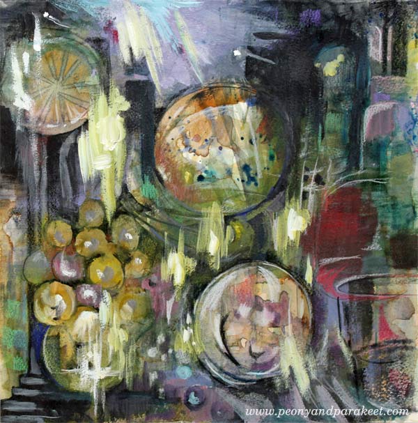
>> Tosca
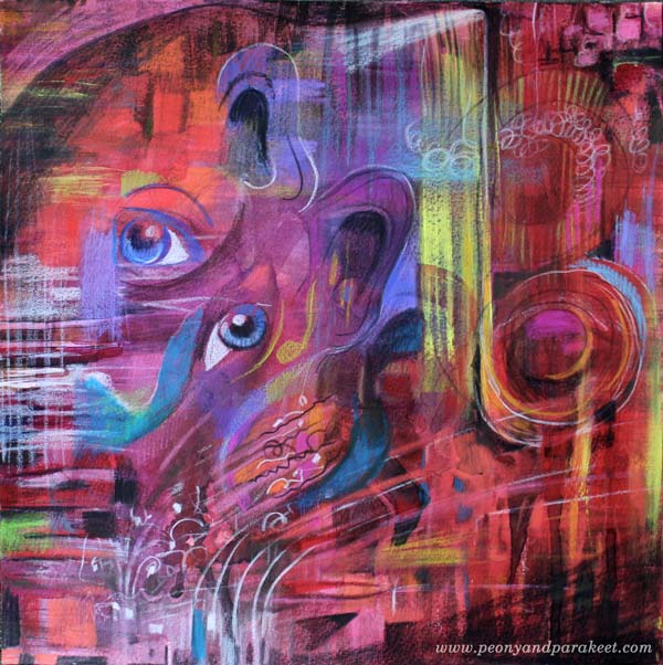
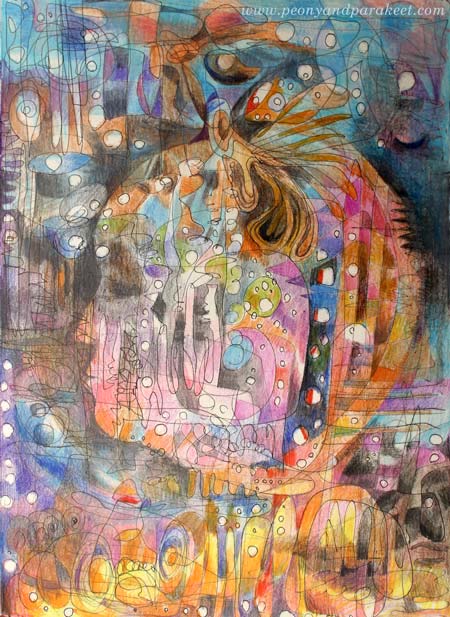
>> La Traviata
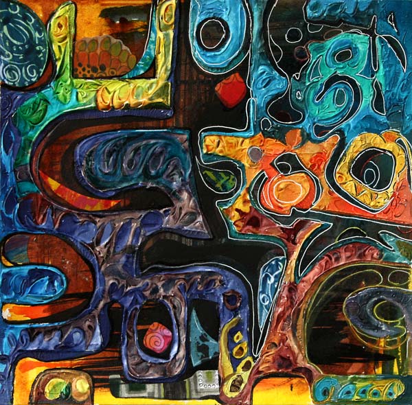
And there’s also a video about
>> Kaija Saariaho’s Emilie
More About Simple Shapes
>> What to create from simple shapes – 6 ideas
Self-study classes:
>> Planet Color – release your mind by focusing on color!
>> Modern Mid-Century – put a modern twist to simple shapes!
Let me be your mentor in creating: Subscribe to my weekly emails!
How to Make Your Art More Captivating
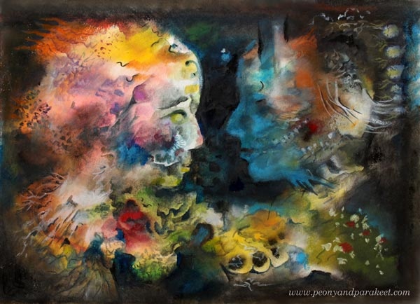
Captivating is a big word, but I like to explore it from many angles. In this blog post, I give you six tips with examples. The first two are more related to the process of creating art than to the result. I believe that if the process itself doesn’t captivate, it’s less likely that the final piece will! The last four tips are about finishing your art so that it will be compelling.
1) Captivating Supplies – Choose What Gets You Going!
Using too many art supplies can cause overwhelm and unnecessary distraction. I choose the supplies based on how many hours I want to work on the project.
- Under an hour: Black drawing pen and colored pencils. They are quick to grab and work on any paper.
- Few hours: Water-soluble media like watercolors or inks. They cover big areas quickly, but they also allow detailed work, especially when combined with colored pencils.
- Tens of hours: Acrylic or oil paints. The result lasts time and can include tens of layers.
The projects shown in this blog post have taken 2-4 hours. These are all created with water-soluble media but this time, not with watercolors or inks. Namely, while organizing my supplies, I found Faber-Castell Gelatos and Derwent Artbars from my stash. I bought them many years ago when I was obsessed with having all the mixed media artist’s stuff. I purchased this and that, tried everything for few times, and then got disappointed because they didn’t improve my art. My solution back then was to reduce the number of art supplies and learn more about the basics of visual communication. It worked much better than hoping for the miracle with the new supplies!
But now when I opened the boxes, I was looking at Fabel-Castell Gelatos and Derwent Artbars with the new perspective. They could be quick and handy for sketchbooks and art journals. Because both of them are water-soluble, they could watercolors and inks once in a while.
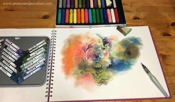
I have now used Derwent Artbars and Faber-Castell Gelatos for my big sketchbook. I use Artbars for detailed brushwork and Gelatos for big and blurry areas.It has been quick and fun. The downside is that the result is quite waxy and I don’t think it will endure time very well. Furthermore, I can’t cover the opposite page because the staining would ruin it. However, the old and neglected supplies have managed to inspire me, and I think it shows in my recent work as well. The image above shows how I started the piece that you can find at the beginning of this blog post.
2) Captivating Looseness – Start without Intention!
The second captivating thing is related to the process of creating as well. I like to start most of my pieces, whether they are small sketches, bigger art journal pages, or big paintings intuitively without accurate planning. Sometimes I have an image, a word or a style in mind. It inspires me to start, but as soon as I have sat down and made the first strokes, I try to let go of it and just enjoy creating freely from the imagination. In this short video, you see me working with Derwent Artbars and Faber-Castell Gelatos.
More videos: I have explained my adventurous creative process shortly in a mini-course called Loosed Up! It’s free for the subscribers of my weekly emails. If you haven’t a subscriber yet, subscribe here!
3) Captivating Story – Make Fantasy Portraits!
Artists often talk about communicating a story through art. Usually, referring to the story doesn’t mean so much what’s in the image, but how the image can deliver a handle to the viewer’s personal stories. One of the easiest ways to embark stories is to make a portrait that is relatable.
Even if you have started freely and intuitively, you can turn almost any blotch to a face, especially a side profile, by adding a color area that defines it. In my piece, I realized that with black, I could bring up two persons. I was intrigued by showing the connection between the two fantasy figures. To me, they express the two sides of me, when I am creating. One side is more feminine, full of emotion and ideas, and the other more masculine, trying to figure out how to put the ideas into subsequent steps. At best, these two sides work together and enter the same flow.
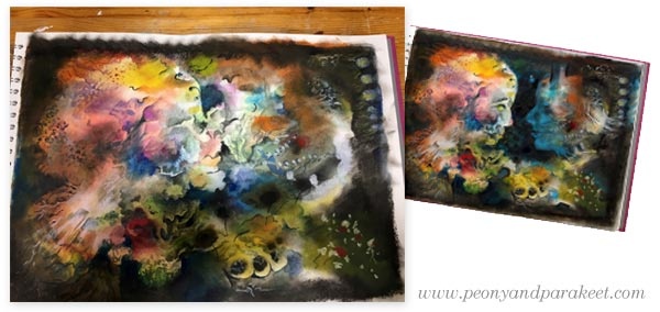
In the enlargement, you can see that the dark areas also include subtle details so that they are not monotone and so that they communicate the connection. The colors also play a role here. Blue expresses the connection that the two share together.
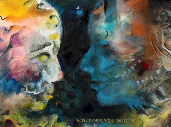
The story that you see in this piece doesn’t have to be the same than what I have told. For you, the image can bring a romantic moment to mind. Or it can take you to a fantasy movie. In the same way, the art that you make can have several meanings and when creating, focusing on the general message makes it more captivating. In this case, the message is the shared connection, and I have tried to adjust the details so that they all support this message.
4) Captivating Richness – Build a System!
Usually, the longer we work with one piece, the more valuable it will become. Not only that we get more attached to it ourselves, or that it has a higher monetary value, but also that time brings the richness of the details. This is especially the case if you don’t try to get the piece finished in one sitting but let it captivate your mind between the sessions.
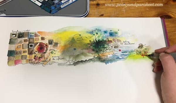
Many artists are afraid of “overworking,” but to my experience, “underworking” is more common. Also, only creating tiny pieces can be one form of underworking. See how a small art journal page, a modest scene, grew to a captivating system or a map when I continued the page!

When working with a detailed big picture, remember to leave some breathing space between crowded areas. Connected lines between the clusters make sure that your system is like a running machine with all the necessary pieces.

5) Captivating Clarity – Highlight a Direction!
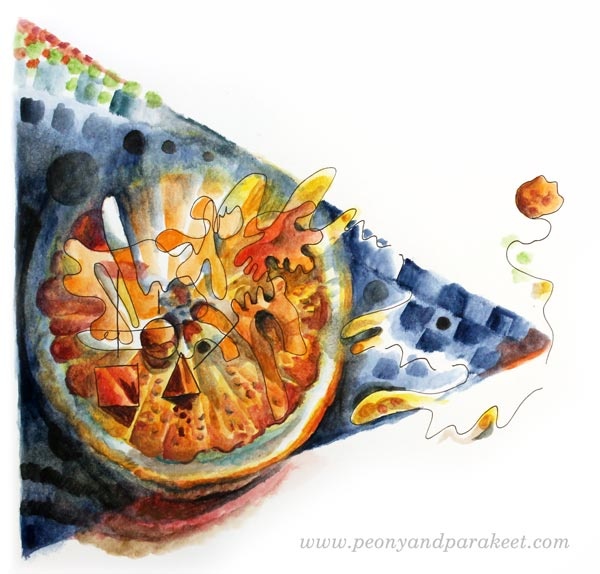
Sometimes clarity can be more captivating than an overwhelming amount of details. My example is an orange that I drew one morning after a fruity breakfast.
I apologize for the low quality of the first image below. There you can see a shadow of me shooting the photo with my mobile phone. But actually, it brings up a good point about the clarity: when you are in doubt what to add, take a photo. It helps you to see your work with different eyes. You can zoom out to test if your image looks both clear and interesting when it’s small. You can also analyze, how your eye wanders around the work and where do you want to lead it. If your art looks like one big mess, adding a direction also brings more clarity.
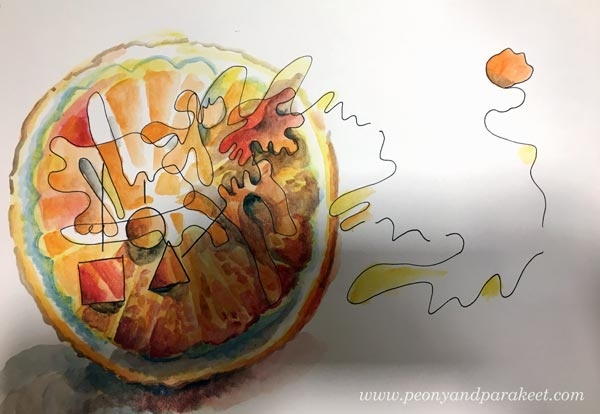
With the orange, I wanted to express the forward-thinking attitude that I usually have in the early mornings. I wanted to add more importance to the single juicy drop that leaves the orange with the bouncing energy. The idea behind the illustration was not just express a fruit that explodes but how a source of energy can keep you moving forward. It’s similar to the idea of my community Bloom and Fly – to keep you inspired to create and remove creative blocks that prevent you from that!
6) Captivating Contrast – Use Two Different Styles!
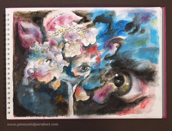
The last tip is about contrast. However, this time I don’t bring up the contrast in color, value, or size, but in style! Now you might say: “Paivi, I have been searching for a personal visual voice for so long. Are you talking about mixing different styles to one piece?” I certainly am! Don’t be a one-trick pony but go to see all kinds of art and practice all sorts of styles! Your technical skills will grow, and you will get ground-breaking ideas. Showing the versatility can also make your art more captivating. See how I combined abstract with realism how it makes the images more captivating and thought-provoking.

With a realistic pansy, I was able to communicate the contradiction that we all get when we envy someone: “When a jewel wants to feel free and be a pansy … And when the pansy secretly wishes to live forever and be the jewel.”

By adding the realistic eye, I was able to express the difference between two different worlds – the inner and the outer world. Paul Klee has said it so brilliantly: One eye sees, the other feels.”
Set Your Goals and Start Creating!
My community Bloom and Fly is for all who want to start and keep on creating. You can get help and encouragement for any art project, and we also have monthly themes.
January’s theme is “Mixed Media Sketchbook as a Tool for Setting Your Goals.” You will get ideas on how to use a sketchbook or an art journal for creative goals. Rather than feeling restricted, you will feel energized by the possibilities behind the goals. An art journal can be a playbook that keeps you moving forward!
With January’s theme, you will also get easy jumpstarts for stepping into the world of art journaling without feeling the pressure to buy more supplies. The money spent on staying inspired and connected with like-minded artists can be more useful than adding extra supplies to your stash.
Make sure that 2018 is your year of art – Join Bloom and Fly!
Loving Vincent and Purchasing Oil Paints
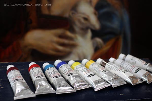
Yesterday, I opened the door of a local art supply store and headed to a specific shelf. On my way to the store, when walking on the narrow streets in the center of Helsinki, I felt it. The feeling that I got a year ago when I opened a tube of Mussini oil paint for the first time. I was attending an art class about old masters painting techniques, and we used the best oil paints I could imagine. Not that I could imagine so much because I had never used oil paints before. But I didn’t expect to experience that strange feeling. It contained both appreciation and excitement. The appreciation of color, and the excitement to learn more from it.
It was not that I would have been new to color. I had been painting with acrylic paints for a long time. When I was a teenager, I got them from my parents who thought that it was a perfect solution to me. No worrying about toxic painting fluids and still being able to paint with ease. The acrylic paints have developed a lot since that time, since the eighties. They have worked perfectly for my needs. I have found a good brand too. I really like Golden acrylics.

But now I was standing in the front of a vast collection of Mussini oil paint tubes. I picked the color chart and went through my choices one more time. For a whole year, I had been going through this in my mind: raw umber, zinc white, titanium white, yellow ochre and so on. It had been a mantra that changed a little bit every month. The paints are expensive, and I had to pick the colors carefully. One tube can cost more than 70 euros.
Plan for the Hand and Mind
After trying out the paints for the first time, I went to live in denial. Yes, I had painted the class pieces with oils because they were provided by the class. But the odorless and water-soluble acrylics felt much more suitable for me. After a while, my attitude changed a bit. I let myself dream about the oil paints. I visited the art supply store, touched the clean and shiny tubes, imagined getting just a bit of paint on a palette and make it last for as long as possible.
But dreaming and reality are surprisingly close. It’s difficult just to dream and not to do anything. So I made a plan that felt more like extortion. I had to get my floral painting class finished. I had to get several acrylic paintings finished. I had to figure out where and how I would store the paints. I had to get more information about the oil paints and the painting liquids.
I still had some finishing touches to do for my paintings in progress, but other than that I had followed the plan. So I started picking the tubes: raw umber, zinc white, titanium white, yellow ochre and so on. After selecting the colors, I went for the liquids: poppy oil, turpentine, and glossy dammar varnish.
When I left the store, my mind summarized the past year. Learning the old masters’ techniques had been essential for growing my technical skills. My art had become less imaginative, and more conventional.
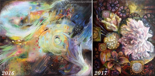
I had a turning point in 2016 when I felt that my imagination and my hand didn’t function so well together anymore. My imagination wanted to proceed to new territories, but my hand couldn’t follow. But now when my hand is wiser, I can also challenge my mind more freely. Purchasing the oil paints were a reward for the persistence that I have had for the last twelve months. However, it wasn’t the only reward. I was also going to see the new movie Loving Vincent.
Loving Vincent – The Movie
The movie theatre was about 10 minutes walk away from the art supply store. When I arrived, there were several queues for the tickets. I joined one. While I was waiting for my turn, a young man suddenly came to me and asked: “Do you want a free ticket? I have two, and my friend wasn’t able to come.” I happily accepted it and thanked the man. “Is this a sign?”, I asked myself. “Is this the final sign that I should do this – go forward, open the tubes, start painting my newest, odd ideas?” I don’t believe in destiny so much, but at that moment, it felt like Vincent van Gogh was talking to me: “Do that, paint those ideas, just like I painted mine.”
I found the movie very emotional. Every time, I saw a familiar painting coming to live, tears came to my eyes. I realized that this movie had to be published now, not earlier. Vincent’s art has become so well-known during the past decades that it unifies us. Art that was odd for masses of the 19th century is understood by every one living the 21st century. It has become so familiar that it’s sometimes difficult to appreciate it. And still, we need to feel the togetherness that Vincent’s paintings can offer. They are like icons that make us stronger together.
Looking back helps us to move forward. As artists, we are all Vincent’s descendants. No matter how we paint, what technique we use, we know about modern art because of Vincent. We know more than the people of the 19th century, and that enables us to explore art to all kinds of directions.
Loving Vincent – Art from the Students
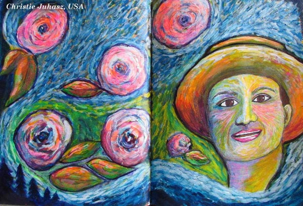
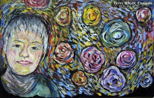
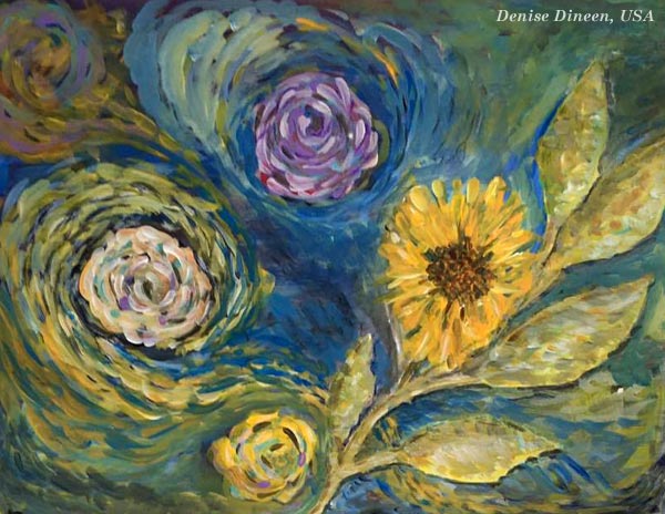
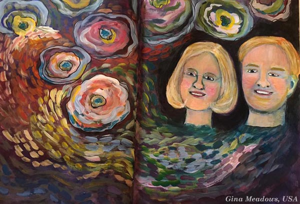
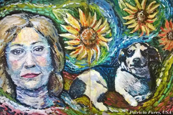
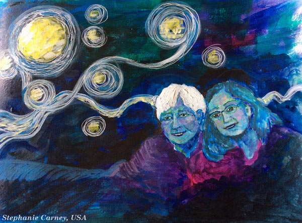
I want to celebrate Vincent by showing beautiful pieces made by my students. They are made from my class Selfie Fantasy that shows an adaptation of Vincent’s technique.
Christie Juhasz:
Terry Whyte:
Denise Dineen:
Gina Meadows:
Patricia Furey:
Stephanie Carney:
Have you seen the movie? What did you think about it?
Imagine Through Art – Buy 5 inspiring mini-courses! (including the Vincent-inspired one)