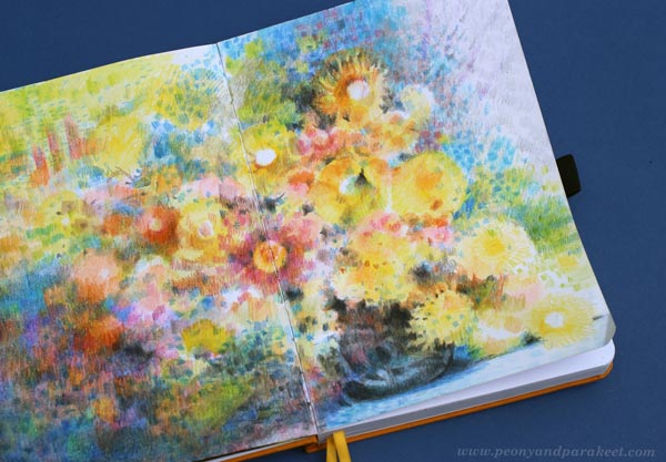
How to Color like Monet – Step by Step Instructions
This week, I share the newest spread in my colored pencil journal and show how to make pages in Claude Monet‘s style.
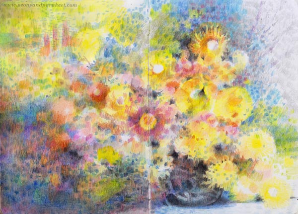
This project is just simple flowers in a vase, but the layering of colors in an impressionistic style makes it special.
Supplies – Colored Pencils and Paper
I used watercolor pencils but mostly dry, so you can have any colored pencils for this project. My selection has some fancy Caran d’Ache Museum Aquarelle pencils, but mostly old Staedler Karat watercolor pencils.
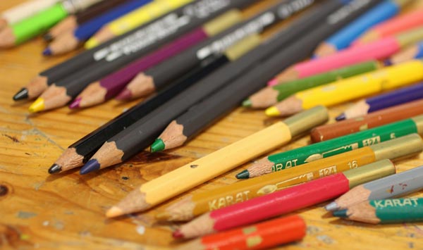
Karat pencils are getting so short that I need an extender for convenient coloring, but they look endearing and I want to give them a long life!
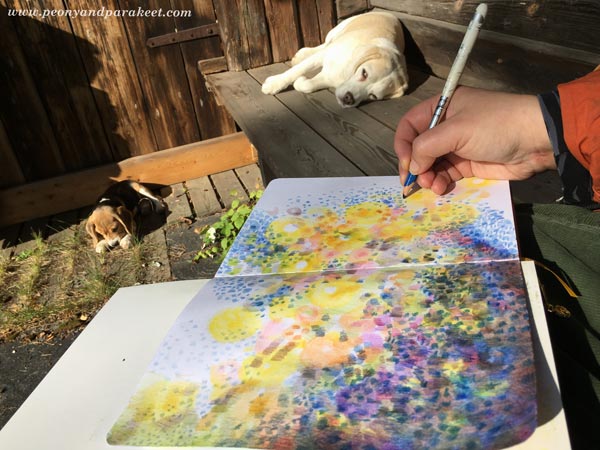
Step 1 – Color Circles Across the Page
Let’s begin with circles. Color a variety – full circles, half-circles, hollow and filled ones, big and small! Pick only a few colors first, and only fill a diagonal that goes across the paper.
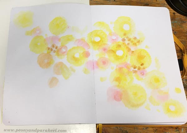
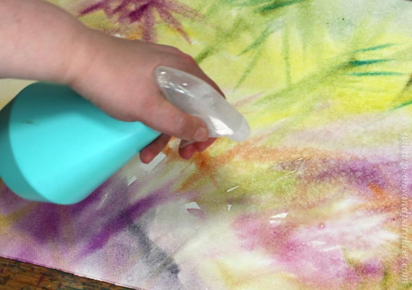
Color lightly so that you can add more layers on the top later. If you have watercolor pencils, you can spread the colors with water.
Step 2 – Color Short Stripes on the Top
Color short stripes over the circles. Now you can use a wider variety of colors and enlarge the size of the colored area.
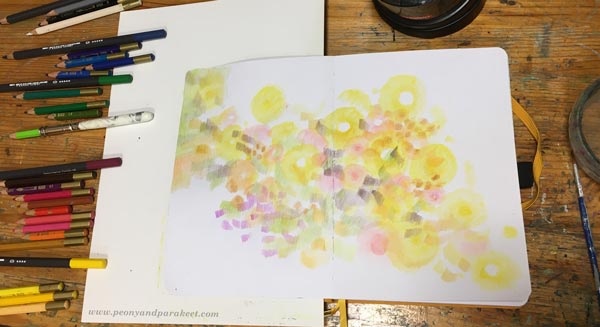
I arranged my pencils so that they are grouped by color families. It helped a lot in this project, especially for the color areas in the next step.
Step 3 – More is More!
Continue coloring circles and stripes in various sizes and colors so that they fill the paper.

You can have so short and tiny stripes that they are more like spots. Stripes can go in different directions. Change the orientation of the paper once in a while.
Even if you color tiny elements, divide the page into big areas. The diagonal in Step 1 is one of them. Each area can have many layers and colors but decide which color will dominate. For example, I have a blue area on the left bottom corner.
Step 4 – Color a Dark Vase
Color dark stripes on either side of the centerline to form a vase. Leave some space between the stripes so that it looks like it’s dark glass.
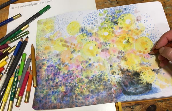
You can also add some shadows below the vase to make it look more like Monet’s work. I used blue for them.
Step 5 – Highlight the Best Flowers
Add more bright colors and details to make a few flowers that catch the eye more than others.

I don’t draw any outlines, but continue to color freely in short strokes.
Step 6 – Make Sure That You Have Enough Variety
Color more so that you have a wider variety of colors and shapes. See how I have used both vertical and horizontal stripes on the left top corner. They look a bit like windows or trees. Monet often had abstract elements like these in his work.
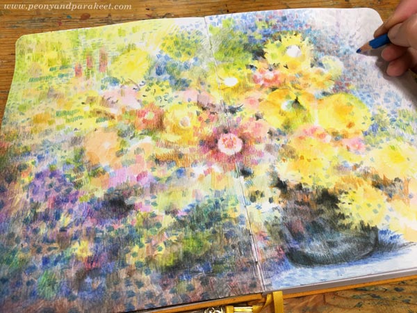
When you color more, make sure that blank paper isn’t visible everywhere. Color lightly over the areas that are less important. When they don’t have any bright white, the overall impression is less busy.
Step 7 – Finishing Like Monet
Go through your colorings one more time. Color lightly over large areas to make them look more unified and add dark spots near the best details so that they become more noticeable.
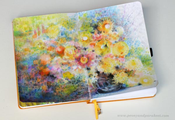
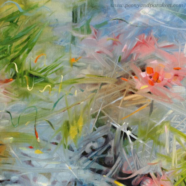
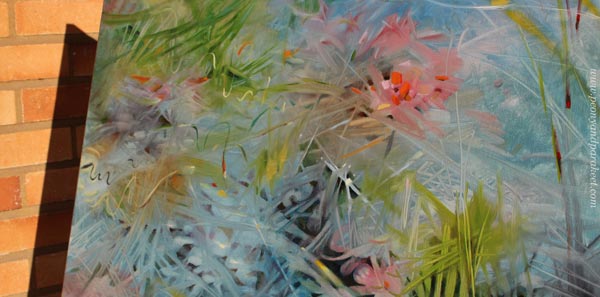
Here’s a closeup of the finished work – lots of small dots, stripes, and layers!

Colored pencils are very versatile. You can really color like Monet! I like this painterly look a lot.
P.S. For more colored pencil inspiration, sign up for Intuitive Coloring!
P.P.S. Thank you all who have signed up already, we will have a lot of fun!
Artist’s Life – What’s Boring and What’s Not!
This week, I make a watercolor painting and talk about how artist’s life can seem different than what it is.
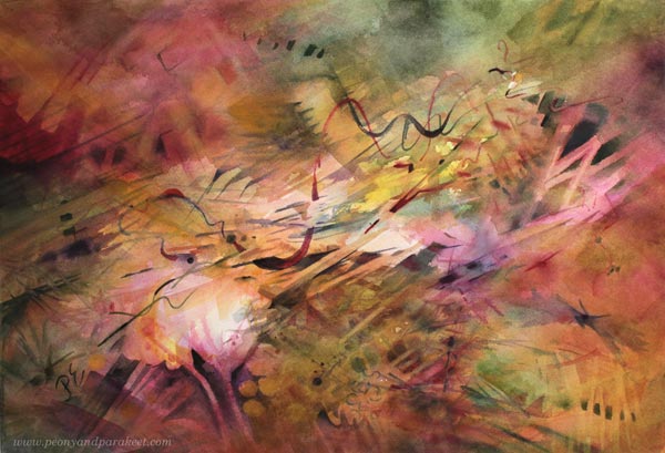
Let’s turn back time and see how this painting came to life!
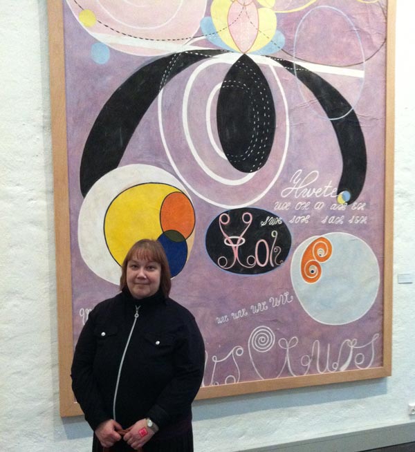
Is the Art Understood – A Story about Hilma af Klint
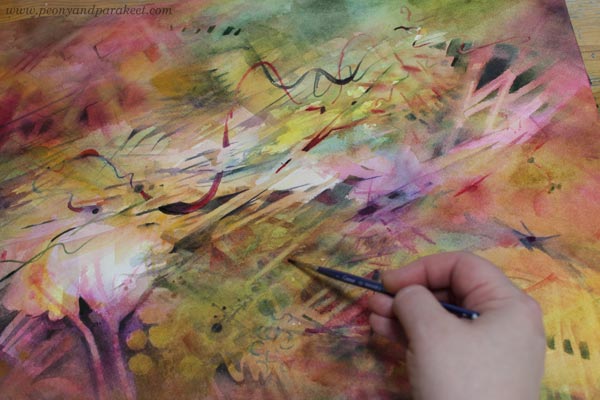
It’s a hot summer day, and watercolors are calling me. So I wet a paper, and after the water has soaked in, I start painting with a big brush.
The paper is Fabriano Artistico (cold press). I buy watercolor paper in big sheets and split them in half.
With the first strokes, I listen to the last minutes of an audiobook that has kept me company for a few weeks. It’s “Hilma af Klintin arvoitus” (The mystery of Hilma af Klint) by Pirkko Kotirinta. It’s a new book, published this year and currently only available in Finnish.
Even if the book is about Hilma af Klint (1862-1944), an interesting Swedish abstract pioneer, the companionship with the book hasn’t been pleasant. Mostly because I wanted to know about Hilma’s thoughts and philosophies – her inner life. But the book focuses on the external events and on the author’s background investigation for those.
When the book ends, I think about how people who admire artists from the outside perspective often romanticize things that are not romantic at all. There has been a lot of them around Hilma too. These people say: “The artist chose not to sell her art” or “The artist wanted to keep her art private,” but honestly, no professional artist wants that.
Instead, it can happen as it did for Hilma, that despite all the effort, the art was not respected or understood, and that breaks the artist’s heart. Hilma af Klint decided that the time would be more suitable later. So, she stated that her work had to be kept secret for 20 years after death.
Every artist wants to be current, but art has its own timeline. Sometimes it’s too far in the past, and sometimes – like Hilma’s – in the future. Painting freely is like a game where every layer is a new level. The result is unexpected, yet synchronized with the inner clock of the artist.
Boring and Not – Two Sides of Artist’s Life
People who look at artists from the outside perspective think that they live a carefree and eventful life. Therefore, they try to solve the mystery of Hilma af Klint by tracking the external events instead of internal ones. Artist’s handwritten diaries can be too confused, and it’s less complicated to travel from town to town and follow the actual footsteps. But most of Hilma’s life was spiritual, and her 193 gigantic temple paintings, laborious to create.
From the external perspective, art-making is one of the most boring things if you measure it by the amount of silence and concentration.
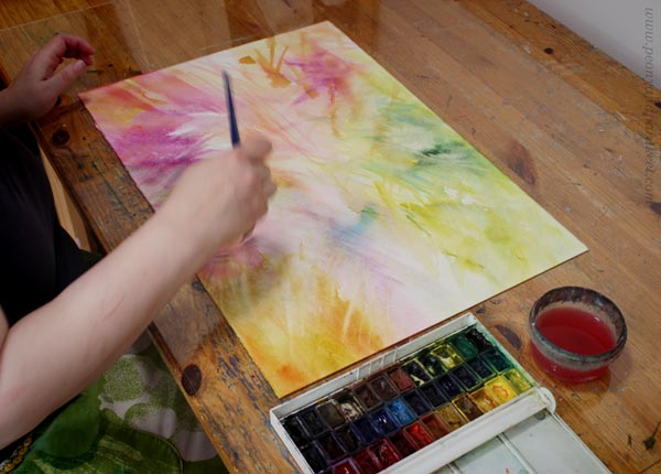
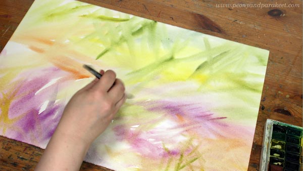
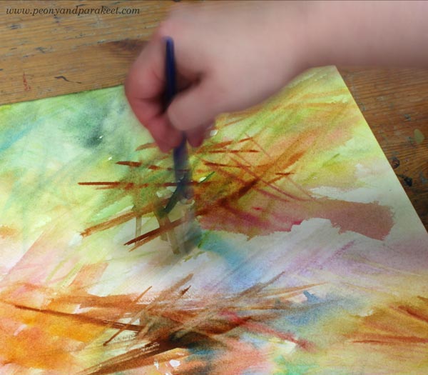
Here I am working with a flat brush.
However, what happens in the inner world, can make the artist’s life most exciting. We get to fly to a new land, find a color, be a color! We get to transmit a spirit through shapes and their interaction.
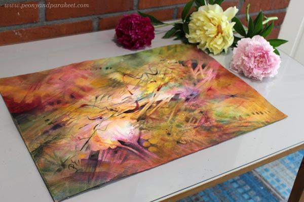
At first, accidental spots of color cause traditional associations: “Here could be a leaf, there a flower.” But when we let them go, a more personal layer opens: “Here’s something that reminds me of teenage years.” And slowly, more layers unfold, colors give room to shapes, and something that first sounded like a foreign language reaches the natural rhythm, and everything falls in place.
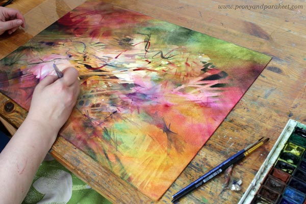
Negative painting – painting around the shapes – brings out light elements.
I work from light to dark and slowly add depth. The process of moving from traditional to natural is the toughest one for me. It requires to face many unpleasant memories – mental monsters that guard the paradise. From the outside perspective, I only make slow strokes for hours. But inside, I am crossing a storming sea feeling afraid of failure and success at the same time. The monsters are roaring on both shores and the only way to get through is not to beat but tame them.
This painting took two days and several sessions.
The monsters are often visible in my paintings too. People often point them when choosing their favorite details: “I like this. How did you do that?”
The two sides of art – the technical and the spiritual – are always present. Thus, art is always about both learning the strokes and living the strokes.
Paivi’s Watercolor Classes & Exhibitions
No matter what media you end up loving, watercolors have a lot to teach! Color washes, the negative painting technique, making simple shapes more elegant – all these techniques are useful for any art. Paivi likes to think about her watercolor set as a little assistant, always eager to work, and someone who sets her back on track.
- Watercolor Journey – outer and inner sceneries
- Floral Fantasies – loose and layered bouquets
- Magical Forest – intuitive watercolor painting
If you are in Italy or Finland, come to see Paivi’s watercolor paintings! “Shyeling” is displayed in the international group exhibition in Fabriano from June 20 to Oct 31. “Torchbearer” and “Maximalist” are displayed in the Akvart gallery in Helsinki from July 12-25, 2021.
Also check: Original watercolor paintings available in the shop
Monet in the Box – Creativity and Shame
This week, I show my latest finished painting and talk about Monet and the hall of fame – no! – the box of shame!
Last week, I participated in an online event organized by the Finnish Illustration Association. One of the speakers was Eeva Kolu, who talked about maintaining balance in life, not letting work take over all of it. She referred to a book that she had written which is unfortunately available only in Finnish. It’s called “Korkeintaan vähän väsynyt” (free translation: A Little Tired At Most)
I have been listening to the book on daily walks, and even if I am not finished yet, I already like the inner dialog that it raises. It makes me stop to ponder, sometimes agree, other times disagree. It’s not only pleasant, and yet, it’s definitely worth reading. One of the things Eeva Kolu brings up is shame. She says that shame defines the size of the box where we live. The box can become so small there’s not much room for life.
Eeva Kolu made me think about all the things I am shame of. Surprisingly, one of them is central to my art.
My Relationship With Old Art
When I was in my twenties and thirties, all I wanted to see was contemporary abstract art. In museums, I rushed through the old paintings because representational and traditional art was for mediocre people, and I didn’t want to be one of them. I felt shame about my uneducated family and the lack of abstract thinking in the surroundings where I came from. I had a new life with higher education, and my love for mathematics was well aligned with geometric shapes and lines.
But age has made me understand more about my background and art as well. I have begun to love old art, and still, it’s something that causes me shame as well.
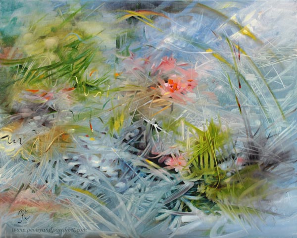
“Waterlilies,” my husband said when he saw this painting.
It made my box shrink. My intention was not to do any Monet. I just painted the dreamy blue that needed to come out, not make any imitation of anything.
I Kind of Hate Monet’s Waterlilies
I have seen them in National Gallery in London. They are captivating. People love them.
But instead of making what people easily love, I would like to be an artist who sees to the future. Who builds paintings that are like complex machines. I should be a Leonardo of this age, imagining something technical that engineers will skillfully implement someday.
But my art has a mind of its own. No, a mind of mine. Or would I dare to say: a mind of my shame. I am stuck to the past, so I paint the past. I reach the worlds that feel excitingly unknown first but turn out familiar once the painting is finished. I end up recreating instead of inventing. That’s my shame.
In my classes and in this blog, I talk about old art now and then. But compared to the amount I think about stiff renaissance portraits, romantic baroque sceneries, frilly victorian dresses, cubistic still-lives, and all the masterpieces from the 15th to 20th century, it’s very little.
“My Readers Want Their Art to Be Current”
That’s what I say to myself often. The readers – you – don’t like old art so I try not to write about it. And still, the expected goal to be current seems ridiculous sometimes. There’s a bridge between current and old, and it’s very difficult to be current without knowing what’s not.
That bridge – or should I call it a long historical timeline – is the place where my creativity naturally lies. My shame is also my utmost love. When I paint, I don’t think about Rubens, Monet, Picasso, or Kandinsky. When you love something deeply, with the skills, it comes out naturally.
“Everyone discusses my art and pretends to understand, as if it were necessary to understand, when it is simply necessary to love.”
Claude Monet
Monet’s attitude seems very unintellectual. And yet, if you think about what you create and have created, can you relate? That sometimes it’s necessary to omit the feeling of intellectual understanding, bypass the shame, and simply love – so, widen the box instead of trying to get out of it?
Thumbs up or down for talking about art history and old masters? Share your thoughts in the comments!
P.S. Claude Monet is “a guest teacher” in the class Floral Freedom!
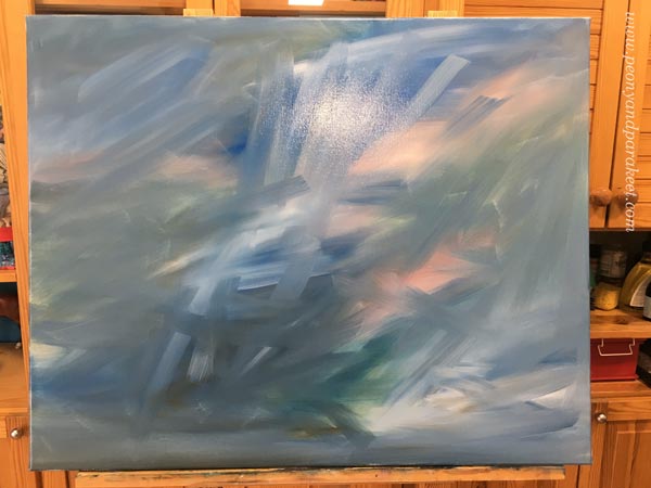
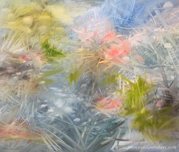
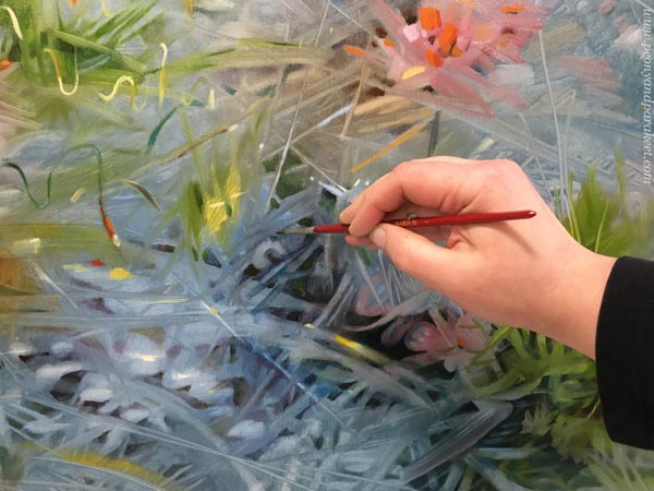
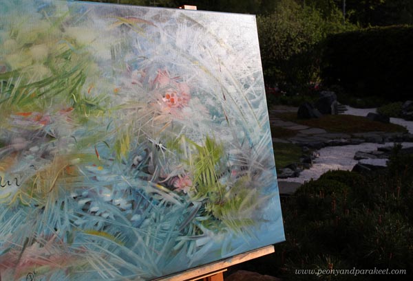
Your Art and Loosening Up
This week, I talk about being unique and loosening up in a video. You also get to see me working with a new oil painting.
Your Art and Loosening Up – From a Former Engineer
With the video below, I want to get you to think about how much you do layering. But this time, I don’t talk about the actual layers of the painting, but the layers of you and your life – the more abstract stuff. Namely, we often lead our artistic direction too literally and don’t allow contradictory or silly ideas. I hope you enjoy this video!
This is a little different than many of my videos. I would be interested to hear how you like it! Do leave a comment!
Links Relevant to the Video
- Ilun Handu Duunaa, Episode 44 (in Finnish)
- Paul Klee and Wassily Kandinsky at Wikipedia
- Paul Klee’s Pedagogical Sketchbook at Amazon.com (affiliate link)
- Wassily Kandinsky’s Point and Line to Plane at Amazon.com (affiliate link)
- Floral Freedom (the abstract floral class!)