Coming Up with Ideas that Make You an Artist
This week’s blog post is about working with ideas that bring more of you together and make you an artist.
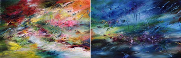
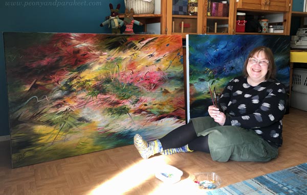
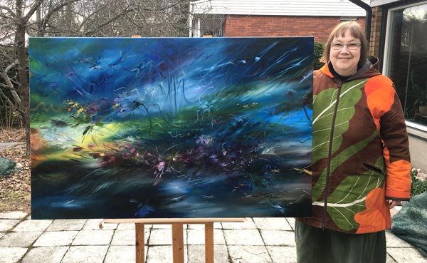
Here’s one of my newest paintings called Merkuriuksen lämpötilat – Mercury Temperatures. This oil painting is a part of my series Linnunrata – Milky Way, where I explore planets and outer space. (See previous work: Neptune here, Pluto here, the Earth here, Venus here, and the Sun here!)
My first intention was to create Mars, not Mercury, so I started with sharp strokes and fiery colors.
But it happened that Mars appeared in another painting, so I changed the subject after the first layer. This wasn’t hard. All I needed was to get back to left-brain thinking, which I call my inner engineer.
Fact-Finding for Artistic Inspiration
It has been fun to find out facts about the planets. I have also had great discussions about them with my husband. We both love science and are interested in the bits of information about outer space. The mind-blowing fact about the planet Mercury is that its temperature varies about 650 degrees! Night and day in the same location can have very different temperatures.
I try to keep the fact-finding separate from the painting process as possible. I want the facts to be just one of the many inspiration sources and be intuitive and inventive during actual art-making. For example, in this painting, I also thought about pattern designs, interior decorating, wallpapers of William Morris and Designers Guild, fantasy stories with unicorns, gardening … all kinds of inspiration got mixed into one piece.
Hidden Love for Natural Science
Over a couple of years, natural science has got more and more impact on my art. However, I have been pretty quiet about it because it feels weird to talk about science and then show flower paintings. But now, my inner engineer said that Mercury Temperatures is the only appropriate name for the piece, and I noticed how happy she looked, being involved and accepted more than many times before.
This spring, I have learned a lot about leading myself artistically. I have noticed that if my inner engineer can provide concepts like “temperature changes” rather than direct images, my inner artist can then tie them freely with visual ideas. Together they form an effective pair. My inner engineer can provide exciting ideas based on her background studies, and my inner artist can still get all the creative freedom she needs.
Digging Deeper into the Professional Identity
It has started to feel that there’s a reason why I first studied engineering, then moved to design, and only finally to art. I play with the question that if my career had started as an artist, would I be studying technology now? It feels that my ideas are on several levels, and if I omit the science level, something is missing.
For years and years, I have been trying to manage what my inner engineer can do and how she should not disturb the inner artist. But now, when I have given the inner engineer a significant role, the inner artist hasn’t complained at all. On the contrary, it feels like the artist praises the engineer and vice versa.
This understanding has also closed the gap between design and art. Some of my work can now be openly more design-oriented than others. My inner designer had a lot of fun participating in this painting.
I feel happy about being able to use my curiosity about natural science in the artistic process. I have even started to think that my background in technology and science can be one factor that makes my art unique, even if it doesn’t get the leading role when marketing my work.
Coming Up With Genuine Ideas
We often think about using the skills from one profession to another very literally. But the identity in one can be used for another when we get to the level of ideas and inspiration. Every field has pieces of information that are super inspiring, especially if you already have the foundational knowledge of the area. With the knowledge, your imagination can build bridges between what is and what could be.
Ideas that make you an artist are not about art.
The artistic identity is more like an umbrella rather than an individual thing. An artist is a connector rather than a lonely one on a closed island.
What do you think?
Painting the Best Work for the Show
This week, I present the main artwork for my solo show in June and talk about the pressure of painting the best work.
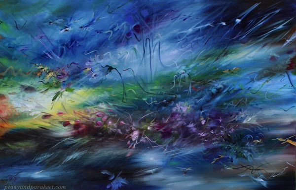
This oil painting, “Juhlat Neptunuksessa – Jubilee in Neptune,” is a part of my series Linnunrata – Milky Way, where I explore planets and outer space. (See previous work: Pluto here, the Earth here, Venus here, and the Sun here!)
Painting the Best Work – Feeling the Pressure!
I have had terrible pressure to create my best work for the show. Especially the two big pieces on the back wall needed to reach the next level, not that I was able to define what that would be. So I couldn’t pre-process and plan the paintings in my mind. I had to trust the brush and the intuition and start painting.
This size (about 35,5 x 55 inches) was also new for me, so I felt like being in a new territory. But several smaller paintings of the same series had already been made, so it was a continuum too.
Extrovert
Last week I talked about introverts and extroverts, and this painting definitely was an extrovert. From the beginning, it knew what it wanted and kept talking to me gently but determinedly, and all I had to do was listen to its spirit.

I felt like the painting gently carried me over a mystery of life and took me through the gates that I would not have dared alone. I don’t usually talk about the painting process in this mysterious way, but this time, it all felt pretty magical.

One part of me, the inner engineer, was wiping the sweat from the outside pressure, and the other part of me, the inner artist, couldn’t care less. She was only serving the needs of the painting.

I am very happy about the brush strokes – many of them have been created fast, but they still look pretty flawless.
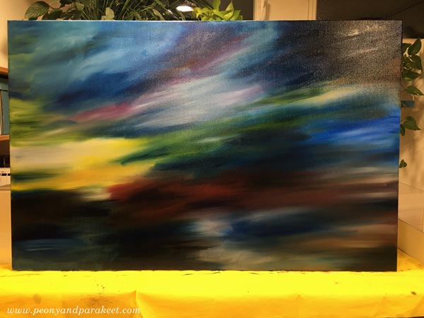
Creating a Panoramic View
I wanted the two big paintings to be individual in identity but still share some parts when placed side by side. This way, the overall view of the gallery’s back wall could be panoramic.
To achieve this, I needed to finish the pieces so that they were placed side by side.
Whales in a Small Bond
My studio is a small room attached to our home, and the two whales were much too big.
But I managed anyway. In art, I don’t want to live a life where everything needs to be perfect before I can do something. I want to accomplish paintings like this right now and can’t wait for a better situation. And I love our home and working from home, so I just have to make things work. Fortunately, we have quite a lot of wall space in the other parts of the house so that the paintings can dry elsewhere.
Main Promotion Piece for the Show
The new painting is airy, but there are a lot of details too. I am very fond of this piece and feel relieved.

This painting is the artwork in all the promo material for the exhibition. See the press release here! Because the show is in Finland, the text is first in Finnish but scroll down the page to read the English translation.
My first solo show Linnunrata will be June 3-19, 2022 at Gallery K, Vantaa, Finland.

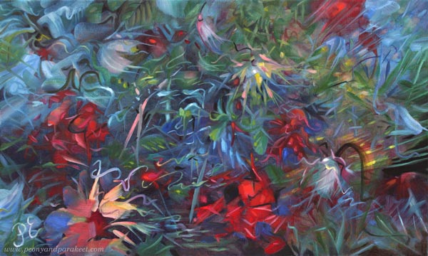
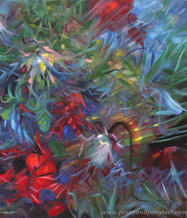
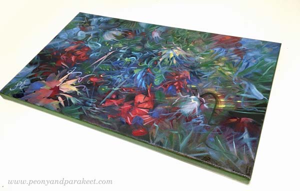
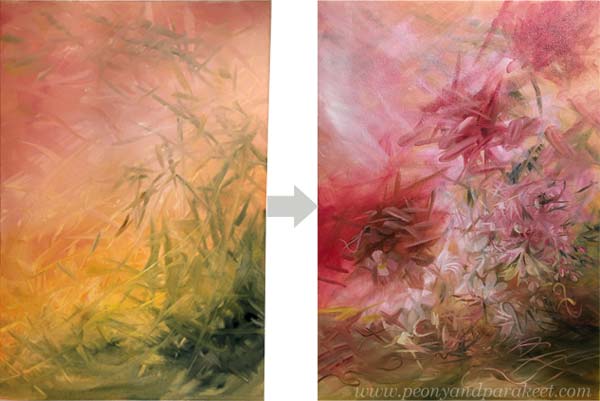
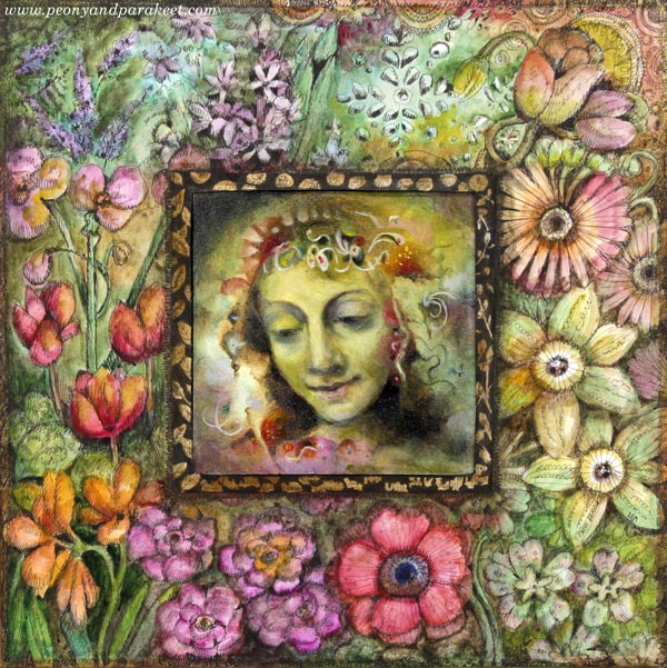
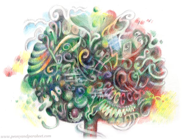
Bringing Old-World Feel to Abstract Floral Painting
This week, let’s dive into the old-world feel and get inspired by the opera singer Edita Gruberová!
Ideas Behind the Painting
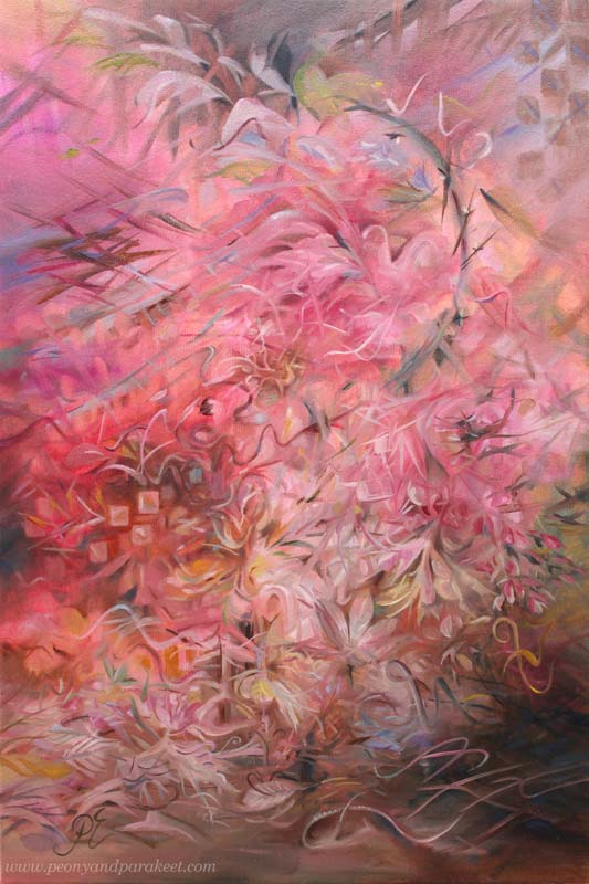
I listened to the opera singer Edita Gruberová (1946-2021) while working on this painting. Her version of the famous aria Queen of the Night from the opera Magic Flute is exquisite. Gruberová’s voice is partly like a bird’s not a human’s voice at all, and the aria brings that up well. The music editor Outi Paananen calls her a nightingale of Slovakia.
The transformation from a human to a bird felt inspiring. Maybe I could do a transformation of a painting so that my free and careless strokes would turn into decorative swirls, adding an old-world feel to an abstract floral painting. I had done something similar just recently but in a much smaller piece. See this blog post where I revamped a flower painting! From that experiment, I knew that it would take both time and patience. In a bigger piece, I could also get lost in the details so that the painting becomes confusing.
Before listening to Edita Gruberová, I already had a lot of ideas, collected in the blog post called Pink Inspiration. And now I wanted to add her and her birds to the painting too. I heard Edita’s story from Outi Paananen’s excellent radio program “Narrin aamulaulu” (in Finnish) on the Finnish Broadcasting Company. She had a clear artistic vision and strong willpower, and she demanded a lot of herself. It inspired me to challenge myself too.
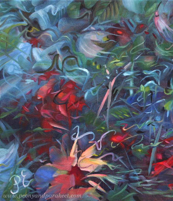
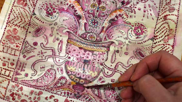
Bringing Old-World Feel – 2 Tips!
In the past, painters often started with sketches and made detailed underpaintings with two or three colors. But a looser approach is not an enemy to the old-world feel.
When you want to bring an old-world feel to an abstract painting, two things are the most important:
- Blurry on the bottom! Start from the background with soft transitions from light to dark, add blurry shapes, and paint like you would see the scenery from a far distance.
- Sharp on the top! Add sharp shapes and lines on the top of blurry ones. You can sharpen some blurry shapes but do it only partly, leaving some parts more undefined. But most importantly, let sharp lines and shapes sing the melody of their own. If the background is the orchestra, the top layer is the singer that has a melody of her own.
The thickness of the lines can change in places and there can be decorative dots too.
Timelessness Takes Time
It’s always tempting to get the piece finished quickly, but to get the sense of timelessness, the time has to stop while painting. So, I focused on tiny details and immersed myself in building a wondrous world with curves and swirls.
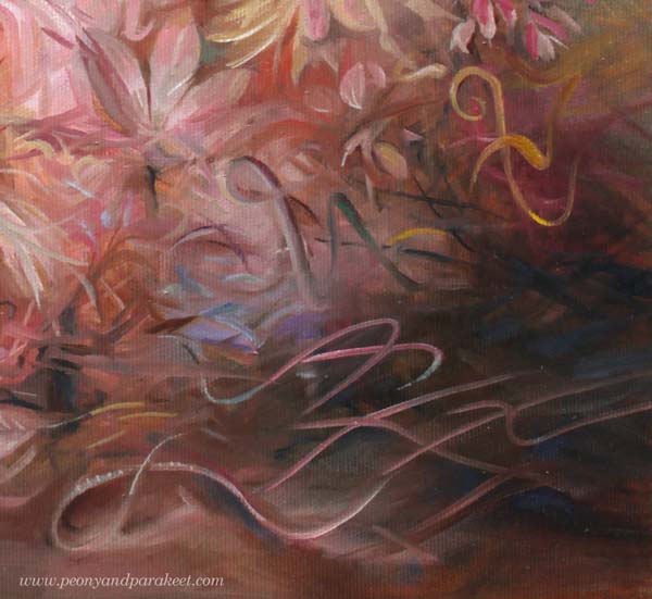
My lines are like old-fashioned handwriting in places. I have practiced them by drawing for a few years. Any note or waste paper can be used for practicing! I often doodled on planner pages.
Intuition and the Ability to (Not to!) See
As usual, I didn’t use any direct reference photos for the painting but worked intuitively. However, I tried to reduce the human ability to see ordinary concrete objects like flowers, faces, or such in simple forms. For a long time, I have thought that the ability to see is a part of creativity. But the more I create, the less I need the ability, at least in the first place. Seeing too soon makes me hurry and my art much less unique. So I try to let the shapes fly free and the big picture appear without too much forcing and seeing.

During the process, a little bird-like mesh appeared on the right. When I was making the final touches, and intentionally made him a partner in the center.

Sadly, Edita died last year, just before I discovered her, so I can’t send her a photo. But I want to honor her with this blog post and ask you to listen to her singing on Youtube. Isn’t that inspiring!
A Series in Progress
I have been painting like mad this month because I have to get everything finished for my solo show in June very soon. So, there are lots of paintings in progress in the studio!
Easter was mostly spent with brushes, and if this wasn’t my ultimate passion, I would be quite exhausted already! Also, seeing the flow of wonderful creations from the students in my community Bloom and Fly energizes me a lot.
Let’s keep creating and inspiring each other!
Art Inspiration from Period Dramas
This week, I am sharing art inspiration impacted by period dramas.
Visual Deliciousness of Period Dramas
I am a fan of period dramas. Recently, I have been watching Gilded Age and Bridgerton. Both of them have beautiful outdoor and indoor scenes, and dresses too, of course! My eyes like the delicious visual world they illustrate and my heart always feels a bit lighter after an episode or two.
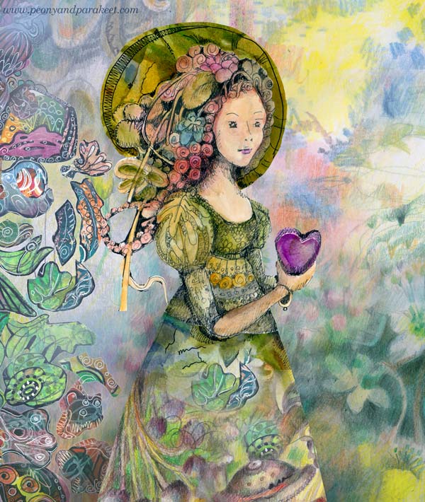
Even if the dramas have historical settings, their colors are not dull at all. A picnic in the forest looks vibrant and is full of sunlight.
I like how flowery everything is, and how the jewelry frames the faces of young ladies.
Being so inspired by period dramas, it’s no wonder that my art is full of romantic and old-fashioned elements. They speak fantasy to me.
Fantastic Old-World Impact
I think that every artist needs to find their approach to fantasy and fairytales – how to use imagination and what to express with it?

I am fascinated by the power of the inner world and all my pieces are inner sceneries in one way or another.
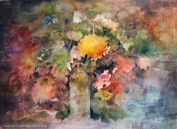
Pablo Picasso has said: “Art is a lie that tells the truth.” Similarly, I would say that art is a fantasy that gives us what we need.
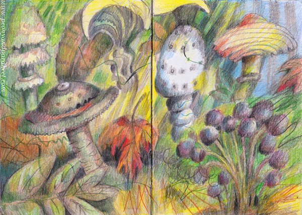
Bringing Fantasy to Life
I often talk about seeing art as a story or a collection rather than a single piece. In the new class, Fun Botanicum, we create a set of illustrations that are all unique but still a part of the series. This is a great project for setting a style and bringing different coloring techniques together.
Plants are a fun theme to explore what you can do with colored pencils and imagination!
>> Sign up here!