
Eurovision 2021 Collage Party & Flash Sale!
This week, we are celebrating Eurovision Song Contest and I am running a Flash sale – Decodashery is 50 % off!
Hurry and buy now! The sale lasts only a couple of days. It ends on Saturday 22nd May 2021, midnight PDT (9 am Sunday in Rotterdam, the Netherlands, where the contest takes place this year)!
Eurovision Song Contest Brings People Together
I have always watched Eurovision Song Contest, but after we had here in Finland in 2007, I became a big fan. When I sat in the audience of a rehearsal between Finnish men from the countryside and two urban Europeans, it felt like we truly are a big diverse family. And last year, when there was no contest, but only a television show, I cried with my fellow Europeans when seeing the empty streets of the big cities.
But last Tuesday, when this year’s first semifinal started, it felt incredible and I knew that I wanted to make something to celebrate the contest here on my blog too. So I selected a few from this year’s songs and asked the little paper people of mine to dress up and got creative with lighting when taking photos of them. Eurovision 2021 collage party – let’s start the show!
France
Let’s start with my favorite of this year – France’s Voilà.
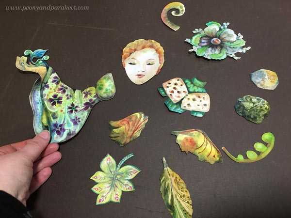
The song is so elegant and beautiful, I love it!
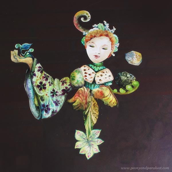
Lithuania
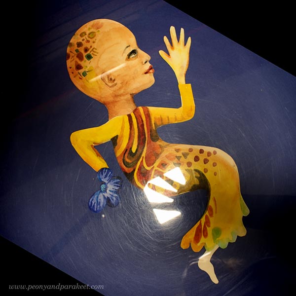
Lithuania’s Discoteque is another favorite.
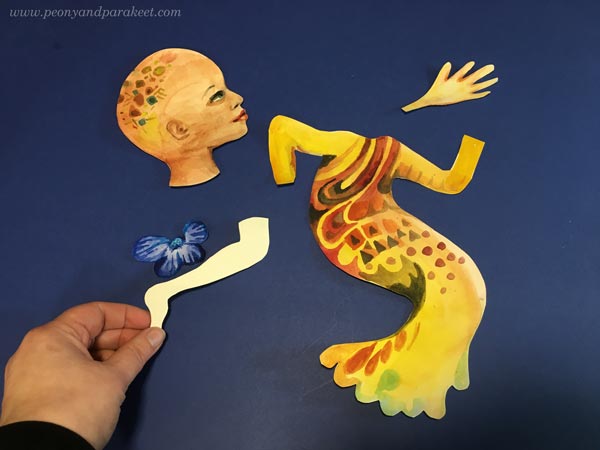
Even my husband likes it, and he is very critical when it comes to Eurovision Song Contest. He also helped me with taking the photo!
Moldova
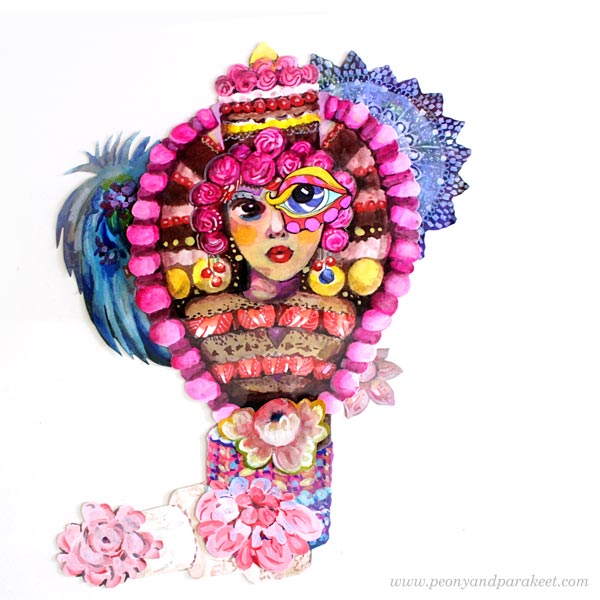
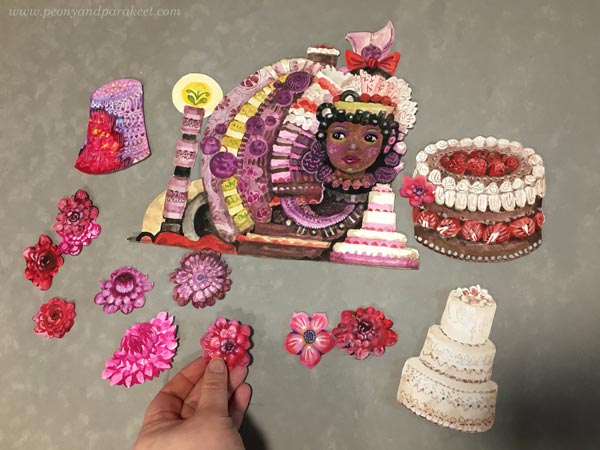
Moldova’s Sugar has definitely the best video. The videos and the stage performances are often a bit different, but I absolutely love the delicious colors in the video and am excited to see the song in the second semifinal this evening.
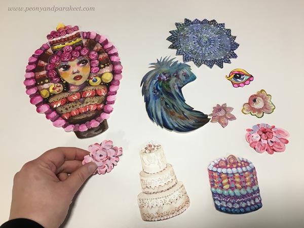
Sugary brightness goes so well with the song!
Sweden
Sweden’s Voices is really good – of course! Our neighbour Sweden always beats Finland in music and we try to accept that bravely.
I switched off the lights and took a flashlight to get the stylish darkness that I admired on Tuesday when Sweden was in the first semifinal. They got through to the final, of course!
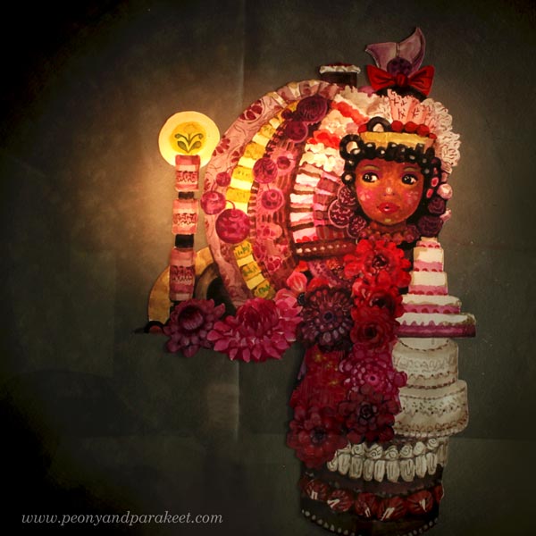
Australia
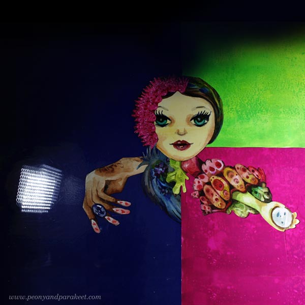
Yes, I am typing it right, not Austria, but Australia! Australians have been fans of the contest for so long that they are now part of the big European family. I think this is the fourth time already. Sadly, Technicolor didn’t make it to the final, but I definitely want to celebrate the love for Eurovision across the globe, so here’s my setting.
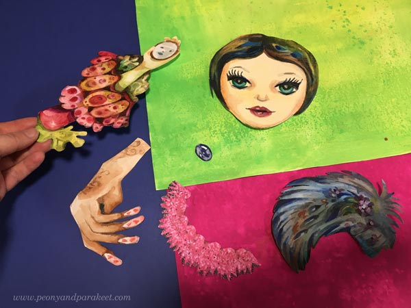
Then I switched off the lights and moved a studio light so that it looks very … well, technicolor!
Malta
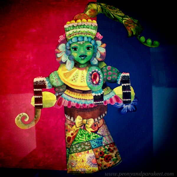
Malta’s singer Destiny has a wonderful strong voice. I think she is the best singer this year, and I had a paper doll that looks quite like her (despite the skin color!).
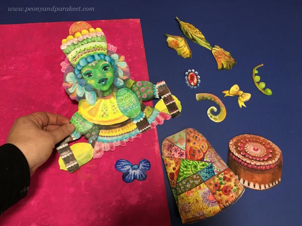
So here’s to Malta’s Je Me Casse!
Eurovison 2021 Bonus – Norway
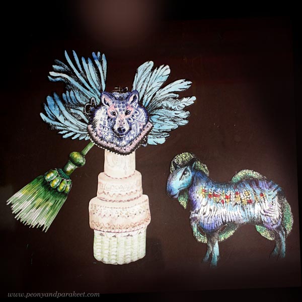
Norway’s Fallen Angel is so funny weird that I wanted to make my version of it.
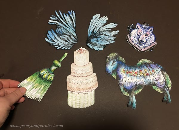
An angel wolf and a sheep as a devil! Not quite like in the show, but you get the idea.
I hope you enjoyed this post, the contest, and the flash sale of Decodashery!
I usually never have a discount this big so now is the time to grab this wonderful class!
Decodashery – Use any paints you have – watercolors, gouache or acrylics, you choose!
3 Tips for Bringing More Life into Your Art
This week, we look for what’s natural and lively in a bit different way than usual. I share three tips for bringing more life into your art.
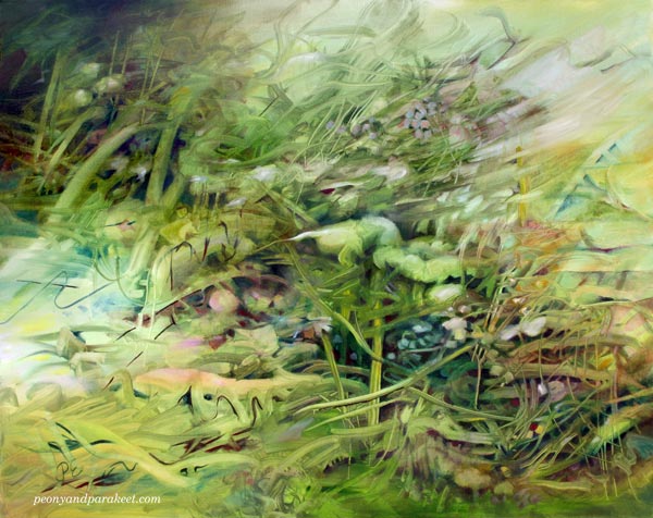
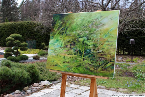
I just finished this green painting. It’s called “Muuttumaton” in Finnish, but this time, the translation “Unchanging” fits it better because the English word has a more active tone.
This painting was in progress in the video that I shared a couple of weeks ago.
Here’s the video again so that you can see me working with this in practice and compare the middle and the end!
So, that was the video, but in this post, I want to give you ideas on how you could bring more life into art.
These ideas are not technical because I think that my classes are better for learning the techniques, but more about changing the way you get inspired and observe what first appears on paper or canvas.
Tip #1 – Let Weeds be Weeds
In my painting, the main character and the focal point is a blooming weed. It appeared on the canvas right away and reminded me of Fernando Pessoa‘s poem that talks about a crop bending with the wind and then straightening once the wind stops. This kind of natural resilience that weeds also have is inspiring. In art, we usually make weeds look more like a flower. But could we loosen up and bring more life by letting the weeds be weeds?
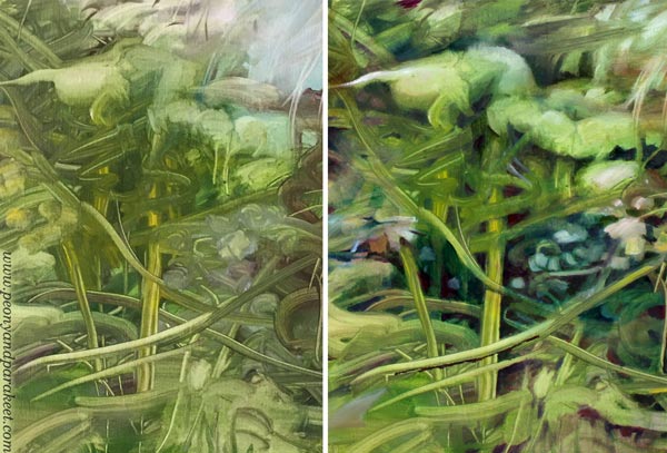
So, I just made the big plant look a bit more defined and let it be the star of the show.
Tip #2 – Try to Ignore Color
Even if I took pictures of the painting in our garden, I have been more inspired by the untamed side of nature lately.
With my beagle Stella, I have been exploring banks and woods that look ugly but are full of layers. For Stella, layers of smells, and for me, layers of shapes and textures. I have tried not to seek the most beautiful spring flower, but develop my eye to notice other than colorful things.
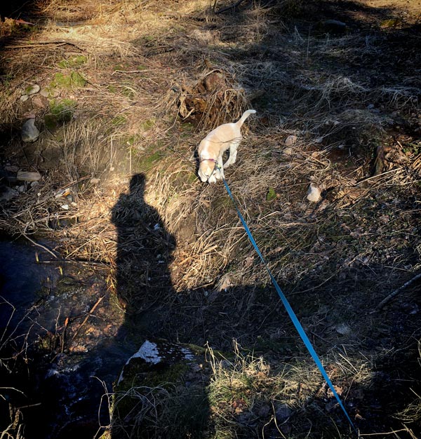
What looks ugly first can be beautifully free.
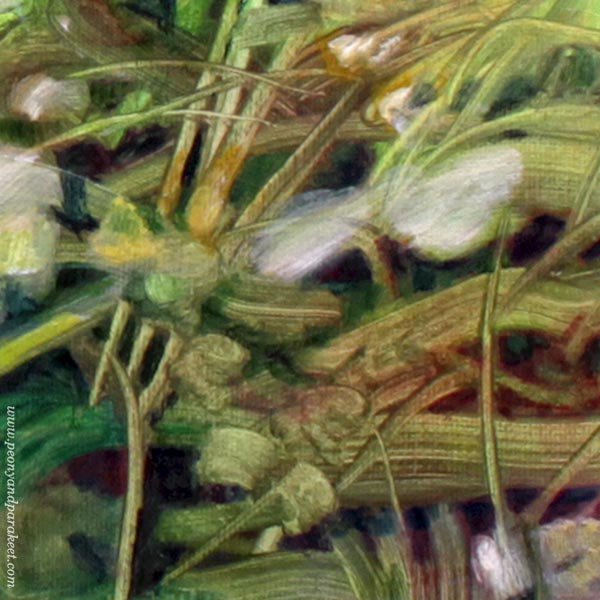
Subtle changes in color can make the painting look more lively than if you throw in a bunch of strong colors.
Tip #3 – Embrace Destruction
When bringing life into art, it’s not that we have to start with life. We can look at broken and deserted things like fallen or chopped branches. They can then have another life in our art. Imagine branches falling further down and breaking the cover between the outer and inner world. What kind of life could you give them there?
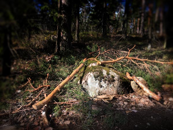
Admire how the grass grows, but also, how it withers!
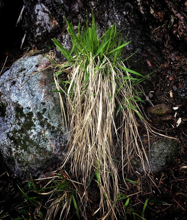
When we create, we can start with destruction and then use colors to make all the ugliness bloom. This way, we build a bridge between the garden and the wilderness – between the traditional beauty and nature’s aesthetics.
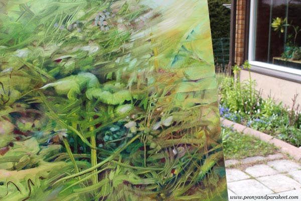
I don’t use references for my half-abstract paintings like this one. But I believe that things that we see and appreciate find their way to our art in one way or another.
So when you want to bring life to your art,
look for life as it is in the wilderness, not only as it is in your garden.
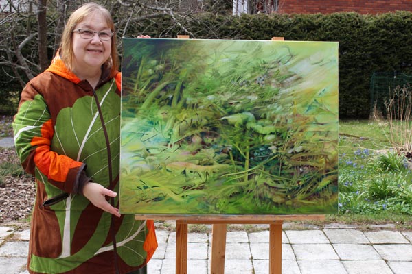
When looking at this painting, I want to be like that weed, stand tall where I happened to fall. I want to believe there’s something unchanging in this ever-changing life that keeps us creating. I hope we can be Pessoa’s crop that straightens right away when it gets the chance!
No Creative Blocks – Painting Grief and Loss
Even if I want these blog posts to be a celebration of art-making, I also want to paint and write from the heart. This week’s post is about sadness and its’ effects on creativity.

Here’s my latest acrylic painting called “If Grief Smoked.” Like many of the recent paintings, this also has a connection to a poem. The title is from Eeva-Liisa Manner’s poem “Jos suru savuaisi.” But this time, I didn’t follow the poem but used the title as a prompt only.
Missing Cosmo
I have been very melancholic this fall, and to be honest, building a new class Floral Freedom, has been my savior. It’s been a captivating escape from a life that feels emptier than before. My loyal companion Cosmo died in September, and it’s like a part of me has lost a purpose.
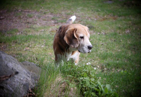
Cosmo was our family member for over 15 years, and there’s a lot I miss about him. Small things, often quite insignificant ones, like how he used to pick a sock when he wanted attention. My heart breaks when I remember how softly he did that, not leaving a single mark. In the end, he was a good dog and didn’t want to behave badly.
So yes, my grief has been smoking and burning. A wind of time has taken some away but also spread it further. When it started to feel that the grief would scorch my brushes, destroy the paints, and make the studio a smoky place, I knew it was time to paint. Not that it would take the grief away, but force me to deal with it.
Persuasion Can Replace Inspiration
Art is not always about inspiration. You know Picasso’s saying that the inspiration has to find you working. I find self-persuasion especially useful. “After this, you can paint whatever you want,” I said to myself.
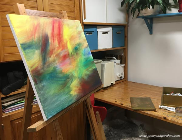
If we don’t paint these paintings that need to come out, it can cause a creative block. I have had some major ones in the past, and I didn’t want that to happen now.

“Follow the color,” I said to myself like many times before. It’s a quote of my own that boosts my confidence when I am working.
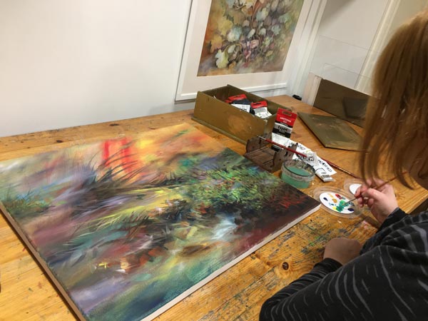
Stepping Into The Painting
This scenery had been in my mind for weeks. It was like an overdue baby, pushing through the brush.
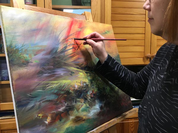
I just had to open my heart and welcome it.
Wassily Kandinsky talks about a glass between the artist and the painting, and how to remove it. It’s one of the hardest things when in grief, but also the most impactful one.

When we paint without the glass, the image becomes more personal. It doesn’t matter what other people think about it because you are living and breathing it. But oddly so, removing the glass also makes the image more general. My loss gets connected to everybody else’s losses. We are all behind the same glass, under the same blanket.
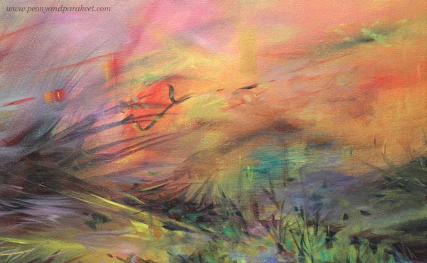
If grief smoked, we would all be covered in it. Even if it’s the saddest thing, it’s also beautiful to let go of someone or something you love. You can no longer help them, and it’s time to give them away.
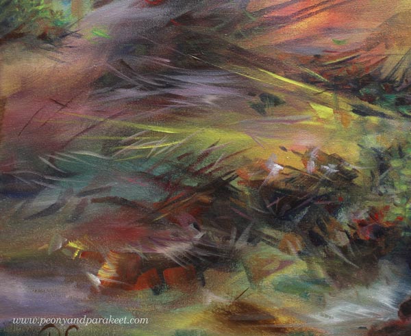
Mental Queue – Images That Need to Get Painted
Art helps us with things that can’t be solved intellectually. I also think that artists have a mental queue. If we try to jump over the hard images, we don’t have the energy for the more cheerful ones that come next.
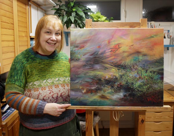
I hope this inspires you to pick the brush and paint the image that has been waiting for its turn.
Painting Poems – Watch the Video!
This week, we’ll continue the theme of painting poems from a couple of weeks ago. I create a small painting from a poem in a video and also talk about overcoming perfectionism.
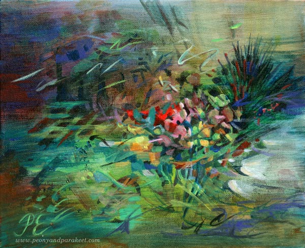
Here’s the acrylic painting that I created from Saima Harmaja‘s old poem “Olkoon niin!” I also include some examples from the class Floral Freedom at the end of this post.
Painting Poems – Watch the Video!
In the video, I show how a poem can make a painting more finished and meaningful. I also talk about why I thought I can’t paint Finnish poems and how I have realized that aiming for perfection doesn’t always help.
More Poetic Paintings
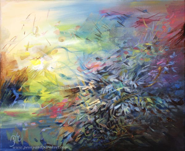
I created these two paintings for the class Floral Freedom. The first one is inspired by Anna-Maija Raittila’s poem Ruiskukkaehtoo (Cornflower Night).
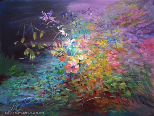
And the one below is inspired by Katri Vala’s poem Kukkiva maa (Flowering Earth).
Paint Dreamy Florals to Free Your Spirit!
Floral Freedom – the abstract floral class based on Paul Klee’s and Wassily Kandinsky’s insights – will begin on Dec 4, 2021. In this class flowers are not just passive decorations, but they fly, sing, and dream! >> Sign up Now!
Floral Freedom is 20% off for the rest of November, so now is a good time to sign up!
>> Sign up now!