
Intuitive Coloring Explained + Extended Black Friday Sale!
This week, I have a new free video for you, inspiration from my drawing classes, and there’s also an extended Black Friday Sale going on! Exciting!
Extended Black Friday Sale – Shop Here!

All classes are 25% OFF!
Now is the time to get the classes you have been thinking about!
>> Shop Here!
The sale ends on Nov 29, midnight PST.
Intuitive Coloring Explained – Watch the Video!
This video is an excerpt of the live speech that I gave for my art community Bloom and Fly this month. It introduces a fresh way to think about drawing and coloring. Lots of art-making inspiration is packed into this 6-minute video!
The classes mentioned in the video – Intuitive Coloring, Inspirational Drawing, Animal Inkdom, and Magical Inkdom, as well as all my painting classes – are 25% OFF during the extended Black Friday Sale. >> Shop Here!
More Inspiration from My Drawing Classes
The longer I draw, the more things come together. Not only so that I find more inspiration from the individual previous pieces, but also so that they describe a world that’s lively and ever-expanding. I also feel that my classes are like doorways to building a world of your own.
In Intuitive Coloring, we travel from one meadow to another lesson by lesson and play on the way.

In Animal Inkdom, we start with little creatures and the animals get bigger lesson by lesson.

Insects and butterflies are simple to draw, but decoration makes them look fantastic!
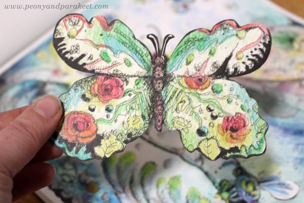
Animal Inkdom is one of my most popular classes, maybe because it’s so playful! I had to edit out some of the laughs and smiles because I had so much fun drawing these that it would be a bit disturbing! And after Animal Inkdom, I couldn’t stop, but made an independent sequel – Magical Inkdom!
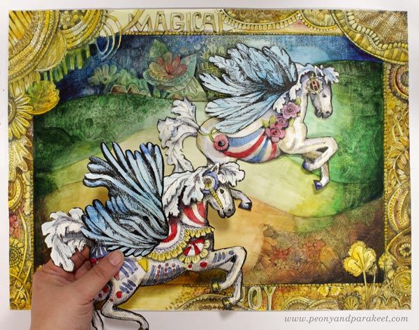
Art is a journey, so combining previous work with the new one, has often made me see new possibilities.
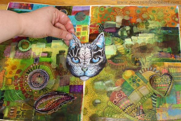
Inspirational Drawing is based on doodling and creating meshes from lines, but also on picking inspiration from images. I still collect inspirational images and use them indirectly in this way.

All Classes Are 25% OFF!
Now is the time to get the classes you have been thinking about!
>> Shop Here!
The sale ends on Nov 29, midnight PST.
Can or Can’t Draw – Did You Know This About Drawing?
Before you decide whether you can or can’t draw, read this!
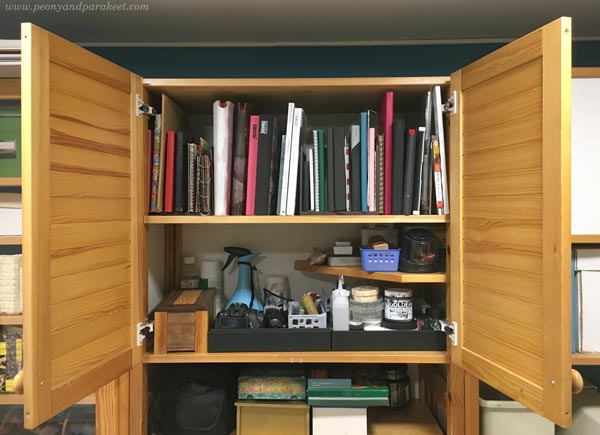
Last week, I re-organized my art supplies. Paints and painting mediums got a more accessible location, and pens and other drawing supplies went into a closet. It was a consequence of the revelation that I had become a painter.
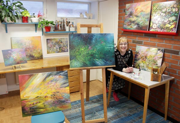
But instead of declaring the love for painting, this post is about drawing!
Namely, my journey in art has been gathered around finding my line. To me, the line is the voice. It’s the leading singer, while colors and heavier shapes are the rest of the orchestra. The line itself is enough to make any piece of art sing.
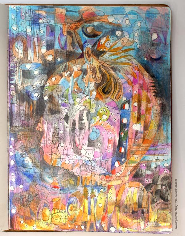
“I can’t draw” was my problem for too many years. Then I realized that we define drawing too narrowly.
We aim for the skills of drawing realistic objects and then end up worrying about the stiffness of our work. “I want to be more spiritual, I want to be more abstract, I want to see me in my drawings.” Have you ever thought like this?
My solution was to abandon references and start drawing circles.
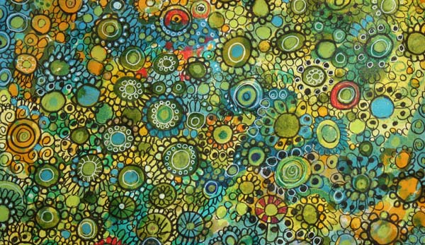
Don’t Just Draw Circles!
Those years spent with circles now felt like a waste of time. I didn’t have guidance for freehand drawing, and I did what felt comfortable at first. But circles are closed and rigid shapes, and when you want to open up and loosen up, you need to open and loosen your circles too.
Here’s a short 4-minute video from 2017 that shows how you can move forward from drawing circles.
Drawing – like any art – has two sides.
One side is a skill of controlling a pen or a brush so that the result is attractive and aesthetically pleasing. But drawing is also a skill of getting out of control and expressing the limitlessness of the mind.
Both skills support each other. Clarity and stiffness add ornamental beauty to loose lines. And drawing wildly helps with showing more personality when you want to be in control.
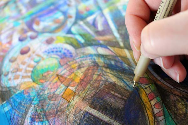
For me, exploring drawing from the other angle was ground-breaking.
I developed a class called Inspirational Drawing, where we draw and color freely but also use inspiration images to boost imagination. Inspirational Drawing 2.0 is the latest version of this popular class.
You know you can draw when drawing feeds inspiration.
When I paint, I start with a vague idea and go where happy accidents lead me. I don’t need much to get started. The first idea can be just a color combination from an old painting.
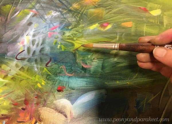
By practicing inspirational drawing, I found my living line, and the energy that’s packed into it is enough for any sized painting. My line sings, and the rest of the orchestra supports it.
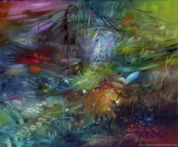
So, isn’t it sad if we try to improve our art without paying any attention to our line?
If we try to release the expression without releasing the line, giving the full power to the leading singer?
If we say we can or can’t draw without allowing free expression?
What do you think?
Art Journal Video – Adding Text and Layers to Your Pages
This week is all about art journal inspiration. You see more spreads from the art journal I started a couple of weeks ago, and there’s also a video of making the spread below.
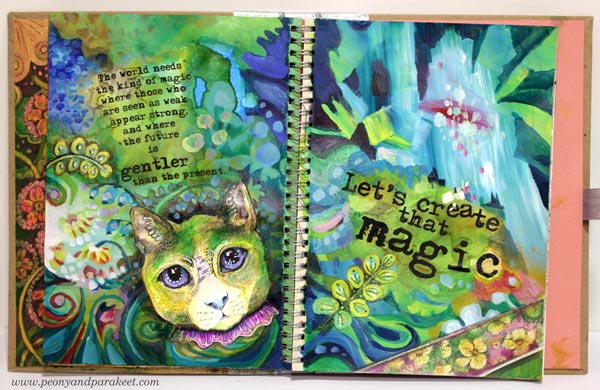
The world needs the kind of magic
where those who are seen as weak appear strong,
and where the future is gentler than the present.
Let’s create that magic!
Including Text in Art Journal Pages
I have a pile of these kinds of small stories about art and imagination. Or maybe I should say “a feed” instead of “a pile” because I post them regularly on Peony and Parakeet’s Facebook page. I have always liked writing, and I have a natural urge to share thoughts about my passion. So it hit me that I should write more in my art journals too. And why not use those stories that are born so effortlessly every week?
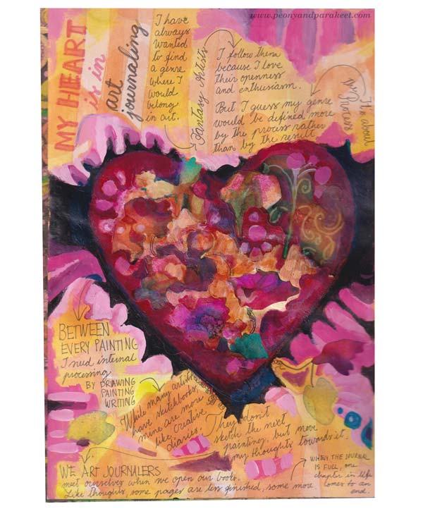
I have always wanted to find a genre where I would belong in art.
I follow fantasy artists closely because I love their openness and enthusiasm.
But I guess my genre would be defined more by the process rather than by the result.
Between every painting, I need internal processing by drawing, painting, and writing.
While many artists have sketchbooks, mine are more like creative diaries.
They don’t sketch the next painting but move my thoughts towards it.
We art journalers meet ourselves when we open our books.
Like thoughts, some pages are less finished, some more,
and when the journal is full, one chapter in life comes to an end.
Art Journal Pages with Typed Text Blocks
After writing by hand, I decided to make the next page so that the text would be typed. Not that I hate my handwriting, vice versa, hand-written pages always look great. But when I was a child, I used to write a lot with an old Bijou, and I missed the typed look. I still have the old typewriter, but the possibility to play with the size and style of the letters, made me use a computer instead.
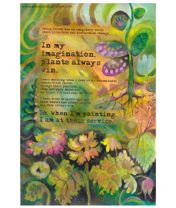
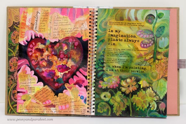
Every person has an imaginary world where priorities and hierarchies change.
In my imagination, plants always win.
Every morning when I look at my houseplants,
remove dried leaves, change their position,
they not only maneuver my hands but take over my mind.
I have tried to battle against these modest and silent spirits, but they always win.
So, when I’m painting, I am at their service!
Here’s the spread with the two pages side by side.
In the second spread, I wanted to play with the orientation and the shape of the text blocks.
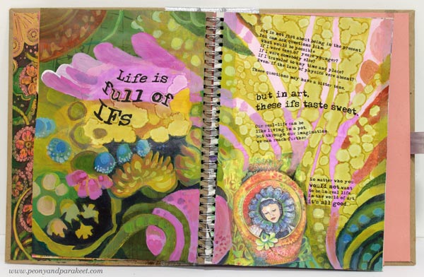
Art is not just about being in the present. You can ask questions like:
What would be possible if I were tens of years younger?
If I were somebody else?
If I traveled to any time and place?
Even: if the laws of physics were absent?
These questions may first have a bit bitter tone,
but in art, these ifs taste sweet.
Our real-life can be like living in a pot,
but through our imagination,
we can reach further.
No matter who you would not want to be in real life,
in the world of art, it’s all good.
Mixed Media Art Journal Pages
For the second spread, I printed a gouache painting that I had made for the class Decodashery on a sticky canvas and adhered it on the page.
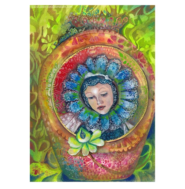
I really like the yellow-green circles, made with alcohol inks.
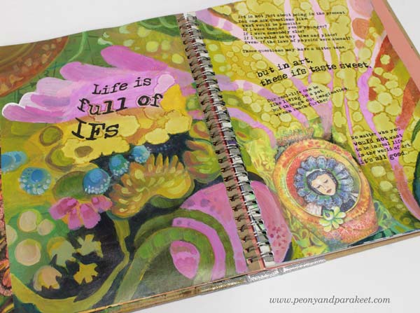
In this spread, I also used hand-drawn and hand-painted collage pieces made from the classes Magical Inkdom and Decodashery.
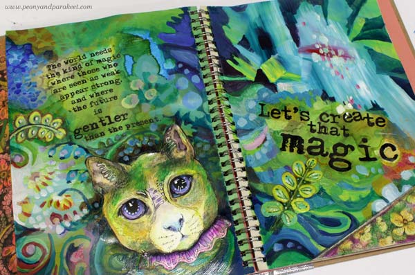
I added green to the cat so that it fits with the rest of the page.
Art Journal Magic – Watch the Video!
See the process of attaching printed text, using alcohol inks, and painting with acrylics more in detail by watching the video below!
I hope the video inspired you to fill your journals!
Draw animals and more: Animal Inkdom, Magical Inkdom
Paint decorative flowers and more: Decodashery
New Oil Painting and Pretty Art Journaling
This week, I have finished an oil painting and started an art journal that I want to make as pretty as possible. I also talk about my aspire to paint horses and ask how deep you have to know the subject to own it in your art. This post has lots of pics!
Wreath Maker – Painting with Oils Like They Would be Watercolors
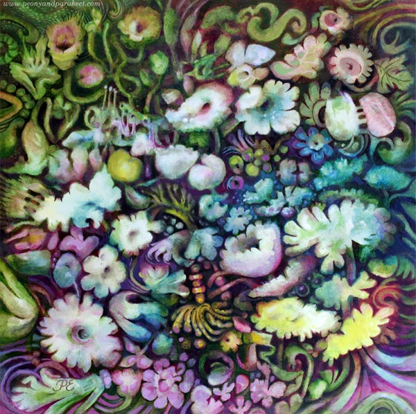
I started this painting in January, and I am so glad that it’s finally finished. Even if this is an oil painting, I used the approach that’s best for watercolors – I started with pale pastels and worked towards darker tones. I really like painting like this, and the result pleases my eye. The pictures below show the process and I have also blogged about this painting in May 2020.
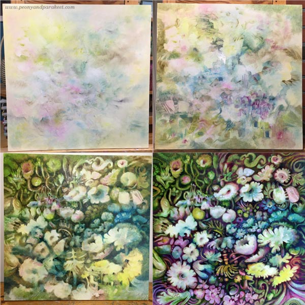
The Series of Three Floral Paintings
The painting is called “Seppeleentekijä – Wreath Maker”. It’s the last one for the series of three paintings. The two first ones are watercolor pieces called “Jäänmurtaja – Ice Breaker” and “Soihdunkantaja – Torch Bearer.” I made the paintings so that they could be seen as a triptych where the flowers of the two watercolor paintings lean towards the centerpiece. Click the image below to see the series as a bigger picture!

The Shelf of Art Journals – Re-Organizing the Studio
Making the three paintings was quite an accomplishment, and finishing the last piece made me feel empty. What to do next? Well, I don’t know about you, but if I need recreation, cleaning and organizing is the thing! While going through the stuff on the shelves of my little studio, I gathered the sketchbooks and art journals in one place.
Smash Books – Do You Still Remember Them?
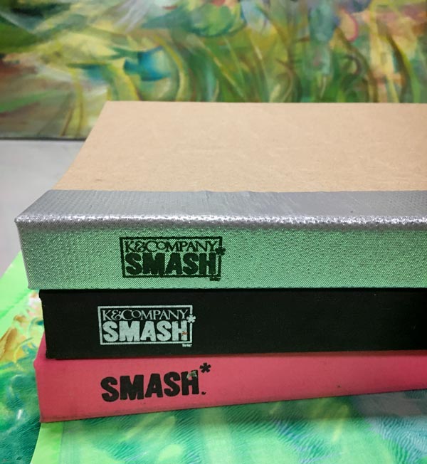
I found one almost empty old Smash Book – do you remember the time when everybody had them? See the flip-through videos of my two Smash Books here:
>> Pink Smash Book Flip-Through
>> Black Smash Book Flip-Through
The third Smash Book has a silver back and with that, I remembered how back then, all the art journals were more or less messy. In 2012, I daringly wrote a blog post that asked: “Can’t there be pretty art journaling?”
So it hit me, that the extra Smash Book could continue the tradition of the two past ones and be a pretty art journal. It could also be my tool for encouraging myself to paint what I really want, and not fall into the trap of trying to paint what seems more appropriate. Namely, I would like to paint things like … (gasping a bit)… ahem … HORSES! I tried to make a long list, but all I could think of was HORSES.
Horses – Can only an Expert Paint Them?
You see, I am no expert in horses, I have ridden on a horse only once, as a child, and I have never been living close to a stable. But I had toy horses, and I have always admired their beauty. I have tried to get rid of this disease by drawing zebras for the class Animal Inkdom, and horses for its independent sequel Magical Inkdom, but it hasn’t gone away.
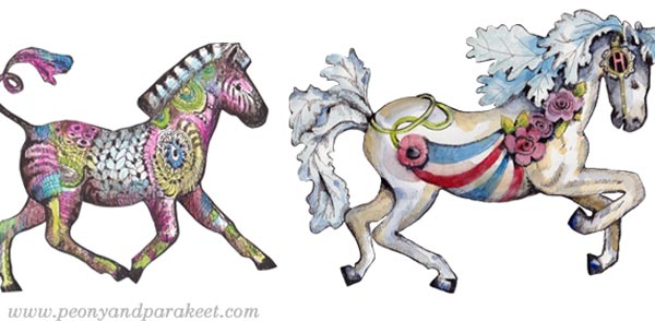
Can you paint something you are no expert in? Many years ago, I heard an interview with an artist who said that everything clicked when he started painting cows. He had been living with them most of his life, and he knew exactly how they are. You have to know what you paint, he claimed, as far as I can remember. It makes sense. I love plants and have always been growing some. I feel I know the soul of flowers and in the oil painting that I just finished, I wanted the flowers to reveal their soul, to be chatty and curious, just like they are if you silently observe them very, very closely.
But isn’t it possible to use the expertise for other things too – to transfer the soul of a flower to a horse, and thus, regain the mastery? To use the flowery language from Decodashery to express a moving thing?
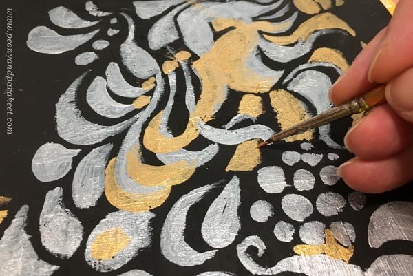
It doesn’t have to be anything grand at first, just a small art journal page.
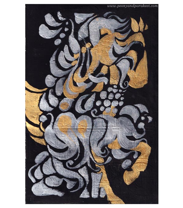
Pretty Art Journaling Can Be Reverse Creative Exploring
If I can paint a horse in the language of flowers, couldn’t it also be possible to revert the process? Could I make an art journal page from the painting, a sketch after a result?

I want to allow this free flow from one theme and one media to another happen again with this journal.
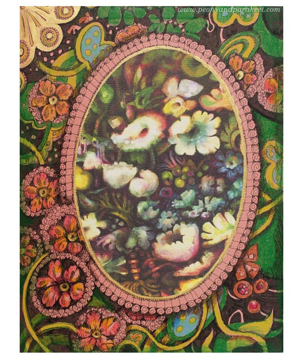
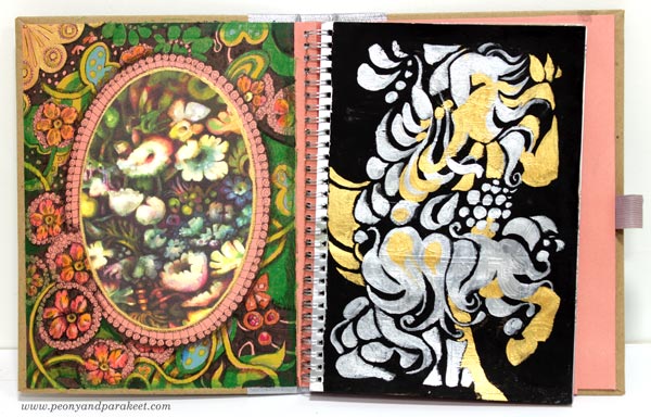
The image of the painting was printed on a sticky canvas bought ages ago. Then I drew and colored the floral frame, and added some gold and silver paint too. Here’s the first spread of the “new” Smash Book – the new beginning of pretty art journaling!
Handmade Picture Shelf Finishes the Display
A part of reorganizing was to get a picture shelf on the wall. My skillful husband made it, and I absolutely love it.
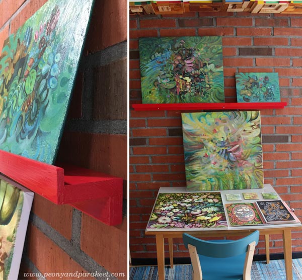
Finished paintings, paintings in progress, and art journal spreads can now be displayed together.
Tell me, what inspires you at the moment?
What do you put in your list of what to paint or draw?
Classes which inspired this post:
Animal Inkdom – Draw and decorate wild animals! – Buy here!
Magical Inkdom – Draw the magic of mysteries and fairytales! – Buy here!
Decodashery – Paint beautiful florals and more! – Buy here!
Flowers masterclass: Floral Fantasies – Buy here!