Art Supplies I Should Not Use Anymore
When I look at my art supplies, there are many that just take up space and don’t bring me joy anymore. Recently, I have tried to use them up, but one crayon, for example, can last a long time. Maybe I should just stop using them and give them away?
This blog post is a little inventory of what art supplies don’t bring me joy anymore.
Arteza Gouache Paints
Arteza sent a big set of their gouache paints to me in 2019, and I made a blog post with a video about them.
>> Intuitive Painting in 60 Colors of Arteza Gouache Set

I prefer Schminke Horadam gouache paints, because they are much better quality.
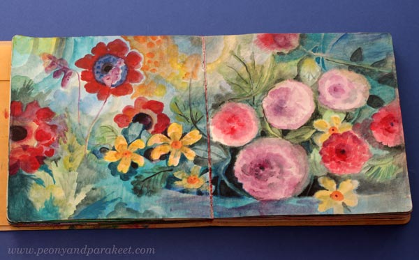
In general, I like watercolors more than gouache paints because they are livelier and more transparent. In the course Decodashery, I have used both gouache and watercolors.

Gouache is great for decorative-style painting, so I will keep my few Schminke paints, but I should give the Arteza gouache paints away.
Derwent Artbars

I have a love-hate relationship with these crayons. I have used them quite a lot, especially with water. But always when I look at the finished piece, I think that it would have looked so much better if I had used watercolors instead. For example, this recent art journal page would have been quicker to create and much more delicate with watercolors.
On the other hand, I really like many sketchbook pieces from 2017, like the one below.

In this blog post from December 2017, I share many projects where I have used Derwent Artbars.
I bought the Artbars somewhere around 2014, and even if I have tried to use them now and then, they may live longer than I do. I think I should either toss them or give them away. Watercolors easily replace them.
Faber-Castell Gelatos
I often wonder: “What did I think to achieve when I purchased these?”

I bought Faber-Castell Gelatos around the same time as Derwent Artbars. Mixed media enthusiasts thought that Gelatos were fun at that time, around 2010. I was very much into mixed media, and it was not difficult to sell new art supplies to me. Nowadays, I am much more traditional and don’t consider myself a mixed media artist anymore.
However, if you have Gelatos, you may enjoy this blog post from 2014 where I show some color mixing with them. >> How to Mix Colors (with Gelatos)
And this blog post where I work with Gelatos by using inspiration from art history.
>> Consistency and How to Get Inspired by It (with Gelatos)

I try to use gelatos now and then, and managed to use up one stick of the big set. But these are just a nuisance: no accuracy and not enough pigment. I should give these away.
Oil Pastels
I only have a small box of oil pastels. They really suit my art style. They have strong pigments and it’s easy to mix and blend them. Oil pastels look great a a top layer of pencil drawings and work well on top of many other art supplies too.
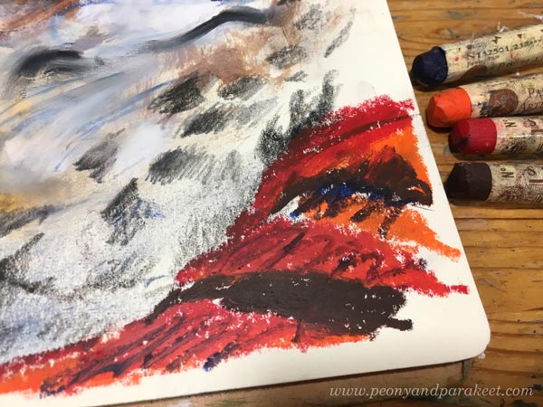
And I love the results! Here, the face has been painted in acrylics, there are regular pencil marks, and then the oil pastels add their flare.

See more images in this blog post from 2018: Oil Pastels and Spicing Up Your Art
I have also used a lot of oil pastels in this recent blog post: Using Up Old Crayons
And I have even made a course that uses oil pastels with other supplies. It’s called Innovative Portraits!
So, why should I not use oil pastels anymore when I seem to be so excited about them? Well, they are messy for sure, but also this: If I make a piece with oil paints instead, I can sell it and get more worth of my time. Oil paints (and acrylics) can do everything oil pastels do. Oil pastels are quicker, but the result is more valuable if I use paint. So, this is related to what kind of artist I am and what I need to get out of my time.
Alcohol Inks and Acrylic Inks
I bought alcohol inks in my mixed media years and loved them.

Alcohol inks are strong and work on any background, even on the top of acrylic paint. I used to use them to make backgrounds too, here’s one example from 2015.
And in 2012, I made many collages in the Collageland style where I also used splashes of alcohol inks, often pinks!

But now, they don’t feel so much fun anymore. Their odor is a bit disturbing too. But I have some pens that can be filled with alcohol inks, and will use the rest of them like felt-tip pens.
I also have some acrylic inks and acrylic watercolor inks.

I prefer to use watercolors instead nowadays. I should just make some art journal pages to use up those few bottles or give them away. I actually found a fun idea from an old blog post: Inktober Warm-Up Exercise (inks + drawing, from 2019)
All That Glows
Gold, silver, pearlescent effects – they are not my thing. I love to imitate glowing effects with regular paints, but glowing surfaces are not what I like to create. I have tried too many times, and made some fun pieces too, like this one from 2020.
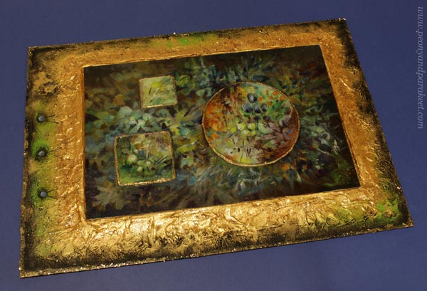
See more images in the blog post: Impressionistic Floral Painting on Structure Paste
And see how lovely glitter glue looks on the box cover, made in the course Doll World!

I have already given away many glittering paints, and I intend to give away the few that I still have.
Special Mediums
When visiting an art supply store, it’s tempting to try a new medium. I have velázquez oil painting medium, masking fluid, granulation medium, fiber paste …
Some of these mediums are for adding surface effects. For example, fiber paste creates a surface that can then be used for watercolors. Velázquez medium is for those who like to paint thickly. The more I have painted in oil, the smoother surface I want. For me, the smooth quality of the surface feels important to achieve. Smooth paintings bring old masterpieces to mind.
I know many use masking fluid and granulation medium for watercolors. I have used masking fluid in the course Watercolor Journey, but have stopped using it. There are ways to avoid it so masking fluid feels unnecessary nowadays. Granulation medium is not a miracle medium either. I like to keep my watercolors with water only. I think they don’t enjoy the makeup!
However, in Watercolor Journey, we use the masking fuild in a fun way – for doodling – and I think the result is fun!
I have some masking fluid and granulation medium left. Maybe I should make some art journal pages with this doodling approach to quickly use them up!
My Basic Art Supplies
These are the basic supplies, I want to keep: oil paints, acrylic paints, watercolors, watercolor pencils, colored pencils, and felt-tip pens. Oil paints and acrylic paints are mainly for canvas paintings. Watercolors are mainly for watercolor paintings. And colored pencils and felt-tip pens are mostly for art journal pages and small drawings.
Mediums
With oil paints, I need painting medium. And with acrylics, I like to use gel medium and glazing medium for thinning in addition to water. I could give up the gel medium if I had to choose, because the glazing medium works better for thin layers. Then comes the question: how minimal to go and what would it serve?
What do you think?
However, nowadays when I want to have a treat while visiting an art supply store, I buy a new color, for example, a new colored pencil or a new tube of oil paint.
Watercolor Wisdom – 6 Techniques that You Need to Try Before Giving Up!

This week I am writing to you who have always liked the idea of using more watercolors but whose experiments don’t often last long. Try these techniques to keep going and not giving up!
1) Doodle with a Brush
Dip a thin brush into the paint and start doodling! Add more paint to some areas so that the thickness of the line varies and evokes new shapes.
I have also used acrylic paints for finishing this piece called “Netfishing.”
2) Doodle with Masking Fluid
I don’t often recommend purchasing more art supplies to boost the motivation, but with watercolors, I highly recommend buying masking fluid. For example, Daniel Smith has a masking fluid that comes with handy applicators. You can just pick the bottle and start doodling. And while you are doing that why not fill the whole paper with them! Then add several layers of paint and remove the fluid gradually.
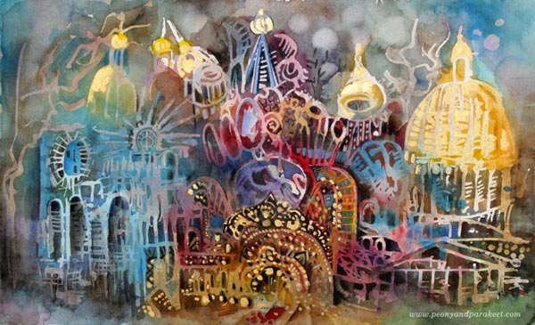
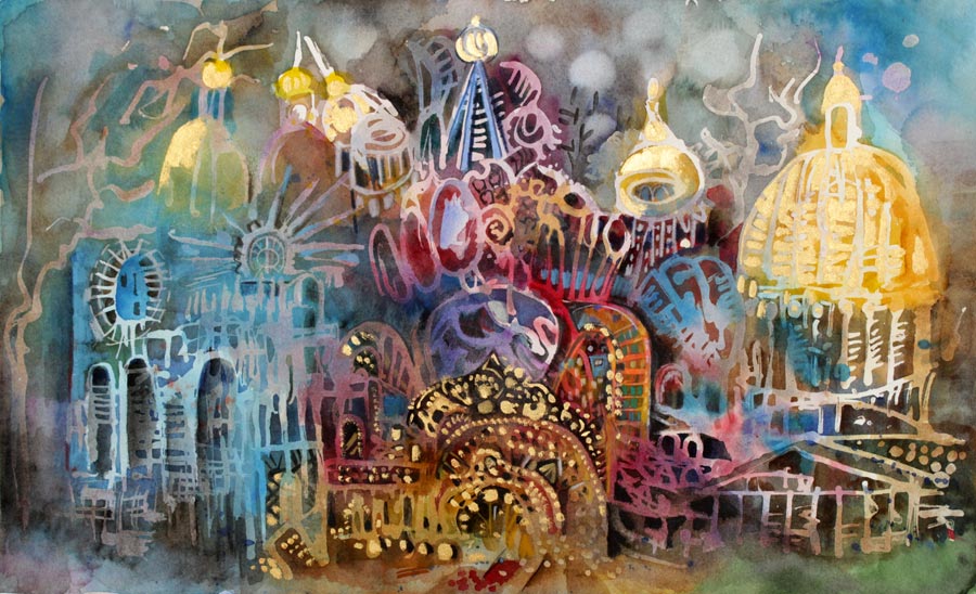
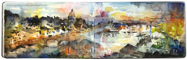
I have also used golden acrylic paint and colored pencils in this piece, called “Three Churches of St. Petersburg”.
3) Add Geometric Shapes to a Scenery
If all the elements are realistic, defined and “make sense,” you are underestimating the potential of watercolors. An easy way to push beyond the conventional is to add geometric shapes to a realistic theme, for example, to a scenery.
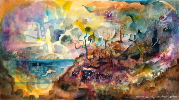
You can also paint vice versa: start with the geometry and then make it look like scenery.
4) Leave Blank Spots to Express the Light
Think about your painting as a collection of layers. Paint 6-10 layers so that every layer is a bit smaller than the previous one. Leave blank spots when painting the first layer. Focus on tiny details in the last layers. Let every layer dry before adding a new one.
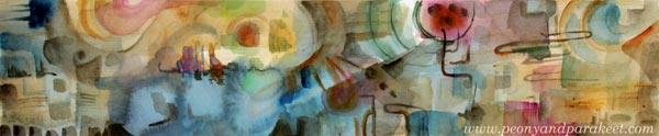
5) Add Muddy Colors to Make the Brights Shine
Don’t be afraid of dark areas. If your work looks unfinished or the colors don’t shine no matter how much you add them, the solution is to add more really dark areas.
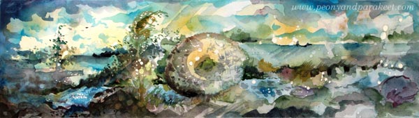
There are a lot of browns, greys, and blacks in these two small sceneries which make the color glow!
6) Pick One Dominating Color, but Use Many Tones of It
When applying paint on paper, add small drops of other colors too. Use the transparency of watercolors to get new tones: add watery paint, let dry, repeat!
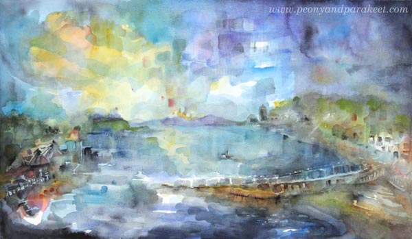
“Oban,” a small town in Scotland that left an impact on me. I could have painted the sky solid blue, as well as the water, but adding more variation of the color makes this painting.
Watercolor Journey – More Watercolor Wisdom for Self-Study!
The pictures and tips of this blog post are picked from my class Watercolor Journey. In this class, you will learn how to use the techniques and the imagination to express energizing sceneries. The fun thing is that these sceneries can be either realistic, or imaginative, or anything between. Sometimes the scenery is born with the technique. Other times painting is more about reconnecting with a happy memory. I have tried to make the videos as inspiring as possible so that you and your watercolors become a better match after each one.
>> Buy Watercolor Journey!
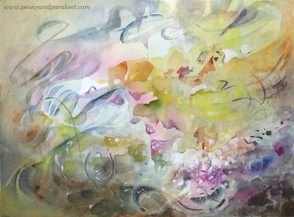
Paint Your Mental Images!
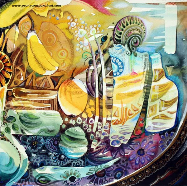
This artwork is inspired by the subject that keeps on fascinating me: beautiful objects like Russian handpainted plates! My admiration for them began many years ago, and only got stronger when I saw them in 2013 at St. Petersburg, Russia.
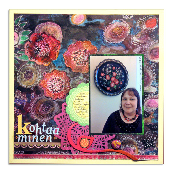
Here’s a scrapbook page which I made back then. My husband took the snapshot in The Russian Museum. Even if I look a bit worn out from the amount of walking we did during our travel, I love how my clothing and the plate match up!
We also bought one plate as a souvenir. I placed it on the table near me while finishing the painting. Just to keep me inspired to fine-tune all the details. But let’s not go that far yet! Before that, a lot happened, in my mind at least!

From Photos to Mental Images
Before starting the painting, I spent quite a lot of time thinking what to paint and how. I feel that it is easiest to think while walking, so I took the dogs out to the snowy nature. Then I took some photos, which is also a great way to observe and examine things.
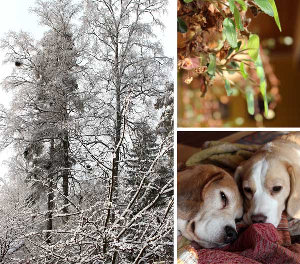
After my beagles had fallen asleep, I browsed the photos. “There’s a difference of how I those subjects in my mind,” I thought. If I think of a Russian plate, I might see one detail of it, then other images come to the mind, then the fraction of a Russian plate again. The thoughts move so quickly that the images seem to get mixed up and change.
I could not help looking up what psychology says about it. Yes, there’s a concept called mental image and several theories about how mental images are formed in the mind.
What I find fascinating is, that when creating art, we tend to pick one photographic image instead of a mental image. Then we get disappointed when the artwork does not represent the realistic, photographic image. Replicating the photographic image to the mental image is extremely hard. Let’s try! Look at any of the photos above, then close your eyes and imagine every little detail of the image – impossible! Similarly, if you read a story for the first time, then try to repeat it exactly from word to word, you will certainly fail! But could we paint what we remember and see in our minds, like Edward Munch said: “I painted only memories, adding nothing, no details that I did not see.”
Using Mental Images in Art
I thought it would be both philosophically and practically interesting to use the mental image as a starting point for a painting. So, I decided to paint the mental image of my souvenir, the decorated plate. I forcefully thought about the plate for few minutes. But at the same time (as focusing on one thought is so dull), I was also cleaning. When I grabbed the morning newspaper to put it away, I saw an article of Paul Gauguin‘s artwork being sold at a high price. Just when I had gathered my thoughts around the Russian plates, there it was, a picture of Gauguin’s art! Whoosh … my mental image changed to a mixture of a decorative plate and Gauguin’s art, not just that specific one but many others too that I have seen!
While walking towards the room where I create art, I saw a banana on the kitchen counter, then thought about the wine we are going to taste to celebrate my coming birthday. My mind wondered towards glass objects – how I love them and how I should really paint only them … Before I began painting, my mental image had grown into a huge collage!
The complex thing in mental images is, that if you think very visually, holding the static view is difficult. Instead of trying to focus on one thing only, let it go and replace it with a more general subject. I chose my love for decorative art, beautiful concrete things and how they are at their best when they represent the beautiful shapes and shades from nature.
Instead of trying to build one controlled mental image first, accept the short-term, fractional nature of them. My artwork could be a collection of mental images appearing while I work. To emphasize that, I decided to start the painting with masking fluid. That way I could not even start building one complete image.
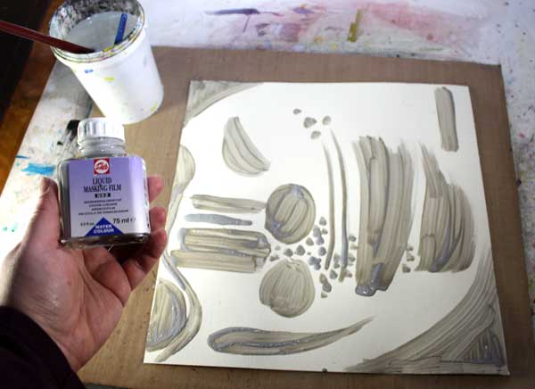
Masking Fluid
… or liquid masking film as my bottle says creates a rubber-like surface which you can remove afterward. You can add as many layers of paint as you like, then remove the masking fluid and you still have white areas to fill – or you can pick a colored area which you want to preserve and cover it with the fluid. It is a great way to obtain a layered look without too much thinking. Just remember to let the fluid dry properly before moving forward.
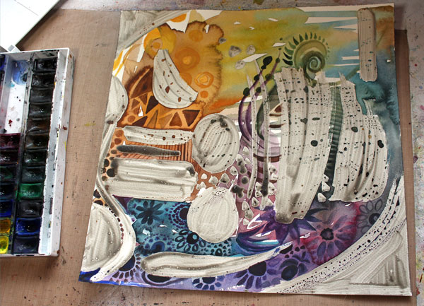
You can remove the dried fluid easily just by pulling it off with your fingers. With the help of the fluid, I was able to create very detailed areas before focusing on bigger objects so that they still look very sharp.
The painting was finished with colored pencils. The process was very similar to the one I teach in the video “Watercolor 101 for Intuitive Painting“, I just added the masking fluid before starting to paint with watercolors.
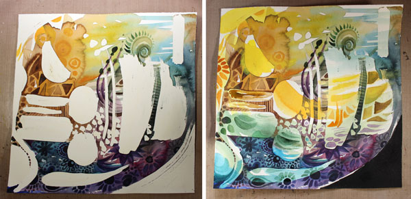
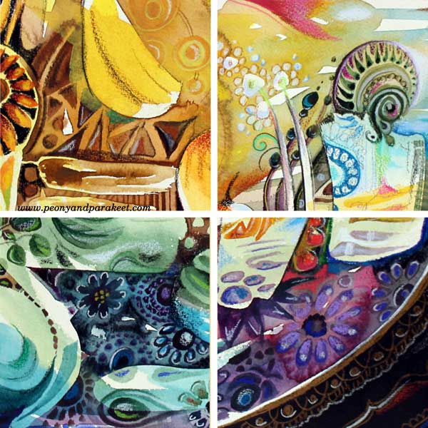
Here are some details of the finished piece:
And here’s the painting again:
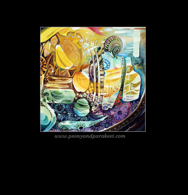
Before finishing, I realized that the banana from the kitchen counter had made it’s way to the painting. It seemed awkward at first but then, why not accept it to be the part of this surrealistic still life, surprisingly exact copy of the collection of my mental images!
What do you think? Could increasing intuition and including mental images improve your art?
Combine ideas with techniques – Buy Imagine Monthly Art Journaling Bundle!