Inktober Warm-Up Exercise
It’s soon October and with that – Inktober! Last year, I did all 31 prompts. Read about my previous experience here and here!
This year, I intend to make at least some drawings. And because Inktober was such a great experience for me last year, I want to support you to take it too. Here’s an Inktober warm-up exercise. I hope it inspires you to use inks and black felt-tipped pens to create black and white art. Follow the steps to keep going!
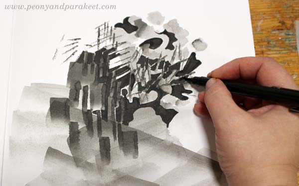
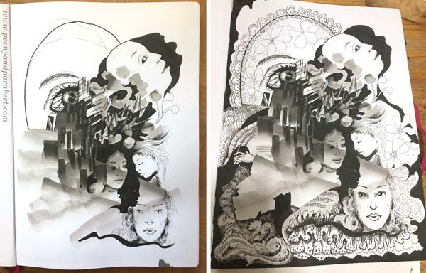
1) Paint an Abstract Composition
Let’s start by playing with liquid ink! Mine is Dr. Ph. Martin’s Bombay India Ink. I make the image on Leuchtturm 1917 Sketchbook.
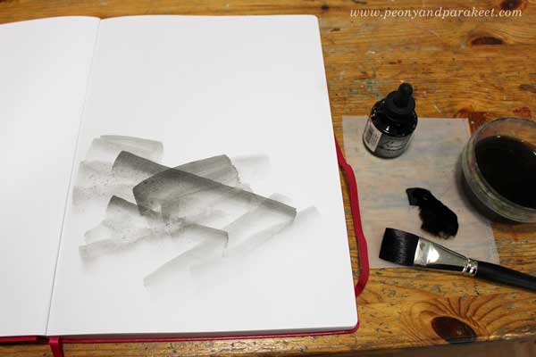
Put a few drops of black ink on a palette. Mix some water to the ink so that it’s grey rather than pitch black. Make some pale strokes with a flat brush. Then add new strokes on the top of previous ones. Work slowly! Enjoy each stroke and the translucency of it.
Turn the brush upward and make narrow strokes by using the tip of the flat brush. Experiment with both wet and dry brush.
Pick a small round brush and add some ink on the top of the narrow strokes. Now you should have an abstract composition that has a variety of painted elements.
2) Fill Spaces Between the Painted Areas
Use a brush pen or black ink that hasn’t been watered down. Focus on the center of your composition.
Fill most of the spaces between the painted areas with black ink. Leave some white to highlight the best parts. Black adds depth to the grey composition.
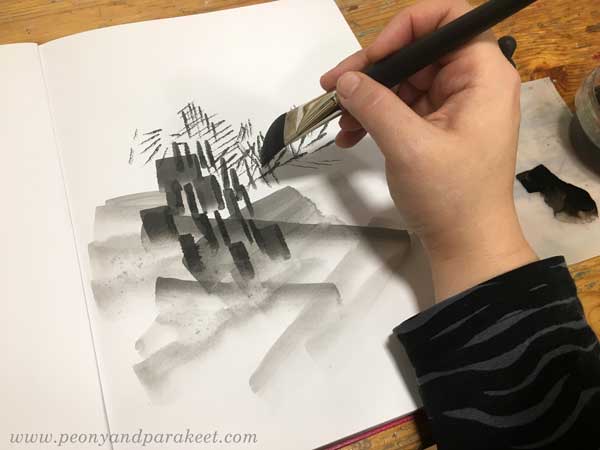
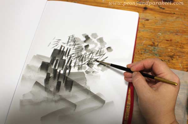
3) Draw Realistic Objects
Select black thin-tipped drawing pens of various thicknesses. I use Copic Multiliners from 0.05 to 1.0.
Choose a realistic object that you want to repeat in the image. My choice was women’s faces. For example, flowers or birds could be great too.
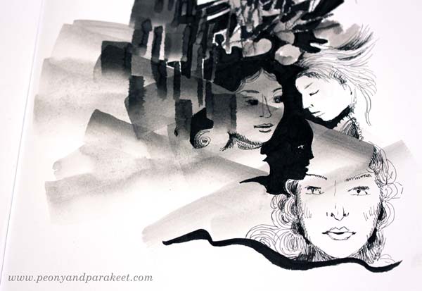
Look at the abstract composition and seek for places where you can add the objects. Add more black, and adjust the shape of the pale areas so that they partly outline the objects. When drawing the objects, play with the scale so that some are big and some small no matter where they are located in the image. All the objects don’t have to be fully visible. Some can hide partly behind the abstract elements.
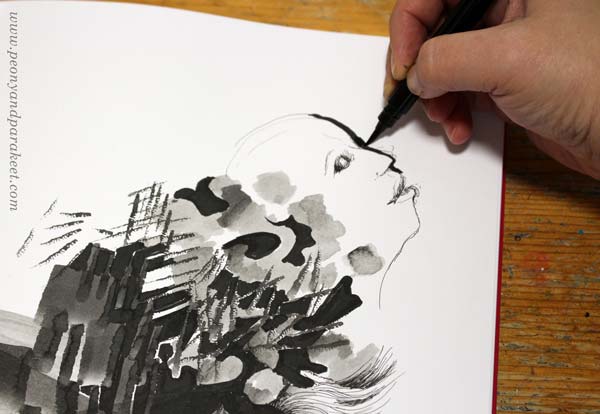
I like to draw faces so that I sketch it first with a thin ink pen, and then adjust it by adding a black element beside the face. (In my classes Animal Inkdom and Magical Inkdom, I show easy step-by-step methods for drawing all kinds of fun figures.)
4) Doodle Decorations
Continue with the black drawing pens, and doodle on the blank and pale areas. I also use a handmade oval template to get a big geometric shape that is fun to decorate.
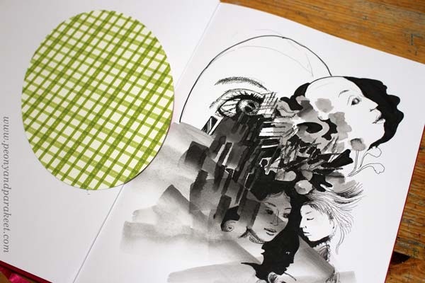
For decoration, the sky is the limit, but I like jewels, frills, laces, waves, and flowers!
When doodling, I also add shadows to the elements by drawing thin lines side by side.
5) Finishing Touches: Shadows and Highlights
Squeeze your eyes and point all the white areas. Usually, there are too many and it makes the image look busy. Pick a brush and paint most of the white with diluted black ink.
Especially the areas that are near the edges are worth toning down.
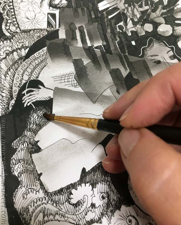
I also like to paint over the shadowed areas to give them a softer look.
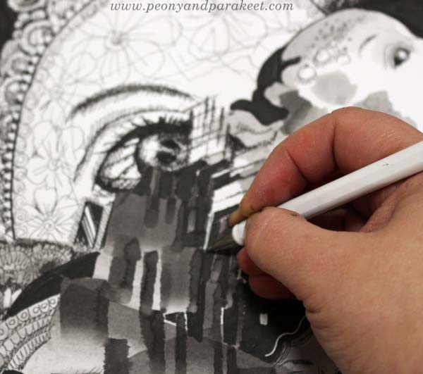
White gel pen can be handy for those areas that need a little bit more white.
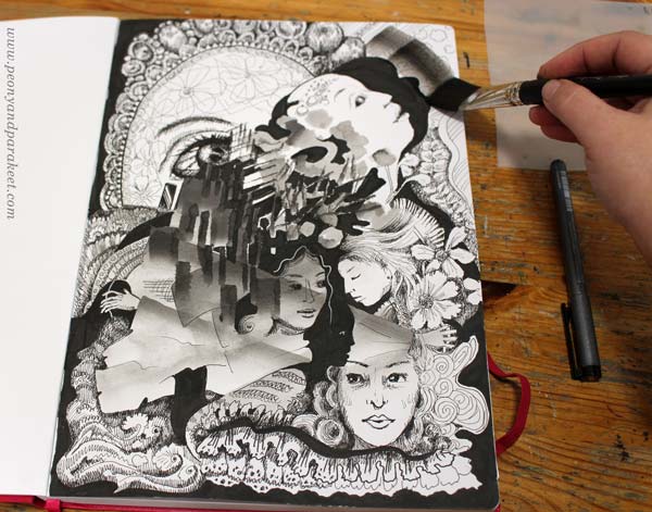
Inktober Warm-Up – Finished Piece
Here’s my finished piece again. See how limited the number of white areas is.
I hope you enjoyed this Inktober warm-up! Tell me – are you going to participate in Inktober?
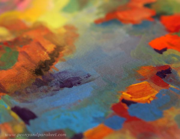
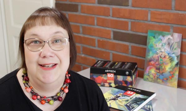
Intuitive Painting in 60 Colors of Arteza Gouache Set
Paint with me! This week, I have a video tutorial of making an intuitive gouache painting with Arteza Gouache set.
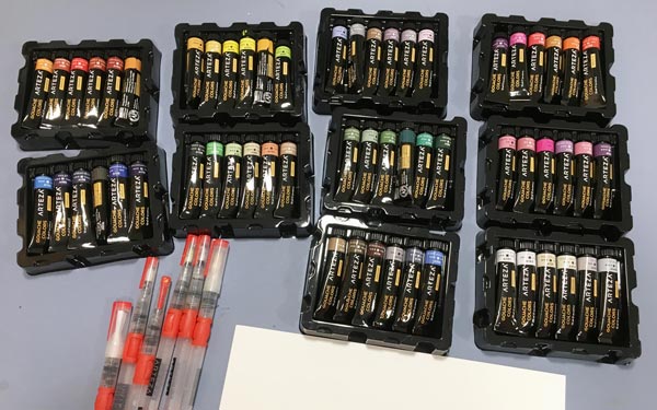
In addition to the gouache paints, I also use Arteza water brushes, Arteza watercolor paper (mine is A4 from Arteza’s UK store, but here’s the link to the similar paper in the US store), and Arteza Fineliner. These supplies are all donated to me by Arteza (US Store, UK store). You can get 10% off with coupon code peonyandparakeet1. This coupon is valid till Oct 25th, 2019.
Intuitive Gouache Painting – Watch the Video!
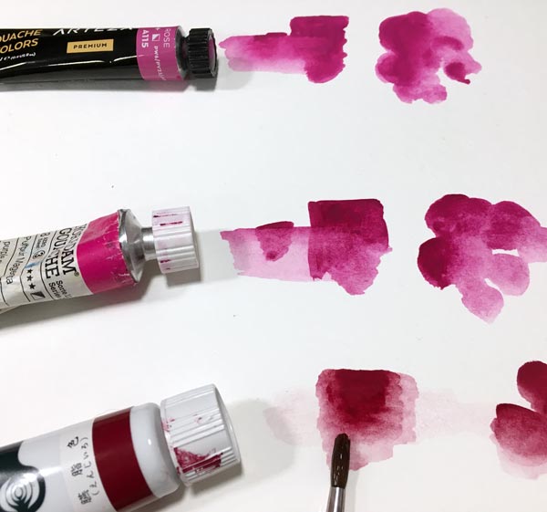
Gouache Comparison – Arteza vs. Schminke
Arteza’s gouache paints are very affordable compared to artist quality paints. I have few tubes of Schminke Horadam Gouache paints, and with the price of 60 colors of Arteza, you can only get a few tubes of Schminke!
But of course, there are differences too. Schminke, manufactured in Germany, has a higher pigment level than Arteza, manufactured in China. These tubes are both Burnt Sienna, but Arteza’s color is much more pastel and creamy.
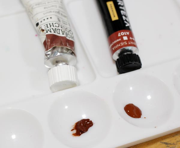
Most of Arteza’s colors have names that are not pigment names. They describe the tone very well and sound tempting, like “Blush Pink.” But if you have used to dealing with pigments and their individual qualities in transparency and archival quality, it can feel frustrating. If pigments are individual spices, Arteza’s gouache paints like spice mixes – easy to use for beginners, but a bit joyless for professional cooks.

The differences between these paints are small, and it requires an eye for nuances and experience on pigments to notice them.
When painting, Arteza’s creamy paints are like family vehicles, easy to maneuver. Schminke’s gouache paints are more like sports cars, quick to react with water and more suitable for fine brushwork.
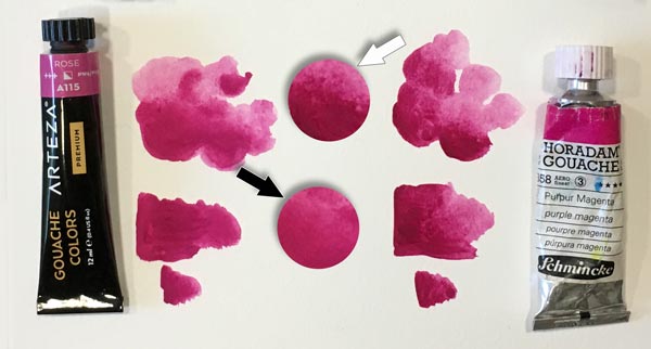
Traditional vs. Acryl Gouache – Reacting to Water
Some gouache paints are marked as acryl gouaches. It means that they are not opaque watercolors as gouaches normally are, but translucent acrylic paints. I had some Turner acryl gouaches (made in Japan), and you can see the difference below. Unfortunately, I didn’t have similar magenta tone, but the color doesn’t matter when testing how the dried layer reacts to water. Both Arteza gouache and Schminke Horadam bleed, Arteza a little more than Schminke. But acryl gouache doesn’t bleed at all!
Bleeding is not necessarily a bad thing. Actually, I prefer paints that bleed because I often like to remove color in later stages.
Bleeding wasn’t any problem when making this painting either. I used both thin and thick paint quite effortlessly.
I hope you enjoyed the video, and let’s keep creating!
Let’s share the passion of creating art!
Subscribe to my weekly emails | Welcome to my classes
Flower Gardener’s Diary – Welcome to My Art Exhibition!
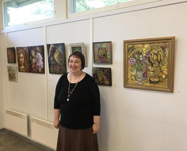
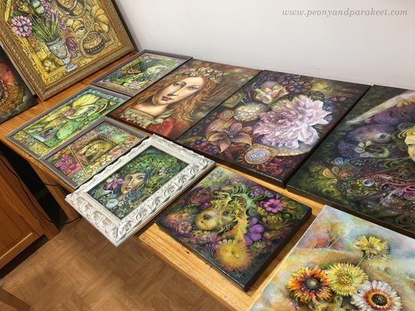
I currently attend a group exhibition in Helsinki, Finland. The place is called “Hietsun paviljonki”, and it’s located on a beautiful beach quite near the center of the city. The art exhibition is open from 11th to 22nd September, so if you are in Helsinki during that time, welcome!
See the Exhibition – Watch the Video!
For those who can’t come, I have made a video of all the 11 pieces that I have there.
The Art of Framing
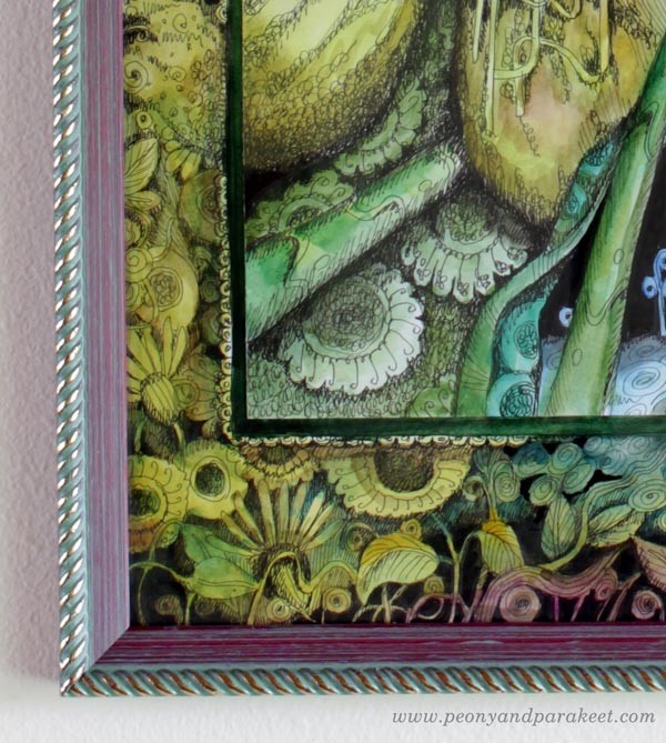
As you see on the video, I got several pieces framed for the show. My artist friend Eeva Nikunen has gorgeous frames in her paintings, so I used the same framer than she usually does. I am really happy with these frames!
For a drawing, that already had a hand-drawn decorative border, I chose a narrow frame that goes well with the fantasy theme too.
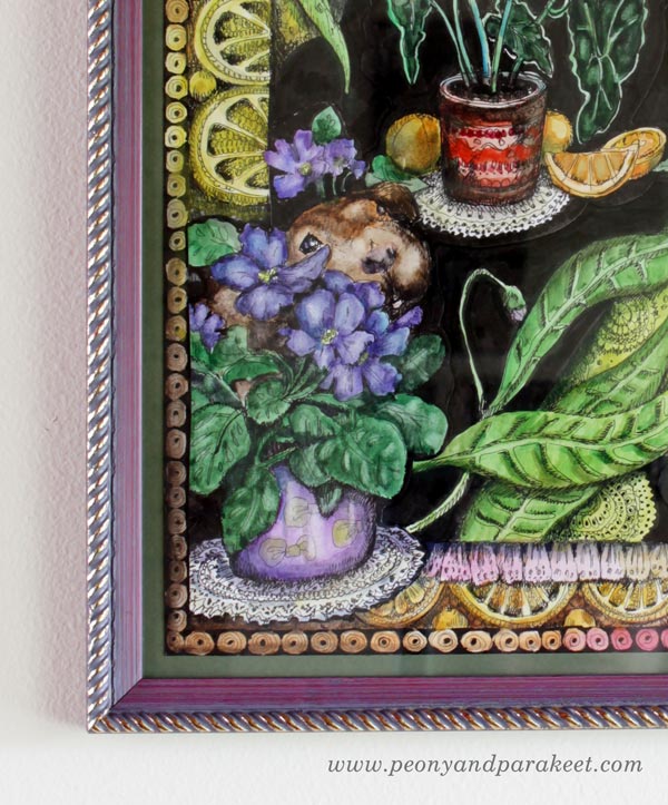
This frame also had a purple version, and I chose it for the houseplant-inspired piece. The purple frame highlights the green leaves beautifully. Originally, I hadn’t planned to frame this piece so I didn’t leave any blank space around the paper when creating it. The framer attached the drawing on the green cardboard first. I like this solution.
I wanted something silvery for the madonna painting and chose a broad white frame that also has real silver! It wasn’t the cheapest option …

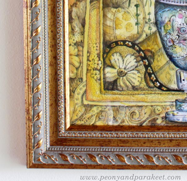
I was a bit doubtful if I could find a perfect frame for my big yellow drawing but this one really hit home.
I hope this inspired you to frame some of your pieces!
Coming Up!
I have another group exhibition coming up soon (Sept 20 to Oct 8). It’s in Gallery K in Vantaa, Finland. The show is called “Raffia ja smoothia” – Rough and Smooth, and it’s organized by the local professional artist association.
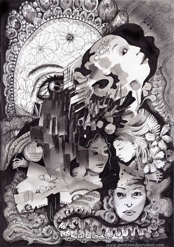
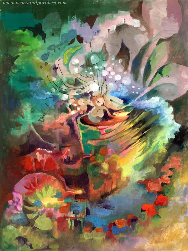
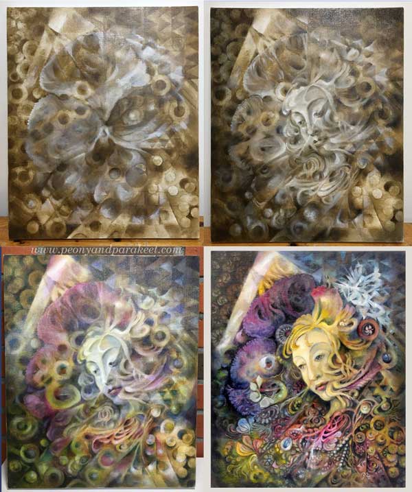
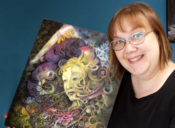
The Only Thing You Desire to Paint – Whether You Are Aware of It Or Not
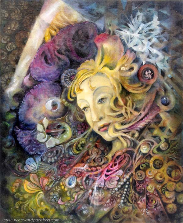
I finally painted something that I have tried for years – my view of life and my personal mystery.
Art, Religion, and View of Life
Art and religion have been connected for centuries. Some see it primarily as a business connection – churches have ordered paintings and artists have made their living.

But I like to think that the connection is not only about money but that’s spiritual too. At best, art expresses what we think about life and death. This doesn’t mean that an image has to be gloomy, or that it has to illustrate any particular religion. Vice versa, I believe that every person has their view of life. Let’s call it a personal mystery!
Searching for Personal Mystery
Your personal mystery sets the direction of your deepest thoughts, but it’s difficult to put into words. Now and then, you can catch it emotionally. But intellectually, it can feel impossible to reach.
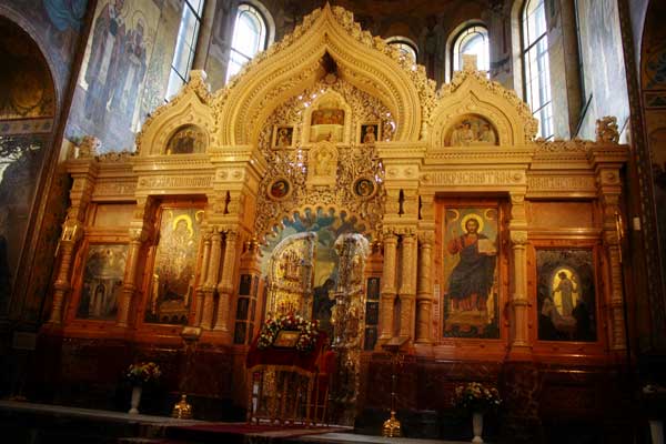
Even if your personal mystery is unique for you, it’s so authentic that it resonates with many other people too. When I go to historical places like the Church of the Savior on Blood, they have a flavor of my mystery. But still, it’s not quite in line with my deepest thoughts and feelings.
The Only Thing You Desire to Paint
Your personal mystery dictates your artistic goals. Whatever you say you want to accomplish, the deepest desire is to express your personal mystery. You can say you paint because you want to escape everyday life, but in truth, the escape is about reaching your mystery. No matter how successful you want to be, you also want to be authentic – and that requires discovering your mystery! Your visual style may seem like the primary goal but believe me, it’s secondary – just a tiny hammer in a big toolbox that you need to reveal your mystery.
No matter how orderly you begin the painting, the final goal of the process is to let go and become one with your mystery.
Painting Your Mystery
In the middle of the painting process, your mystery like a secret whisper, so sacred that it feels forbidden even to try revealing it. This secrecy sends mixed messages to your creativity and the process gets confusing and disappointing.
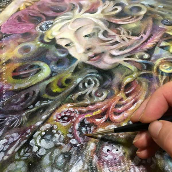
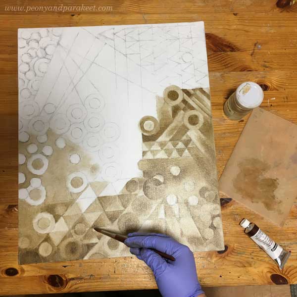
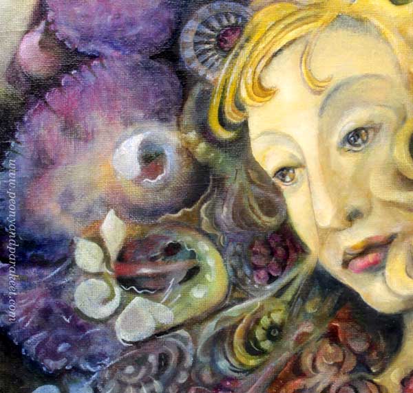
When painting the woman and all the colorful details, I started to hate the mess and get disconnected with it. The image felt too complicated and decorative, and I didn’t know what to do with it. I was traveling through strange places and wondering how to reach an unknown destination.
At this point, it’s tempting to give up. I put my painting away for months. My plan was to wipe the paint away with turpentine so that I can re-use the canvas for another painting. But about a month ago when I picked the unfinished piece again, I knew instantly how to finish it.
Five Tips for Revealing Your Personal Mystery
I don’t think there’s a straightforward formula for revealing the mystery, but here are some things that are helpful:
- Grow visual skills so that you can freely choose what you paint whether it’s representational or not. Learn to use references creatively, and study the principles of abstract art (my favorite book about abstract art).
- Grow confidence so that you can let uncomfortable, erroneous, silly, and “wrong” things happen while creating. You won’t find the mystery if you stay in your normal zone (breaking the rules)
- Grow imagination so that you can jump from one association to another and come up with a unique solution. Creating from prompts help with that (I recommend Inktober).
- Curate what you love and value. List things that inspire you and keep filling and editing the list (remember to include innocent little secrets)
- Become more aware of details and nuances in all art-related things. The more general you think (“I am an abstract artist”, “I draw faces only”, “these are pretty flowers”), the more difficult it is to connect with your uniqueness and find inspiration.
I used to think that when painting people, humans should look as realistic as possible. But I am more of an engineer and an innovator than a portrait painter. By trying to make the woman look like a real person, I had blocked my personal view of life appearing on the canvas.
When I realized that the woman is just an anonym observer, the painting was very straight-forward to finish.
My Personal Mystery
In my mind, science, beauty, and spirituality are all connected.

The biggest miracle for me is how the universe works, and how I can take parts of that to create a new world.

Historical buildings and paintings connect me to the origin of our culture and universe emotionally. To me, the painting looks historical enough to fit in.

In the future, I hope to create more pieces that express my personal mystery.
For Finnish readers: Come to see this piece and more of my art! I show about 10 artworks in a group exhibition this month in Helsinki. Lisätietoja täällä!