Messy Art Journal Style with Colored Pencils
This week, we go deep into the messy art journal style. See how to mimic messy mixed media pages in colored pencils!
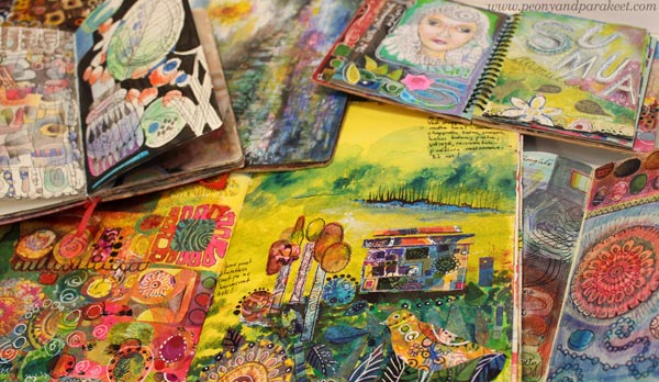
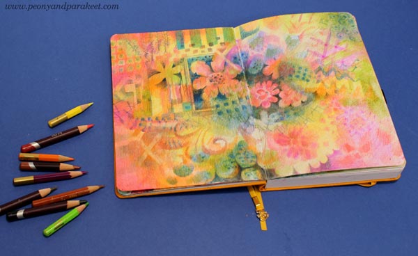
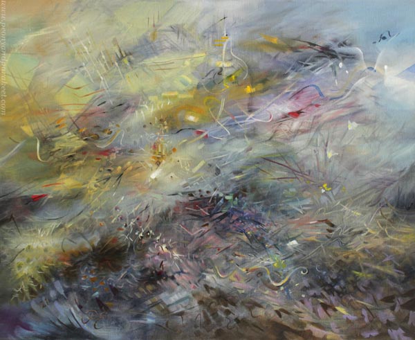
I wanted to add some happy freedom to my colored pencil diary. So here are the most recent spreads!
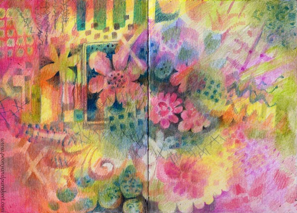
These spreads have an impression of a messy mixed media look – collage, paints, and all – but they have been made with colored pencils only.
Confessions from a Former Art Journal Book Junkie
Let’s first turn back time over ten years when my best hobby was art journaling. My day job took a lot of time, so buying became a part of self-expression. I bought almost every possible book about art journaling and dreamed about becoming a mixed media artist.
Now when I look at these books, their examples look clumsy, sometimes even ugly. But I still get attracted by the easiness that made me buy the books: “Messy is ok, you can do it!” And so did I: mixed paints, pens, collage, and all the possible media into one spread. “Mixed media techniques” was the word that I was looking for when browsing a book store or Youtube.
Art Journals Started a Journey
These journals were all the art that I created for a long time. Like the books stated, I assumed that the messy pages would be enough to define me as an artist. In some ways, I was right. A messy art journal style was a ticket to the world of art-making, blogging, even teaching. For example, in Collageland, I use paints, pens, and scissors to create fun and messy pages.
But in 2013, when I was in a local art supply store and proudly presented one of the journals to the owner, his fake smile told me that I hadn’t even started yet. In the traditional side of art-making, that is!
Nowadays, I think of myself being a traditional artist rather than a mixed media crafter. I prefer to stick with one medium at a time and my main artworks are more on the traditional side. And I wince every time when someone calls me a mixed media artist!
But art journaling has led me to so many happy places that I don’t ever want to get too far from it. Often, I have just replaced images from magazines with my own hand drawings.
So, instead of collecting products, I can be the product. My most popular classes like Animal Inkdom and Magical Inkdom have started on that idea.
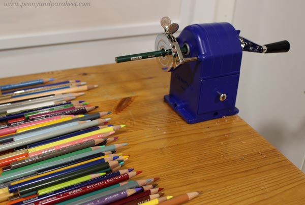
Choosing the Shortest Pencils
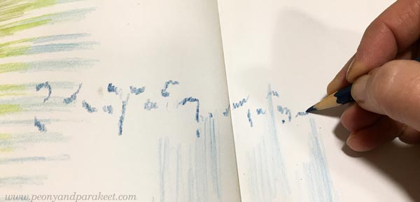
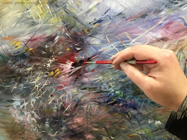
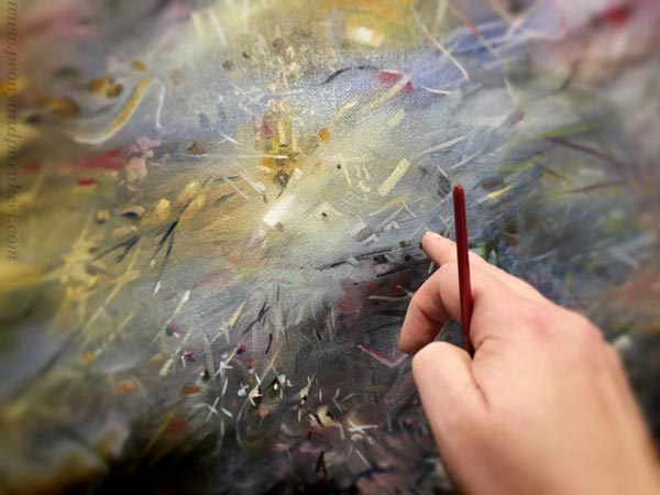
The best thing that I have learned from art journaling is to not over-think and just start creating. It often feels like my hand knows more than my brain. So, when I want to think further and forward, I say to my shortest pencils: “Let’s create something messy, like in the old times!”. And these little pensioners are always willing to get back to work and do what’s expected.
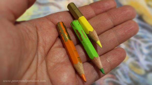
Using old and much-used pencils also takes off the pressure of pursuing brilliancy right from the beginning. For example, before I started building the class Intuitive Coloring, preliminary pieces were made with the shorties, and then for the actual recordings, I picked longer and more prestigious pencils.
So, when coloring a mess, do it with a small and diverse set of retired pencils that no longer care if you are a true artist or not!
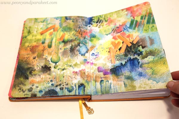
Collage Imitation in Messy Art Journal Style
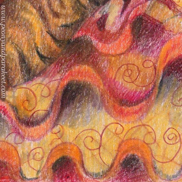
On the first spread, I mimicked what we used to include in our messy art journals: paper scraps, geometric stencils, scribbling, simple marks like x’s and o’s, flowers, and curves.

Just keep layering until the paper is covered, and don’t forget to mimic the glue too! Make the elements go on top of each other, or erase a part of them to make everything look integrated.
Look at my little pencils! Aren’t they endearing? I have started to carry them in a pencil case so that they are always with me, ready to be pampered.
Paint Imitation in Messy Art Journal Style
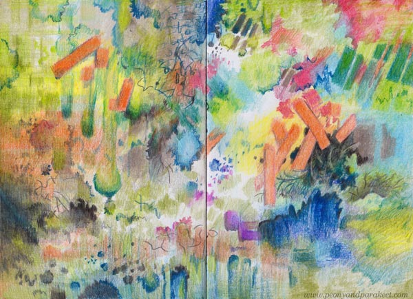
Then let’s change the mindset a bit and move from mimicking products to imitating paints. Start with stripes and small splotches and slowly grow them so that they cover more of the blank page.
When we make a mess with paints, the edges are jagged, so color freely and intentionally make errors on the shapes.
My orange rectangles represent a product, a stencil maybe, but most of the elements are more like watercolor, acrylics, or inks.
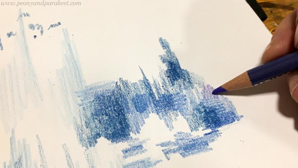
Watercolor spots have dark edges that softly fade away. By adding more colors, you can make the spots look translucent.
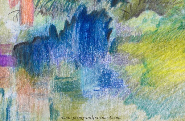
Acrylic paint has wider shadows, reflections of light (stripes and spots), and less transparency.
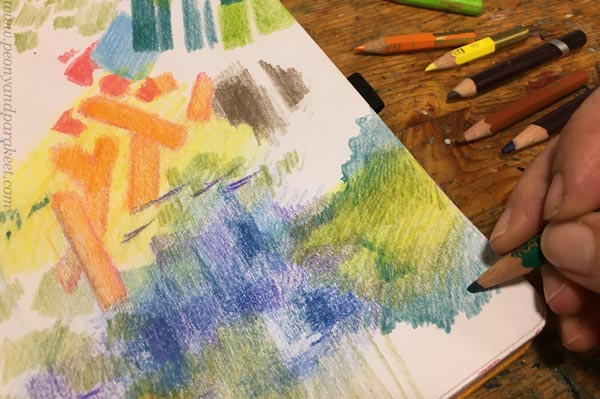
Add tiny spots too and make sure that their patterning is irregular.
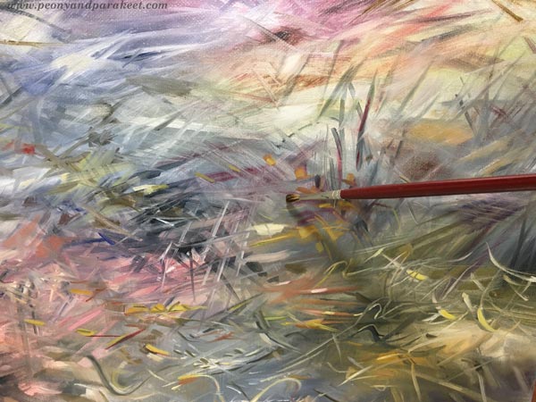
Drawing all kinds of splashes and drops was so much fun that I am now thinking: could I imitate watercolor in oils. Doesn’t this prove that mess-making and traditional fine art are not so far away from each other after all?
I hope this inspired you to pick your pencils and start faux mixed media with them!
Art Inspiration from Lucas Cranach the Elder
This week, I gather inspiration for the next painting of a series, enabled by the grant that I got from Arts Promotion Centre Finland. This is the third blog post of this project, see the first one here and the second one here!
German Renaissance Portraits by Lucas Cranach
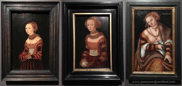
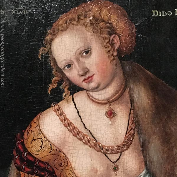
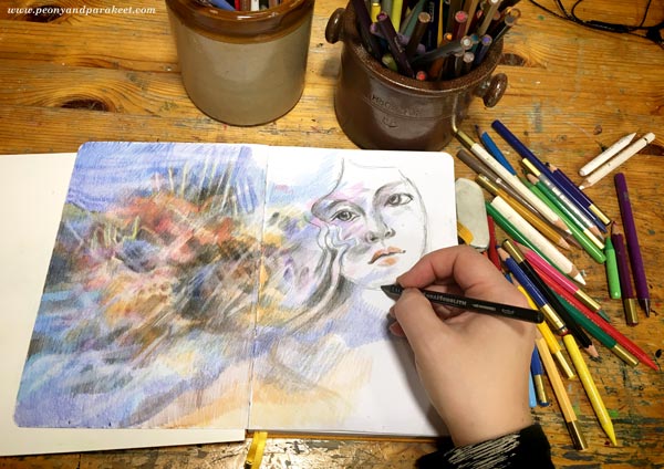
The first painting of my series (The Empire of Light) was inspired by Sandro Botticelli, Italy. Now I move further up in time and on a map and go to Germany to meet Lucas Cranach the Elder (1472-1553). Here’s a spread in my colored pencil journal inspired by Cranach’s style.
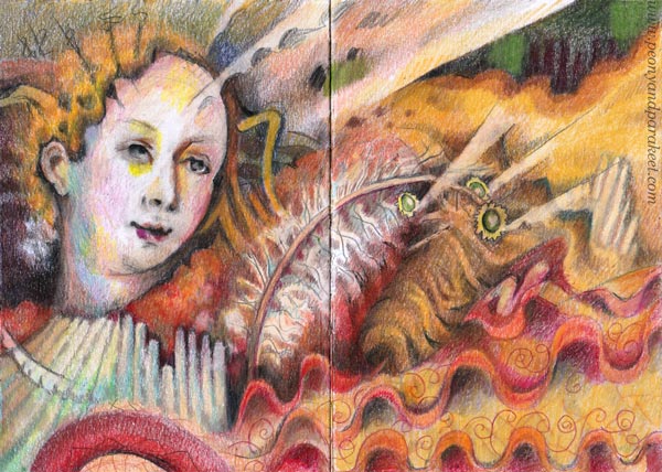
She is a weird-looking little woman but so are Lucas’s portraits too.
Their faces are small and not so pretty at all, at least according to today’s standards. Are these two even smiling at all? Is that boredom or irony?
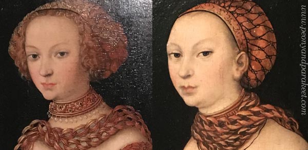
Cranach’s women seem so arrogantly materialistic that it doesn’t feel suitable for a series about spirituality at all. But because expressing light is impossible without painting the darkness, I have decided to explore spirituality’s ultimate opposites as well. Like insolence, materialism, and money.
Lucas Cranach’s Super Production
Lucas Cranach the Elder wasn’t just a painter. He was a businessman who ran a workshop and a pharmacy too. His unusually large workshop wasn’t just for fine art. Printing presses produced religious images for people who had less money.
Lucas Cranach surely knew how to run a business. When he needed pigments, he decided to found a pharmacy at the same go. He got friends with prestigious people like Martin Luther. I can imagine Lucas whispering to Martin at a dinner: “What kind of images does your religious movement need? I can produce thousands of them!”
He must have had a sense of humor too. And yet, his figures and the way he painted the clothing, are a bit stiff and clumsy.
From Cranach’s Bluntness To Sharp Pencils
When Botticelli made an elegant curve, Cranach added a straight like like saying: “That’ll do. They won’t notice it anyway.” So my Cranach imitation was built around similar angular lines and weird proportions.
But the more I worked with the face, the more real it felt. The woman wasn’t just an angel but had vices as well. She felt so relatable and maybe because I was glancing at my new sharpener. In the middle of the spirituality project, I had become very materialistic and spent almost 150 EUR on it.
Botticelli’s goddesses wouldn’t be even willing to touch it. But Cranach’s women would grab the handle without hindrance. They would crank fast and smile quietly, and it would all look a little immodest.
My workshop has produced a lot of pencil shavings lately.
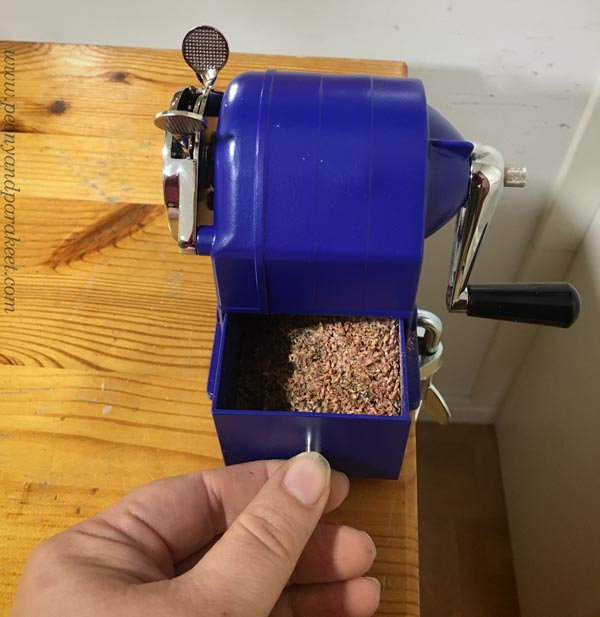
I can assure you that all my pencils are sharp!
Long Live the Spirit of Lucas Cranach!
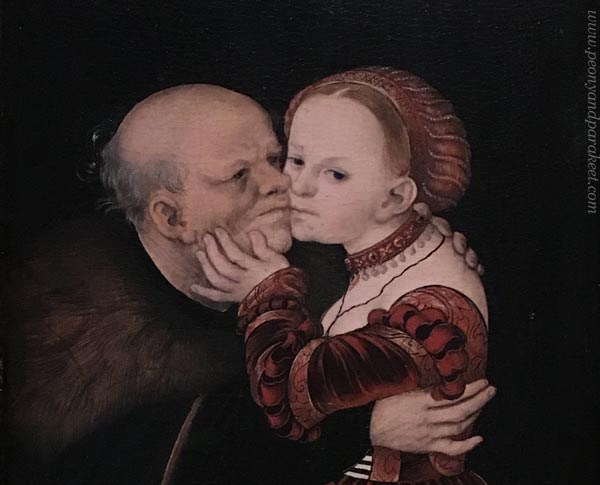
Queen Dido’s smile in Cranach’s painting is deceiving. She had made a decision to leave the materialistic world.
Her story goes like this: Dido founded the city of Carthago after her husband died. Then her lover, a Trojan hero Aineias was taken away and in agony, she killed herself.
Black and white always go together. Dido was not just a wealthy royal, but a sensitive woman too. Maybe Lucas Cranach and Martin Luther had deep discussions over dinner. Perhaps my sharpener will live longer than I do and serve many enthusiastic colorers after me.

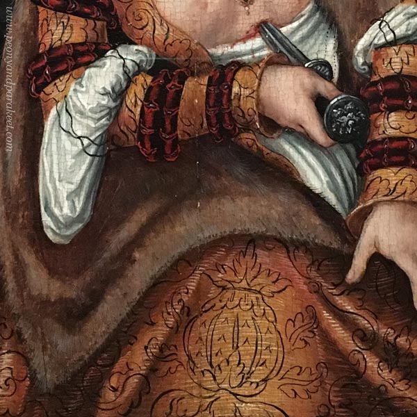
The most inspiring detail in Dido’s clothing is this carelessly painted ornament on the hem. It just floats there! It doesn’t follow the folds of the fabric at all. But its living line documents Cranach’s spirit.
No matter what the subject is, art always carries a spirit with the way we draw lines.
Like Cranach, I made two layers of lines, first x-shapes, then swirls.
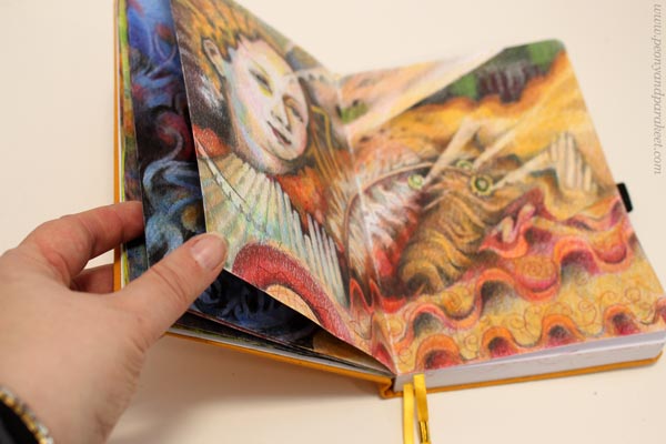
Colored Pencil Journal
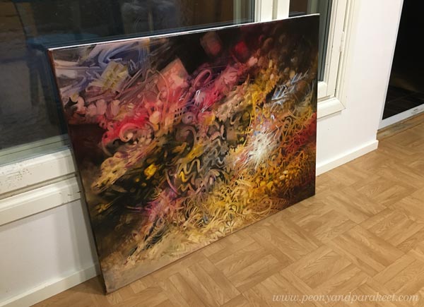
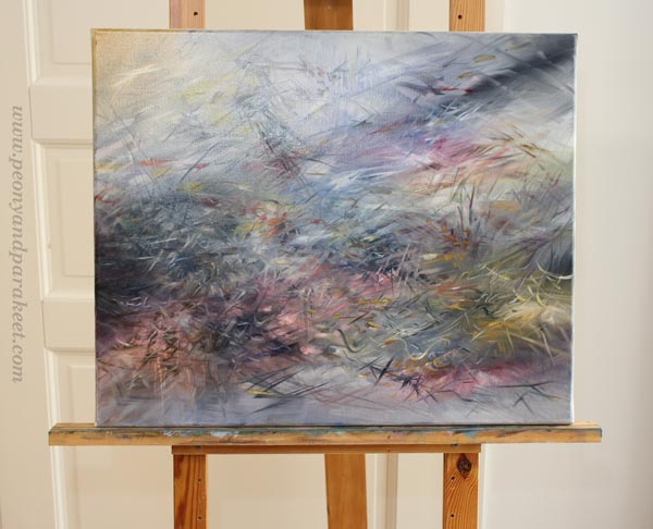
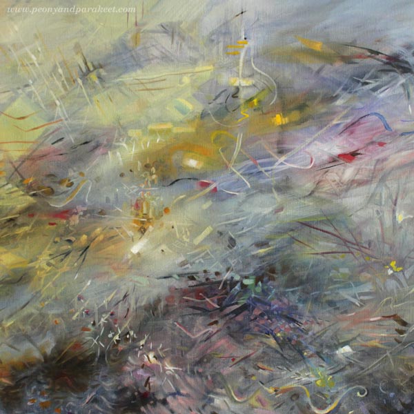
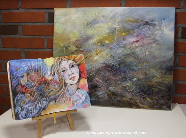
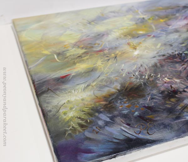
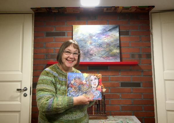
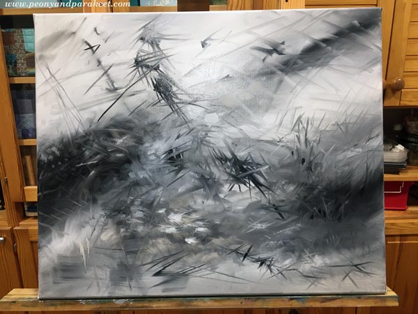
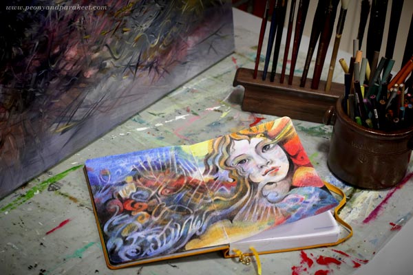
This journal spread will be my inspiration for a new abstract oil painting.
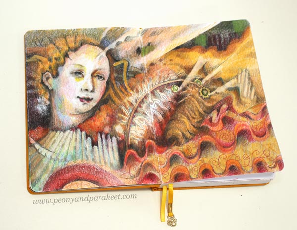
My little journal has quite many drawings already. I browse it often and it brings me joy.
Do you also have an art journal, a visual diary, or a sketchbook that you like to browse and fill? Can you find your living line there?
P.S. My photos of Lucas Cranach the Elder’s paintings are from an exhibition in 2019, see this blog post for more pics!
Getting Inspired by Removing the Obvious
This week, I have finished the first painting of the new series, enabled by the grant that I got from Arts Promotion Centre Finland. This is the second blog post of this project, see the first one here!
I wanted to combine two different styles for the painting.
Struggling with Differences
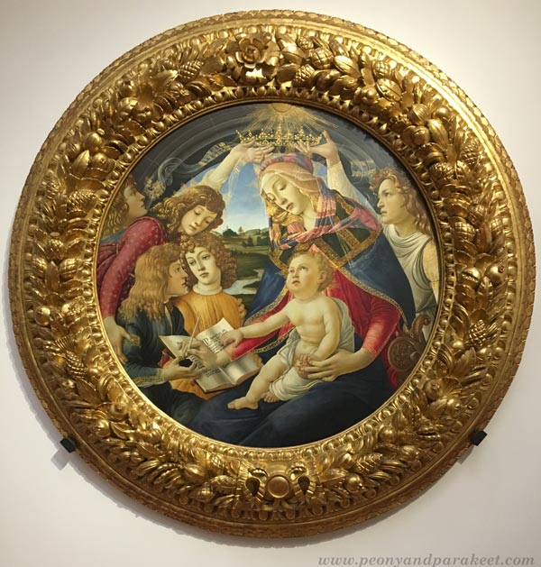
First, I wanted to honor Sandro Botticelli, a masterful painter from the Italian Renaissance, and include some of his colors and ornaments. I especially like the pastel colors in his paintings. Yellow ochre and ultramarine blue look beautiful in the mixtures. Botticelli’s painting The Madonna of the Pomegranate was my main inspiration for the color scheme. I also listened to Renaissance choir music and imagined how he felt when he painted and analyzed his work.
I also had another tutor, Wassili Kandinsky, from the 20th century. I reread his books On the Spiritual in Art and Point and Line to Plane and imagined him talking about releasing the inner sound of a shape.
But knowledge and advice and all the left brain stuff can only help to a certain point. When focusing on facts and words, I lost not only Botticelli’s and Kandinsky’s voices but my own too. I ended up making too bold moves and the spirit of the painting was lost.
Indoors – Outdoors
Fortunately, I had to take many sittings because dogs require pauses. It feels that I am constantly moving from indoors to outdoors nowadays!
Then it hit me, that painting, life, and spirituality are not about defining two states like outdoors and indoors. I can bring indoor elements like lamps with outdoor elements like trees. Botticelli broke the division by painting decorative flowers that continued from the grass to clothes.
Removing the Obvious Limitations
And if indoors and outdoors can be one, why not break other obvious limitations too – for example, combine science and beliefs in the same painting.
So I painted a chandelier, Botticelli’s divine rays, a light bulb to honor Thomas Edison, a tiny cross to represent spiritual beliefs. I allowed one association to freely lead to another. My mind was exploding when I thought about light and its all interpretations.
Some people collect chandeliers, others search for a proper lightbulb in a supermarket. Sometimes we believe in science, other times we have different beliefs. Some see angels instead of flowers. Sometimes we need darkness to see light, and other times we may need more light to the lightness. Light can be glitter that saves the day or a more permanent feeling of hope. Art and spirituality don’t have to be separate from the rational and mundane, but they can be the glue between the inner and outer world. We can remove the obvious, and express the diverse experience instead of a single thing.
Releasing the Inner Sound
In the light of removing the obvious, Kandinsky’s idea of releasing the inner sound can simply mean this:
Make subtle changes to an element
so that the obvious interpretation becomes vaguer
and a variety of new ideas are raised.
What could “removing the obvious” mean to you? Tell me what you think!
Art Journey to Spirituality – Let’s Begin!
This week, we will begin a journey to express spirituality through art. Think about this and the upcoming blog posts as an interactive diary that you can adapt to your own work. The idea is to question and examine first and then intuitively find more truths.
Introduction to the Journey
As I wrote last week, I have got a grant from The Arts Promotion Centre Finland to create a series of paintings and write about the process.
In the series, I will dive deeper into Wassily Kandinsky’s idea of unleashing the inner sound of form (check the class Floral Freedom). I will also examine the art of the 16th and 17th centuries and get influences from there. My paintings will express spirituality, but they won’t be subject to any particular worldview or religion.
I will work both systematically and intuitively. I will create studies in my colored pencil diary that help me to build a formal language for each intuitive painting (check the class Intuitive Coloring).
I hope this 3-month project inspires you to start an art journey to your spirituality! Take a bit of time for it every week, have a sketchbook or an art journal, maybe create a few paintings too. You can also write down names, quotes, and personal thoughts. The idea is to keep ideas and associations flowing while art gets created!
I hope to hear your thoughts in the comments! If you want more social support, purchase any of my classes and you will get to my community Bloom and Fly for the rest of the year. We will have discussions about this project in the Facebook group of the community.
Ok, let’s begin!
How to Define Spirituality
First, let’s ask what spirituality is! Google replies:
“the quality of being concerned with the human spirit or soul as opposed to material or physical things.”
But as artists, we don’t have to obey any general answer. Rather, it’s expected that our art expresses our personal points of view. I also believe that any word can start a journey. The first answer is just a ticket, and the answers get deeper piece by piece.
Connection, empathy, and understanding – I imagine squeezing these three words in my hands like they would be paper tokens. I want to connect with artists in the past, empathize with their shapes, and understand how to go deeper. But instead of getting overly serious, I also want to learn to play. The goal is to create a spectrum rather than one truth.
What three words would you pick as your tickets to a spiritual journey?
Meeting Sandro Botticelli
The first painting of the series will be the one that started last July. It was then black and white, an underpainting only.
This week I got back to it and brought in more colors.
Even if the painting is not finished yet, the colors took me to meet the first companion of my journey – Sandro Botticelli.
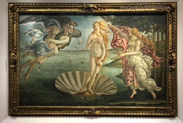
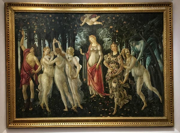
Sandro Botticelli (1445-1510) was an Italian painter. I have seen his famous paintings Primavera and The Birth of Venus in the Uffizi Gallery, Florence, but many other pieces inspire me too.
Botticelli equals perfection in many ways. His shapes and lines are so flawlessly beautiful that they make me shiver. He didn’t paint alone but had apprentices. I wonder what it would be like to work in his workshop – trying to paint a curvy line that would get his approval! Botticelli was born again in the 1850s when the Pre-Raphaelites found him. The easy way to fall in love with Botticelli’s work is to look at, for example, Evelyn de Morgan’s (1855-1919) romantic ladies. After those, it’s easy to greet Sandro too.
Botticelli’s Spirituality
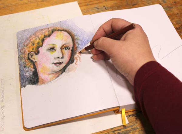
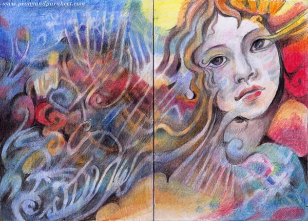
I made this little study of Botticelli’s style in colored pencils to examine how his shapes are. It’s often good to let the hand think instead of using only the mind.
When I imagine discussions with Botticelli, he whispers out romantic mysteries. “Your stories would make great plays,” I tell him. But what interests me most is not the characters themselves, but how ornamental their speech is and how much in detail he describes their clothing and the overall setting.
I think the spiritual in Botticelli is the way he empathizes with things. For example, how a thin vail looks like the extension of the soul. Or how the flowers that are on the ground continue on the dress and fly in the air. Sandro’s people look immersed in their surroundings.
Like Wassily Kandinsky would say, they seem to be not watching something as outsiders but being an integral part of the overall experience. I hope that this understanding will somehow help me to finish the painting!
Tell me, who is the first companion in your art journey to spirituality? Botticelli or somebody else?