Bright and Decorative Art Style
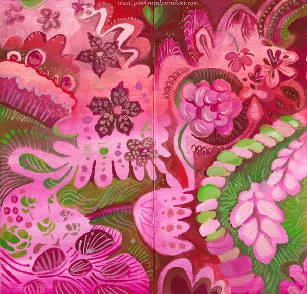
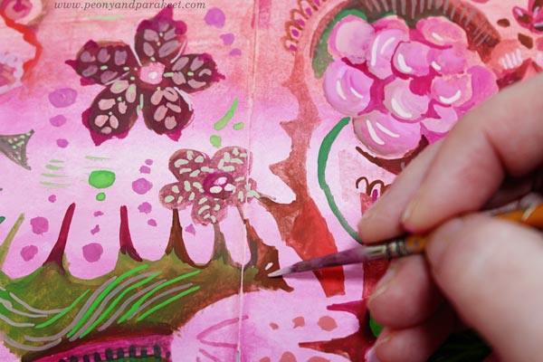
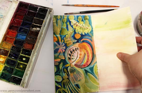
This week, I needed colors that are so sweet that they almost taste on the tongue! I found a little watercolor notebook from my paper stash and made a gouache painting on the covers.
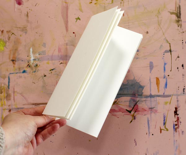
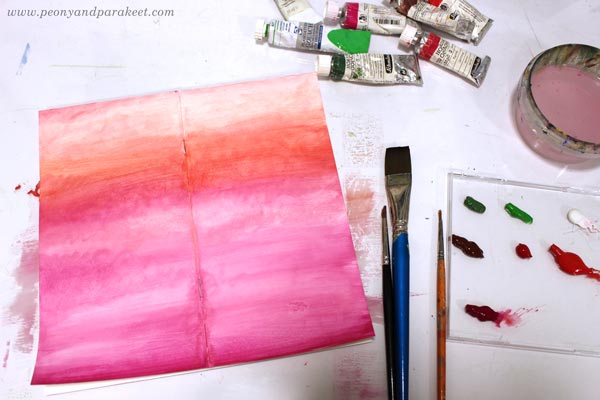
Painting the Covers
I used a limited palette of gouache paints – pinks, reds, and greens, and made pastel hues by mixing them with white.
After painting the background, I filled the covers with decorations.
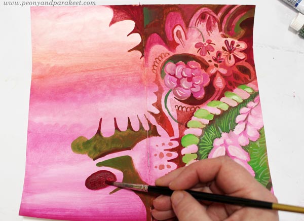
Making all the little dots and lines was both calming and refreshing. The darkness of the world faded away!
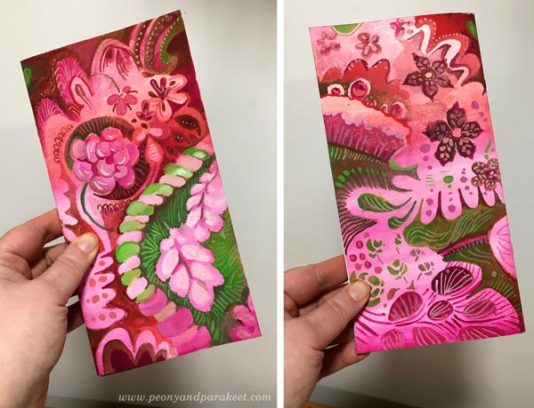
Here’s how the covers look when the journal is closed. Isn’t that sweet?!
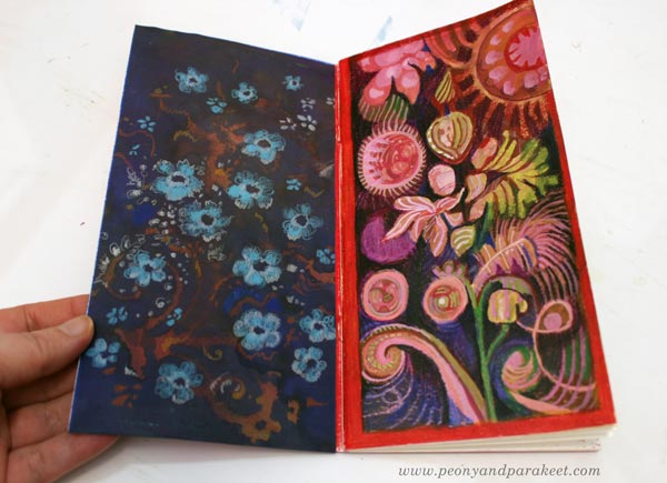
Inside: Decorated Papers and Flowery Shapes
I also decorated an inked paper and taped it on the inside of the cover. Flowers are easy to make with colored pencils!

I also combined gouache paints and colored pencils and made a mixed media drawing on the opposite page.
Inspiration from the Movie Emma
A couple of weeks ago, I watched the movie called Emma, and the beauty of it blew my mind. I love Jane Austen’s stories and had planned to go to a movie theatre to watch it, but they closed. Fortunately, it became available on iTunes, and within 48 hours of the renting period, I was able to watch it twice! I have always enjoyed examining decorative tapestries, furniture, clothing, and such, so I took my time, especially on the second time, stopping the movie now and then just to admire the beautiful sceneries, interiors, and dresses.
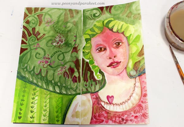
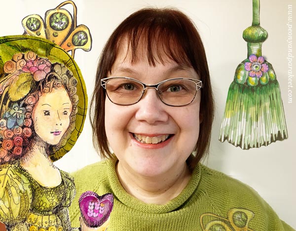
Here’s Emma’s friend Harriet and all kinds of decorative elements from my imagination.
Decorative Art Style – Fun to Design, Fun to Paint!
This year, I have been practicing pattern design, trying to make at least one pattern per month. I have used my watercolor paintings as an inspiration.
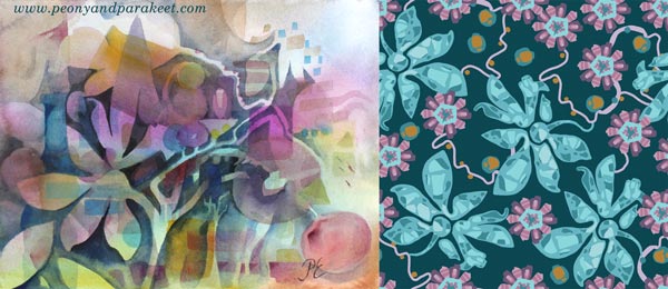
These design ideas go back to my paintings as well. I have really enjoyed making them more decorative now.
I feel like I am connecting the dots between the many styles that I am fond of. It’s like William Morris, Marimekko, and decorative Russian metal trays are coming together. My detailed style to draw and the intuitive style to paint seem to integrate, and it all feels so effortless and fun. I am going to do more of this kind of decorative art style projects – I hope they inspire you too!
Related Blog Posts
>> From Art Journaling to Pattern Design
>> Paint Your Mental Images – Love for Russian metal trays
>> 8 Style Tips from the Students of Peony and Parakeet – William Morris inspired art journal spreads
Bloom and Fly – Sign up for My Classes!
Sign up for any of my classes, and become a member of my active community for the rest of this year!
Art Inspiration from Sanditon
This blog post is for us who love Jane Austen and Sanditon tv series. I watched the series last month, and it has inspired me a lot. I hope you enjoy this Sanditon inspiration overload!
Torchbearer – Esther and Lord Babington on the Beach
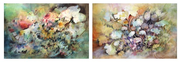
My newest watercolor painting called Torchbearer had a modest beginning and I had no clue how to finish it – until I saw episode 8 of Sanditon!
My favorite female character of Sanditon is Esther and the scene where she is in the carriage with Lord Babington was so romantic! The sudden change in her appearance, his gentle smile, black horses, empty shore – oh my! It hit me, that even if my painting has flowers, not people, I could express the emotion from the scene.
The tallest flower and the glow come from Esther’s powerful spirit.
The flower that bends down, expresses her sensitivity.
I tried to paint every flower so that they highlight the bubbling energy. Their stems are like the carriage where the couple sat.
The black background represents both the horses and the lord, supporting Esther’s joy.
In this painting, Esther is a torchbearer who leads us to better times.
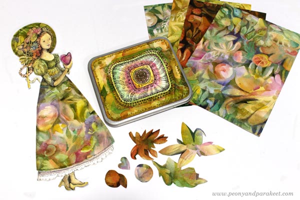
Tin Box – A Souvenir from Sanditon
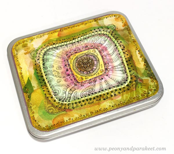
I like little boxes that can be used for storing hand-drawn pictures and papers. I wanted to decorate a small tin box so that it would have old-fashioned and luxurious feel. So that I could think of it as a souvenir from Sanditon!
I already had saved a hand-drawn piece that was quite perfect in size.
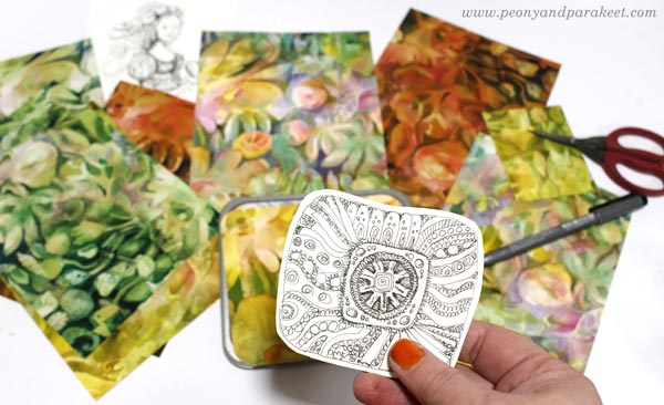
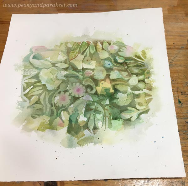
I also found some papers with a watercolor print. They were test runs of the surface pattern designed earlier this year. I mostly designed the pattern manually, so by painting a design on the center of the paper and then cutting the paper into four parts.
This way you get a continuous design.

Avoid painting edges, and re-arrange papers until they are all fully painted.
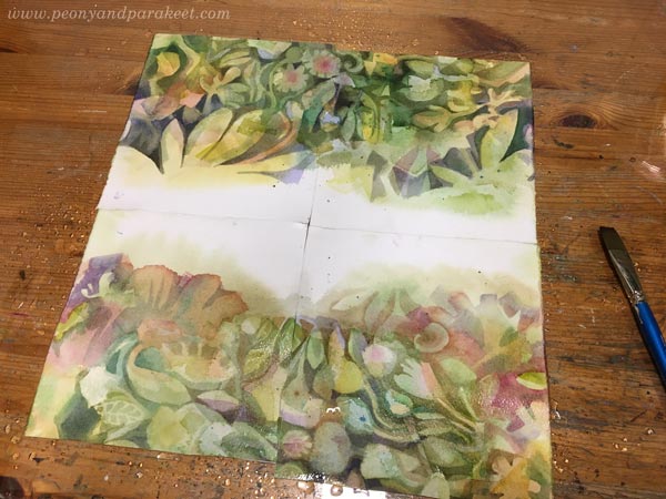
Then scan the papers, and clean the edges in an image processing software. Here’s a sample of my design.
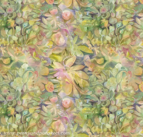
I made several variations in Photoshop. These papers go really well with hand-drawings, so they were perfect for the box.

The center motif was first colored with watercolors.
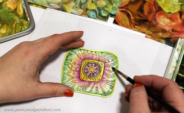
Then I hand-stitched it on a background paper and added more hand-stitching around the center. In the photo below, I highlight the surroundings of the stitches with a pen so that they look more 3-dimensional.
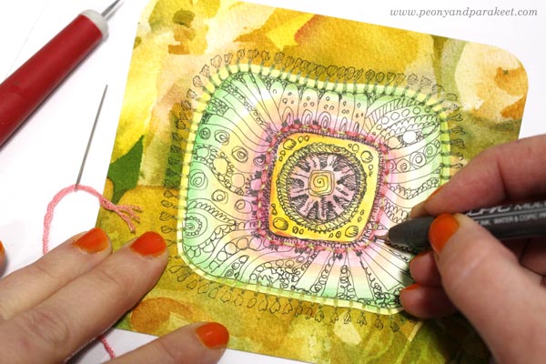
I also added beads, more colors and decorative marks.
The centerpiece is a button with a shank removed. I love this little box!
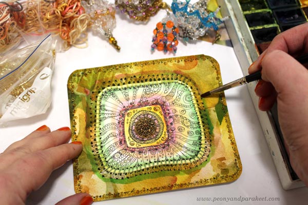
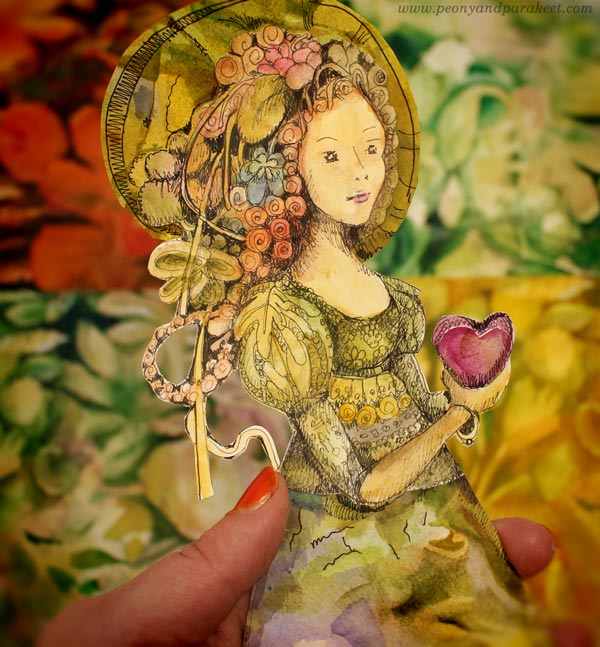
Esther Denham – Sanditon Paper Doll
I also wanted to create something for my ever-growing collection of collage figures. “Just an unknown habitat of Sanditon”, I decided first. I didn’t use any reference and drew the doll just freely, but when she was colored, she looked just like Esther!
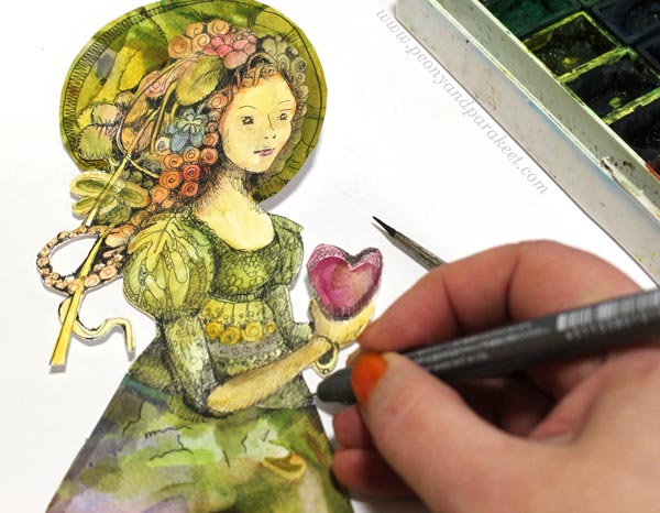
I played with her proportions so that she has overly long legs. That way I could make the dress more imaginative. The hem was cut from one of the watercolor papers. I couldn’t help playing with her right away, trying wings on her, filling the teacup with herbs from Sanditon. The wings and the teacup are from my fun class Magical Inkdom.
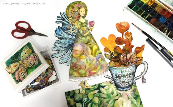
Her hat is also a collage piece cut from watercolor papers.
Souvenirs from Sanditon!
The Romance Continues
I am currently painting an oil painting that looks quite romantic already.
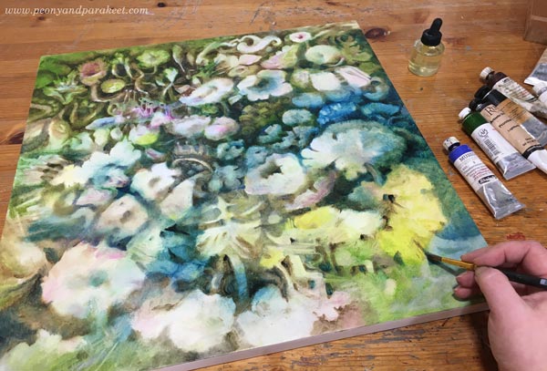
My vision is to make it the third in the series after Icebreaker and Torchbearer – and put it in the middle of them.
One Source of Inspiration – Many Interpretations
If you have been following my blog, you know that some of my projects are fine art, others more illustrational, and there can be a bit crafty things too. This blog post demonstrates well how the inspiration can be the same, but the interpretation is different. For me, the wide range of projects is a way to stay inspired and creative, and I hope that you have tolerance for all of them. I don’t believe in getting too serious or not getting serious at all. The humorous side of art allows us to get playful, and the playfulness feeds our ability to express the deeper side of our inspiration.
Esther can be the person who handed me a crafty gift box, or an innocent paper doll, or a mysterious flower in a painting that took tens of hours to create. The key to your artistic style is less in the looks and more in the inspiration. For me, it’s often old-fashioned romances, like Sanditon.
Welcome to my online classes!
– Paint watercolor fantasies – Sign up for Magical Forest!
– Draw the magic – Buy Magical Inkdom!
Happy New Year from Paivi’s Art Studio – Greetings in a Video!
On this last day of the decade, I share some moments from my art studio in Finland. Watch the 1-minute video!
Many times when people look at art, they say admiringly: “How did the artist do that?” They assume that the artist intentionally painted every spot. But often, art is more about seeing what accidental spots to preserve rather than how to intentionally paint them. It’s the nature of art to explore the wild and uncontrollable side of life, and it’s the job of an artist to make it serve the expression.
During the past years, I have tried many art techniques, many approaches, but this the journey that’s for me – to produce and teach art that goes out of control at times, and that has unrealistic and abstract elements as well.
Start the New Year by Painting the Magic
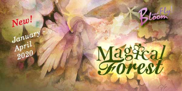
Magical Forest begins on January 1st, 2020! >> Sign up Now!
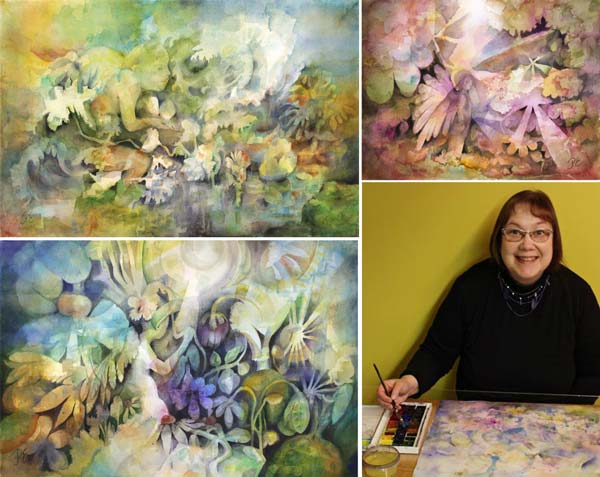
From Portraits to Stories – How to Dive Deeper in Visual Expression
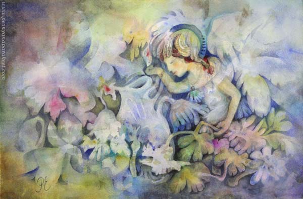
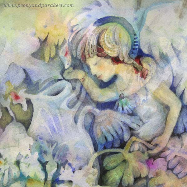
Here’s my latest watercolor painting called “Mirimer”. The name is a combination of “Miracles” and “Meri” (sea in Finnish). I love to invent these names that mix the two languages!
When I started this piece, I had two things in mind: I wanted to use Cobalt Blue Spectral (see the previous blog post about this gorgeous color), and I also wanted to continue my series of watercolor fairies.
These fairies really speak to me. I feel that I should have started making these story scenes a long time ago and not wasted my time for stiff self-portraits, for example.
Life in Self-Portraits
As a teenager, I stared myself at the mirror and made self-portraits all the time. Any cardboard or piece of paper had my face!
Every time I wondered if this would be a portrait of an artist: “Would my dream come true? Is this piece good or not?”
It has taken tens of years to move from literal self-reflection to expressing my emotions and my inner world. If I could turn back the time, I would peg myself to move from technique back to childish imagination, because there’s always enough time to learn the techniques, and never enough time to deepen the expression.
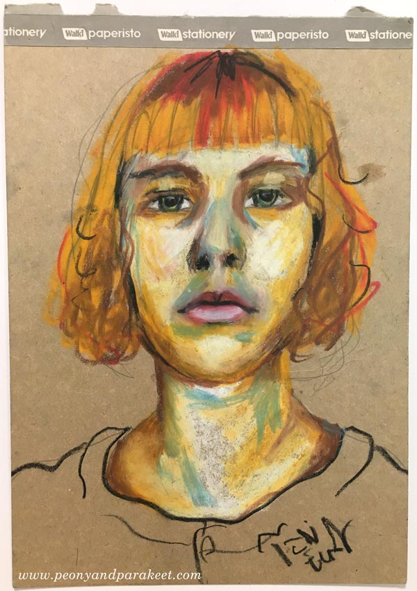
This is a self-portrait from a couple of years ago, and I like that the inner world finally begins to show.
However, for me, the greatest satisfaction of art is not in self-portraits or portraits in general. I want my art to move from portraits to stories, be more dynamic than just staring faces, tell about my experiences, and how I can see them in a new light. I believe that our inner world is full of stories that connect us to other people on a deep level. When I have thought about my artistic style or whether my art is “good” or “bad,” I have often neglected this story-telling aspect.
Mirimer – From a Portrait to a Story
When painting “Mirimer”, there was a magical moment when I heard my mother calling my name. She passed away tens of years ago, and I thought I had forgotten the exact tone in her voice, but the painting brought back the memory. It must have been because of the blue color, her favorite. I realized that I wasn’t painting a portrait of a fairy anymore. I was painting the story of accepting loss as a part of life.
Mirimer became a blue-hooded angel, and the drops of water got some red to indicate that life carries pain that we can’t get to choose.
Illustrating Stories by Lucas Cranach
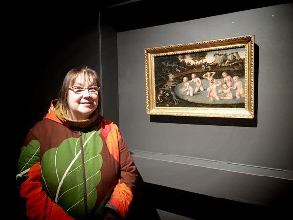
Stories also came to my mind when I went to see Lucas Cranach’s exhibition in the Sinebrychoff Art Museum. Lucas Cranach (The Elder) and her son, Lucan Cranach (The Younger), were not only German master painters in the 16th century, but they also knew how to run an art business. They had a workshop, an illustration studio, which had many employees, a logo, a style that everyone had to follow, and they produced prints too. So even if they lived in the Renaissance, they did what most artists today dream about. They built a visual world around stories that people yearned for.
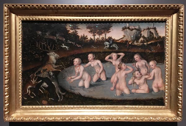
Many of the Caranachs’ stories were from Greek mythology. This painting, my favorite from the exhibition, tells a story about Actaeon turning into a stag when Diana and the nymphs splash water on him. They don’t like him to watch them, and his dogs begin to attack him too!
In the painting below, there’s Venus and her child, a little cupid. The cupid has been stealing honey and the bees have bitten him.
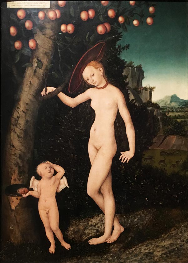
There’s also an old poem, written in Latin on the top corner of the painting too:
As Cupid was stealing honey from the hive
A bee stung the thief on the finger
And so do we seek transitory and dangerous pleasures
That are mixed with sadness and bring us pain
From Portraits to Stories – 5 Tips
- Allow more intuition and imagination into your process: Add splashes and other unexpected elements. Spend time with a color that speaks to you. Instead of actively painting something, spend time discovering and highlighting what already can be seen.
- Grow your skills from faces to body gestures. Learn to process a shape that’s on paper, in your head too so that you can find alternative ways to continue the painting.
- Play with the scale of the elements. We tend to make shapes that are all equal in sizes. But if you want to paint a tiny fairy, for example, you need huge flowers to indicate the small size.
- Let go of strict outlining, and leave room for spots of light and shadows. There’s no story without the atmosphere, and the atmosphere is created by setting the lighting.
- Take time to let the story unfold. Often, the stories have many layers, and the first associations are just the path to deeper ones.
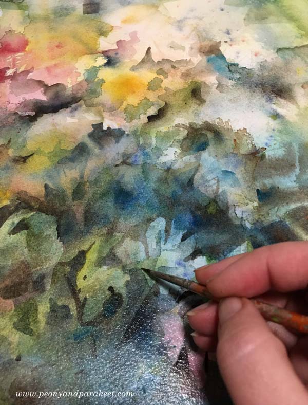
Magical Forest – Discover Stories by Painting!
Paint watercolor fairies and nature’s spirits in their magical surroundings. Enjoy freeing up your expression while exploring flowery woods, shallow ponds, leaf chapels, and adventurous sceneries. Magical Forest begins on January 1st >> Sign up Now!