Between Fine Art and Illustration – Combining Both Into One Artwork
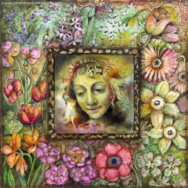
This week, I continue showing pieces that will be presented in the upcoming group exhibition “Flower Gardener’s Diary” (Kukkatarhurin päiväkirja, 9.- 22.9.2019, Hietsun Paviljonki, Helsinki). This one is called “Flower Fairy’s Year.” I will be presenting both paintings and drawings, so I wanted to create a piece that would build a bridge between fine art and illustration. I hope you find this project inspirational!
Inspiration Piece: Wheel of Fortune
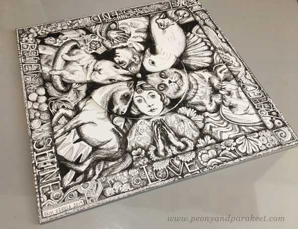
When building the class Magical Inkdom earlier this year, I made a fun drawing called Wheel of Fortune. It has a center that’s separate from the rest of the piece, and it can be rotated so that the heads of the figures change. The bigger drawing is attached on thick cardboard so that it feels like it’s a game board, not just a flimsy piece of paper.
I wanted to use the idea of a separate centerpiece and sturdy base for this project too.
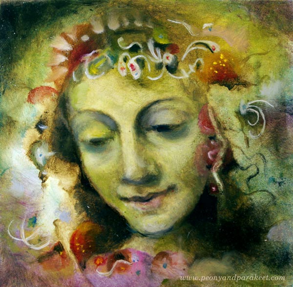
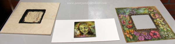
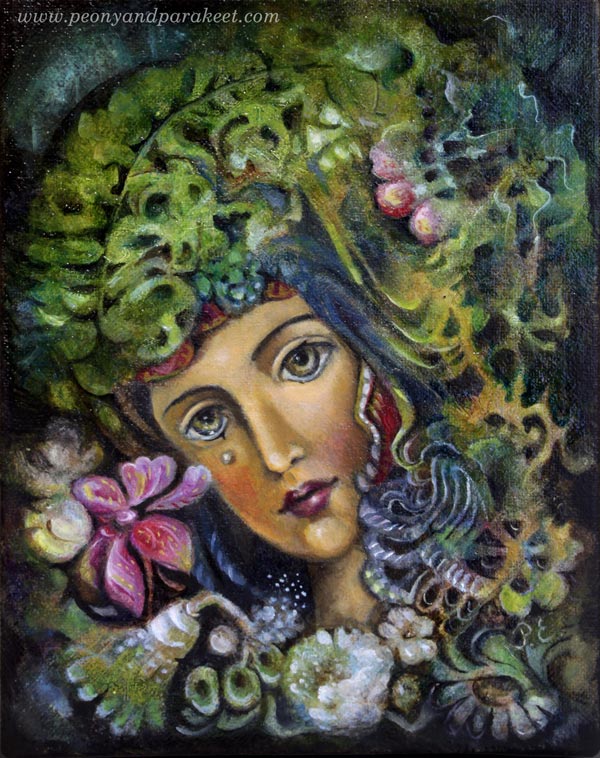
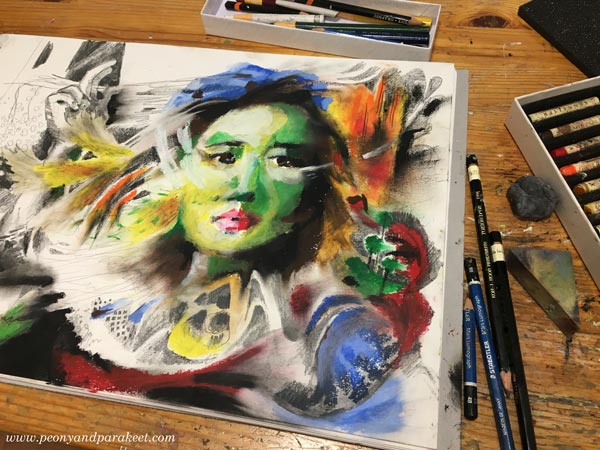
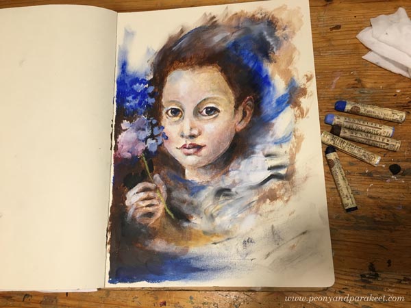
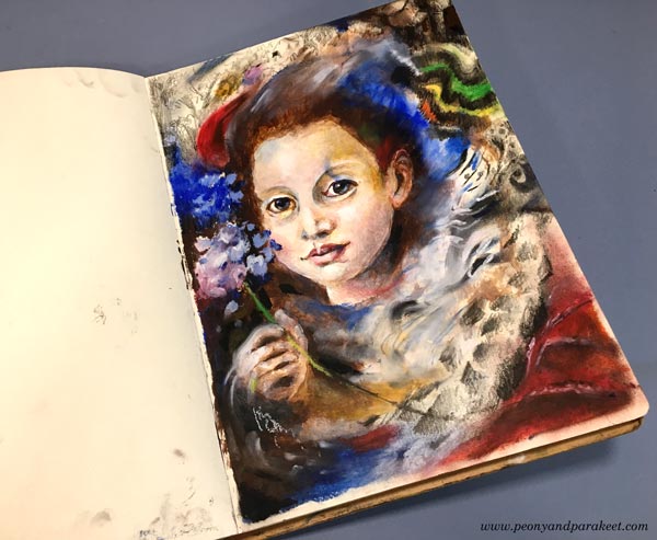
Fine Art Centerpiece: A Miniature Oil Painting
The project started by finishing a miniature oil painting that I suitably had in progress. It’s only 4 by 4 inches.
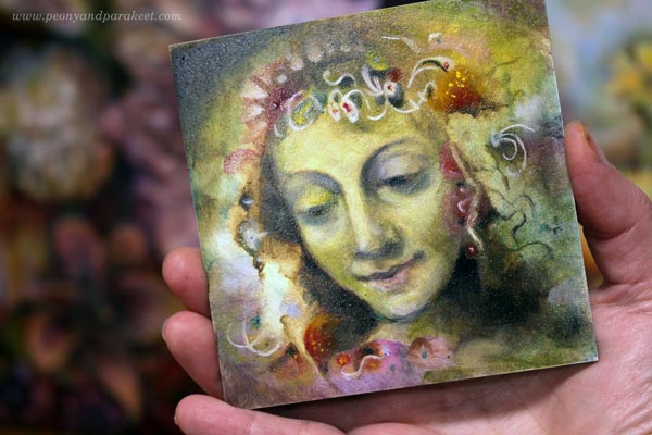
The painting was made very traditionally. I sketched the face with charcoal, and then made an underpainting with umber and white. I used Bernardino Luini’s portrait of Saint Catherine as a loose reference for the facial features.
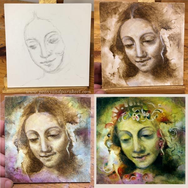
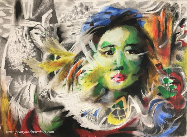
The color layers were thin so that the previous layers stayed visible too. It took a bit of courage to give a green wash to the face, but I really like the result. Decorations were easy and fun. They are quick lines and shapes that make the saint look like a floral fairy.
With oil, the most difficult thing is to wait for every layer to dry separately. Other than that, I find oil easier to handle than acrylic paint.
Illustration: Decorative Flower Frame
For the frame, I cut a piece of Bristol paper. It’s about 10 by 10 inches.
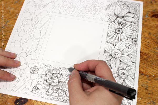
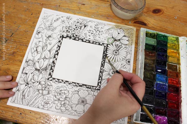
I wanted to include flowers from January to December so that the frame is like a clock that has months instead of hours. The drawing was made with Copic Multiliners (I mostly use 0.05 tip), and I colored it with watercolors.
Plywood Base
My original idea was to cut two layers of cardboard so that the topmost layer would have a 4-by-4-inch hole. But when I told my husband that “Ideally, the base would be wooden”, he went to his workshop and came back with a hand-carved plywood base!
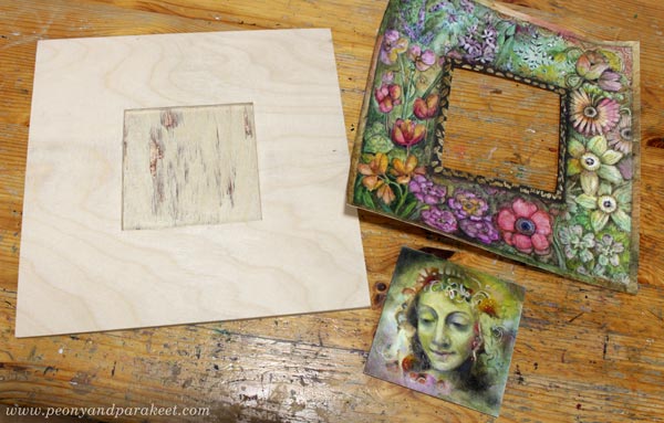
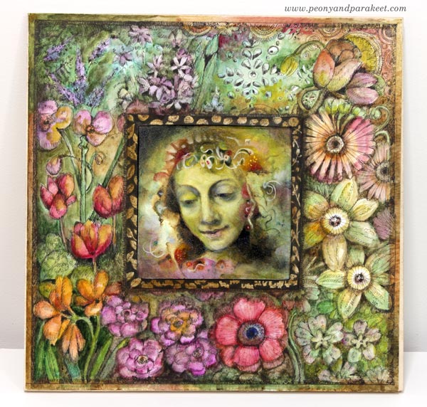
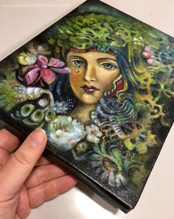
Putting All The Pieces Together
I painted the plywood black near the surroundings of the miniature painting. It makes sure that the plywood won’t show if the piece is observed from different angles. I varnished the oil painting with Gamvar and let it dry overnight. I put a plastic plate over the frame to reduce the curviness of the paper after painting it with watercolors.
Then I glued the painting to the base with gel medium and attached the frame with double-sided tape. Finally, I marked a line of 0.5 cm from the edge of the base and made sure that the motifs extend there. This piece will be professionally framed, so I didn’t want to leave too much empty space around the edges.
Between Fine Art and Illustration
In the art world, there’s a lot of talk about choosing between fine art and illustration. Many define fine art so that it comes up solely from the artist’s own creative expression when illustration illustrates a story or can easily be used with the text. One way to separate them is the number of copies. Fine art pieces are often unique or manufactured in very limited quantities only when illustrations are more of everyday art, consumed by the masses. Some say that it requires talent to create a piece of fine art, and just art education to create a piece of illustration.
In my artistic path, I have found the definitions both helpful and destructive. It has been essential for me to expand to illustration – to learn how to visualize text and written ideas. It has made me more connected with the surrounding world, and it has also brought me more work. However, I feel that art is free, and without exploring that freedom, it’s also difficult to create insightful illustrations. So I have tried to keep up with both worlds.
However, I hate when people say that you have to choose between fine art and illustration. For me, bringing the two approaches as close as possible has been a working solution. I think this project shows really well how one is not the enemy for the other.
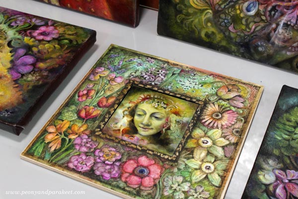
I can’t wait to show you more pieces that I have finished for the exhibition! I will also have many framed and will blog about how I selected the frames in the upcoming weeks. Stay tuned!
Come to draw fantastic art (+ fantastic frames) with me –
Sign up for Magical Inkdom!
Right after the registration, you will get all the lessons, and you are good to start drawing! >> Sign up here!
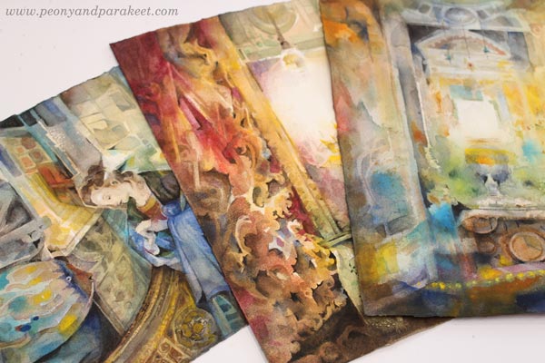
Watercolor Interiors – Four Tips
Here’s a watercolor painting that I made while being a student of Finnish watercolor artist Mika Törönen. I took the class to understand more about watercolors. Watercolor is a weird medium, and its weirdness fascinates me! Watercolors seem simple and easy at first. But the more you paint, and the more atmospheric you want your paintings, especially watercolor interiors, to be, the more challenging they become.
I have recently realized that more than outdoor sceneries, I love painting interiors. Here are some of my tips for painting watercolor interiors!
1) Start with Geometry and Positive Attitude
Last spring, I committed to learning more watercolor techniques. I built a class called Watercolor Journey.
In the past, when I was teaching IT professionals my colleagues often said: “You learn best when you are teaching.” First, it felt like cheating because I thought that teachers have to know everything already before starting a class. But when you have to break things into small manageable and teachable parts, deeper insights come up. This way I have found simple methods and easy guidelines for making rich and creative paintings.
This painting is made for the exercise of Watercolor Journey. It’s about painting geometric shapes and thus simplifying the interior. You can make the photo more blurry by squeezing your eyes, and focus on the flat shapes that you see from it, for example.
But methods, tips, and guidelines are not the only useful things that I have learned by building classes. By making sure that I teach with a smiling voice and appearance, I have learned to think positively about what I do and how to encourage myself. One of the most depressing things in classes is to hear negative self-talk, whether it comes from the teacher or the student. That’s why I think it’s important always to express positive emotions, the love for art, and all the enthusiasm that can be found from creating.
2) Choose a Reference You Love
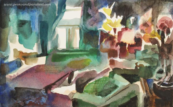
Mika Törönen creates his beautiful paintings from the references. We also had to pick some for the class. I wanted to continue the inspiration that I got by visiting Italy a couple of years ago. I chose a snapshot taken from one of my favorite places – Palazzo Pitti, Florence. Many students used the same photos as references as the teacher did, but to me, it’s difficult to use references that I don’t have any connection.
I didn’t aim for an exact copy but still, the photo was quite complicated and it took all the three sessions to complete to painting. I learned some tricks from Mika Törönen, like how to prevent the paper from curling while working (watch the video where I use the method for painting a watercolor bookmark), and the courage to use small shapes and lines of very thick paint when finishing.
The class was based on us students watching him paint. He wasn’t very good at translating his methods to words but as far as I saw it, a lot was to do with finding abstract elements from the photos and building a composition from that. He didn’t guide much, and the painting time was quite limited. The benefit for me was that I got new energy for working with watercolors. I painted a lot between the three weekly sessions.
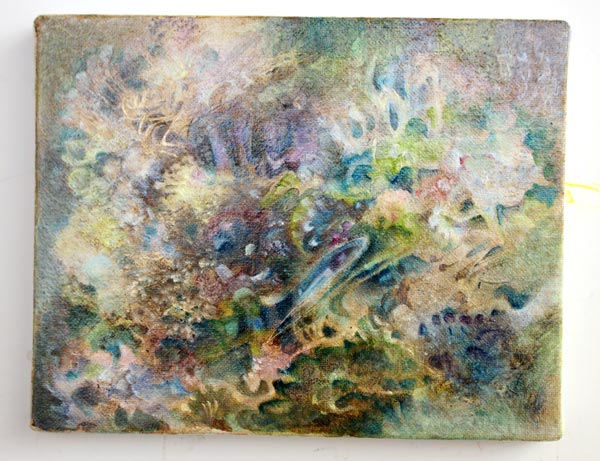
3) Embrace Surreal to Express Emotions
One of the paintings that I have made recently, is this surreal interior. I used several references for this one and also worked quite loosely from them. Choosing one reference is not always the best starting point because it can control the work too much.
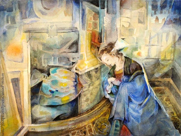
Here, my most important influencer was the feeling that I got after the first class session. The session was very quiet, and I felt the loneliness that felt both good and bad. Loneliness gives the chance to spend quality time with imagination. But of course, it is also a sad feeling.
When I have clarity about a specific emotion, I have both the positive and the negative aspect in mind. That tension inspires me to express it. In this painting, I used a fish to symbolize creativity that I connect with the time spent alone.
Often, the loneliness is in your head. You can feel alone even if you are surrounded by people. So I left a blank triangular ray of light that hits her head.
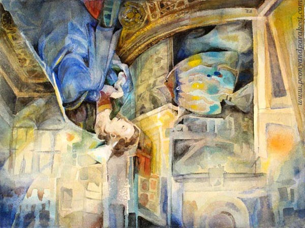
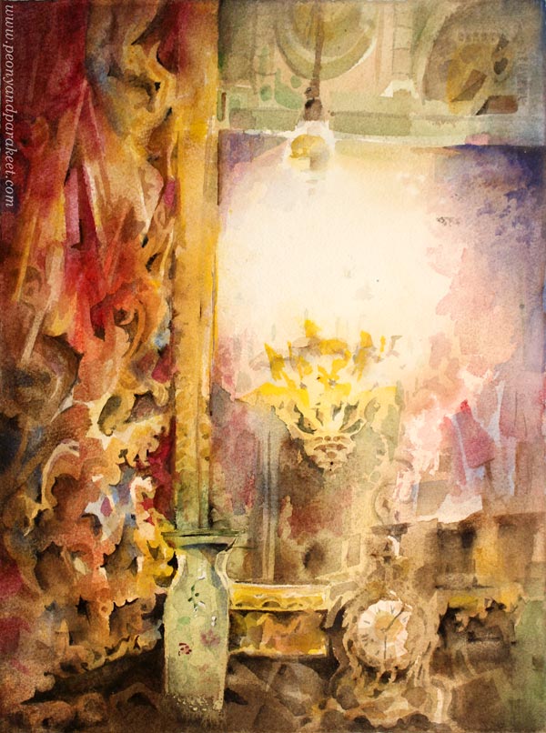
Working with creativity and without other people’s perspectives, can make things turn upside down. I used my photo of Palazzo Vecchio’s Hall of Five Hundred as a loose reference. If I turn the piece, you might recognize some of it.
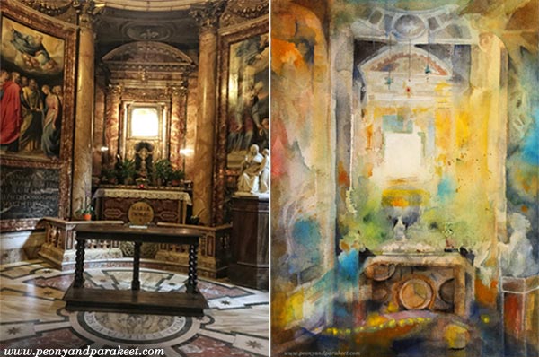
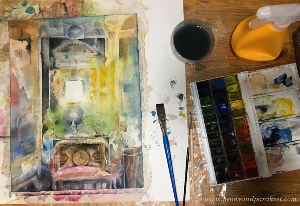
4) Design the Lighting and Focus on the Light
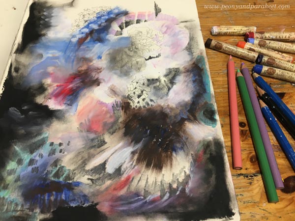
Here’s my latest watercolor painting called “Eternity”. I think that it’s most loose of all the paintings of this blog post because here, I focused on the light.
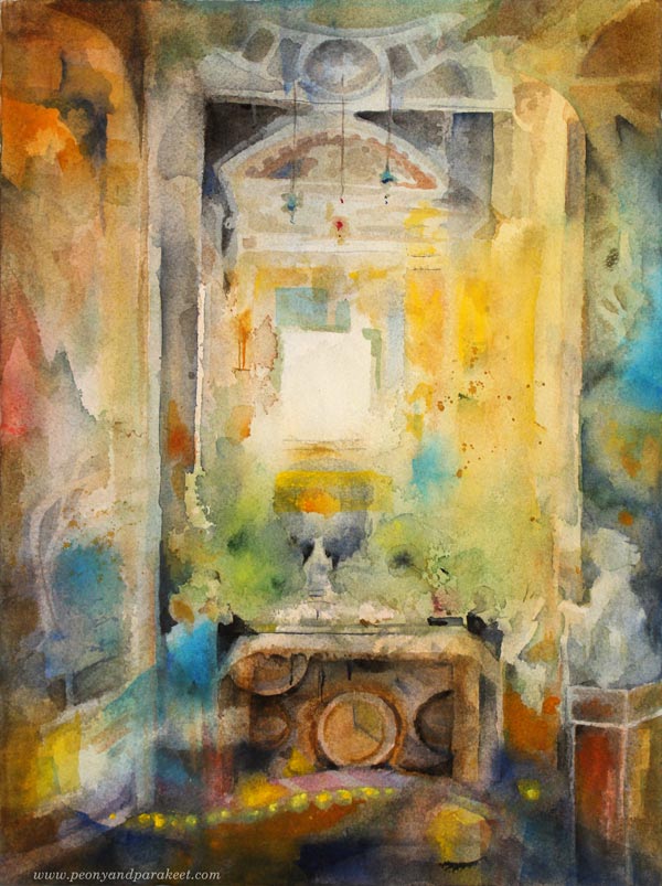
My reference photo was taken in an old church Chiesa del Gesu in Rome. It was only a starting point. After the first pale compositional layers, I abandoned it.
The elements and the lighting didn’t quite match my vision of
I used a lot of water when making this one! Sprayed, too!
Watercolor Interiors – and Flowers!
I used Arches Rough 300 gsm watercolor paper for these three watercolor interiors. I hope that this blog post inspired you to pick your watercolor set and paint some watercolor interiors!
This spring I will rerun my class Floral Fantasies in Three Styles, where we paint watercolor florals, a very suitable theme to go with the interiors! There will also be an extra watercolor exercise, which will be available separately if you already have the class. Stay tuned!
Breaking the Rules – Creating What’s Right for You
This blog post is about breaking the rules when choosing what to create.
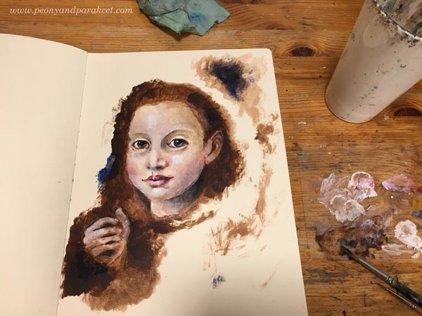
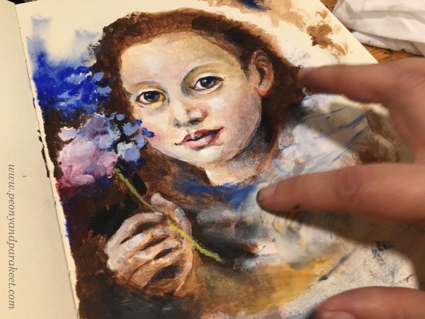
Let’s begin with this oil painting. Oil paintings are big projects for me, and I only finished two of them last year. The first was Temptation, and this is the second one, called Madonna of the Heart.
Following the Heart – Breaking the Rules
My Madonna is a small painting, only 18,5 x 23,5 cm, but it’s quite detailed. I first planned to make it fully abstract, but then got second thoughts.
As a child, I learned the basics of eastern-orthodox art by attending an icon painting group. I was taught many rules – what colors to choose, how to mix the right tones, how to build layers, etc. It was not just about learning the right techniques, but also obeying the long tradition. The repeating discussion in the group was the difference between right and wrong. There was very little room for creativity, and I loved it! I was about 10 years old and eager to learn new things. Work was challenging, and it was comforting to know that there’s one clear direction.
When painting the small canvas, I was tempted to travel back to my childhood, and participate in that small and safe group of icon painters again. But I also knew that it’s very wrong not to follow the rules. My supplies were wrong, my background was wrong, the whole idea was wrong. But it felt natural and tempting, so I made it.
Natural to You, Wrong to Some
Recently, I have found many creative blocks like this one. To paint an icon with oils on an abstract background is wrong to some, but it’s natural to me. I love painting intuitively, and the idea of an icon is the most beautiful that I know. Don’t we all need an image that offers consolation and reminds about kindness? To me, it has nothing to do with any specific religion. Everybody has a right to have a Madonna of the Heart.
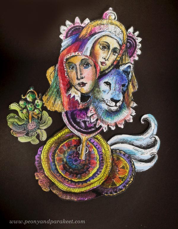
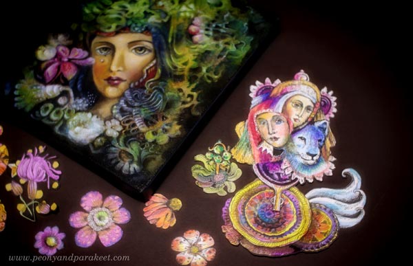
While building the class Animal Inkdom, I have also filled my “boxes of joy” with hand-drawn collage pieces. Very soon after starting, I realized that the principle “natural to me, wrong to some” also applies to these small drawings.
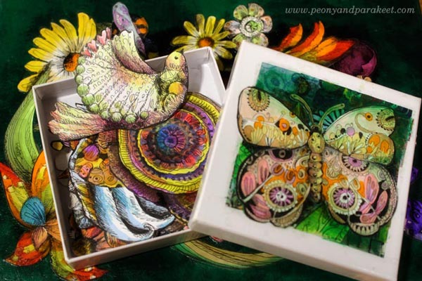
Yes, I love to draw flowers, birds, butterflies, very innocent stuff. But there are also pieces that are quite odd like this one.
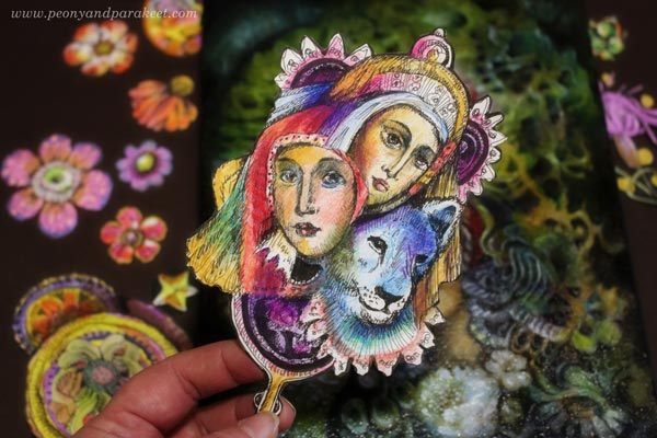
This hand-drawn ornament has two women, both dressed in old Byzantine clothing, and the lion. It has a handle so that it can be held like a sacred image. This small drawing is packed with stories about my childhood. I remember the conversations with my mother, already passed away. I remember my idol, Joy Adamson, and her lion Elsa. I remember my love for blue color. Seeing all that together makes me happy.
I also love to play with the ornament by adding more handdrawn elements around it!
Breaking the Rules Between Serious and Playful
So it happened that a carefully painted oil painting and this little ornament became equal. Of course, not equal in monetary value, but equal in the kind of satisfaction I get from them. And it also feels that this world that I am building is surprisingly inclusive, both humorous and deep. All I need to do is to make what’s natural to me, even if it would look wrong to some.
We often miss this natural zone because we are so focused on what makes sense to others. When choosing what to create, we work with pre-defined labels like “portraits” or “art journal pages” or “abstracts.” We do what seems to be right for the genre, rather than step into the world where someone might not get it, or in the worst case, might get offended. Still, the freedom in art can’t exist without the freedom of imagination.
Come to Play and Draw with Me!
So, I dare to suggest: play with your art! Cross the boundaries between “right” and “wrong”! Follow the general rules of aesthetics but brea the rules of subject matters.
I think that with Animal Inkdom, you can nail it. You will get practical tips and techniques, but there’s also humor and play, all flavored with the love for wildlife.
It’s still a good time to sign up for Animal Inkdom! The first one of the five modules is published, and you will get it right away after the registration.
Let’s keep on drawing, and never forget the playing part either!
Oil Pastels and Spicing Up Your Art

This week, I show you how to use oil pastels with other art supplies. I also talk about spicing up your art, especially by choosing subjects that are so personal that they make you tremble a bit!
Early Memories of Oil Pastels
Making art can be compared to cooking. Sometimes the food tastes good because the ingredients and the way are processed go well together. That was how my mother cooked. Her food was delicious because it was fresh and made with care. Even if our family wasn’t wealthy, the time that she put on cooking, made the meals worth remembering. I still don’t know how she was able to include the thick layer of blueberries into her pie. When there was a local art competition for children with the theme “home,” it’s no wonder that this is what I drew.
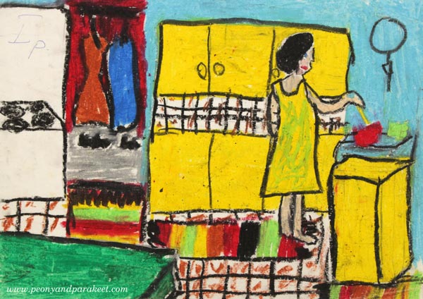
I remember struggling with the oil pastels, definitely not artist’s quality, but the drawing won the first prize. It was a little unpleasant that the organizer has written the prize in the drawing, but now it just adds a nostalgic flair to it.
My mother wanted her children to step away from cooking and caring for the home. She wanted me to get a good education and declined to teach me how to cook. I grew to question what women and men are supposed to do and felt rebellious in that respect. As a result, I went to study engineering and worked in a field that had mostly men.
QUESTION: What memories do oil pastels or other early art supplies bring to your mind?
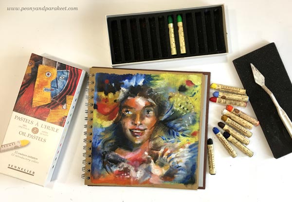
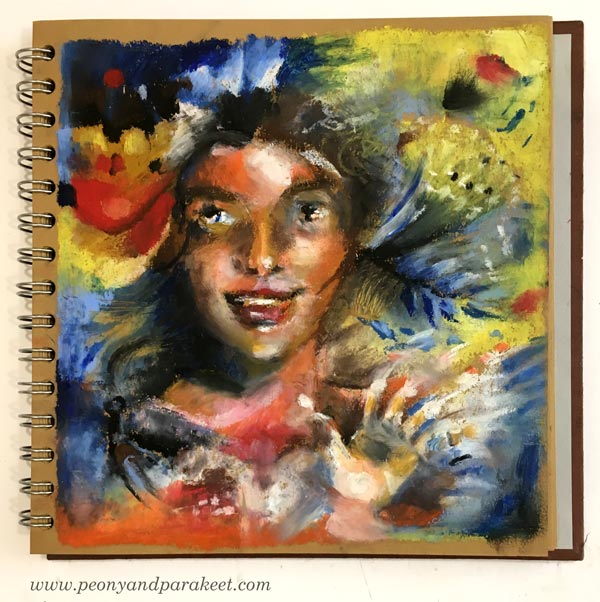
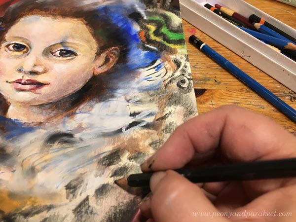
Sennelier Oil Pastels – First Experiment
I bought a small set of Sennelier oil pastels for mixed media art. I didn’t want to spend money on a bigger set until seeing if I like them or not. My first experiment was to draw a portrait on a small sketchbook.
My mother used two spices mostly: salt and pepper. When creating art, salt and pepper are the lightness and the darkness of colors. You need both, but not too much. As beginners, we often think that we don’t need any salt and pepper. That the fresh ingredients – bright colors – will do the trick. But you need some paler and darker colors, not too much, but enough to harmonize a busy painting.
For the first experiment, I thought that making a basic portrait with salt and pepper would be enough. But creating just a pretty face often lacks expression, so I added a hand because oil pastels and fingers go together. No matter how hard I tried to use a palette knife for blending, I ended up enjoying the waxy feel of oil pastels on the fingertips.
The first experiment made me remember why I had tossed away my old oil pastel set over 10 years ago. Oil pastels are messy! Later in the evening, I made a big mistake of not wiping the table carefully and then placing my cross-stitch projects on the very same tabletop. I had to wash oil pastel marks from the fabrics, and that was very upsetting!
Woman’s World – Oil Pastels with Graphite Pencils
I wasn’t ready to give up oil pastels but headed for the new experiment the next day. This time my idea was to use a sponge for blending and combine oil pastels with graphite pencils. They have called me more and more these days. Maybe it’s because my friend Eeva Nikunen uses graphite a lot and I have one of her drawings on the wall. I am not so much into using graphite alone, but I love using it with watercolors, so why not try it with oil pastels as well!
Making of this sketchbook page both excited and scared me. It went deeper than the first page and expressed thoughts that I don’t usually reveal to the public. I support women becoming equal with men, and often think even more strongly: it’s now the time of the history when we women can take power. I believe that it will liberate men too. Many young women say that they are equal already, but my experiences haven’t been quite like that. And when thinking back to the past, even when narrowing the focus only to the field of art, women have been neglected for centuries. So it can be woman’s world now if you ask me.
When creating this piece, I realized how much I had been used salt and pepper only: making images that are aesthetically pleasing, but that could be spiced up with the message.
QUESTION: What thoughts do you have that you haven’t expressed in your art?
When you think about “what to put in the background” next time, maybe perfect the face a little less and spend more time with a message no matter “what others think.”
Girl Power – Oil Pastels with Acrylic Paints
When I processed the theme – the power of women – further, I wanted to send encouragement to today’s young girls. Most girls that I have met are very smart but also polite and gentle. I wanted to express my appreciation for them.
This time, I wanted to try acrylic paints with oil pastels, and I also had a perfect reference image in mind. It was a miniature portrait of Europa Anguissola painted by her sister Lucia Anguissola. There were six sisters who all became painters in the Renessaince age, but only one of them, Sofonisba, continued her career. I saw the portrait of Europa a couple of years ago, and it’s sweet and amazingly detailed for a small painting.
This project was created in my Dylusions Creative Journal. Acrylics were my choice for the face, and I started very traditionally, making an underpainting with umber and white.

Again, I didn’t want this piece to be just about the face, so I added a hand too. Here you can see how far I worked with acrylic paint only.
Now to the oil pastels. After experimenting blending with a palette knife and a sponge, I gave up and used my fingers only. But I had a new weapon: baby wipes! They are very handy for removing paint both from the fingers and from the table top. After getting used to having a baby wipe in hand, the messiness of the media doesn’t bother anymore!
I love blending out the color when working with oil pastels. It feels enjoyable and natural. I am excited to try these techniques with oil paints as well.
Here’s one technique that I discovered: First, lay several colors carelessly on paper. It’s like throwing the ingredients into the pot!
Second, mix the colors with a finger – beautiful – not the finger but the art!
I also wanted to add some pencil strokes too. Loud and bold oil pastels look very appealing when they meet the quiet power of graphite drawing.
So this one is for young girls: “I wish you all the luck and all the power. Europa Anguissola abandoned painting when she got married, but you don’t have to. You can be anything, and we support you!”
Who do you want to send greetings through your art?
Free Like a Bird – Oil Pastels with Turpentine
The true test for the oil pastels: how do they work with abstract art and intuitive process. This time I used colored pencils and graphite as well.
In the middle of making this abstract piece, a new problem came up. I wanted to spread a thin layer of paint, and tone down some areas. I got the idea of thinning the pastel with the medium that I use for oil painting. The painting liquid has poppy oil, Dammar varnish, and turpentine. After googling, it seemed that turpentine could thin oil pastels. So I rubbed some color on a palette, added few drops of the painting liquid and started painting.

The liquid worked very well. Of course, the odor of turpentine can be unbearable for many. Working in small amounts, and keeping the lid closed reduces it a bit, though.
Here’s my finished piece: “Free Like a Bird.” It’s what I hope for everyone, regardless of the gender.
If you compare the images of this blog post, the abstract piece leaves more room for interpretations. Recently, I have felt more and more drawn into creating abstracts, and letting go of delivering a pre-chewed message. Cooking without a recipe can be much harder than you would first think. Making a vast selection of foods, learning to use pepper and salt, helps. But first and foremost, art is not just a matter of learning how to cook a meal. It’s also the matter of choosing what you want to serve to the world. And no matter how clumsy the execution, the subject can be the most significant spice.
The Exploring Artist Begins on Sept 10 – Sign Up Now!
The Exploring Artist is a 12-week group coaching program for artists, between Sept 10 – Nov 30, 2018. This coaching is for you who wants to get clear about your artistic passion and become more open about your art, for example, share your art in social media, blog about art, sell your originals and prints, teach classes, etc.
In The Exploring Artist, you will get coaching as a part of a small and tight-knit group. I will personally help you to put your passion into words and visual insights. We will work together to discover what you want to change in your art, where you want to move forward and how to do it. >> Sign up now!