
Hearts and Flowers – Draw Freely with Me!
This week we will grab colored pencils and draw freely in full color. Follow me step by step!
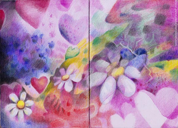
This exercise is set so that we start simple and then get more creative. If you are a beginner, you can stop earlier, and if you have more skills and patience, you can go to the very end. You only need paper and colored pencils. I drew the picture in my colored pencil journal.
Step 1 – Draw a Flower and a Heart
Pick a brown or blue colored pencil and draw a flower and a heart.
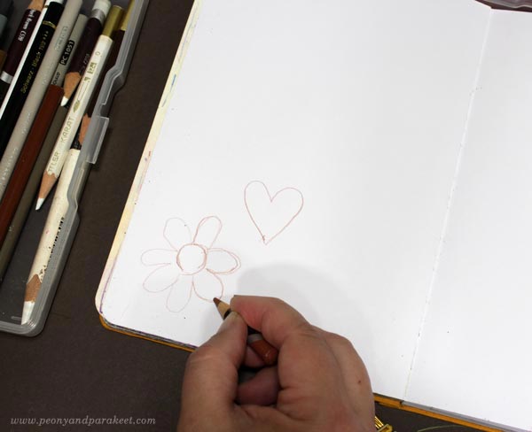
There’s nothing creative here, these are just the basic symbols of a flower and a heart. Place these on the corner of the page so that they are like a starting point for the rest of the image.
Step 2 – Draw a Tilted Flower and a Heart
Now draw a flower and a heart so that they look tilted. Having variation makes the image!
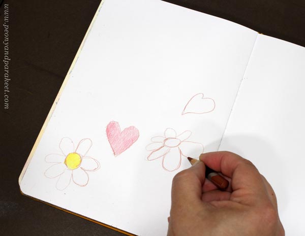
Instead of a circle, draw an oval for the center of the flower. Change the length of the petals gradually. Draw the other side of the heart smaller so that it’s not symmetrical anymore.
I like to add some color right away – not much, just a light layer as a warmup.
Step 3 – Draw a Big Flower and Then a Heart Behind It
I bet your flowers and hearts are pretty similar in size and placed separately – like mine are! Let’s add variation by drawing a big flower and by placing a heart behind it. So here, the heart is only partly visible.
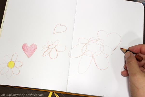
Again, I drew the flower a little differently than before. I made the petals go on the top of the center. Now when the flowers and hearts are all a bit different, they look more lively too.
Step 4 – Color the Hearts and Flowers and the Background Around Them
Now pick a wider selection of pencils and color the hearts and flowers. Also, choose a background color and add some of it to the background.
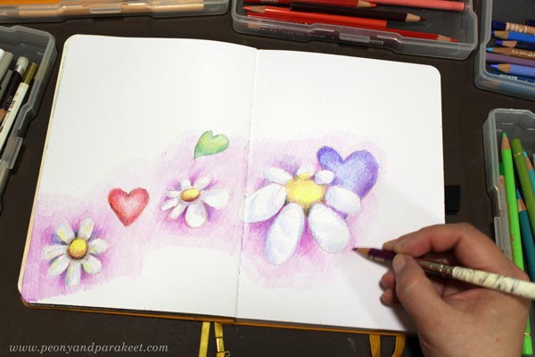
You can adjust the outlines if needed with the background color. Color lightly and leave most of the background blank.
Now you have a cute little drawing, but let’s draw more freely next!
Step 5 – Color Flowers on the Background
We now have stereotypes of flowers, but let’s go further and question them. When a flower wants to be free, it becomes less defined, and the center disappears. Make the background more lively by coloring three big blurry flowers freely.
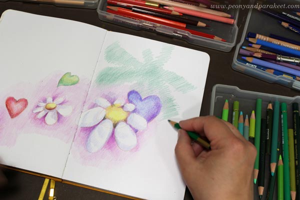
Without thinking about typical flowers, color stripes that go in different directions. They can have different lengths, be straight or curvy, and the result can look pretty odd!
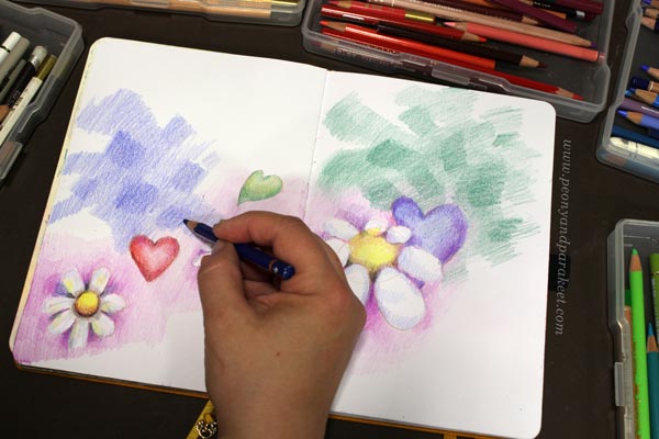
Then color rectangles on the top. Make three blurry flowers total – sets of stripes and rectangles, that is!
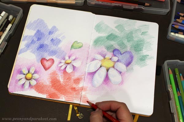
Connect the elements so that the new ones go a little behind the old ones. When you want to create an emotional connection, create a visual connection!
Step 6 – Color Hearts on the Background
Without outlining, color a set of hearts with the background color, and then make a second set of white hearts by coloring the background.
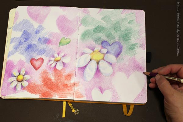
Color around the heart, not the actual heart! The hearts can have various sizes. Place a part of the hearts near the edges so that they are only partly visible.
Then add more background color so that it goes partly over the background elements and makes the image a little darker and calmer.
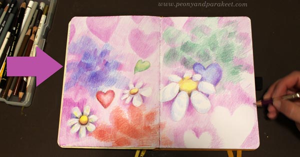
Now you have some free expression, but next, let’s go further and add more drama!
Step 7 – Color a Dark Path
Light always shines more brightly when there are also dark colors. Pick black and other dark pencils and plan a path that goes across your image from one corner to the opposite side of the center.
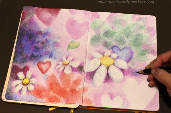
First, color the chosen corner and the nearest edge. Then move towards the center. There, add shorter stripes and spots that mark the path and highlight the best parts of the image.
Now you have set the basic lighting. But in nature, light often travels less straight and makes the overall impression less stiff.
Next, we will get creative and free up the light!
Step 8 – Draw a Freeform Line and Color Its Sides Differently
Take a deep breath, and practice first. Stand up, and move a pencil in the air so that it creates curves. Then sit down and draw a curvy and continuous line that goes across the page.
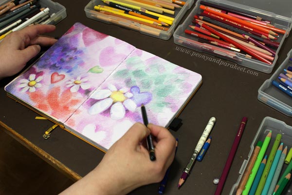
Draw freely and lightly!
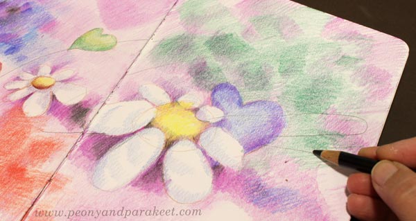
Then color around the line so that light and shadows alternate there. When darkening an area, notice that you can also color smaller shapes and patterns instead of using a solid color.
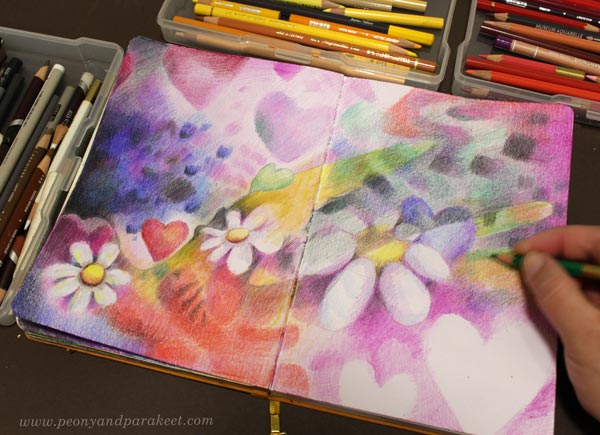
Hearts and flowers can also interact with the division so that they add more little curves to it.
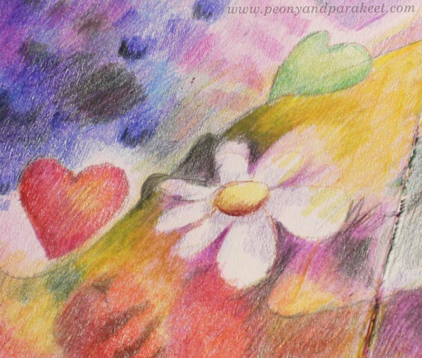
Here, the petals push the line away, creating small bumps.
If you want to add more interest to any other area, you can do the same: draw a line and then color the sides differently.
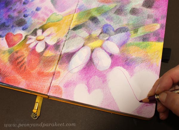
Now you have an atmospheric image, but does it have a message?
Next, let’s ponder what to express and color a little more!
Step 9 – Finishing with a Message
Ask yourself: what element do you like the best? My favorite thing was this blurry heart.
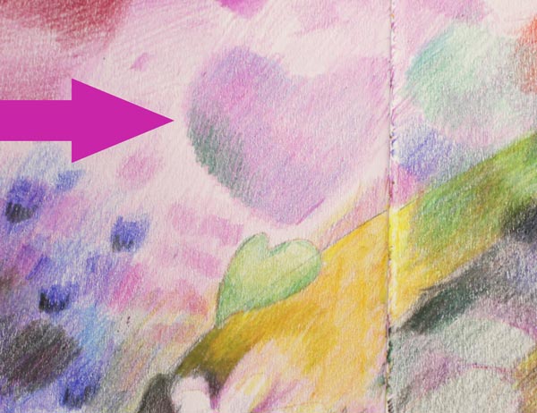
Even if it’s not a centerpiece like the big white flower, it felt like a force that affects the scenery the most. I often discover this kind of “background force” in my drawings and paintings. It seems to be the most strongly connected with the overall message that I want to tell.
The pink heart is like a lady who makes everybody fall in love with her. I want the overall scenery to look feminine but also have elements that include agony and the more desperate side of romantic feelings. I like the tension that I gave with some sharp lines and dramatic curves.
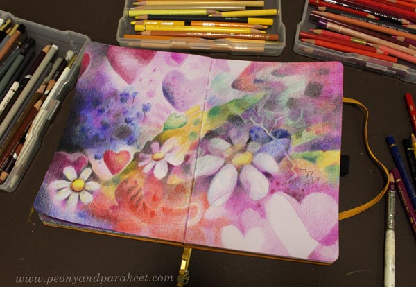
Because everything has two sides, often finishing with the message means adding more tension. It makes the image feel more real and more relatable.
I hope this inspired you to draw freely!
How to Stay Motivated – Colored Pencils and Free Video!
This week, I have a free video for you! I hope it helps you to stay motivated and keep creating.

In the video, I am creating this small spread for my colored pencil diary and talking about how colored pencils help me to stay motivated. I share some thoughts about taking a break and getting back to making art. There are also lots of visual examples and an idea about Modern Me and Ancient Me. Imagining these two sides can help too.
How to Stay Motivated – Watch the Video!
I hope you enjoy the video. Let’s keep creating!
Drawing Swirls with Colored Pencils
This week, let’s make a summery drawing by coloring ornamental swirls!
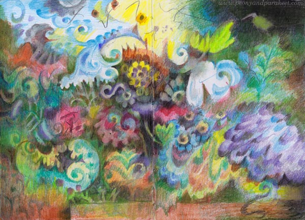
Here’s the latest spread in my colored pencil journal. I have been recovering from painting a big series of oil paintings, so I wanted to create something small and experiment with the idea that I got in mind while cleaning the studio for the next paintings. Because I like to create freely and intuitively, my colored pencil journal is not a direct sketchbook for paintings, but more like a study book of ideas – a place to ponder and practice at the same time. This time, I wanted to focus on ornamental swirls so that they flow freely on the page. The elements themselves have stiffness but the overall impression is dynamic when the ornaments are layered on top of each other.
Drawing Swirls is a Good Art Practice
Practicing swirls makes all your drawings more beautiful because it develops both the hand and the eye. Try to make a perfect curve that ends with a perfect little circle, then widen parts of the curves so that they grow broader gradually. Observe not only the swirl itself but also the shape that it creates besides it.
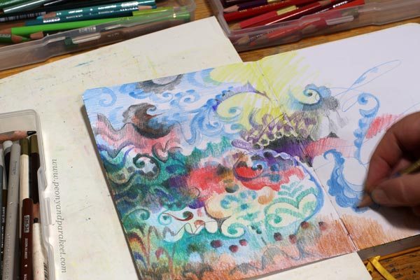
If you tend to place the swirls stiffly row by row, draw some free lines as guides for their placement. You can also turn the page in different directions and color ornaments that are directed differently from each other.
Shadows Can Be Swirls Too
I like to color many layers and make some swirls disappear into the background. When layering, you can make everything ornamental: the background, the shadows, and the actual elements.

There are lots of swirls in my drawing but I also included some simple scallop shapes and circles to make the visual language more diverse.
Darkening a Little More Than You Would Normally Dare
If you want to make your drawing atmospheric, cover most of the white spots.

Darken the drawing gradually by coloring thin layers over most of the elements.
Add Something Angular to Go With Swirls
When my drawing progressed, it started to remind me of old still live paintings, for example, those that Riks Museum in the Netherlands has. There the vase was often placed on a tabletop. The rectangle on the bottom works as a contrast to the organic flowery shapes.
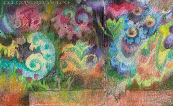
Add some shapes that break the rectangle, like the leaf-like one in my drawing. This way the result looks less strict and more layered.
Summer Coloring – A Little Bit Now and Then
I like and need this easiness of colored pencils when I slowly rebuild and restrengthen my creative core. Colored pencils are easy to grab for short sessions and you can color outside too. It’s now summer in Finland, and the weather has been fantastic. I think it shows in my drawing.
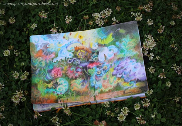
This journal has quite many colored pages already. It brings me joy to browse them. I am dreaming of the day when the journal is full even if it may be far away.
P.S. Check the class Fun Botanicum for more journal inspiration!
Let’s Get Inspired by Tassels!
This week, we dive deep into the soul of tassels and get the most out of our creativity.
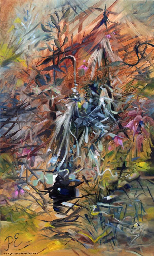
Here’s one of my newest paintings called Church of Saturn. This oil painting is a part of my series Linnunrata – Milky Way, where I explore planets and outer space. (See previous work: Jupiter here, Uranus here, the Moon here, Mercury here, Neptune here, Pluto here, the Earth here, Venus here, and the Sun here!) When I painted it, I thought about the rings of Saturn, the god of agriculture, branches and twigs, an old wooden church from my childhood, wabi-sabi, and the beauty of – tassels!
Tassel Dolls
When I was living in Eastern Karelia in the 1970s, the simplest doll we could make was a tassel doll. I painted it in watercolors so that you can check if it’s something that you had too!
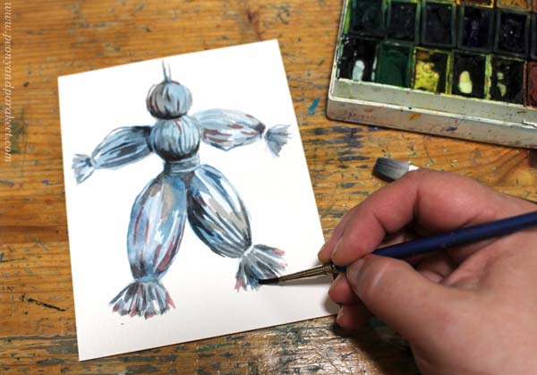
The doll was made of wool yarn and so simple that even a 5-year-old could make it. It’s a good example of a thing that is not valued by our adult self, but that brings up our inner child: “Hey, Miss Tassel, where do you want to go?”
Tassels as Extra Decorations
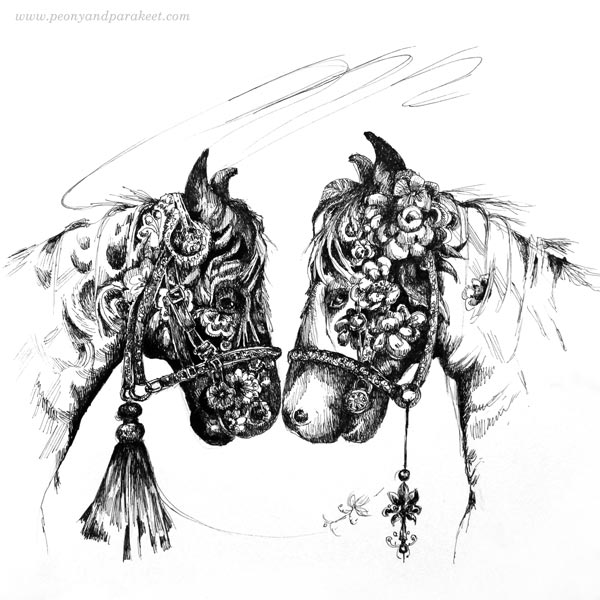
I rediscovered my love for tassels in 2018 when I participated in the Inktober challenge. Back then, I thought of tassels being a fun accessory and I have enjoyed using them as extra decorations in my drawings.
This week, I drew a new tassel for my boxes of joy and had a lot of fun making it.
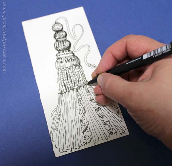
First I drew some circles and lines with a black drawing pen, then added textures and shadows in the style I each in the classes Animal Inkdom and Magical Inkdom.
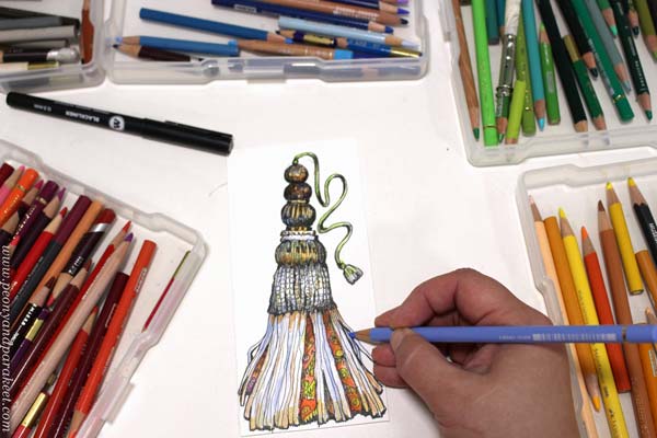
After colored pencils, I picked some other hand-drawn pieces from my boxes and admired the luxurious collection.
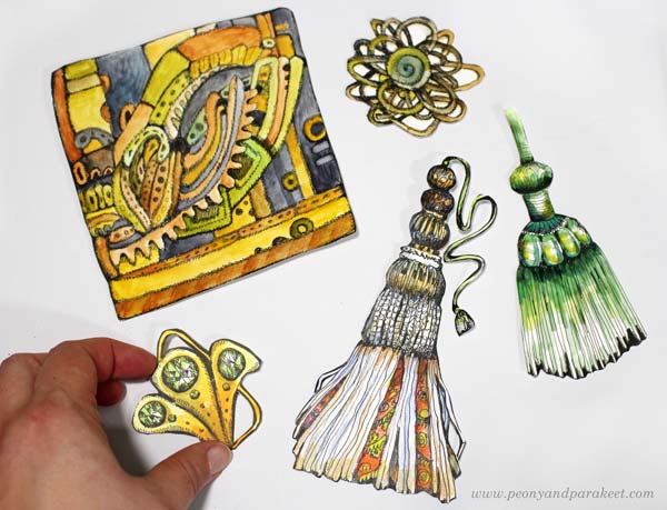
Who needs shopping when you can have your own personal store and draw all the good stuff for it!
Blowing Life to a Tassel
A tassel drawing can be more than a decoration only. You can have more fun by playing with it so that it will get a personality. Imagine a tassel as a person or an animal – a living thing. Here I see two tassel ladies on a stroll!
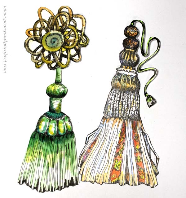
Now, the tassel has a mind of its own. An artist can see any simple object as an element of expression.
In the painting “Church of Saturn,” the tassels have a spirit that makes them an integral part of nature.
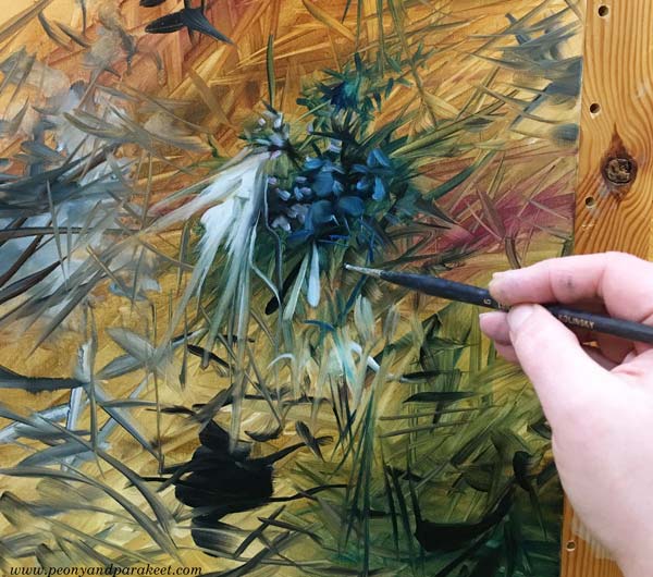
These tassels are organic, and the style is abstract rather than illustrative.
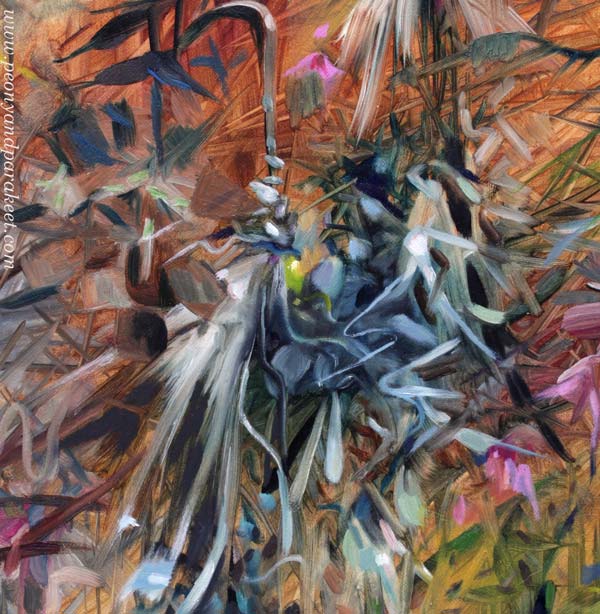
As artists we need to do this – go beyond what’s expected and commonly seen.
Ornamental Figure with Tassels
In the class Magical Inkdom, I draw a funny bunny with a tassel on her head and now I got the idea of making an ornamental figure so that the tassels form the body.
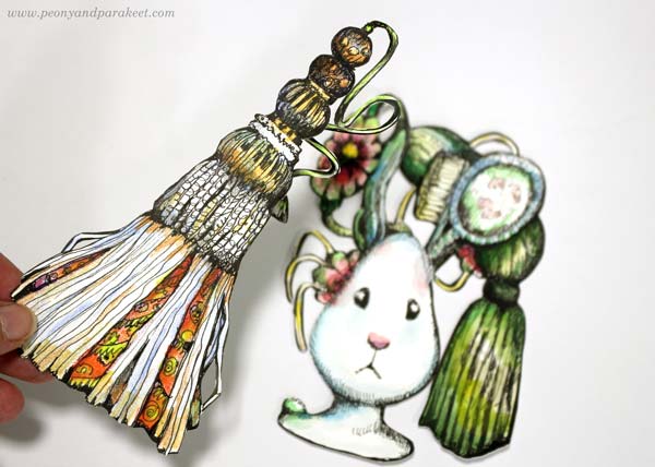
To make a symmetrical ornament, I traced the tassel three times on the right side marker paper. Marker paper is thin so it’s easy to see through it.
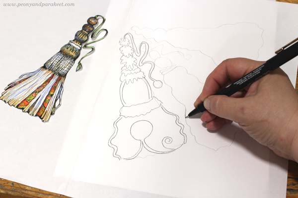
Then I taped the paper to the window and traced the three tassels on the left side of the paper. I added additional elements to the center and some facial features too. My tassel doll!
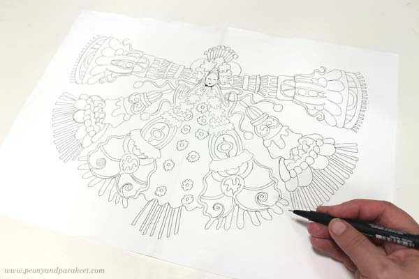
But when I continued the drawing, I got a crazy idea of a knitting hamster. Tens of years ago, I was a hamster breeder, attending shows and everything. I know those little animals well! Knitting is one of my favorite hobbies and the thought of a hamster collecting all the yarn and trying to knit it made me smile.
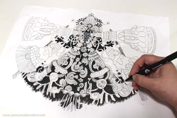
Then the word “Knitwork Orange” came to my mind, and I included the orange as well!
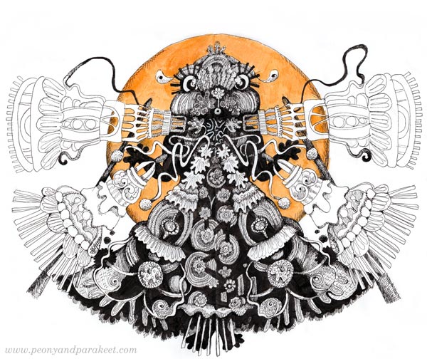
Here’s me, in the middle of the night, knitting away!
Tassel Dolls on Mars
Last spring, I had a small canvas that was first just a mess. I like to start my paintings in this intuitive way and without a plan. I had some leftover paint so nothing was wasted.
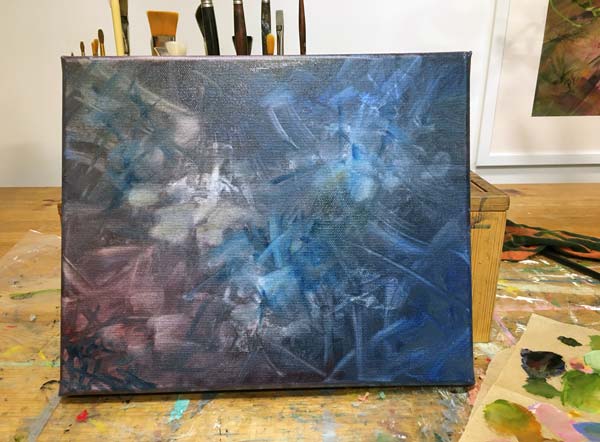
The first ideas are terribly traditional and mine was to make a vase with flowers.
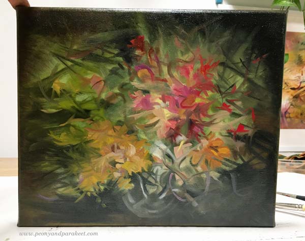
But after this, I was taken to another planet, to Mars! There, tassel dolls met art deco, and I had a lot of fun finishing the painting with all the decorative details.
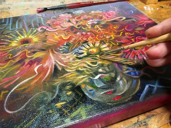
I love the Great Gatsby movie from 2013. It has the best party scenes and good music. I had a lot of fun creating a tassel doll party that took place on another planet.
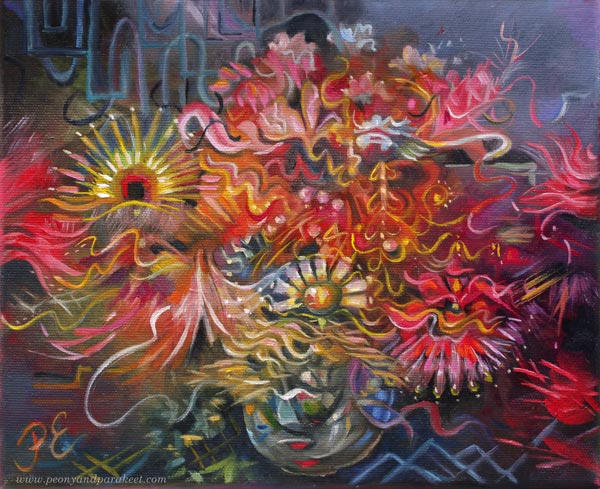
This small piece ends the Milky Way series – 11 oil paintings from March to May. I have taken a break from creating art, but feel like I am recovering now. Thanks to making the tassel drawings for this post! I hope they work for you too!