Expressing Winter Memories
This week, I have a new winter-themed painting, and we talk about the many approaches for expressing winter and memories of any season.
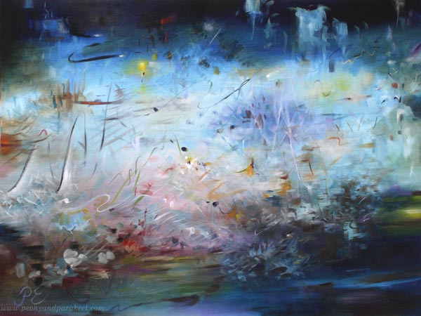
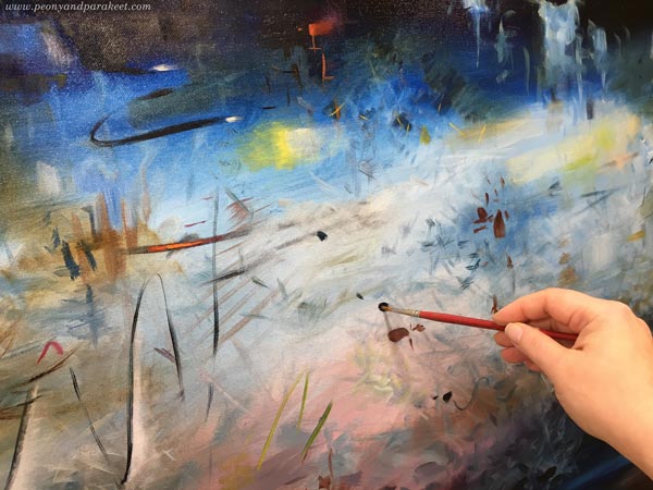
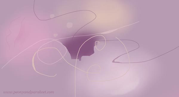
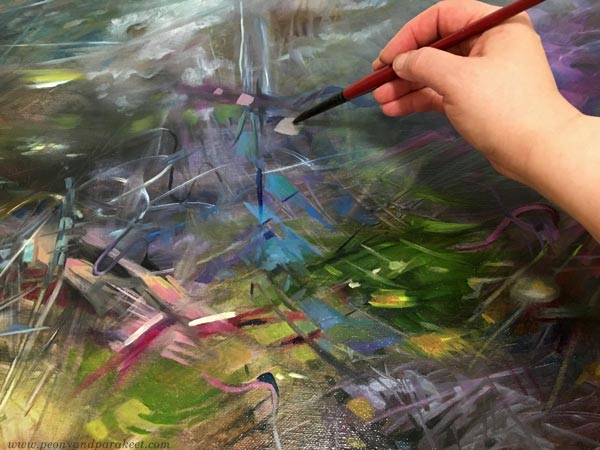
Here’s my newest painting called Winter Night’s Poem. This time, the Finnish name is much more beautiful: Talviyön runoelma. I wanted to give the painting a poetic name – like Shakespeare’s play “A Midsummer Night’s Dream – Kesäyön unelma” but something more wintery. So I come up with the Finnish name, which sounds so romantic (if you know Finnish that is!), and then translated it to English as accurately as possible.
I painted this piece for the local artist association’s winter-themed art exhibition. Winter sceneries aren’t really my thing, but I wanted to take the challenge. I started by exploring Japanese woodblock prints and made a small colored pencil study that is more like a fall scenery, but that has similar abstract elements than in the final painting.

I talked more about this colored pencil piece in October’s video blog post.
Winter Memories
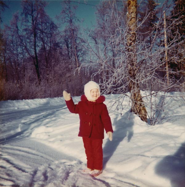
I found it challenging to get emotionally connected with the theme. As Finn, I do know winters. They are cold and dark, and there’s not much that I enjoy about them. As a child, I lived further north, and winters were even colder and darker. Here’s a picture of me in 1974 when I was 5 years old.
However, I have one special winter memory. Earlier this year, in one of the weekly emails, I wrote about Avicii‘s music and how it brings the memory to my mind:
When I hear A Sky Full of Stars, I am a little girl on a cold Tuesday evening in Eastern Finland. After participating in an icon painting group, I walked down the snowy hill looking up. The starry sky was blue-black, I realized. Not black like for those who glance carelessly or blue like for those whose skies were always blue. Working with colors had made the world look more beautiful.
I also remember getting an idea for a poem that I later wrote down. It was something about the starry sky. And there was a melody too. The sight, the words, and the sounds all formed this beautiful winter memory. And isn’t it so that memories are full of sensations of all kinds? Why should we then paint only what we see?
But then I heard myself saying: “Paivi, remember that it’s a winter-themed exhibition. It has to look like winter!”
How Does Winter Look Like?
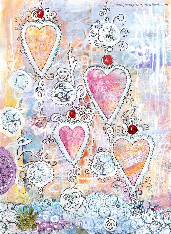
In 2013, I made this hand-drawn collage for Christmas cards. It has a decorative approach to winter. Snow, hearts, berries, pastel colors – they all form a light-hearted and entertaining take on winter.
An even more obvious choice would be to paint a realistic winter scenery with snow, trees, and such. Here’s a watercolor painting from 2018:

My idea was to paint both fall and winter into the same piece. This is a class project from Watercolor Journey where we paint all kinds of sceneries in watercolor.
Winter in a Poem
But the more I thought about winter, the more connection I felt with the abstract side of it. I didn’t want to just paint an empty-looking scenery in black and white. I wanted the lights and darks to have a rhythm.
My favorite poet Eeva-Liisa Manner has a winter poem that I have read hundreds of times because it was in a little poem book my family had. For a small child, the content felt strange, but the more I read it and the more I grew, I fell in love with its rhythm. The poem doesn’t rhyme, it’s free verse, very modern. But still, when I read it, I feel the rhythm, and when it ends, it feels like you have listened to a song, not read a poem. The words have been thrown into the air, carelessly, and yet, it feels like everything has a purpose. It’s like every word would have fought to get into to poem, and after accepted, they are ready to fly beautifully, each on their turn, and then to get mixed up even more elegantly in the reader’s mind.
Maybe you too, love poetry and have experienced the same. The words glow like jewels and have a long effect even if the time spend on the reading, is just a minute or two. Isn’t that what we aim for in visual art too?
Wonders of a Winter Night
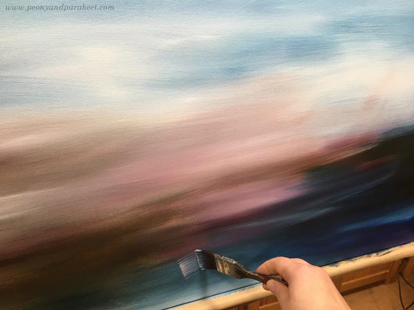
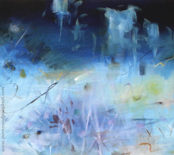
More than thinking about realistic scenery, I approached the painting with a poetic mindset. I imagined the sounds and rhythm of a winter night and visualized those. I trusted that the result will look wintery even if the painting is abstract.
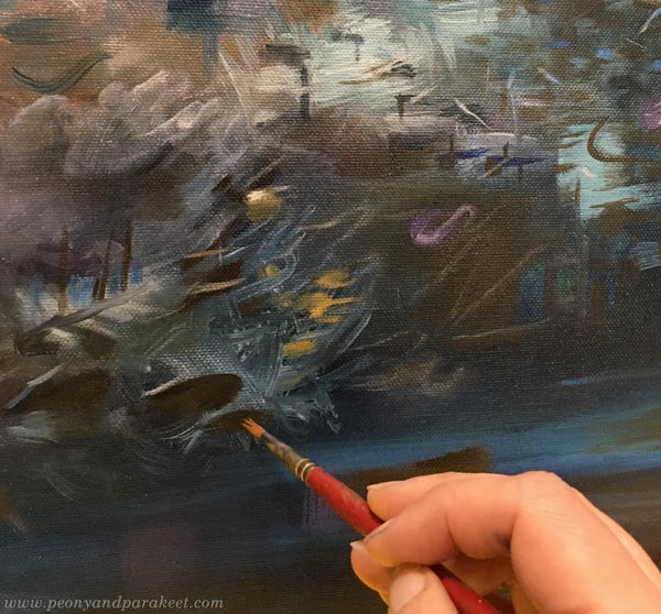
I also thought about how things move, and one of my favorite details is the curvy black wind that blows snow.
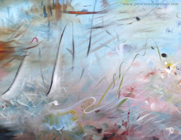
Carelessly painted ice-like objects are on the top, and the sound of ice is visualized below them.
Probably the childhood memory of the winter night has stayed with me because it’s a little bit scary to walk alone in the cold and in the dark, under a few street lights only.
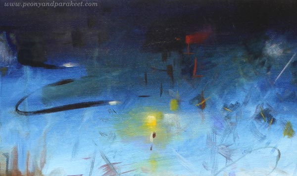
The color scheme was one of the challenges. I didn’t want the painting to look off-puttingly cold. Instead of only using blue and white, I brought a wide variety of tones but so that most of them are quite dark or pale.
Fortunately, winter is not here yet, but usually, we have the first snow in November. So the garden scenery will change soon!

I hope this blog post inspired you to express winter or any season that you have fond memories of!
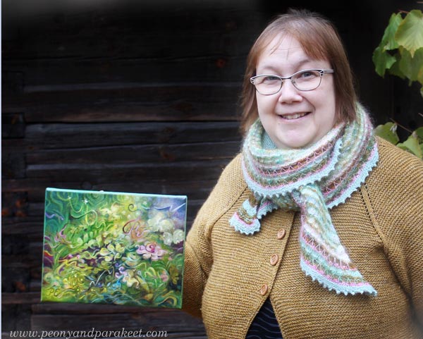
Painting Roses and Their Spirit
This week, we get inspiration from roses – their spirit, resilience, and decorative beauty.
With this post, I want to encourage you to expand the use of decorative art. You can add decorative elements to any art style! See another example in the older blog post: From Decorative to Expressive Art
The Spirit of the Rose Stays Alive in The Fall
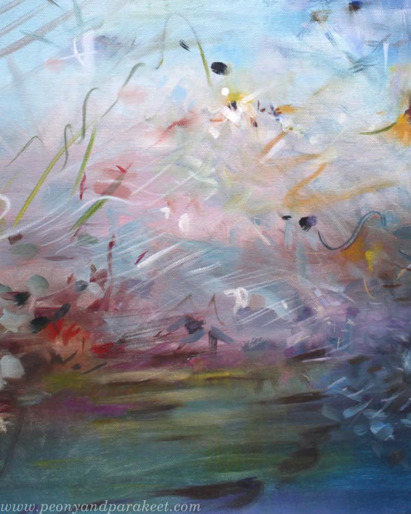
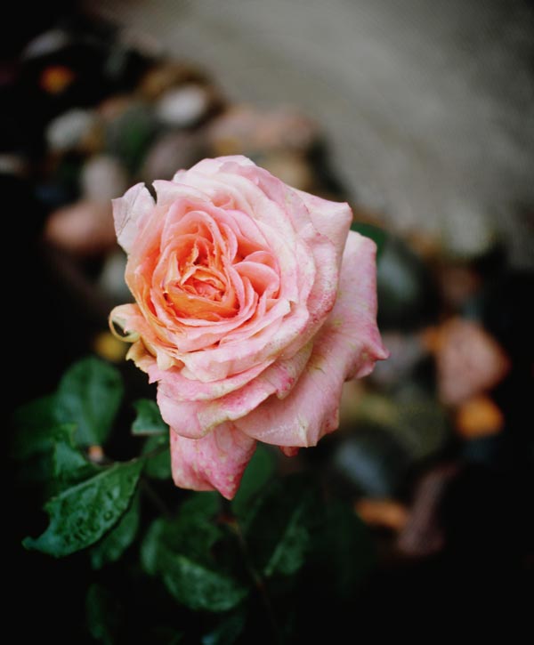
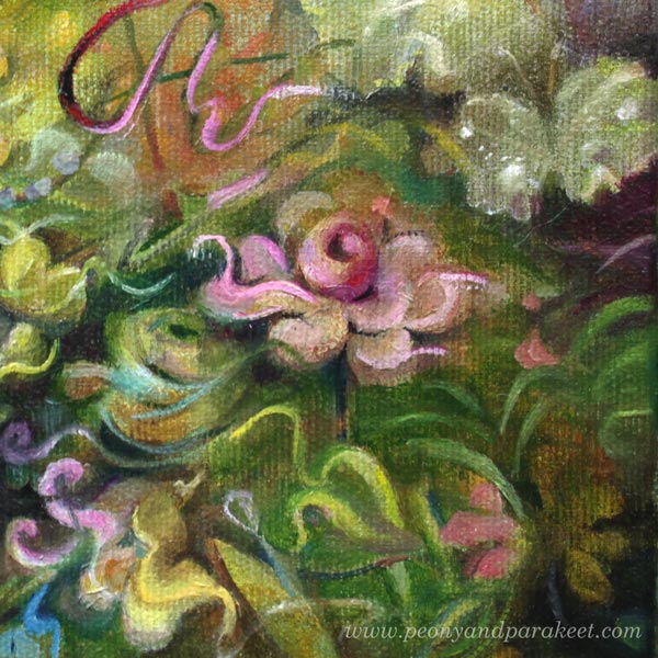
Roses surprise me every fall. When other flowers have given up weeks ago, roses still make buds and continue to bloom. Not as galore as in summer, but they try their best on cold nights and cloudy days. The spirit of the rose is born from warmth and light, but once it’s up, it doesn’t quench easily.
In our garden, roses are more my husband’s thing – I collect peonies! But in the fall, I have to admit how superior roses are, queens of the garden, one could say. When the colorful leaves take over the scenery, even the most modest rose flowers stand out simply because they are different in colors and shapes.
It reminds me of how resilience and beauty are connected. So mere persistence in creating makes your art beautiful.
Expressing with Small and Decorative
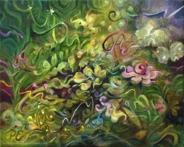
This painting is a small one, only 20 x 25 cm (approximately 8 x 10 inches). When I was a beginner in painting, the small size felt easier. But nowadays, I prefer big canvases, and if I want to create something small, I usually grab my colored pencils, not brushes. But on the other hand, I like the challenge that the small size gives.
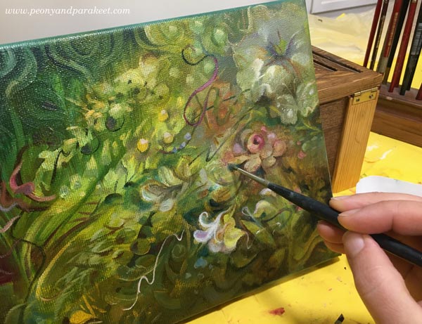
When painting roses in a small size, I need to have an extra focus on the quality of brushwork. Even the tiniest strokes should be elegant, especially if the painting is called ”The Spirit of the Rose.”
Decorative paintings often look very static, but I like to add movement with lines. At best, my small paintings are like short classical musical pieces with a clear melody, lots of short violin strokes, and clever piano tunes in major. It often helps me if I define the desired outcome by other art forms like music or movies.
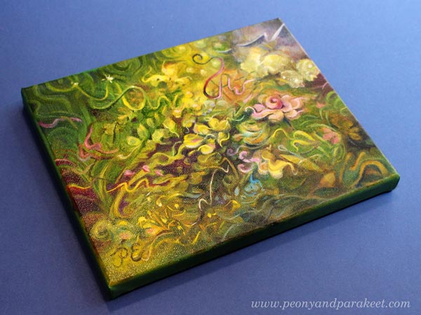
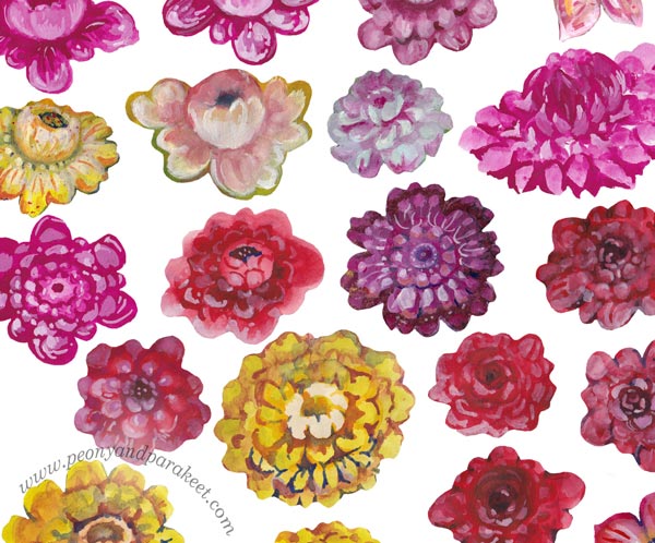
But decorative art has its limitations. The spirit of a rose is not visible if you only paint one kind of rose and if all that you paint is roses. Add flower variations, how the flowers affect their surroundings, and how the surroundings gather around the flowers. Add elements that resemble the living spirit, and let colors interact too so that the roses are not separate but part of the living scenery. So, painting roses is never just about roses, it also expresses how you see the world.
Painting Roses – Decorative Flowers of Decodashery
Even if single floral motifs are often not so expressive, I am fascinated by the techniques of decorative art, especially folk art. A couple of years ago, I noticed that I need practice with the brushstrokes. I wanted to learn to paint in a decorative style and then combine that with a looser and more abstract approach that I already had in my style toolbox. I think that style should not be a matter of narrowing down but expanding, and I felt that more experience in decorative painting was something that I could benefit from. So I made a course called Decodashery and painted flowers after flowers to improve my strokes.
You see, preparing for the course requires deep understanding. A teacher isn’t only someone who masters the technique but one who can also break it into pieces and explain it. And by doing that, the skill becomes more stable and versatile. So, you can create quicker when knowing how things are constructed, and it’s easier to adapt the technique to your own liking. In the classes, whether you are a student or a teacher, the resilience grows, and the spirit of the rose becomes stronger: ”There’s still time to bloom, and I will do it!”
Drawing Roses and Flower Girls – New Course Is in the Making
This fall, I have not only been painting a new series but also developing a new course.
Its working title is ”Doll World,” and it’s about drawing human figures. I think it’s a skill that enables us to do illustrations that captivate the viewer and something that we all would like to do for fun too. We will draw flowers as warmups and decorate the dresses with colored pencils. I plan to run the class next year and open the registration next month. So stay tuned!
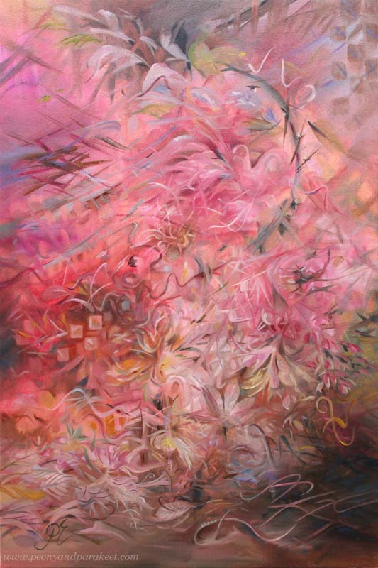
Bringing Old-World Feel to Abstract Floral Painting
This week, let’s dive into the old-world feel and get inspired by the opera singer Edita Gruberová!
Ideas Behind the Painting
I listened to the opera singer Edita Gruberová (1946-2021) while working on this painting. Her version of the famous aria Queen of the Night from the opera Magic Flute is exquisite. Gruberová’s voice is partly like a bird’s not a human’s voice at all, and the aria brings that up well. The music editor Outi Paananen calls her a nightingale of Slovakia.
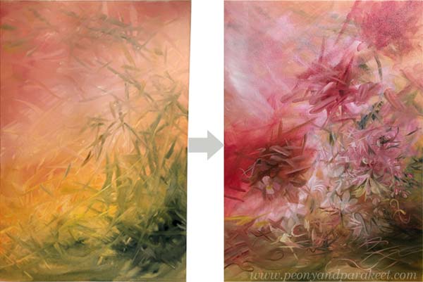
The transformation from a human to a bird felt inspiring. Maybe I could do a transformation of a painting so that my free and careless strokes would turn into decorative swirls, adding an old-world feel to an abstract floral painting. I had done something similar just recently but in a much smaller piece. See this blog post where I revamped a flower painting! From that experiment, I knew that it would take both time and patience. In a bigger piece, I could also get lost in the details so that the painting becomes confusing.
Before listening to Edita Gruberová, I already had a lot of ideas, collected in the blog post called Pink Inspiration. And now I wanted to add her and her birds to the painting too. I heard Edita’s story from Outi Paananen’s excellent radio program “Narrin aamulaulu” (in Finnish) on the Finnish Broadcasting Company. She had a clear artistic vision and strong willpower, and she demanded a lot of herself. It inspired me to challenge myself too.
Bringing Old-World Feel – 2 Tips!
In the past, painters often started with sketches and made detailed underpaintings with two or three colors. But a looser approach is not an enemy to the old-world feel.
When you want to bring an old-world feel to an abstract painting, two things are the most important:
- Blurry on the bottom! Start from the background with soft transitions from light to dark, add blurry shapes, and paint like you would see the scenery from a far distance.
- Sharp on the top! Add sharp shapes and lines on the top of blurry ones. You can sharpen some blurry shapes but do it only partly, leaving some parts more undefined. But most importantly, let sharp lines and shapes sing the melody of their own. If the background is the orchestra, the top layer is the singer that has a melody of her own.
The thickness of the lines can change in places and there can be decorative dots too.
Timelessness Takes Time
It’s always tempting to get the piece finished quickly, but to get the sense of timelessness, the time has to stop while painting. So, I focused on tiny details and immersed myself in building a wondrous world with curves and swirls.
My lines are like old-fashioned handwriting in places. I have practiced them by drawing for a few years. Any note or waste paper can be used for practicing! I often doodled on planner pages.
Intuition and the Ability to (Not to!) See
As usual, I didn’t use any direct reference photos for the painting but worked intuitively. However, I tried to reduce the human ability to see ordinary concrete objects like flowers, faces, or such in simple forms. For a long time, I have thought that the ability to see is a part of creativity. But the more I create, the less I need the ability, at least in the first place. Seeing too soon makes me hurry and my art much less unique. So I try to let the shapes fly free and the big picture appear without too much forcing and seeing.

During the process, a little bird-like mesh appeared on the right. When I was making the final touches, and intentionally made him a partner in the center.

Sadly, Edita died last year, just before I discovered her, so I can’t send her a photo. But I want to honor her with this blog post and ask you to listen to her singing on Youtube. Isn’t that inspiring!
A Series in Progress
I have been painting like mad this month because I have to get everything finished for my solo show in June very soon. So, there are lots of paintings in progress in the studio!
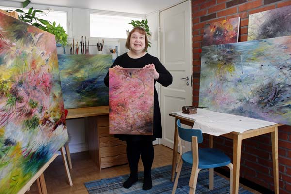
Easter was mostly spent with brushes, and if this wasn’t my ultimate passion, I would be quite exhausted already! Also, seeing the flow of wonderful creations from the students in my community Bloom and Fly energizes me a lot.
Let’s keep creating and inspiring each other!
Pop Music in Art Journal
This week – turn some pop music on and start art journaling!
Since I started working full-time as an artist in 2014, my taste for music has gone wider. Listening to different genres has enriched not only my life but also my art. Music has taken me to all kinds of visual worlds. Even one sound can bring color or a shape to mind.
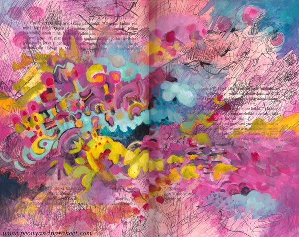
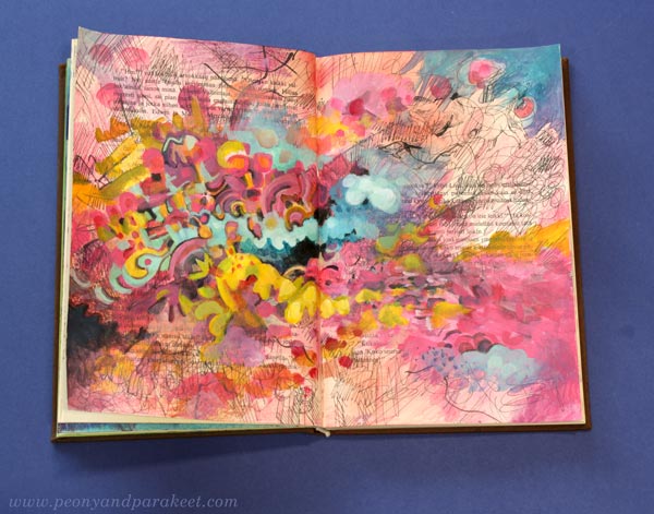
I have an old book as a music-inspired art journal. I like how the variety of music is shown on its pages. Now I wanted to make a spread inspired by Asian pop.
Sometimes Music is a Human, Other Times a Machine
Asian pop music is fun to listen and very easy-going – like an acquaintance who is always ready for a visit to a candy shop and to have a light conversation about current movies.
But when I paint big paintings, I prefer music that’s more like a vehicle – no melodies, only interesting sounds that make me go deeper and deeper in concentration.
Without a repeating chorus and clear rhythm, I don’t feel the need to express the music or paint at its speed. That’s how I have become a fan of contemporary classics that I used to find too boring.
Pop Music in Art Journal – Playtime with a Friend
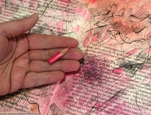
But this week, I wanted my friend back. I went to the Finnish radio website and turned on the newest of “Papananaaman K-Pop Show” which plays current Asian pop. My candy store was the box where I keep my red, pink, purple, and orange colored pencils.
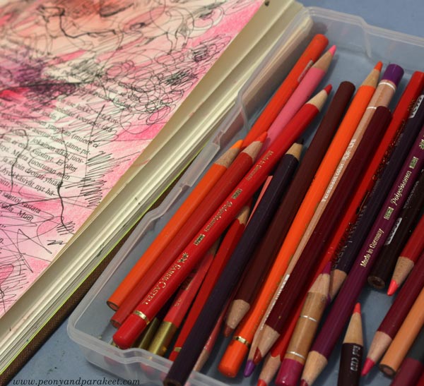
My music-inspired pages are in the “beautiful mess” style that I show step-by-step in an art journal mini-class called Music. It’s relaxing to create step by step and not worry too much about the “proper” supplies. I played with black pens, stamping inks, and the shortest pencils.
When I create canvas paintings, I use oil paints, but acrylics are great for this kind of messy play.
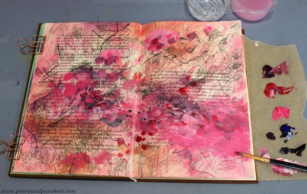
The spread started as red, but I then introduced a wider range of candy colors gradually. This mono-tone approach is great when you want to keep things simple first, and then splash the colors in.
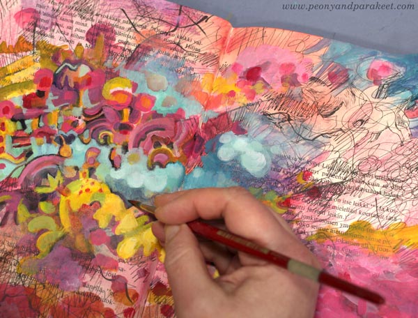
I like the candy colors and the informal look of the finished spread – pop music in an art journal!
I showed the spread to my Blythe dolls and they also gave their approval: “If that’s how you see Asian pop, we can live with that.”
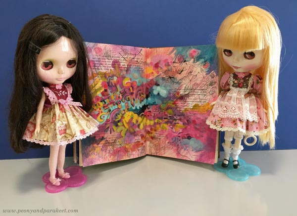
Maybe these dolls have made me listen to Asian pop in the first place! One thing so often leads to another.
Music in Art Journal – Step by Step!
The art journal mini-class Music is now available as an individual class. But you have to be quick – it will go away on Feb 7! >> Buy here!