
Vintage Style Flowers Step by Step
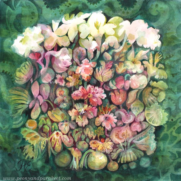
My latest watercolor painting has lots of vintage style flowers. I call it “Lemonietta,” and it’s inspired by home decor, afternoon tea, cream cakes, piano music, and of course, my favorite fruit – lemons!
Vintage Style Flowers in Three Colors
I have always liked old art and not just masterpieces, but decorative die cuts, vintage postcards, and all the more kitschy stuff too. So this post is dedicated to vintage style flowers, and I show how to make a cluster of vintage style flowers to your box of joy – any box that you fill with handpainted and hand-drawn collage pieces!
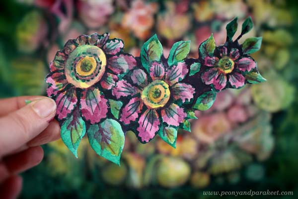
The tutorial is for watercolors, but you can use any paint for it. Just make sure to keep the color layers transparent. I use a piece of smooth watercolor paper, but almost any paper will do. And you only need three colors: yellow, pink, and green!
Step 1 – Three Yellow Circles
Start with yellow and paint three circles.
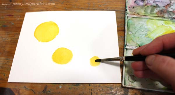
I painted the circles in three sizes: large, medium, and small. They form a curve rather than a straight line. This way, the composition will become more elegant than if you have similar sized flowers in a straight row.
Step 2 – Pink Petals
Add pink circles or ovals around the flowers.

Some petals can be smaller than others, so that the orientation of the flowers varies a bit. Compare my biggest flower to the medium-sized one!
Step 3 – Darken the Centers
Continue with pink, but use a little less water so that it’s darker. Make the centers and petals clearer by painting around the center and the top parts of the petals.
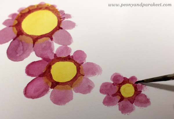
I use a thinner brush to get sharper points near the petals.
Then mix some more water to pink paint, and add small circles to the centers.
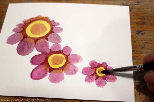
I use a bigger round brush for round shapes.
Step 4 – Green Leaves
Paint green ovals around the flowers.
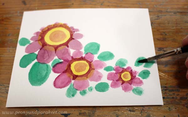
Again, my ovals have a variety of sizes so that the composition looks more lively.
Continue with green, but now use a thicker color. Make the leaves sharper and a bit more elegant. Only paint a part of a leaf with a darker green.

See how pointy my darker shapes are, and how they don’t cover the whole leaf!
Step 5 – More Details to Flowers
Start with thick green paint and a thin brush. First, add green triangles between the petals to make the flower look more three-dimensional.
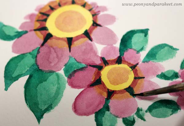
Second, paint around the petals so that they look more frilly.
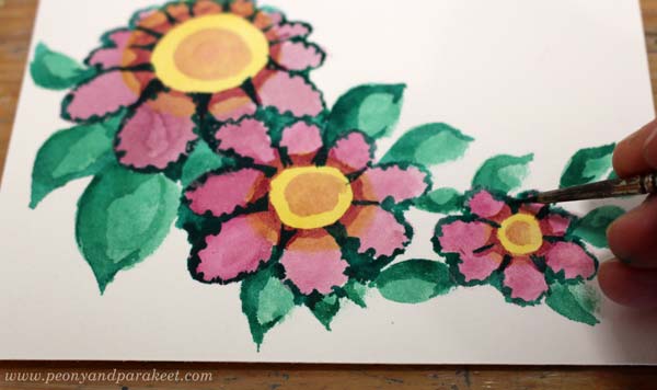
Then change to a bigger brush and add more water to make the paint transparent. Paint pale green spots on petals and on the centers.

With a thinner brush, add green lines to the petals and centers. Finally, change to pink, and paint centers and petals so that they are partly darker.

The nostalgic look comes from the contrast colors and the color variation.
Step 6 – More Details to Leaves
Add pink shadows to the leaves.
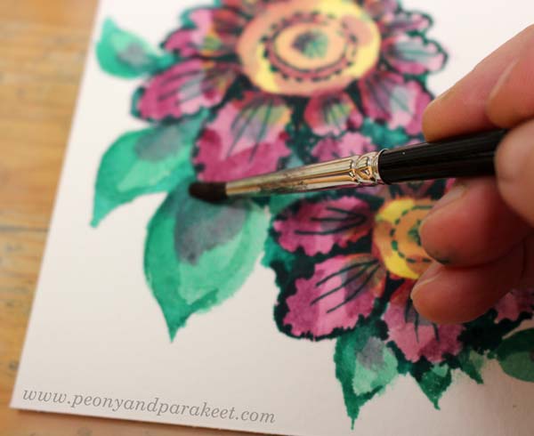
With thicker green and the smaller brush, paint think lines on the leaves.

Step 7 – Dark Background
Mix thick paint from green and pink, and paint the background areas between the flowers.

I also check all the edges around the cluster so that it’s easy to cut.
Step 8 – More Color Variation
To make the flowers glow, add more color variation. Use thin paint, and add yellow to the leaves. Only paint each leaf partly.
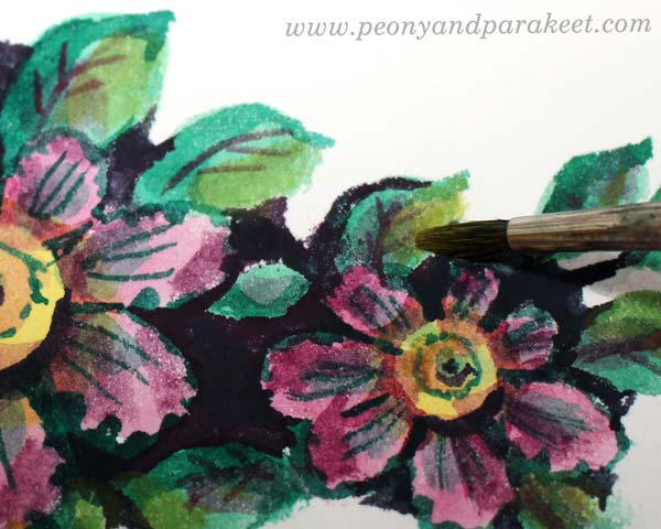
Similarly, add green to the centers.
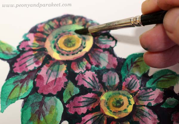
Here’s my finished cluster before cutting.

Step 9 – Cut It Out!
You can still change the shape of your cluster when cutting around it.

It’s so much fun to make and find backgrounds that come alive with these little flowers.
And of course, they bring more joy to the box of joy too!

Vintage Style Flowers – Starting More Intuitively
Painting small pieces is fun, but my bigger paintings are born more intuitively and they take a longer time.
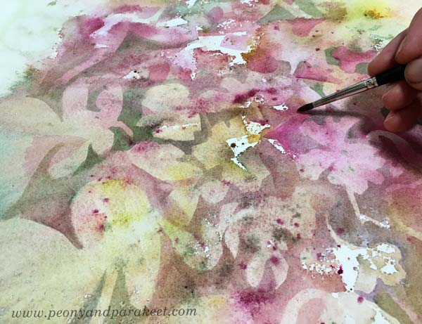
I love to dig out flowers of random blooms and spatters, and then move on to paint them more intentionally.
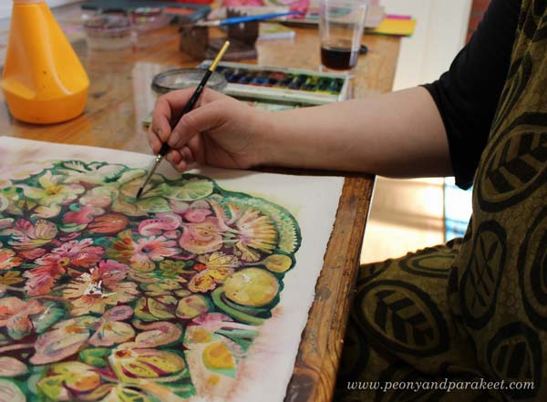
When the paper is full of details, it’s sometimes hard to decide which ones can take the central role and remain bright, and which ones get more background color so that they don’t stand out so much.
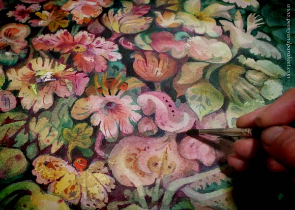
Here’s the finished piece again. It took about two days to complete.
Even the smallest single flowers are still part of the same world.
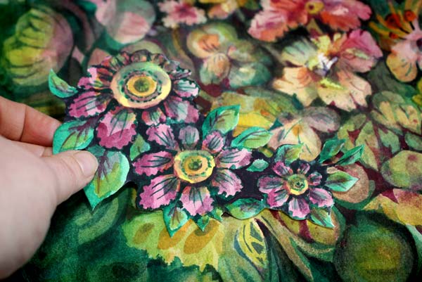
I hope this post inspired you to create, whether it’s a project of two hours or two days!
Inspiring projects for flower lovers: Buy my class Floral Fantasies!
Delicious Colors – Salvage Them!
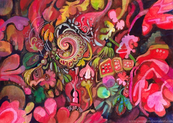
I have never been overly enthusiastic about bright reds, but now seems to be the time. I feel that in this black world, we need to salvage the delicious colors and amplify them with sugary decorations!
Finding Comfort from Delicious Colors
In the evenings, while waiting for the news around the world to be gathered, I paint in my little studio room. The more I think about the sad statistics, the more I want to create the opposite – a careless world with deliciously tasty and juicy colors.
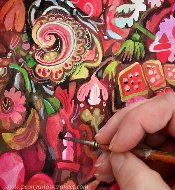
My studio is now like a sweet bakery, and as the main cook, I have lots of motivation to create!
Delicacies from DecoDashery!
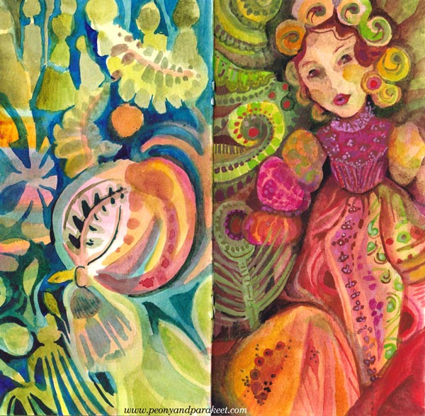
What first was just one little painting, has now grown to resemble a series that expresses an imaginary world. I call this world as DecoDashery, inspired by the old haberdashery from the movie Emma. DecoDashery will also be the next class that I am building, hoping to release it within a couple of months!
You Can Always Start Small!
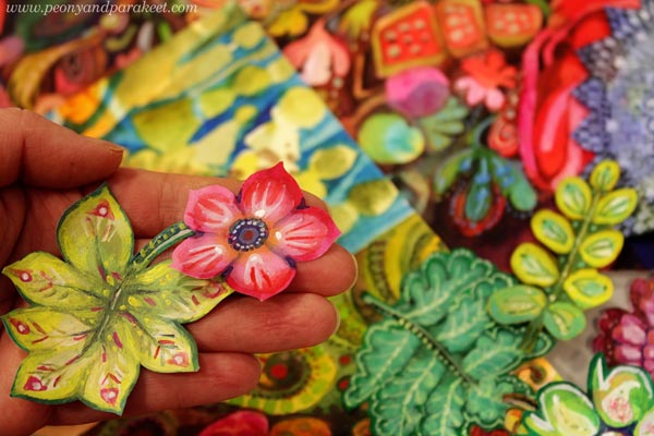
As usual, I haven’t made paintings only, but also collage pieces to my boxes of joy.
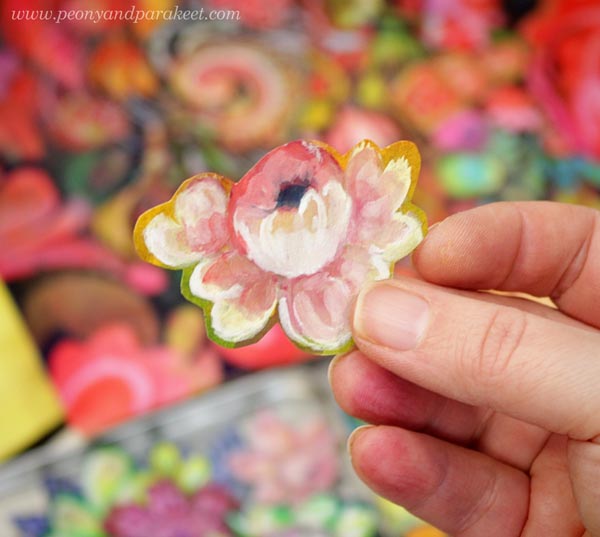
Delicious Meringues, Lace, and Porcelain
Now when my husband is working from home too, we eat together more than ever. Fortunately, he can cook! I have never been into that so much. But my specialties are side dishes and desserts, and it’s been fun to make one good meal in a day and combine our skills.
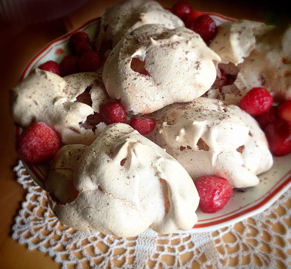
I had never made strawberry meringues, but a recipe from a knitting magazine caught my eye. Strawberries, an old plate, and a hand-crocheted lace doily were all as essential as the meringues themselves.
My current oil painting has progressed well too. Even if there’s a lot of work left, I get a lot of pleasure from working on it. Salvaging all the deliciousness of the random shapes feels so good.
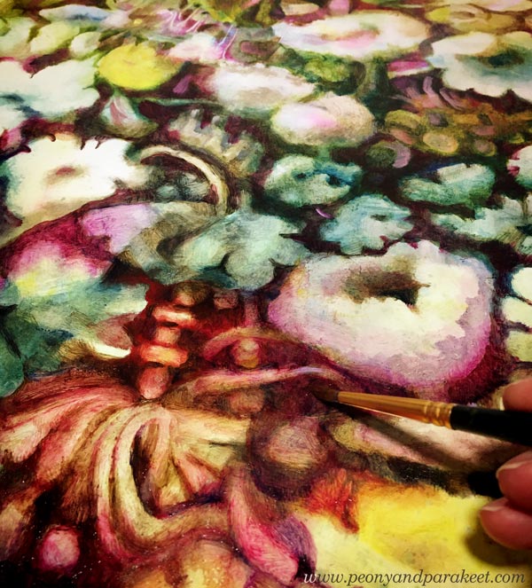
Doesn’t the painting look strangely similar to the meringues, lace, and porcelain? The world of Decodashery is expanding!
Meaningless Has Given Me a New Meaning
It’s kind of funny that when I decided to remove deeper meaning from my work for a while, I feel that my art the overall creative process has become more meaningful than ever.
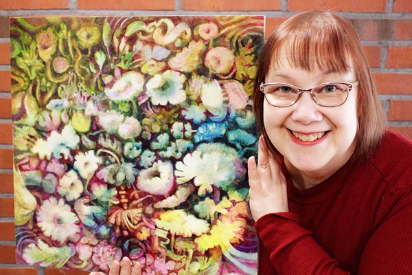
It’s like I have released the beast that I have always quietly carried with me, and once I have seen it eye to eye, it has become my angel in the crisis.
Art Inspiration from Sanditon
This blog post is for us who love Jane Austen and Sanditon tv series. I watched the series last month, and it has inspired me a lot. I hope you enjoy this Sanditon inspiration overload!
Torchbearer – Esther and Lord Babington on the Beach
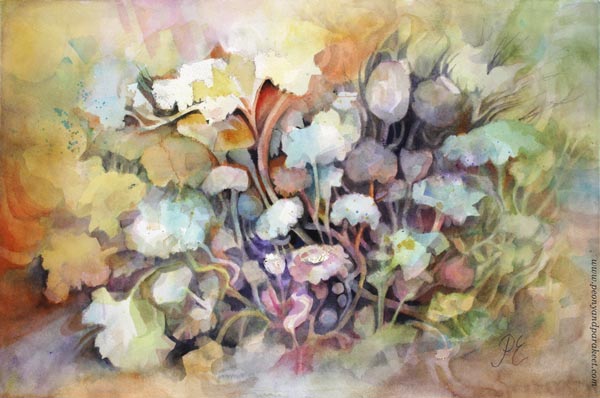
My newest watercolor painting called Torchbearer had a modest beginning and I had no clue how to finish it – until I saw episode 8 of Sanditon!
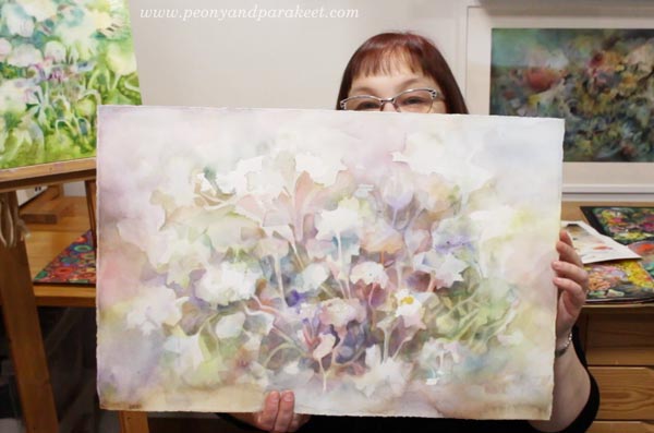
My favorite female character of Sanditon is Esther and the scene where she is in the carriage with Lord Babington was so romantic! The sudden change in her appearance, his gentle smile, black horses, empty shore – oh my! It hit me, that even if my painting has flowers, not people, I could express the emotion from the scene.
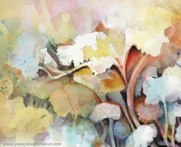
The tallest flower and the glow come from Esther’s powerful spirit.
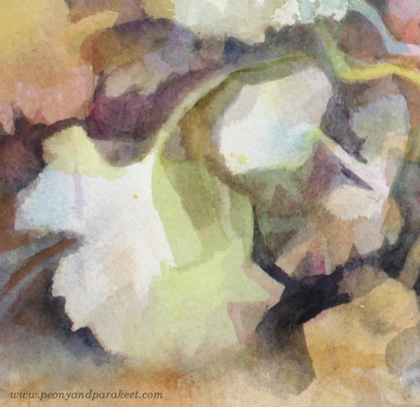
The flower that bends down, expresses her sensitivity.
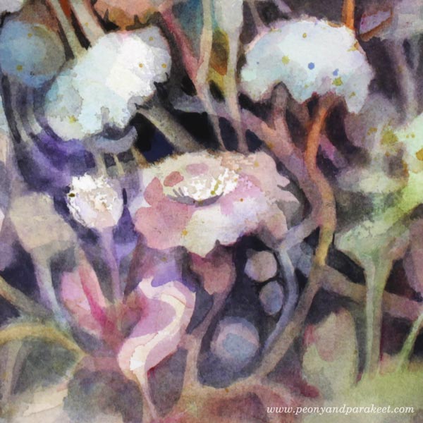
I tried to paint every flower so that they highlight the bubbling energy. Their stems are like the carriage where the couple sat.
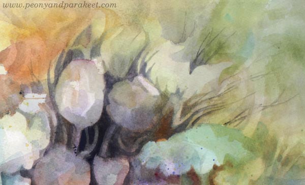
The black background represents both the horses and the lord, supporting Esther’s joy.
In this painting, Esther is a torchbearer who leads us to better times.
Tin Box – A Souvenir from Sanditon
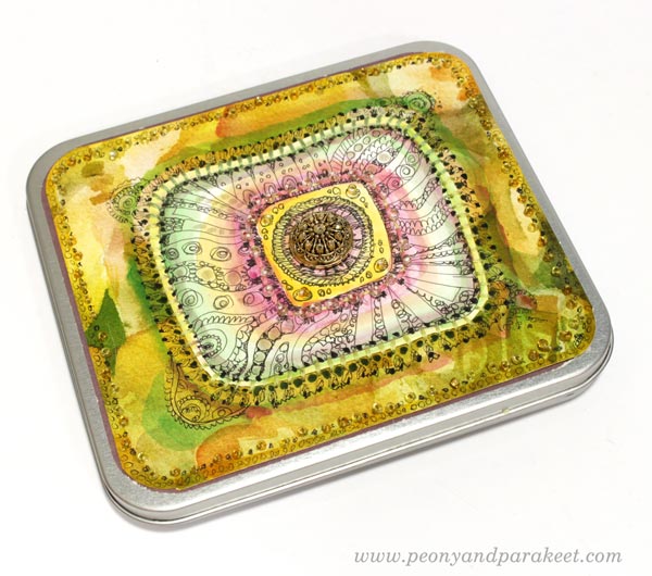
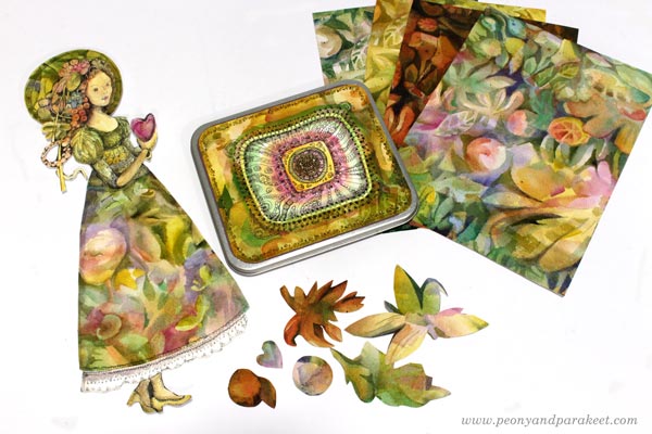
I like little boxes that can be used for storing hand-drawn pictures and papers. I wanted to decorate a small tin box so that it would have old-fashioned and luxurious feel. So that I could think of it as a souvenir from Sanditon!
I already had saved a hand-drawn piece that was quite perfect in size.
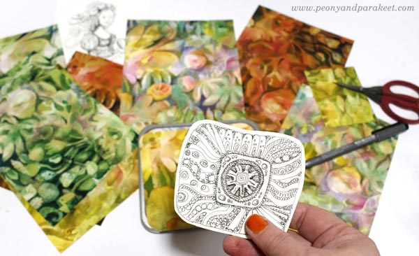
I also found some papers with a watercolor print. They were test runs of the surface pattern designed earlier this year. I mostly designed the pattern manually, so by painting a design on the center of the paper and then cutting the paper into four parts.
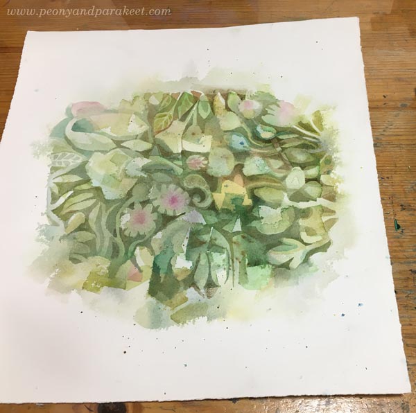
This way you get a continuous design.

Avoid painting edges, and re-arrange papers until they are all fully painted.
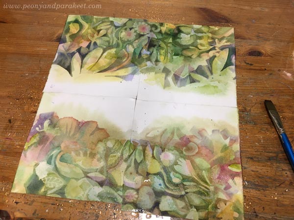
Then scan the papers, and clean the edges in an image processing software. Here’s a sample of my design.
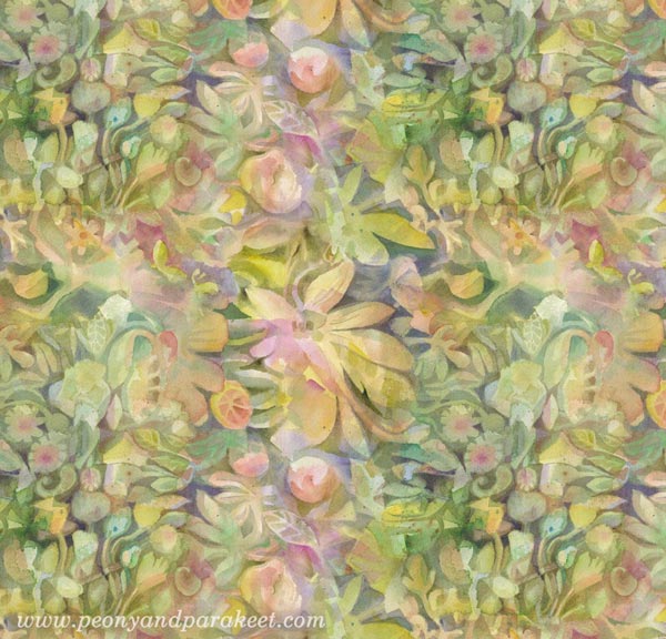
I made several variations in Photoshop. These papers go really well with hand-drawings, so they were perfect for the box.

The center motif was first colored with watercolors.
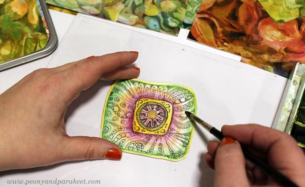
Then I hand-stitched it on a background paper and added more hand-stitching around the center. In the photo below, I highlight the surroundings of the stitches with a pen so that they look more 3-dimensional.
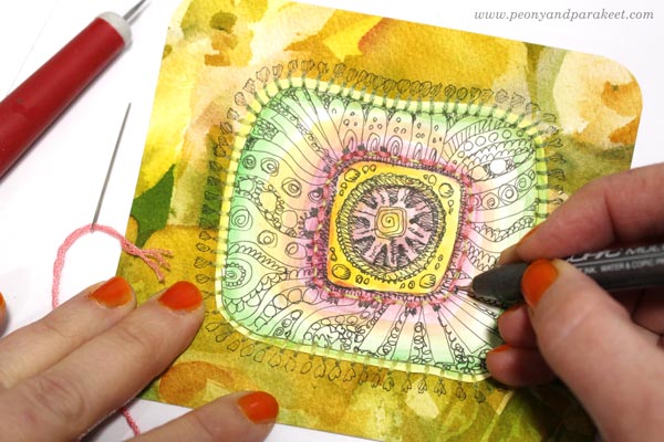
I also added beads, more colors and decorative marks.
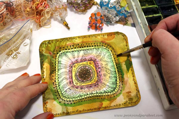
The centerpiece is a button with a shank removed. I love this little box!
Esther Denham – Sanditon Paper Doll
I also wanted to create something for my ever-growing collection of collage figures. “Just an unknown habitat of Sanditon”, I decided first. I didn’t use any reference and drew the doll just freely, but when she was colored, she looked just like Esther!
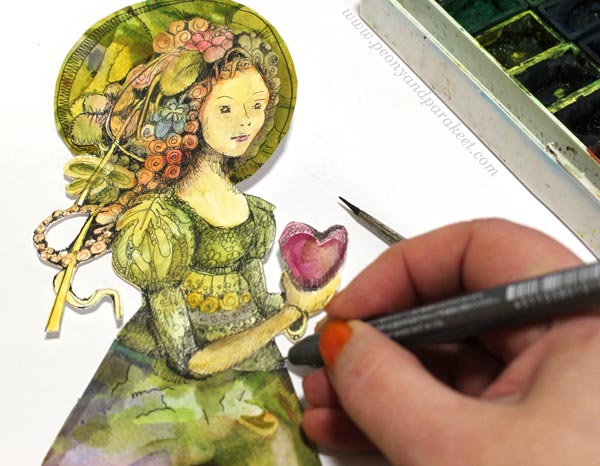
I played with her proportions so that she has overly long legs. That way I could make the dress more imaginative. The hem was cut from one of the watercolor papers. I couldn’t help playing with her right away, trying wings on her, filling the teacup with herbs from Sanditon. The wings and the teacup are from my fun class Magical Inkdom.
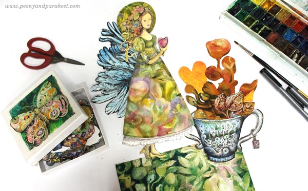
Her hat is also a collage piece cut from watercolor papers.
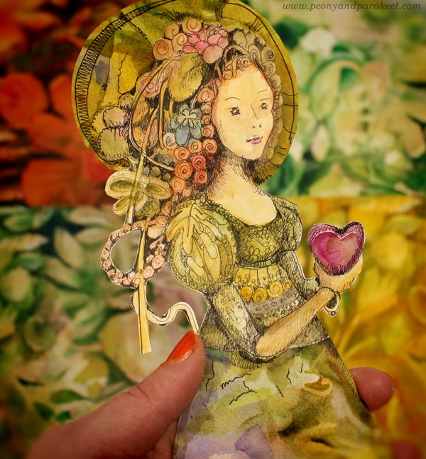
Souvenirs from Sanditon!
The Romance Continues
I am currently painting an oil painting that looks quite romantic already.
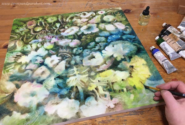
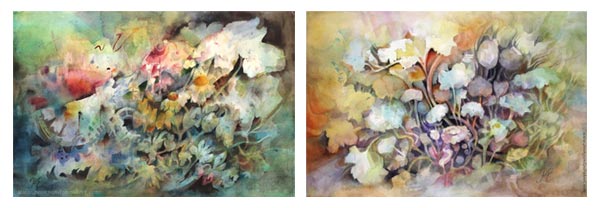
My vision is to make it the third in the series after Icebreaker and Torchbearer – and put it in the middle of them.
One Source of Inspiration – Many Interpretations
If you have been following my blog, you know that some of my projects are fine art, others more illustrational, and there can be a bit crafty things too. This blog post demonstrates well how the inspiration can be the same, but the interpretation is different. For me, the wide range of projects is a way to stay inspired and creative, and I hope that you have tolerance for all of them. I don’t believe in getting too serious or not getting serious at all. The humorous side of art allows us to get playful, and the playfulness feeds our ability to express the deeper side of our inspiration.
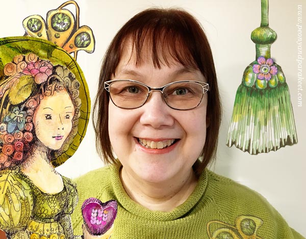
Esther can be the person who handed me a crafty gift box, or an innocent paper doll, or a mysterious flower in a painting that took tens of hours to create. The key to your artistic style is less in the looks and more in the inspiration. For me, it’s often old-fashioned romances, like Sanditon.
Welcome to my online classes!
– Paint watercolor fantasies – Sign up for Magical Forest!
– Draw the magic – Buy Magical Inkdom!
Painted Paper Collage – 6 Tips for Intricate and Fun Art
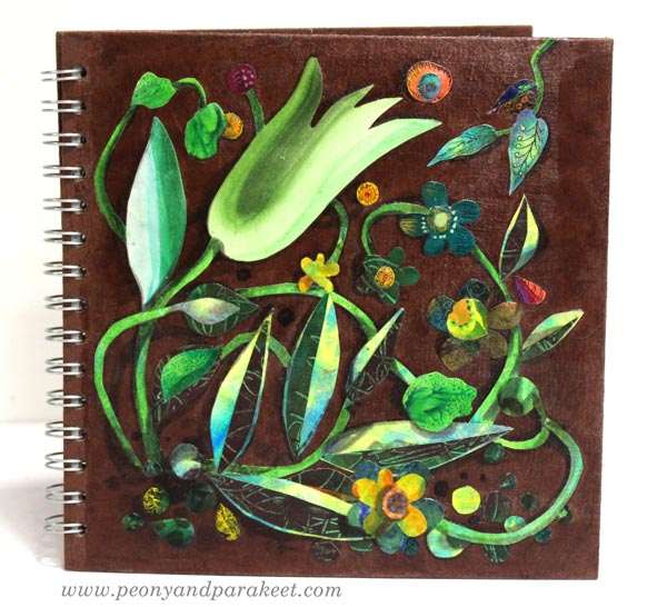
Here’s an 8-by-8-inch sketchbook that I decorated with painted paper collage. Even if all my art is not collage art, I love it. Painted collage art often replaces traditional sketching so that I paint and cut papers to grow the ideas that don’t feel mature enough for bigger work.
In this blog post, I share some tips that are handy for this kind of creative play.
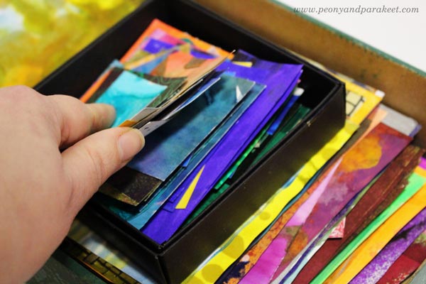
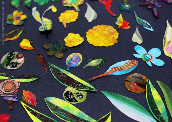
Tip #1 – Organize Painted Papers by Size
I have a box for small paper pieces and another for bigger ones. I keep the papers rectangular in shape so that they are easy to browse.
Tip #2 – Add a Lined Adhesive to the Tiniest Pieces
I like to make intricate collage art so I have tiny collage pieces. Small hand-cut pieces are difficult to handle and get lost easily. Thermoweb has clear adhesive dots called Zots (affiliate), that come with two liners, and they are perfect for both storing and attaching small paper pieces.
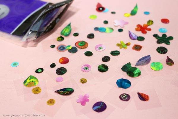
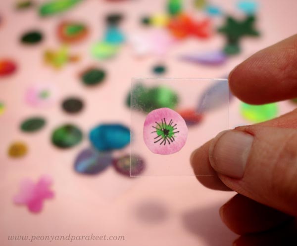
Zots are very flat compared to many glue dots, and they have two liners. Just remove the first one, attach the piece, and then remove the second liner when gluing the piece on a collage! Here you can see a close-up picture. This is the smallest size of Zots.
Tip #3 – Make Clusters
Attach small pieces on the bigger elements and treat each piece as a small artwork!
I also like to decorate clusters by painting and drawing.
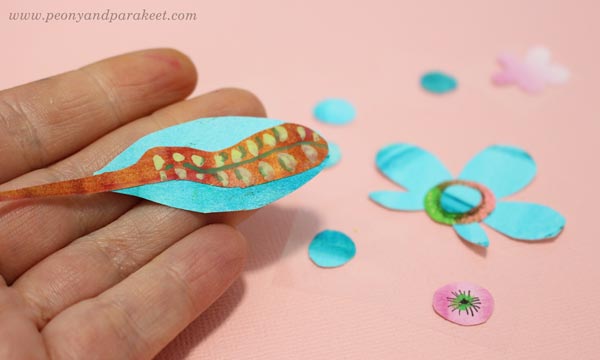
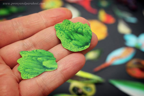
However, I sometimes have elements that are so beautiful that they don’t need anything on them.
Tip #4 – Group and Layer!
When composing the painted paper collage, use connecting lines and intersecting shapes. They make a more elegant and coherent composition than if the elements don’t touch each other.
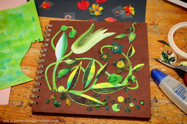
Tip #5 – Add Shadows
For the sketchbook cover, I used grey Faber-Castell PITT Artist Brush Pens (affiliate) to color shadows on both the elements and the background.
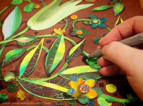
Shadows add depth and make the elements look less separate from the background.
Tip #6 – Sealing
I like to attach the collage elements first with glue dots, double-sided tape, or some paper glue and then use gel medium for sealing. This way, my fingers stay fairly clean when I am building the composition. At that stage, I attach the elements only partly, and they get glued when I am sealing the work.
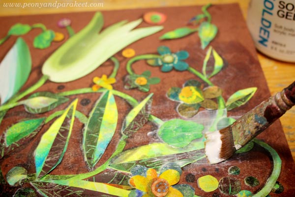
For sealing, I use several layers of gel medium (Golden Soft Gel Gloss (affiliate) is my favorite), especially for the items that will be touched regularly.
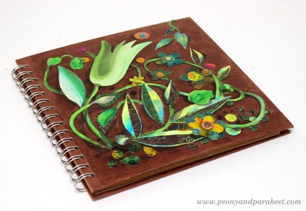
Painted Paper Collage – More Ideas
- For those who want to start by making some papers:
Choose Kiwi, Arboretum or Romantic Doodles - For those who like to play:
Dolls in a Gallery – Paper Collage Step by Step! - For those who need to dig deeper as artists:
Draw Your Innocent Little Secrets! - Class recommendations:
Collageland
Inspirational Drawing
Modern Mid-Century
I hope you found these tips both practical and inspirational!