Art Makeover – Revamp Your Old Paintings!
Let’s give an art makeover for an old painting! The idea for this blog post came last month when I was running out of paper. Instead of traveling to an art supply store, I stayed home as was advised, and found another solution: reusing old paintings!
My starting point was practical, but the benefits were spiritual – the journey that had ended, started again. I picked pieces that were made about 30 years ago – when I was in my 20s. At that time, I studied software engineering but still felt partly an artist.
Makeover Tip #1 – Change the Subject
The paintings from the 1990s look very different from my current work, but after examining old paint strokes, I did recognize myself. Although the strokes were rougher and the shapes simpler, they were still very much the same. The subject has changed, but my love for playing with shapes never went away.
Makeover Tip #2 – Save Something Old
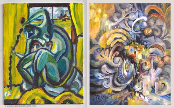
When revamping the painting, I like to save something from the original one. So here, I kept a part of the yellow curtain but altered its color with a thin layer of paint so that it fits with the new color scheme. Old curtain, new home.
Makeover Tip #3 – Change the Colors
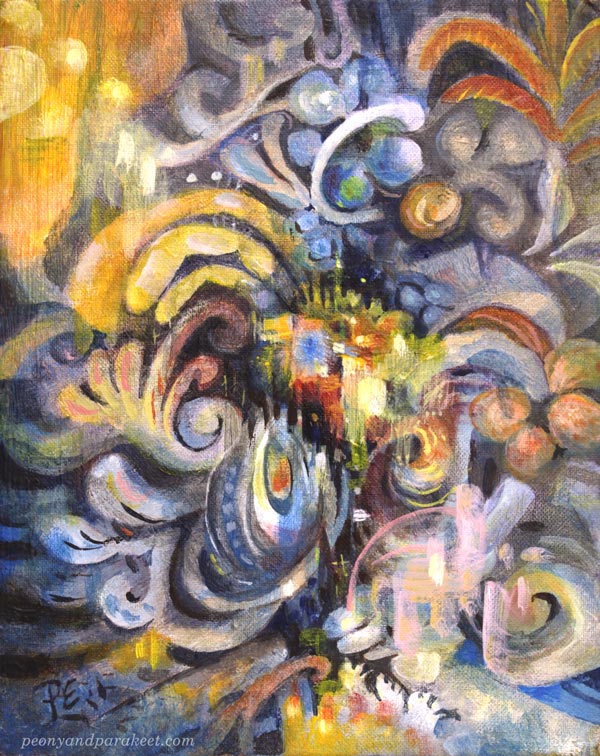
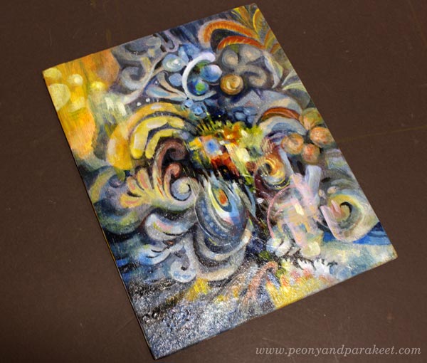
The old painting has screaming colors, but I wanted something more sophisticated for the revamped version, called “Ceruleana.” As the name suggests, the new painting is a tribute to Cerulean Blue.
Cerulean Blue is an expensive but lovely color, especially when mixed with white. It makes every engineer a romantic and looks heavenly with ochre and yellow tones.
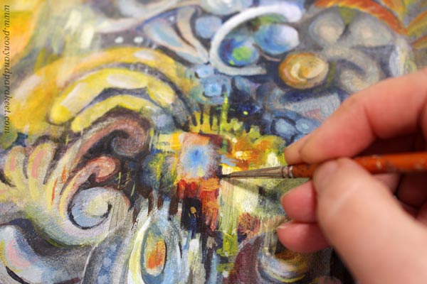
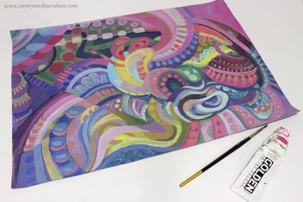
But this post is not only about blues and its hues, I have another example too! This one has a lot of Magenta (“Medium Magenta” of Golden Acrylics), and the colors are very different from the original muddy version.
Art Makeover Tip #4 – Change the Orientation
The original was an artistic self-portrait like the first one. I did those a lot back then, and in every picture, I tried to look a bit different. But my imagination never got this far! The revamped version is horizontal but here they are side by side so that you can compare.
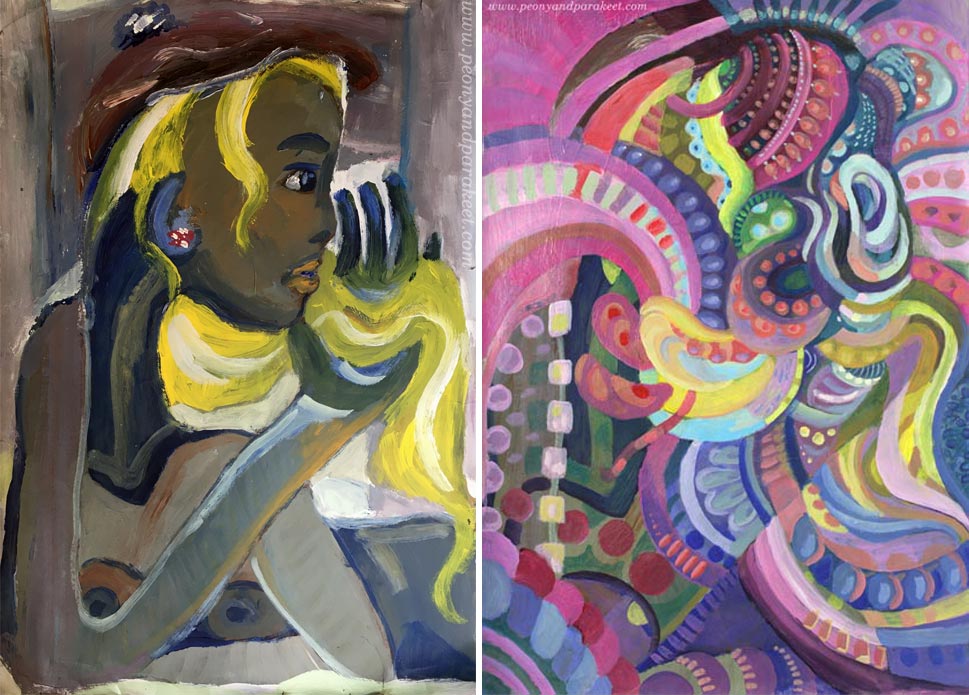
I like how the original version is still present in the new one!
Makeover Tip #5 – Use the Old Painting as a Foundation
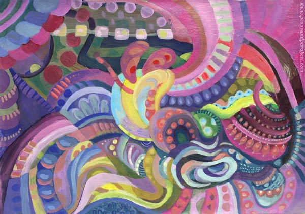
This magenta abstract was so much fun to make. The old painting was like a map that had roads and towns, and when trusting them to lead me to one place to another, I didn’t have to worry about composition or such. I picked the easy abstract painting style from my class Planet Color. The whole process was relaxing, and the painting is called “Cosytopia.” A place to escape the big bad world.
Extreme Art Makeover – Polish and Varnish!
Like in any makeover, why not do it to the very end! Take care that the brushstrokes are smooth where they need to be, and shapes stylish enough for a party.
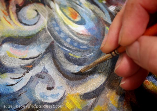
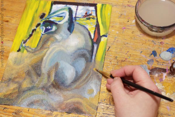
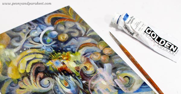
If the painting has a sturdy background, varnish it too! Ceruleana was painted on a cardboard canvas, so I used a polymer varnish on it. Before the varnish, I added a layer of glossy gel medium. (A detailed post about varnishing)
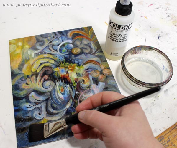
Glossy varnish makes colors glow beautifully. Even if this is an old revamped acrylic painting on cardboard, it may happen that someone someday says: “Oo-oh, it’s an oil painting, isn’t it?”
I hope this post inspired you to make the most of your supplies and past artistic endeavors!
Planet Color – Weekend Sale!
My beginner painting class Planet Color is for sale between May 28th to 31st! The normal price is 35 EUR, now only 25 EUR. >> Buy here!
Delicious Colors – Salvage Them!
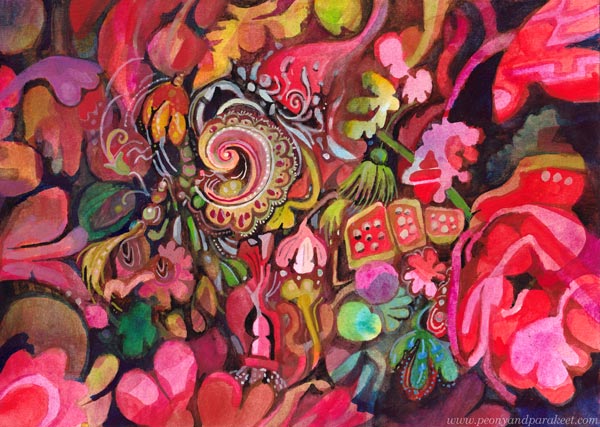
I have never been overly enthusiastic about bright reds, but now seems to be the time. I feel that in this black world, we need to salvage the delicious colors and amplify them with sugary decorations!
Finding Comfort from Delicious Colors
In the evenings, while waiting for the news around the world to be gathered, I paint in my little studio room. The more I think about the sad statistics, the more I want to create the opposite – a careless world with deliciously tasty and juicy colors.
My studio is now like a sweet bakery, and as the main cook, I have lots of motivation to create!
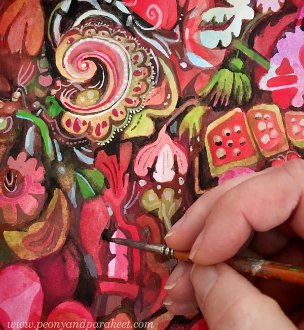
Delicacies from DecoDashery!
What first was just one little painting, has now grown to resemble a series that expresses an imaginary world. I call this world as DecoDashery, inspired by the old haberdashery from the movie Emma. DecoDashery will also be the next class that I am building, hoping to release it within a couple of months!
You Can Always Start Small!
As usual, I haven’t made paintings only, but also collage pieces to my boxes of joy.
Delicious Meringues, Lace, and Porcelain
Now when my husband is working from home too, we eat together more than ever. Fortunately, he can cook! I have never been into that so much. But my specialties are side dishes and desserts, and it’s been fun to make one good meal in a day and combine our skills.
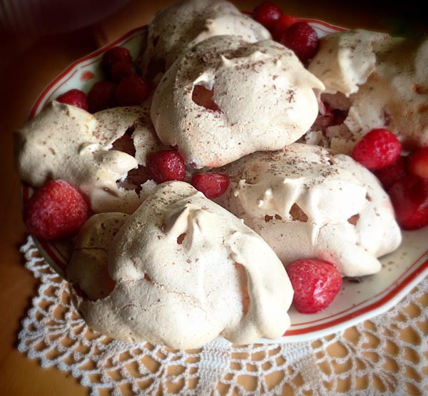
I had never made strawberry meringues, but a recipe from a knitting magazine caught my eye. Strawberries, an old plate, and a hand-crocheted lace doily were all as essential as the meringues themselves.
My current oil painting has progressed well too. Even if there’s a lot of work left, I get a lot of pleasure from working on it. Salvaging all the deliciousness of the random shapes feels so good.
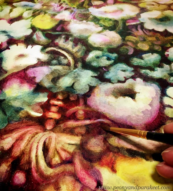
Doesn’t the painting look strangely similar to the meringues, lace, and porcelain? The world of Decodashery is expanding!
Meaningless Has Given Me a New Meaning
It’s kind of funny that when I decided to remove deeper meaning from my work for a while, I feel that my art the overall creative process has become more meaningful than ever.
It’s like I have released the beast that I have always quietly carried with me, and once I have seen it eye to eye, it has become my angel in the crisis.
Paint Spiritual Energy – Step by Step!
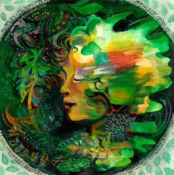
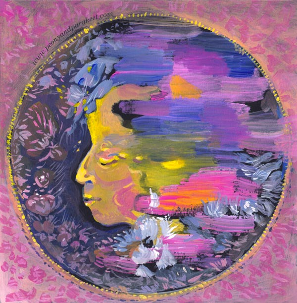
When there is a big crisis in the outer world, it’s important to protect and strengthen the inner world. In this project, we paint spiritual energy with loose strokes, continue it to form a face, and then add a protecting frame around the painting. I find this project soothing and healing. I hope it makes you pick the brushes again too!
A) Where to Paint?
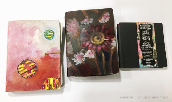
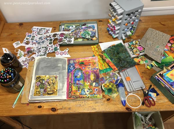
I have made these paintings on my newest art journal which is a black Dylusions Creative Journal. It is my third Dylusions Creative Journal, and I really like this product. It’s durable, the paper is thick, and it can be closed with an elastic band.
My first two Dylusions Creative Journals were large ones, but the newest one is a bit smaller, the page size being 8 by 8 inches.
The links above are Amazon.com affiliate links to product pages.
Watch the flip-through videos of the first two art journals! See these journals in practice and to get more inspiration:
Journal 1 Flip-Through
Journal 2 Flip-Through
B) Collage or Painting?
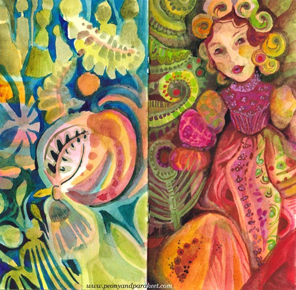
This project can be made as a painting or as a collage where you paint the figure separately from the rest of the image.
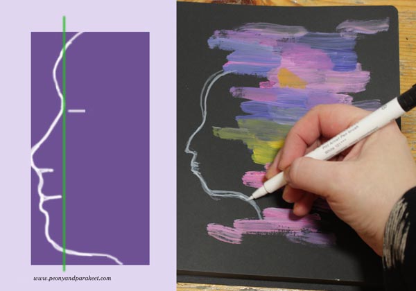
When I did this project the first time, I made a collage. I painted the profile on a paper, cut it out, and glued on the art journal page, and then continued painting the background and adjusting the facial features. In the photo below, the white line shows how I cut the face.
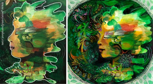
If you choose the collage technique, it’s good if the paper is not too thick. I used Bristol paper, which is fairly sturdy but thinner and easier to attach than thick watercolor papers.
C) Pick the Colors that Bring Energy!
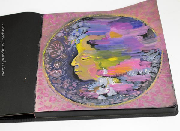
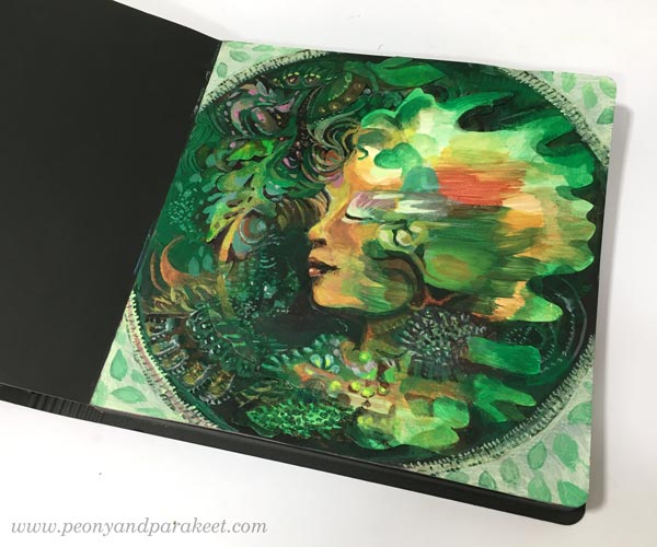
I painted the second version directly on an art journal page.
Both versions have a limited color palette. By picking only a few colors, they come alive and express energy more effectively than if you work with all the possible colors. So, choose the colors that energize you – that you feel drawn to at the moment.
I recommend choosing three different tubes of acrylic paint and adding white to the mix as well. If none of your colors is dark, pick black or another dark color so that you get a strong image with good contrasts.
For the first version, my colors were these (+ Titanium White):
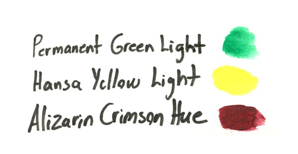
For the second version, my colors were these (+ some Mars Black for finishing)
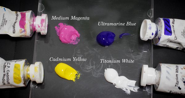
My acrylic paints are Golden Headybody Acrylics.
D) Paint Spiritual Energy!
Let’s create some abstract art! Use selected colors and paint with horizontal strokes. Mix white to get lighter strokes and make muddy mixes to get tones that make the pastels shine. Enjoy the colors and making most of the narrow selection.
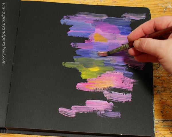
If you paint directly on a page, mentally divide the page in half, and paint on the other side only. This way, you will have enough room for the face.
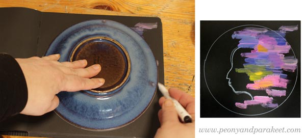
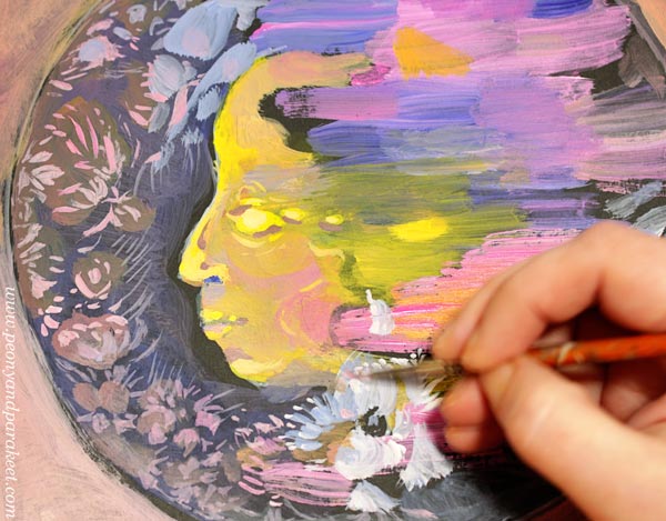
E) Sketch the Face!
Pick a pencil and sketch a profile. You can adjust it later by painting, so focus on the location of the face more than the actual look. I used a white pen in the photo below so that you can see my sketch clearly.
F) Draw a Frame!
Take a round object, for example, a plate, and draw a protective frame around the person.
G) Paint the Face!
Paint the skin and facial features. Instead of outlines, paint shapes. Allow yourself to be more unconventional. Don’t paint bright white scleras or red lips but shapes that connect the person with the abstract part of the painting. In this project, the energy that the strokes represent is more important than the person herself.
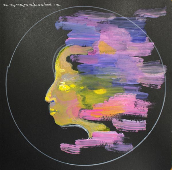
H) Paint the Background!
Surround the person with everything that soothes and heals. At this point, it can be just subtle strokes that will be more defined later, when you finish the painting.
Paint the frame too. Use muted colors so that the frame doesn’t take the energy away from the person.
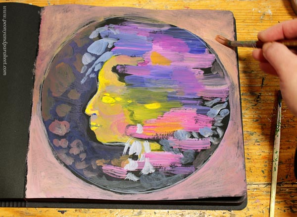
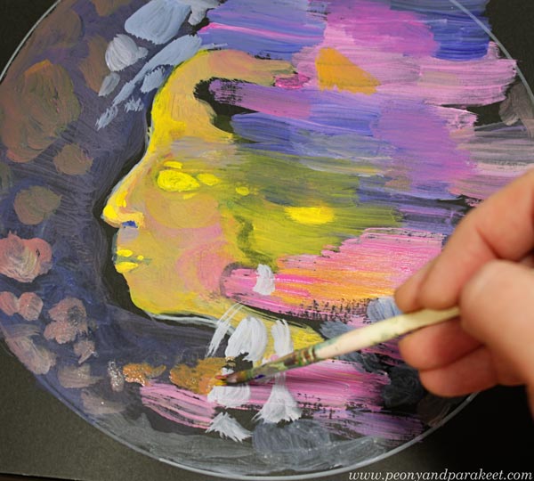
I) Finishing: Give Her All the Beauty She Needs
Paint details with a thin brush so that she will get all the softness and beauty she needs. Again, prevent using intense colors for the details on the background.
Connect her forehead with the beauty so that she is in the middle of the energetic strokes and more delicate and soft fillings.
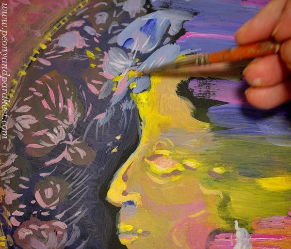
I also added some decorations on the frame.
Less Control – More Energy and Expression
Art is freedom! In this project, we started with wild strokes and then built a portrait around them. These kinds of less-controlled uses of supplies are an important part of self-expression.
On Thursday, March 26, 2020, I will be talking about doodling and how to expand it to various supplies and styles in my art community Bloom and Fly. The session will be recorded too. If you have bought my class this year, you are invited! I have sent an email to the members yesterday.
How to join Bloom and Fly for 2020?
>> Buy any of my classes!
Hand-Drawn Collage Samplers
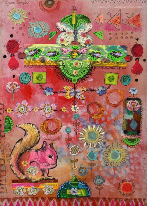
I have been browsing my art archives lately, and it has been surprisingly inspiring. I have lots of art journals and a big box of paintings and drawings from my teenage years. Even if I have experimented with many techniques and themes, it all looks very similar now. Everything fits together and gets my approval. Painting “Icebreaker” gave me a new kind of confidence, and with that confidence, I am now blogging about a playful idea that I got from cross-stitching – hand-drawn collage samplers!
These samplers are composed of hand-drawn paper pieces so that they look like cross-stitch samplers. They have ribbons, many identical ornaments, tiny floating elements, and some symmetry. There’s also stiffness and order so that it looks like the elements are on a grid.
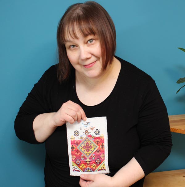
Cross-stitching is one of my hobbies, and even if I try not to think about art when stitching, I just couldn’t resist this idea! Here’s how I applied cross-stitching to collage art.
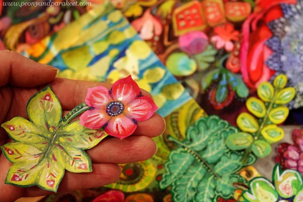
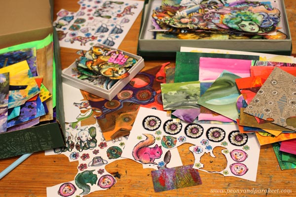
Print Tiny Scans of Hand-Drawn Collage Pieces!
It’s essential to have tiny decorations to make the collage look ornamental. I solved the problem by making collage sheets of scanned hand-drawn pieces. These collage elements were drawn for the classes Animal Inkdom and Magical Inkdom, and there are some jeweled flowers from the free mini-course for subscribers too.
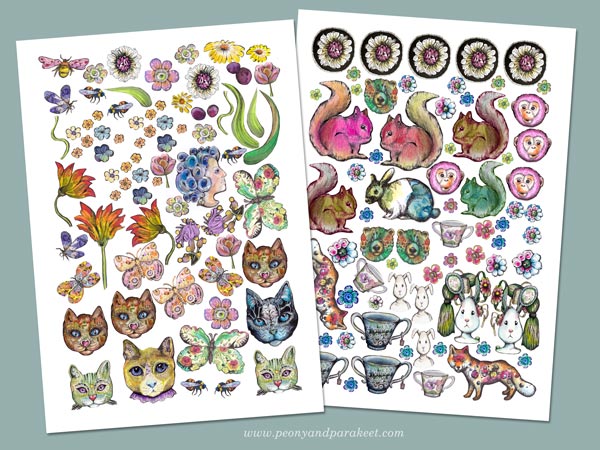
The original size of these pieces is much bigger than in the printed sheets.
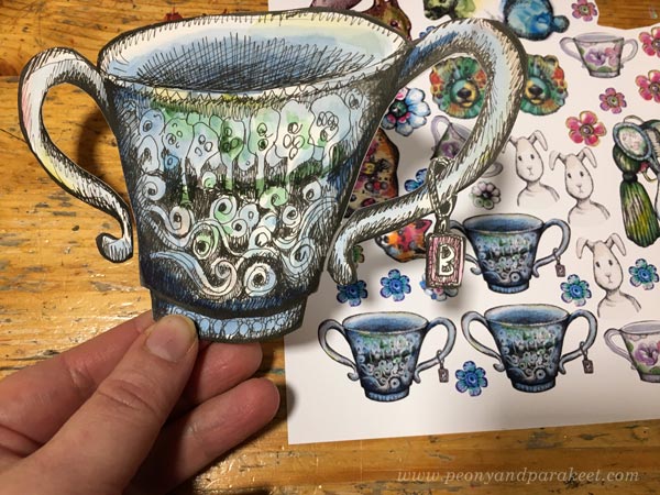
Use All Kinds of Hand-Decorated Papers!
Samplers have a variety of designs, so every little doodle is a potential sampler piece. I have a box of hand-decorated and painted papers (mostly leftovers from Collageland) and two boxes of hand-drawn collage elements. I have also cut some old art created in the 1980s. All these are a good addition to small printed pieces.
Of course, you can also use store-bought die-cuts, pictures from magazines, etc. but if all the elements are handmade, they will all fit together much better because they are all YOU!
Perfect Project for Hand-Painted Background Pages
If you are an art journaler, I bet your journal has a lot of pages that are more like backgrounds rather than finished pages. You can use them for collage samplers!
The background of this sampler was busy and bright, but I just added brown over some of the areas and let the colors speak, or should I say shout!
I attached the pieces with paper glue and some larger elements with double-sided tape. I usually use gel medium, but it’s messier, and it’s too difficult to cut all those tiny pieces with sticky fingers.
Self-Expression with Hand-drawn Collage Samplers
Sticking paper pieces can be just a relaxing hobby, like cross-stitching. But samplers can also tell stories!
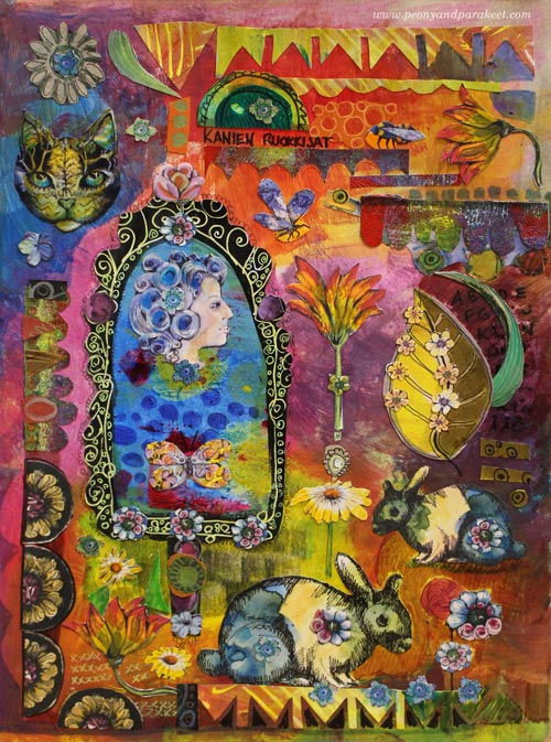
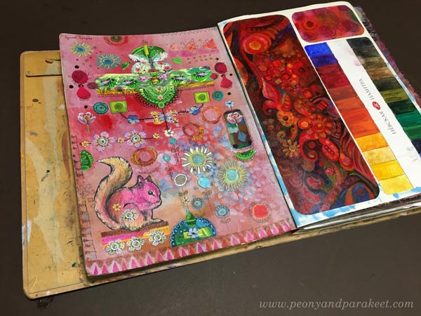
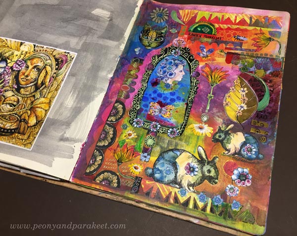
My first page is called Squirrel Sampler, and it has all kinds of little treasures that Paivi the Squirrel has collected.
The second page is called Rabbit Feeders. It refers to women’s status and importance in Virginia Woolf’s novel The Voyage Out. An isolated woman looks at herself from the mirror and questions her importance for the world. I read Voyage Out as a teenager, and this allegory, even if it’s just a few rows in the book, touched me deeply.
It often happens that creative play evokes feelings and stories that are too big to express in any other way. I hope you’ll enjoy making these samplers!
Start drawing your sampler pieces – Subscribe to my weekly emails and get a free mini-course!