
Painting Moss and Coloring Green
This week is dedicated to moss and all the shades of green!
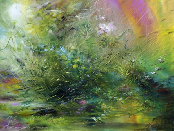
Inspired by Moss
For some gardens, moss is a bad thing, but my husband and I always get delighted when we see moss appearing. It’s like velvet, an ancient treasure, woven hundreds of years ago and still vivid and strong.
Last month, I read Elizabeth Gilbert’s book called The Signature of All Things. The protagonist Alma was a moss researcher and the space where she worked and stored her samples felt inspiring because it seemed to be a world of its own. The Finnish title for the book is Tämä kokonainen maailmani – “this whole world of mine,” and I think it describes both the book and moss brilliantly.
Making of The Echo of Moss
In this painting “The Echo of Moss,” I have wanted to express the two sides of moss – how it enables life but also gently connects us with death. Watch the video to see how it progressed step by step!
I painted this piece in oils in two separate sessions. There was a week of drying time between them. I am not always that quick, but this time I was in the flow state before making the first stroke. Probably because the subject felt both inspiring and familiar, and I love the color green.
Painting and Coloring Moss
Moss is not difficult to paint or draw. You only need softly colored variegated green in the background and then randomly placed dots or short lines on the top. Here’s an example in watercolor.
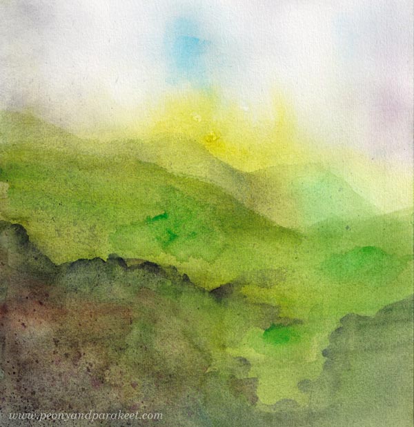
This piece is a sample from my watercolor class Magical Forest which has a lesson on painting moss.
When working with colored pencils, color a variety of greens in different directions so that single strokes are not visible. You can use browns, blacks, yellows, and blues in layers to get a wide range of warm green shades. No outlines are needed.
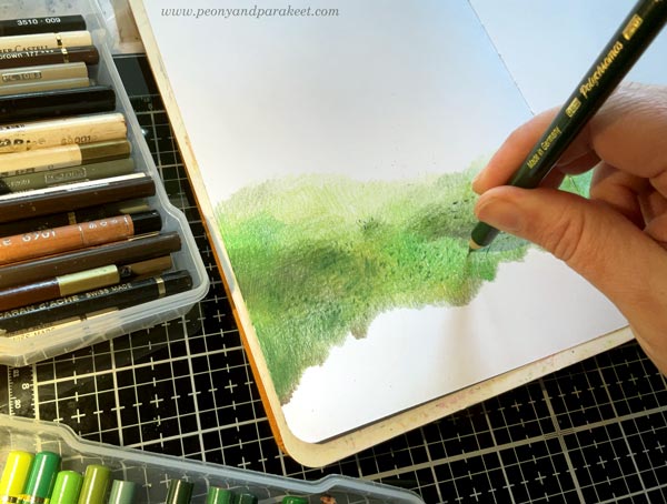
To get natural-looking spotting, close your eyes and tap your pencil randomly on the paper.
Green Green Green!
Green is my favorite color nowadays. “Every painting can’t be green, Paivi, we want variety,” I said to myself before I started painting this one. I was just like my mother who used to give permission and then remind me that it can’t be expected to happen regularly. “Yes, mother, but I want to be a goddess of green!”
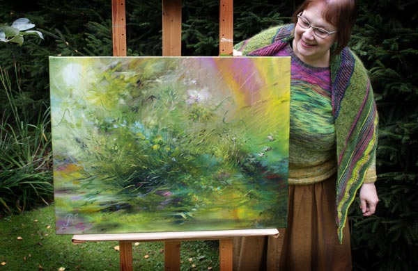
“Everything is green,” said my husband when I asked him to take this photo.
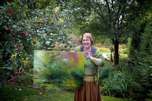
“It’s intentional!” I said to him.
I hope that this post inspires you to explore moss and different shades of green!
P.S. Speaking of color, one of my classes, Planet Color, is retiring on Sept 30.
If you are a beginner in painting and want to use acrylic paints more, for example, in your art journals, check this class! Planet Color is now more than 50% OFF before it goes away! >> Buy here!
Colored Pencil Blogger – A Video Blog Post!
This week, I have a video blog for you. It’s full of art inspiration, especially if you want to fall in love with colored pencils.
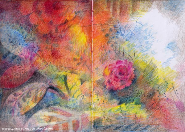
Stories and Inspiration – Watch the Video!
I decided that I have blogged about colored pencils so much that I can call myself a colored pencil blogger!
The video is longer than what I usually record. Is a 30-minute video too much? Tell me what you think!
Links to the Related Blog Posts
Posts about the colored pencil projects shown in the video:
- Coloring Page
- Angel
- Butterflies Journal Spread
- Hearts and Flowers Journal Spread
- Frozen Heart Journal Spread
- Drawing that I showed just quickly
- Previous video project
Posts about the paintings shown in the video:
Extra Post In Memory of Queen Elizabeth
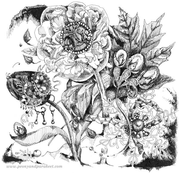
When I was a child, I wanted to be the Queen of England. It was the greatest thing I knew. We lived modestly in a small Finnish town near the Russian border. On Sundays, when we got a thick newspaper and bought a women’s magazine from the local kiosk, we talked about royals in Europe. The greatest of all was Queen Elizabeth, of course. I admired her so much that I got a flower bench under my bedroom window and roses called Queen Elizabeth planted on it.
Queen Elizabeth was my queen back then and still has been. She has been our queen for so long that she has seen more than most of us. With her, a time period that a single human can comprehend and remember vividly now goes away.
We, Finnish people, remember the queen’s visit to Finland in 1976. When my parents saw our politicians taking her to a forest in a walking suit, they were upset and ashamed. I remember my mother sitting on the sofa horrified and even a child understood that our love for forests could have been presented in a more sophisticated manner. But we didn’t get any headlines where the queen would complain about her circumstances, and in fact, we haven’t got much of those during all these years.
So here’s to Queen Elizabeth one more time. She inspired me to dream about jewels and kennels, courts and stables, tartans and silk, and because of her, I looked at forests like they were palaces. It made life so much better then, and it still carries me now when I am an artist.
How Your Personal Story is Related to Your Art
This week, I share how my newest painting was born. At the same time, I talk about how the artist’s personal story affects the outcome.
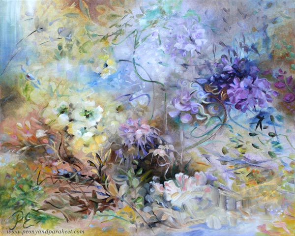
My paintings usually reflect the current season. But now, when there’s a fall in Finland, something springy appeared on my canvas. I call this one “The Spring of Dreams.”
Observing a Flower – Engineer’s and Romantic’s Approaches
Last spring was beautiful. The apple and cherry trees were blossoming.
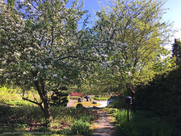
And with the early summer came wonderful irises.
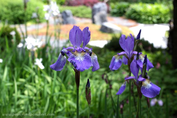
I often take photos in the garden and examine the plants. As a former engineer, I try to see how they are constructed. Not how the petals are attached and such, but how the light constructs the flower, adding its own brushmark to it. As a romantic, I try to see a face of a flower. I look at it like it would be an animal or a human – like it has a name and a history. I am not searching for its eyes but trying to sense its needs and dreams.
This way, I don’t need to copy photos but can paint freely and intuitively. Then when random shapes begin to look like a lighted plant, I try to give it what it wants, even if it’s often a species that doesn’t even exist.
The Fight Between Too Stiff and Too Messy
However, the painting process is not always as straightforward as it sounds. Often the engineer adds something stiff, and the romantic wipes it off. Then the romantic makes a mess, and the engineer tries to clean it.
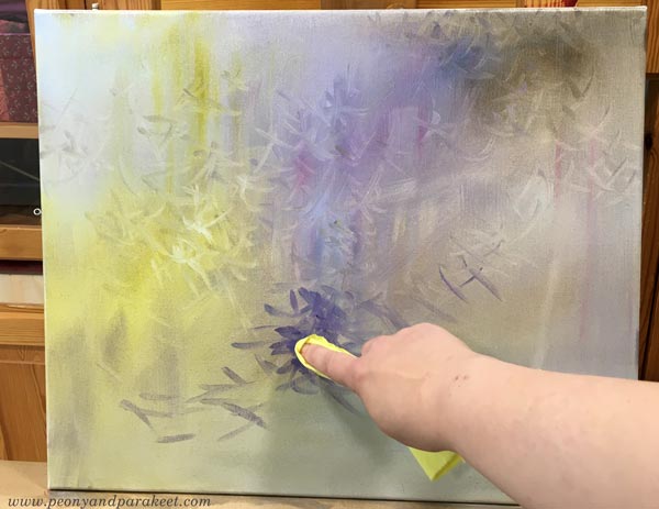
The engineer in me likes to build things with a brush: “There’s a chair, look!”
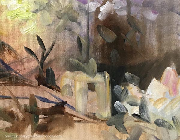
The romantic in me likes leaves and swirls more.
Artistic Direction and Setting Guidelines
To stop the fights, I gave an artistic direction that set challenges for both of them: “We will be making a dreamy floral that has purple. The painting should fit a modern, feminine home that has some rustic elements as well.” Both the engineer and the romantic understand had a common understanding of style when picturing a space where the painting should fit. When I use this method, I choose a location in my home or a picture in an interior design book, or a photo found on Instagram.
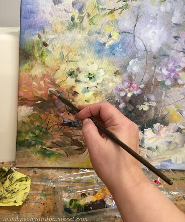
When I was studying industrial design, these kinds of simple and concrete guidelines were called design drivers. Design drivers are different from design principles. Design principles are general guidelines to make your image more expressive and aesthetic. Design drivers are project-based and loosely define the outcome.
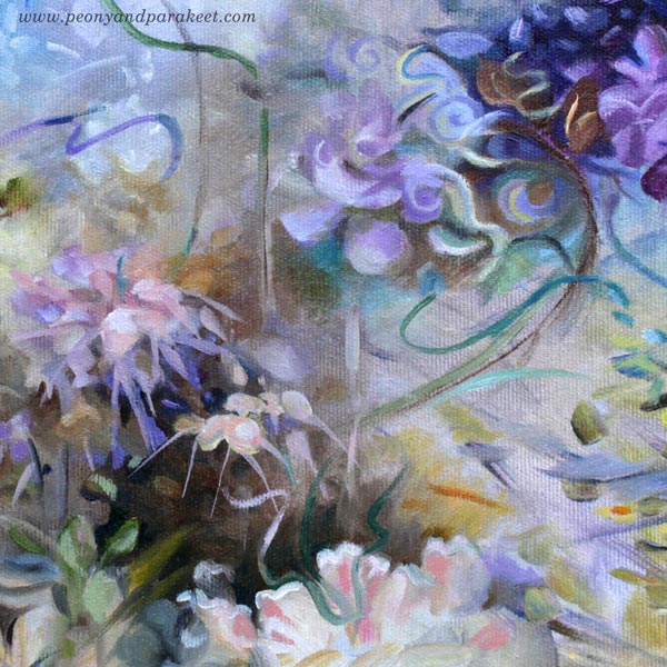
Design drivers prevent me from painting this and that, but I try to make them so general that I can get creative and freely express myself. For example, the requirement to use purple in a painting is not a big limitation.
Personal Story and Art Projects
Behind design drivers, there’s a more general foundation, an artistic vision. My paintings always lean toward the past and have a historical feel. As an artist, I want to combine the past and the present in an uplifting way, creating a fantasy of immortality for the interior space. Because I lost both of my parents at a young age, I never thought I would live old. This way, my artistic vision, and personal story are connected.

I claim that art-making has many layers. It’s not only about the process, techniques, or assignment. The artistic vision and the personal story matter as well. You always have a chance to bring them in, whether you are painting or drawing. For example, if a course sets the starting point, the creative challenge is how to include your artistic vision and story in the projects. This time, rather than listing things you love, go deeper and think about your struggles. How do they define what you want to achieve in art?