Art Supplies I Should Not Use Anymore
When I look at my art supplies, there are many that just take up space and don’t bring me joy anymore. Recently, I have tried to use them up, but one crayon, for example, can last a long time. Maybe I should just stop using them and give them away?
This blog post is a little inventory of what art supplies don’t bring me joy anymore.
Arteza Gouache Paints
Arteza sent a big set of their gouache paints to me in 2019, and I made a blog post with a video about them.
>> Intuitive Painting in 60 Colors of Arteza Gouache Set

I prefer Schminke Horadam gouache paints, because they are much better quality.
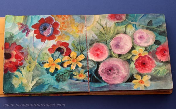
In general, I like watercolors more than gouache paints because they are livelier and more transparent. In the course Decodashery, I have used both gouache and watercolors.

Gouache is great for decorative-style painting, so I will keep my few Schminke paints, but I should give the Arteza gouache paints away.
Derwent Artbars

I have a love-hate relationship with these crayons. I have used them quite a lot, especially with water. But always when I look at the finished piece, I think that it would have looked so much better if I had used watercolors instead. For example, this recent art journal page would have been quicker to create and much more delicate with watercolors.
On the other hand, I really like many sketchbook pieces from 2017, like the one below.

In this blog post from December 2017, I share many projects where I have used Derwent Artbars.
I bought the Artbars somewhere around 2014, and even if I have tried to use them now and then, they may live longer than I do. I think I should either toss them or give them away. Watercolors easily replace them.
Faber-Castell Gelatos
I often wonder: “What did I think to achieve when I purchased these?”

I bought Faber-Castell Gelatos around the same time as Derwent Artbars. Mixed media enthusiasts thought that Gelatos were fun at that time, around 2010. I was very much into mixed media, and it was not difficult to sell new art supplies to me. Nowadays, I am much more traditional and don’t consider myself a mixed media artist anymore.
However, if you have Gelatos, you may enjoy this blog post from 2014 where I show some color mixing with them. >> How to Mix Colors (with Gelatos)
And this blog post where I work with Gelatos by using inspiration from art history.
>> Consistency and How to Get Inspired by It (with Gelatos)

I try to use gelatos now and then, and managed to use up one stick of the big set. But these are just a nuisance: no accuracy and not enough pigment. I should give these away.
Oil Pastels
I only have a small box of oil pastels. They really suit my art style. They have strong pigments and it’s easy to mix and blend them. Oil pastels look great a a top layer of pencil drawings and work well on top of many other art supplies too.
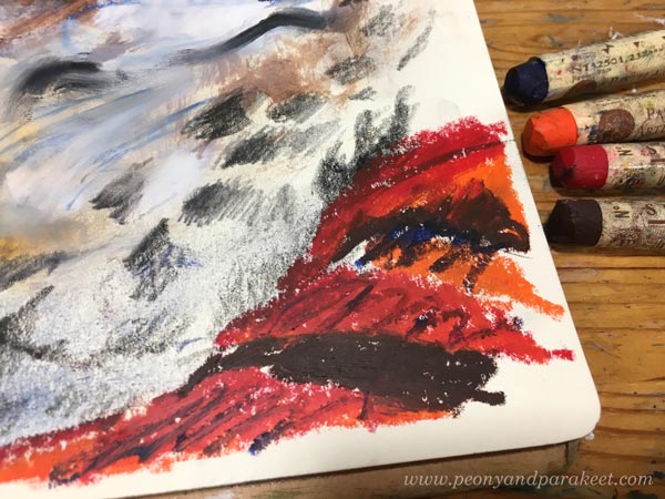
And I love the results! Here, the face has been painted in acrylics, there are regular pencil marks, and then the oil pastels add their flare.

See more images in this blog post from 2018: Oil Pastels and Spicing Up Your Art
I have also used a lot of oil pastels in this recent blog post: Using Up Old Crayons
And I have even made a course that uses oil pastels with other supplies. It’s called Innovative Portraits!
So, why should I not use oil pastels anymore when I seem to be so excited about them? Well, they are messy for sure, but also this: If I make a piece with oil paints instead, I can sell it and get more worth of my time. Oil paints (and acrylics) can do everything oil pastels do. Oil pastels are quicker, but the result is more valuable if I use paint. So, this is related to what kind of artist I am and what I need to get out of my time.
Alcohol Inks and Acrylic Inks
I bought alcohol inks in my mixed media years and loved them.

Alcohol inks are strong and work on any background, even on the top of acrylic paint. I used to use them to make backgrounds too, here’s one example from 2015.
And in 2012, I made many collages in the Collageland style where I also used splashes of alcohol inks, often pinks!

But now, they don’t feel so much fun anymore. Their odor is a bit disturbing too. But I have some pens that can be filled with alcohol inks, and will use the rest of them like felt-tip pens.
I also have some acrylic inks and acrylic watercolor inks.

I prefer to use watercolors instead nowadays. I should just make some art journal pages to use up those few bottles or give them away. I actually found a fun idea from an old blog post: Inktober Warm-Up Exercise (inks + drawing, from 2019)
All That Glows
Gold, silver, pearlescent effects – they are not my thing. I love to imitate glowing effects with regular paints, but glowing surfaces are not what I like to create. I have tried too many times, and made some fun pieces too, like this one from 2020.
See more images in the blog post: Impressionistic Floral Painting on Structure Paste
And see how lovely glitter glue looks on the box cover, made in the course Doll World!

I have already given away many glittering paints, and I intend to give away the few that I still have.
Special Mediums
When visiting an art supply store, it’s tempting to try a new medium. I have velázquez oil painting medium, masking fluid, granulation medium, fiber paste …
Some of these mediums are for adding surface effects. For example, fiber paste creates a surface that can then be used for watercolors. Velázquez medium is for those who like to paint thickly. The more I have painted in oil, the smoother surface I want. For me, the smooth quality of the surface feels important to achieve. Smooth paintings bring old masterpieces to mind.
I know many use masking fluid and granulation medium for watercolors. I have used masking fluid in the course Watercolor Journey, but have stopped using it. There are ways to avoid it so masking fluid feels unnecessary nowadays. Granulation medium is not a miracle medium either. I like to keep my watercolors with water only. I think they don’t enjoy the makeup!
However, in Watercolor Journey, we use the masking fuild in a fun way – for doodling – and I think the result is fun!
I have some masking fluid and granulation medium left. Maybe I should make some art journal pages with this doodling approach to quickly use them up!
My Basic Art Supplies
These are the basic supplies, I want to keep: oil paints, acrylic paints, watercolors, watercolor pencils, colored pencils, and felt-tip pens. Oil paints and acrylic paints are mainly for canvas paintings. Watercolors are mainly for watercolor paintings. And colored pencils and felt-tip pens are mostly for art journal pages and small drawings.
Mediums
With oil paints, I need painting medium. And with acrylics, I like to use gel medium and glazing medium for thinning in addition to water. I could give up the gel medium if I had to choose, because the glazing medium works better for thin layers. Then comes the question: how minimal to go and what would it serve?
What do you think?
However, nowadays when I want to have a treat while visiting an art supply store, I buy a new color, for example, a new colored pencil or a new tube of oil paint.
Beautiful Blog Post
This week is about creating beauty, and I have a beautiful blog post for you.
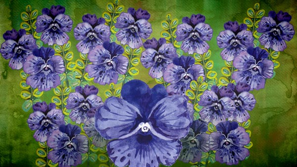
Violets on an Adventure
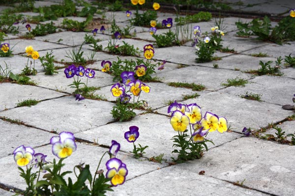
Ten years ago, an old yard tiling gave us a surprise. Renovating it had been on our to-do list, but there had been other things to do in the house. But we were lucky.
The violets planted in the pot had looked at the tiling and its gaps with completely different eyes. What an opportunity for seeds! So, the following year, we were able to enjoy the glory of flowers in the surprising place.
Creativity is a flower that wants to break free from its pot and get on an adventure. Abundance is allowed and ugliness can enable beauty.
A painting that starts with a few ugly brushstrokes can be decorated
to rich and beautiful.
Beautiful Decodashery
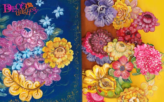
My online class Decodashery is about creating beauty that easily finds its purpose. This kind of art is not just fun to make but perfect for cards and gifts.
Decodashery is one of my personal favorites. The videos are inspiringly colorful and uplifting. You play with the tradition of decorative art and create beauty that people have always found attractive. >> Buy here!
Creating a Protector of Good
This week we get inspired by spiritual and ornamental art and create a protector of good.
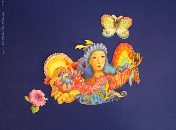
Protector of Butterflies in Colored Pencils
Halloween is not an official holiday in Finland, but we have All Saints’ day soon. I started gathering images for this blog post in the spirit of All Saints’ day, but soon realized that this kind of art has a special role in my life in general. There are times when I want to create art to protect all the good things in life.
In the small colored pencil drawing, I was thinking about the beauty of butterflies and created a protector for them.

At the same time, I created a protector for my sensitivity, and it feels good to have one in my box of joy as I call the collection of hand-drawn paper reliefs.
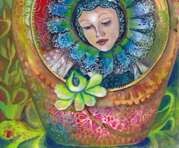
Protector of Everything Sacred in Collage
Back in 2011, when I wasn’t a full-time artist yet, I made this paper collage from hand-decorated papers.
I wanted to express the atmosphere of a sacred space. My hand-drawn lines were clumsy, but I cut the papers so that they look decorative. I painted icons as a child, so I made the woman’s face in that style. I still like this!
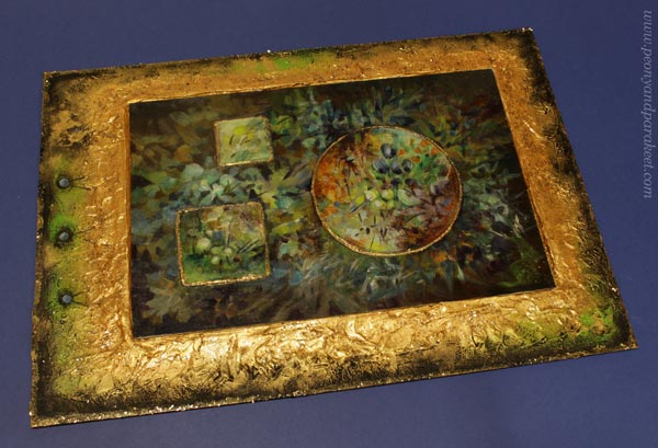
Protector of Flowers and Plants in Oil
In 2018, I was practicing oil painting and explored all kinds of organic shapes. I first painted all kinds of plants and then changed the orientation, and added the madonna. (More about the process in this blog post.)
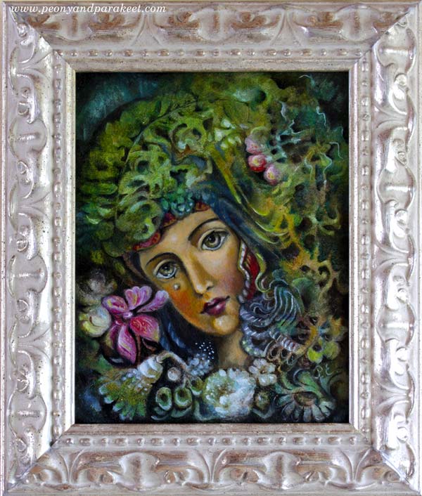
The frame of the painting has a real silver coating, and I think it fits the image beautifully.
Painting and Drawing Precious Artifacts
We can paint and draw precious things that make us feel protected, like candles and crosses. I found these two gouache paintings from my archives today.
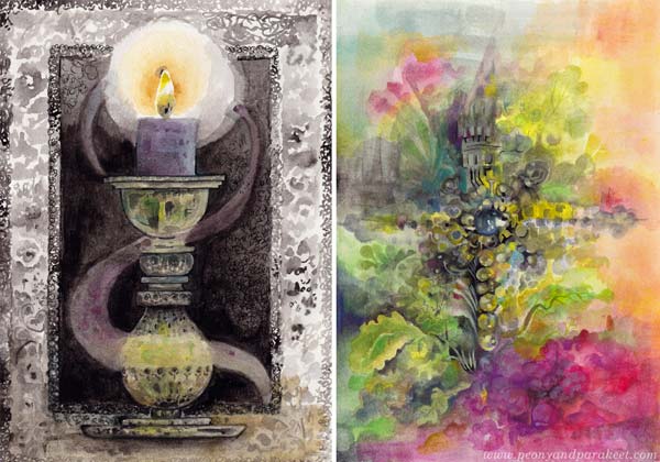
Ornaments can also be more imaginative, like these hand-drawn collage pieces.
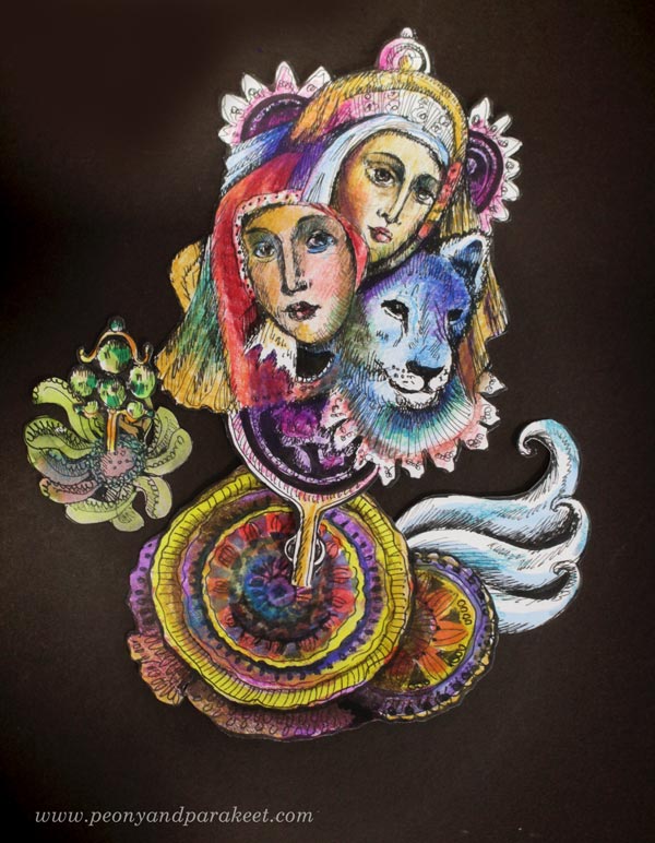
You can compose paper pieces together so that they look like a talisman.
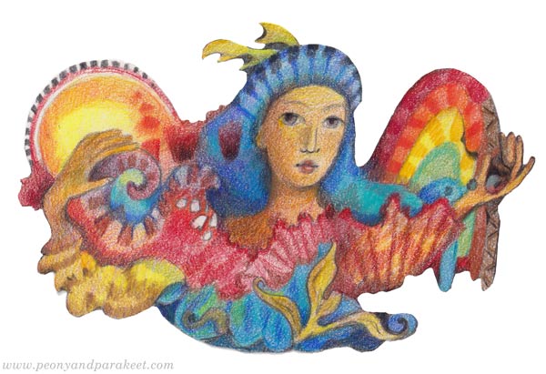
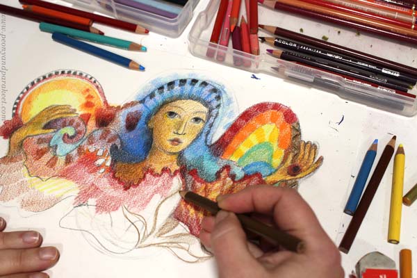
Protector of Light in Watercolor
Now when we are entering dark days in Finland, I feel the need to have a protector of light.
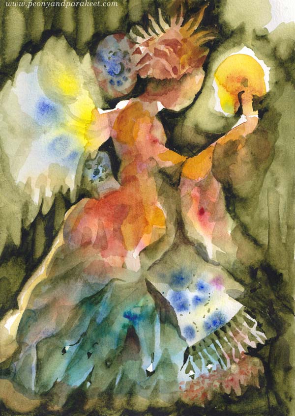
This watercolor angel was painted for the class Magical Forest. I developed a method for it so that you first paint the angel figure freely by splashing colors and then add more definition by painting the dark background.
Protector of the Child in Us
I think one of the most important protectors is the one who protects the child in us. I painted this icon in the early 1980s when I was about 10 years old. It was my second, and as you can see, I wasn’t very good at varnishing back then – too much linseed oil!
The teacher of the icon painting group, Irke Petterberg, helped me with the details of the faces. I wasn’t eastern-orthodox; I just happened to live very near the church and love art-making. It was wonderful to be accepted as a part of the group which consisted of adult painters. For me, religion felt like a gate to the world of imagination.
No matter the religion, let’s cherish the child in us and protect the good through art-making.
Painting and Drawing Fruits
This week, I share my love for fruits and give inspiration for fruit-themed paintings and drawings.
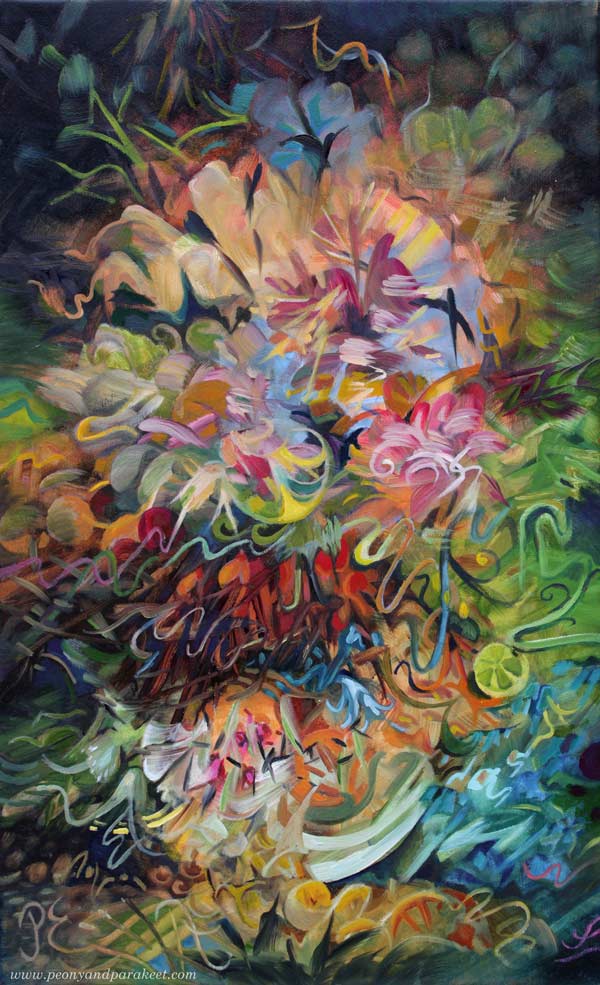
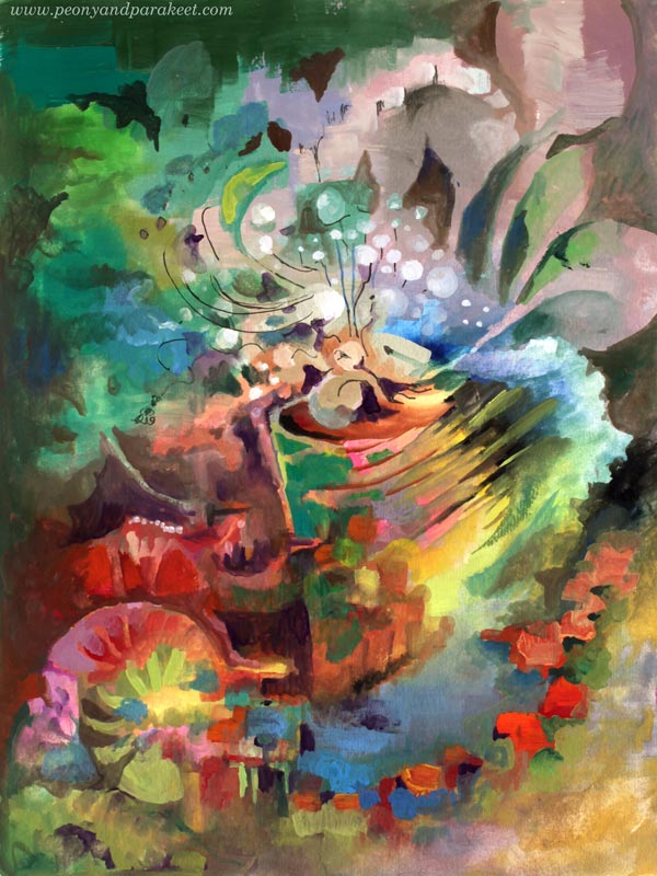
Here’s one of my newest paintings called Jupiter’s Bowl. This oil painting is a part of my series Linnunrata – Milky Way, where I explore planets and outer space. (See previous work: Uranus here, the Moon here, Mercury here, Neptune here, Pluto here, the Earth here, Venus here, and the Sun here!)
Fruit Storm in a Magical Bowl
The idea for this painting started from the orange storm that the planet Jupiter has. But then I thought about the Finnish saying “myrsky vesilasissa” which is “storm in the water glass” in English and similar to the saying “storm in a teacup.” It felt playful and funny to compare the planet to a small bowl and make a still life that doesn’t look still at all.
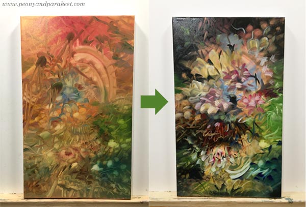
The first layers were very different from each other, and it felt like there was still more to come. The final version has brighter colors and juicy fruits that burst everywhere. Here’s a closeup of some:
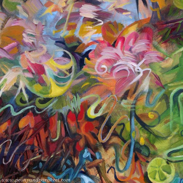
I love lemons and oranges. I think they are one of the most attractive things in the world. Their smell, taste, and look captivate me. And they are not difficult to paint or draw either!
Decorative Slices in Black and White Drawing
Here’s a line drawing from 2018 when I participated in Inktober for the first time. The slices were fun to draw, especially because I treated them like Faberge eggs: filled with jewelry and other decorative elements.
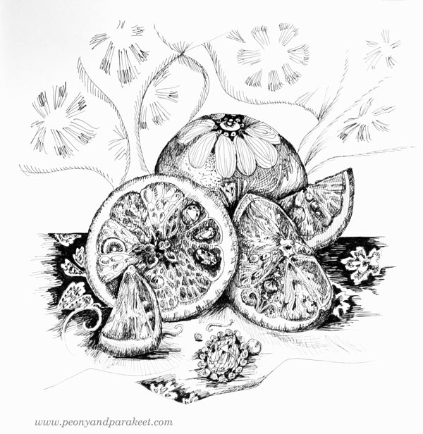
Back then, I was finding out things that I really like and bringing them together in my drawings.
Intuitive Fruit Painting in Gouache
In 2019, I made a gouache painting (see the video!) that reminds me of Jupiter’s Bowl. It has fruity and fresh colors and some stormy vibe too.
I was a bit clumsier painter back then, but the idea of refreshing fruity burst is evident.
Fantasy Fruits in Colored Pencils
This year started by making a new class called Fun Botanicum. The second lesson of the class is about fruits and berries. Here’s my example from the class, made with colored pencils.

I wanted the spread to look juicy with my own fantasy fruits. Practically, you can draw a circle, add shadows and decorations, and it will look like a fruit!
Juiciness vs. Fruits
When I took pictures of Jupiter’s Bowl, it was late May and grass and tulips were in full bloom. There’s a lot of juiciness in summer colors.
My suggestion is to focus on the juiciness when drawing or painting fruits. If you think about how the fruits look in reality, the result gets stiff more easily. If you let go and focus on the juicy part, creating is much more fun and the result more expressive. Anything can have the spirit of the fruit, and art can be juicy without presenting the actual lemons and oranges.
Tell me, which are your favorite fruits? Do they appear in your art too?