Expressive Watercolor Flower Collage
This is a sequel to the previous post “Flower for Your Art Journal” where we painted a watercolor flower step-by-step and used it as a collage piece for an art journal spread. This post has more ideas. Now we will paint more flowers and leaves. I also share some tips for artistic expression so that your collage will be more than just a stiff collection of flowers.
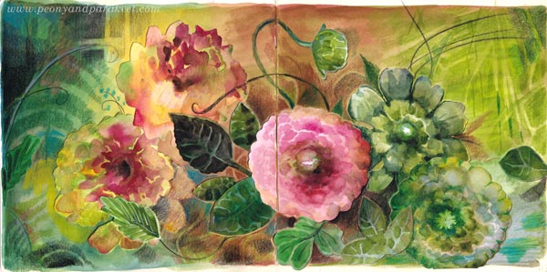
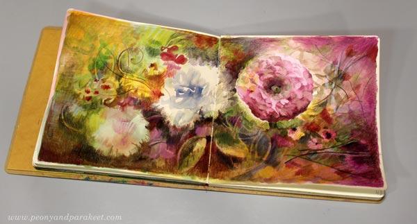
I have created this spread in Dylusions Creative Journal Square. The paper that I have used for collage flowers is Fabriano Accademia Drawing Paper (200 gsm/94 lbs). My watercolor set is a mix of artist quality pans from different brands. I have finished the spread with colored pencils. You can see these in action in the video of the previous blog post. The previous post also has the basic step-by-step instructions for painting a layered-looking watercolor flower. Let’s now look how you can do more and expand the basic idea!
Get More Variation – Grow Flowers More Naturally!
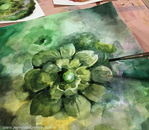
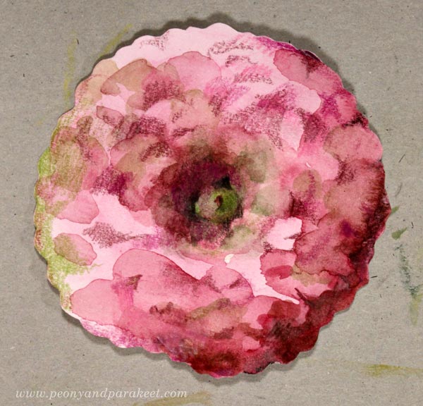
Instead of painting a separate flower by outlining it right in the beginning, grow a flower from the background!
Paint from the edges to the center.
Add more layers.
While you wait for each layer to dry, you can paint more basic flowers as instructed in the previous blog post.

When you can almost see a flower forming in the center, you can start painting petals on it.
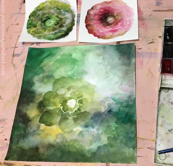
Maybe you can also find smaller flowers near the big one, as I did.
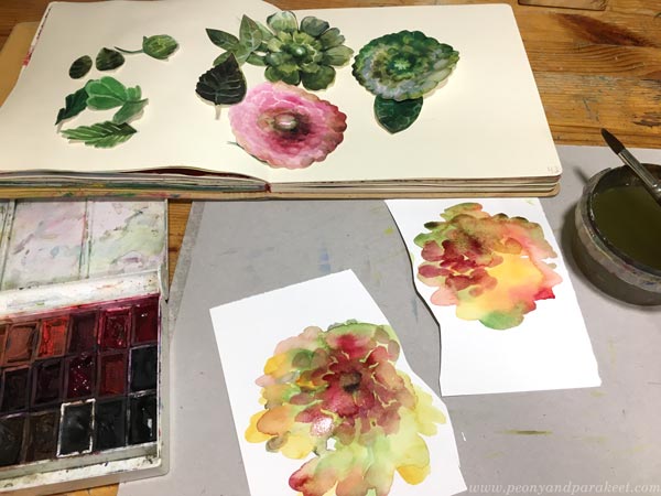
Cut out the big flower but keep the background too. We will use it for leaves.
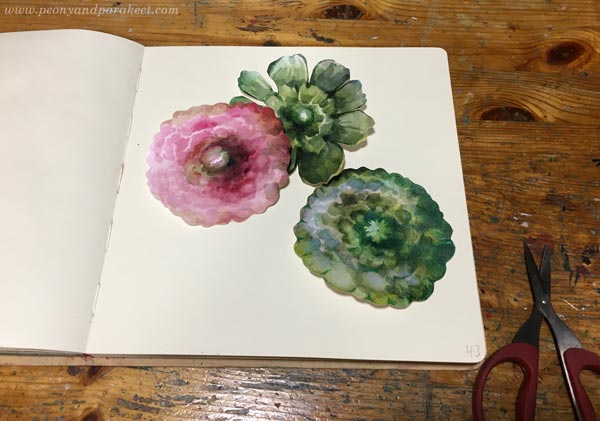
Add finishing touches to cut flowers with colored pencils.
Get More Variation – Paint Leaves!
Use the background for leaves.
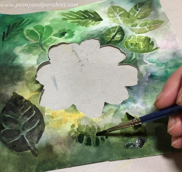
Leave some background visible between the brush strokes to get veins. The thinner the veins, the more elegant the leaf looks!
Let’s Pause and Talk About Colors
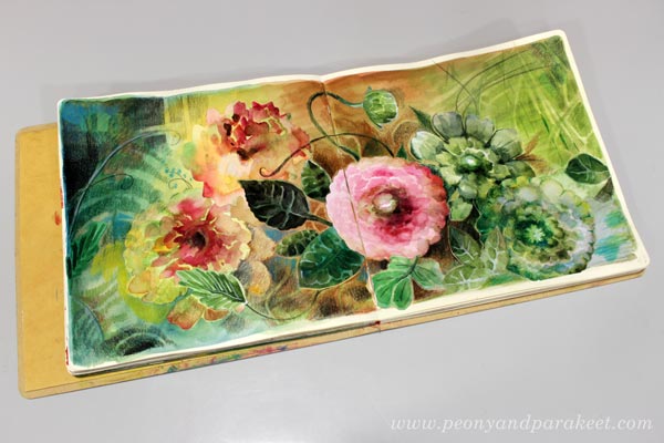
Ï only made one pink flower for my collage. Other flowers have different colors. If you look at the finished piece, the pink flower really pops up because it’s so different. The green flowers may look unnatural when you have them as collage pieces but in the final piece they look like cousins of the green leaves and the result is natural.
When you want to build expression, some flowers have to be less important than others. That’s why you can use any color for both flowers and leaves. For example, you can have blue flowers and blue leaves. These are secondary elements to the focal point.
Get More Loose – Let Watercolors Make Some Flowers!
Put most of your energy to make the main flower, as beautiful as you can. You can then paint other flowers very loosely. Namely, some flowers can be more in the background and because flowers are very 3-dimensional things, their outline is often asymmetric. Think about a peony, for example! It has many layers of petals and they point in different directions.
With a fairly broad brush and quite a lot of water, paint multicolored spots and call them flowers.
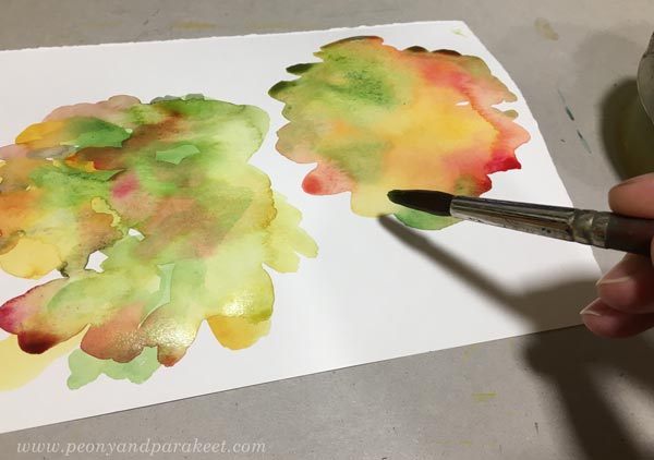
You can add some brush strokes on the spots to make the flowers a bit sharper. However, these loose flowers are much less detailed, see my selection below.
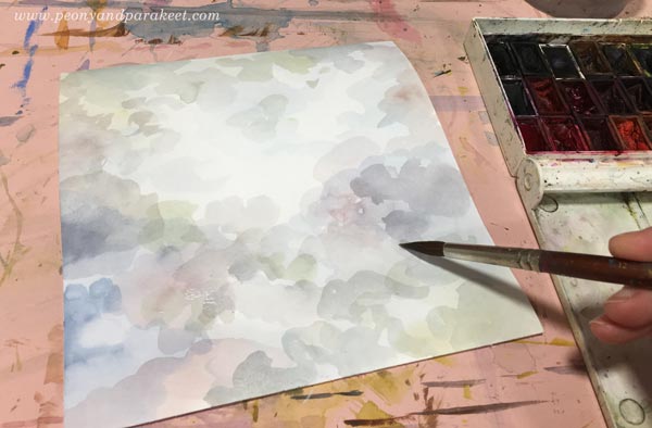
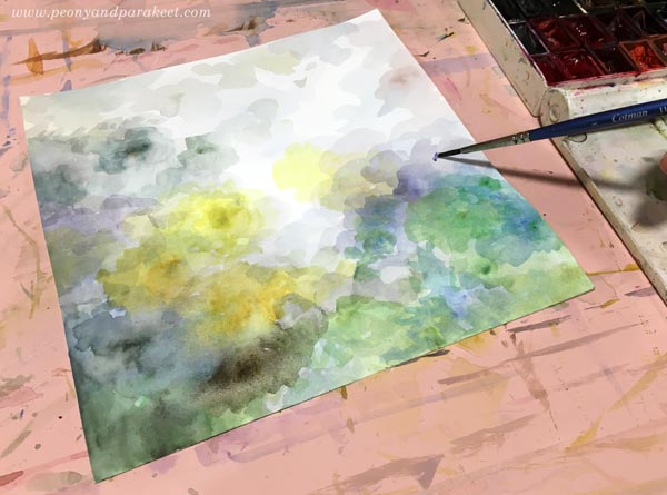
Before attaching the flowers and leaves, add color to the background.
Get More Expressive – Paint a Multicolored Backround!
Backgrounds with only one color are boring, and not only for the viewer but for the maker as well. Different colors form different areas and when attaching the flowers you have much more fun deciding where to put which flower.

I let my background guide me: yellow flowers in the yellow area, green flowers and leaves where the similar tones are, and the pink flower in the center that has the warmest tones. This creates the effect of lighting – the flowers and the background are exposed to the light of similar tone and that makes them look less separate.
Watercolor Flower Collage and Colored Pencils
With colored pencils, you can easily add curvy stems and other delicate lines and darken the surroundings of the focal point so that it catches the eye right away.

Notice that you can also push some flowers further back by coloring over them with background colors.

My blurry and loose flowers get green tones. And I also add yellow to the background to push it visually closer to the flower.

Drawing curvy stems makes the collage flowers look less stiff.

You can also add more subtle details to the background by coloring over it with very similar colors that it already has.
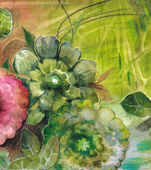
Some green details are a little lighter, some little darker, and that’s makes them visible but not too much – the pink center flower has no competitors.
Next-Level Watercolor Flower Collage with Tension
I know that using dark colors is hard for many. These times need light and you want to make bright art, I get it. But light needs darkness to shine. I always finish my work so that it has the tension between the so-called good and the so-called bad. It has sharp and bright details, traditional beauty, safe and tame areas. But also dark colors, unclear, sometimes even scary-looking wilder parts. This tension makes the collage natural because life is like that.
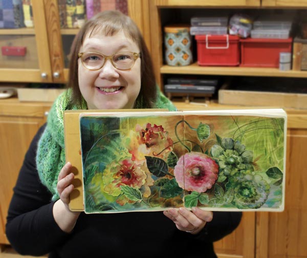
I hope this post inspired you to create more watercolor flower collages!
Flower for Your Art Journal – Step by Step Video
Let’s pick watercolors and colored pencils and make a flower for your art journal! Scroll down to watch a step-by-step video!
This flower can be a rose or a peony or any round and layered species. For me, it’s not so important which flower it is, but what kind of personality it expresses. Here I aimed for a soft but unapologetic character. Every flower you create will become a bit different, and soon you’ll have a collection!
Flower for Art Journal Page – Watch the Video!
The instructions for the flower and all the inspiration for using it on a page is in the video below! We’ll start with watercolors to make the foundation for the layered look and then add more sharpness with colored pencils. Some patience is required because you need to let the watercolors dry between the first steps.
In the video, I encourage you to adjust the center of the flower, the flower’s sould. Find a look and personality that appeals to you!
Including the Flower in Art Journal
In the video, I also show how you can use the flower with almost any background and make a spread for the flower in the spirit of Freely Grown.
I hope this week’s video and the last week’s blog post about picture prompts inspire you to art journal and create art in general!
Picture Prompts – Creating Art Journal Pages with Hand-Drawn Animals
This week, we use small collage pieces as picture prompts for art journal pages.
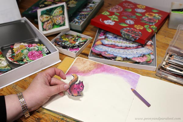
First you pick a small image, a hand-drawn squirrel or wolf in my case, and use that as inspiration for the rest of the page. You will need paper, colored pencils, and a pen for journaling. I also used felt-tip pens for the details that I wanted to highlight and graphite pencils for quick sketching. I attached the animals to the page with double-sided tape. My journal is Dylusions Creative Journal Square. (Affiliate link to Amazon.com).
Open Your Box of Joy and Select the Animal!
We will use hand-drawn animals as picture prompts. You can, of course, use any image, but I suggest starting with animals.
I save my hand-drawn collage pieces in boxes that I call boxes of joy. These little drawings are born from the joy of drawing. I have cut them so that they can be used as collage pieces.
I started drawing these small separate little things in 2018, and have been creating them ever since. It’s so easy to pick a paper scrap and draw something simple, and then get enthusiastic about adding decorations and colors to it. I have several online courses where we draw these: Animal Inkdom, Magical Inkdom, Decodashery, and Doll World.
My animals are mostly drawn for the courses Animal Inkdom and Magical Inkdom, and I love them so much, that I have also printed copies of some of them. I have many boxes to choose from and I love to both use them and re-fill them.
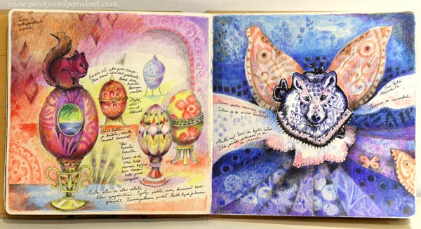
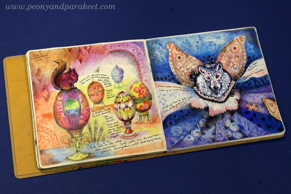
For the first page, I selected a squirrel because it has pink and orange, and those have been my favorite colors recently.
After selecting the animal, use its colors to color a small part of the page! Just color some layers freely (like in the course Intuitive Coloring). Don’t glue the animal yet, wait until you draw more and the story unfolds.
Picture Prompts – Go Beyond the Obvious!
We have a big nut bush in our garden and squirrels love it. So, my first thought was to draw some nuts for the squirrel. But that would be too ordinary and not fun at all. What if this squirrel would chase after Faberge eggs while others collect peanuts?
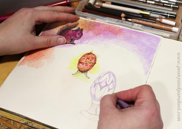
I love drawing decorated eggs. In Doll World, we draw a big egg, but this time I wanted the eggs to be small so I could fit many on one page.
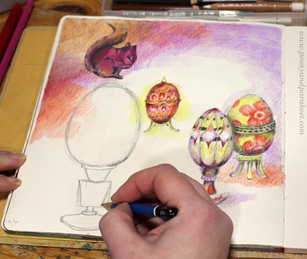
I made the eggs a bit different in size to make the page more interesting.
Static vs. “What If …”
When using the animal as a creative picture prompt, you want to find the story – not only the connection between the starting idea and the additions but also something surprising that keeps the inspiration going. If you only draw the ordinary, the picture easily becomes static – nothing is happening. Go for the extraordinary! Change the rules of reality, change the roles of the objects, make the animal speak – by drawing, you can create a world of your own. Ask: “What if?”
When I drew the first egg, it felt like just any object, but when I drew more of them, my imagination started working. Maybe the squirrel could sit on the biggest egg? And maybe the eggs could have a bigger role than to be just a decoration.

What if the scenery that I colored inside the biggest egg would leak into the surroundings?
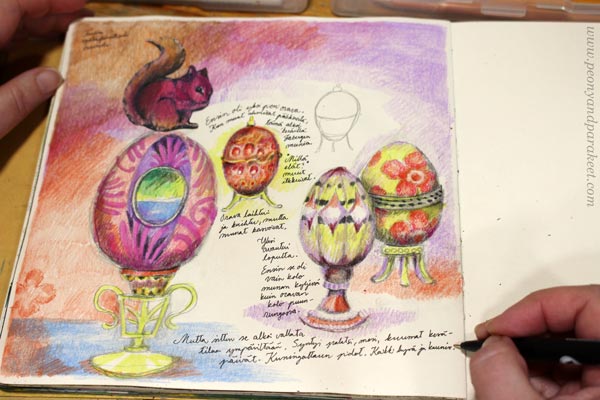
I wrote: “A palace was born, hot summer days came here, the queen (the squirrel) had a party, and all things good and beautiful came up.”
Then I drew more and completed the page inspired by the journaling.
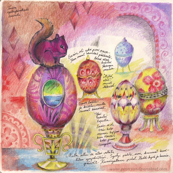
This is a story about an impractical squirrel who collected Faberge eggs instead of nuts and wasn’t much like other squirrels. But her eggs didn’t stay small. They grew and opened and created a place for her to live in.
“Isn’t that a story about every artist,” I realized after the page was finished.
Flying Wolf Art Journal Page
Let’s pick another animal and make the second page!
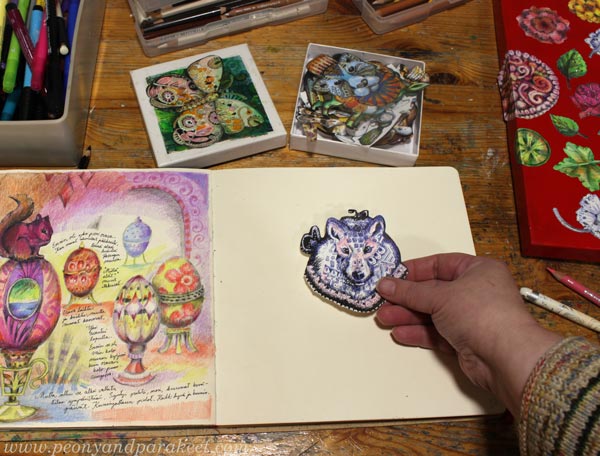
This wolf is the first little collage piece that I drew in 2018, so it’s time to give her a home. Decorating the animals was one of my core ideas for Animal Inkdom, so I can now color freely so that the decorations will continue to the background too.
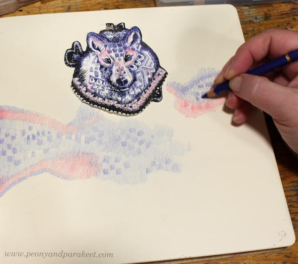
Again, I am using the colors that the animal has: blue, black, and pink. This way the collage piece doesn’t look separate from the rest of the page.
I wanted the wolf to fly, but not with furry wings. Could the wolf be partly a butterfly?
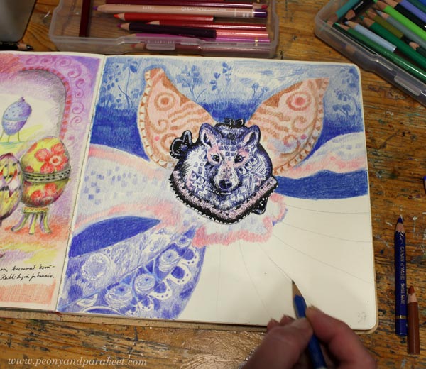
With the wolf, I felt a connection to my North Karelian origin. With the butterfly wings, I celebrated being a woman and loving delicate beautiful things.
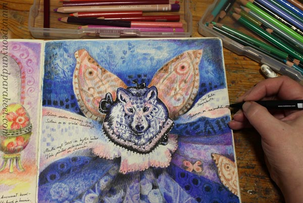
This wolf didn’t feel like a lonely one. So, I added a small butterfly and another bigger that is showing only partly on the right edge.
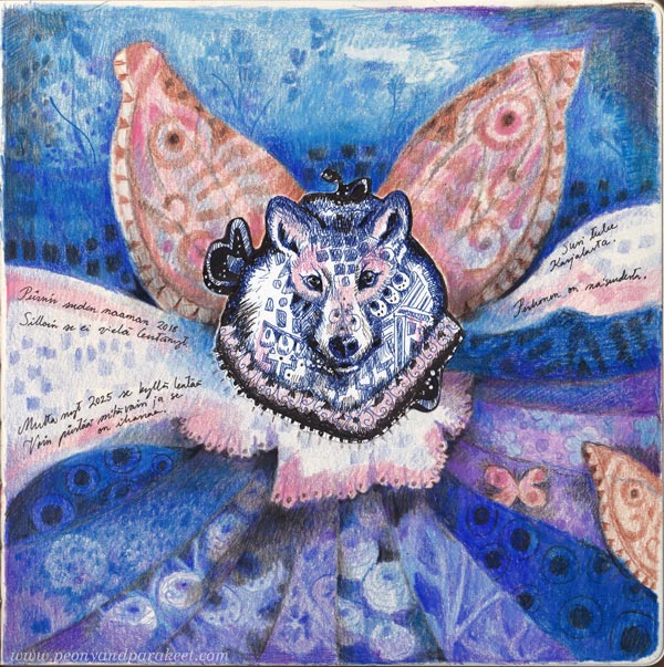
Back in 2018, my wolf didn’t fly yet, but it’s flying now! The more you draw, the more you can imagine!
Picture Prompts – Step by Step
- Pick the animal.
- Use the animal’s colors and patterns to get started.
- Ask: “What if …”
- Answer by drawing and journaling.
New in Development!
I have been making a new course that has a working title “Hearts and Stories.” I have already drawn quite many pieces for it. I collect them under a plastic plate that fits the side table of my studio. There I can see the whole collection at the same time, and think about what’s missing and how I will proceeed.
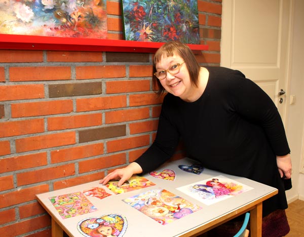
These drawings make me smile. My goal is that you too will smile when the course is running!
I want to be the advocate for drawing, because:
- If you only think, your imagination has limited capacity.
- If you only paint, you will stop playing and eventually run out of creative ideas.
- Drawing is important for any artist and for any human being.
What do you think?
Torn Paper Collage for Artistic Exploration
Torn paper collage – do you remember making them as a child?
This project is not so much about the resulting image, but about the process.
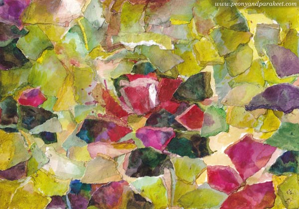
You will need watercolors, thick drawing paper, and paper glue.
I have used Fabriano Accademia Drawing Paper (200 gsm/94 lbs). It’s not as thick as most watercolor papers but holds water well and is nice for collages. I bought this paper for the course Joyful Coloring, and it has become one of my favorites because it’s so versatile.
Step 1 – Paint the Papers
One of the best ways to grow your artistic skills is to move away from ready-made images and make the material for collages yourself.
While creating, think about this!
There’s a hidden miracle in every brush stroke, even in the ugliest ones. The potential of them is huge. Your artistry grows when you keep creating.
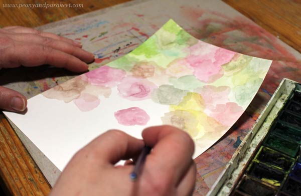
When you make the papers yourself, you can choose colors and add variation that will make every torn paper piece unique.
With watercolors, you easily achieve translucent effects and get great pastel tones. But also make a paper with darker and more vivid colors!
Check that you have all these variations: light, bright, and dark!
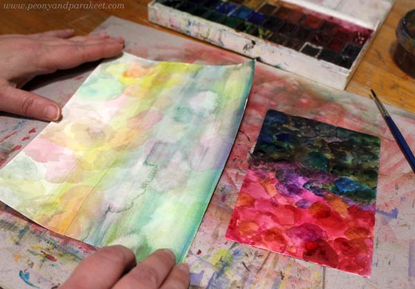
For a small collage, not so many papers are needed. My papers are 1,5 times the size of the final artwork.
Before continueing, think about this!
The papers are precious treasures. Handle them carefully like they would be glass!
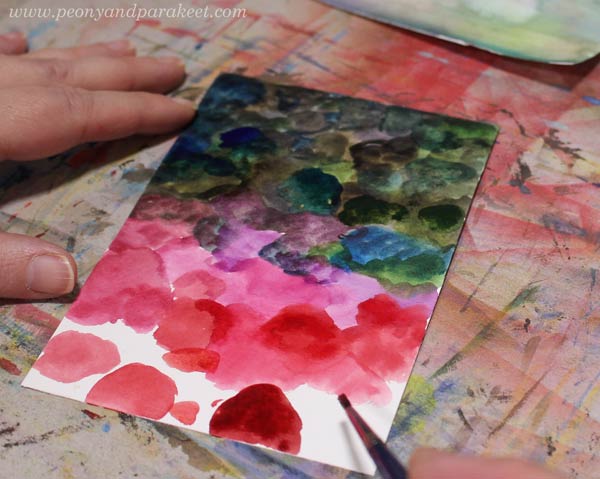
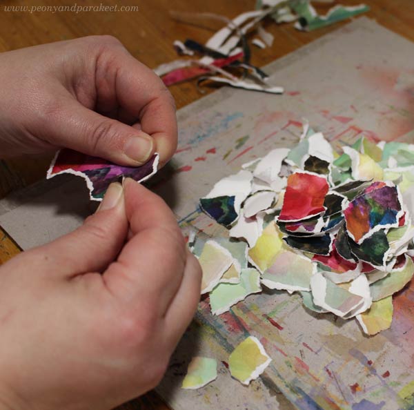
Step 2 – Tore the Papers into Small Pieces
Next, let’s “break glass”! With fingers, tore the papers into pieces.
While creating, think about this!
Art is born, when you question what you see, experience, and own. While tearing the paper, let go of pre-assumptions of what you are going to create.
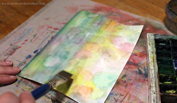
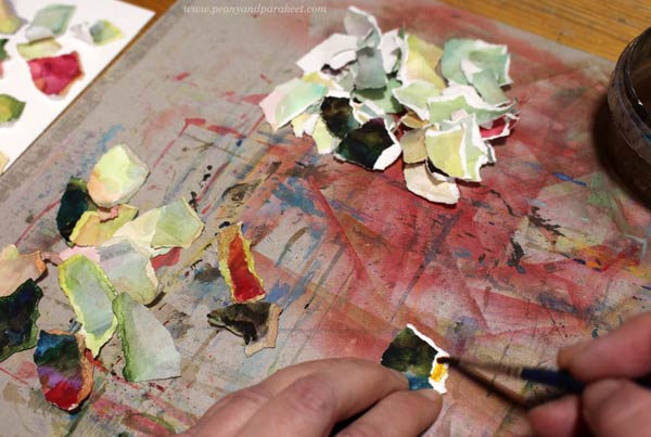
Step 3 – Paint the Torn Edges
The edges are the best part of torn paper collages, but especially when you paint them too. This way you don’t get too much distracting white to your collage, but the result will more colorful and atmospheric.
While creating, think about this!
Some people like to think a lot, some are more hands on. In artistic exploration, finding the balance is the key. This exercise is especially for thinkers. Look at the torn pieces – so many new beginnings, seeds for new ideas!
You can also spread the paint partly over the piece so that the color transition is less dramatic and the piece gets more depth. Some of my pieces have more colorful and some more blended edges. Variation is always good!
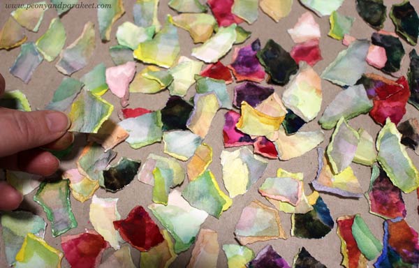
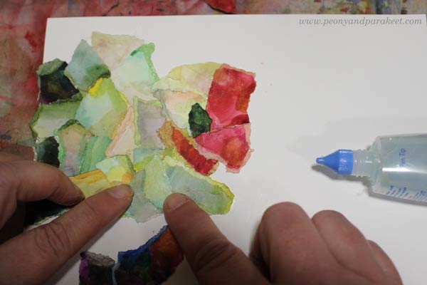
Step 4 – Glue the Pieces
Pick a blank background paper and glue the pieces on it. My background is fairly small, about 6 x 8 inches. I use Towbow Aqua Liquid Glue. It’s not perfect because it’s a bit brittle when it dries, but I like it because it doesn’t make my fingers sticky.
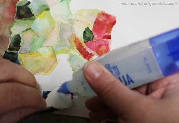
Start from one edge and work towards the center. Save most of the brights for the center and keep the edges less colorful. Create clusters and look for happy accidents.
While creating, think about this!
Papers that have been destroyed now get a new beginning. It’s like a window has been shattered and a new stained glass one gives a new view. Always when you create is some kind of distortion. But that’s not a bad thing at alll. We need these new views to make a shift in our lives, to see beyond the obvious.
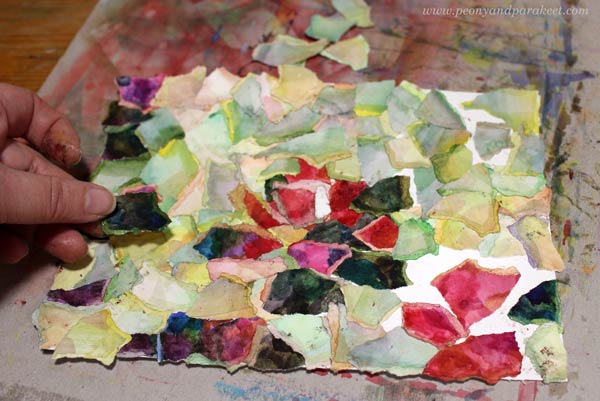
Notice, that you can leave the background partly visible here and there.
Step 5 – Finish with Watercolor
You can still adjust the collage by painting over the pieces.
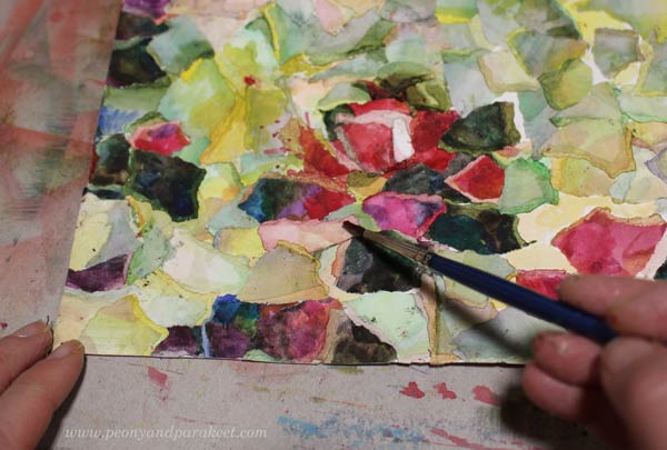
You can add details, but more than that I would recommend adding a thin color layer on most of the pieces so that you get a more unified look. I added yellow over most of the pale greens, and also to the areas where I left the blank paper visible. I like to have white as a highlight color only, and not everywhere.
While creating, do this!
Take a break! Don’t try to do everything in one sitting. Rest and give your mind some time to process what you have been doing!
The collage is now finished, but the process is not. So, proceed to the next step!
Step 6 – Explore Your Torn Paper Collage
Take photos of your torn paper collage. Don’t just take the realistic photo to your archive but get creative! Think about the light and the air and how they create a new layer to everything we see. Take the collage to a place where you get strong sunlight and dark shadows to get a new puzzle over it.
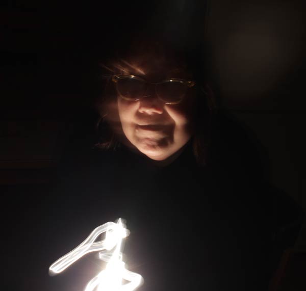
Or if you have a DSLR camera, do what I did: take the collage to a dark room, legthen the exposure so that taking the photo lasts many seconds. Then move the flashlight around the picture and its surroundings.

With the long exposure, you can also move the collage around to get an artistic photo.
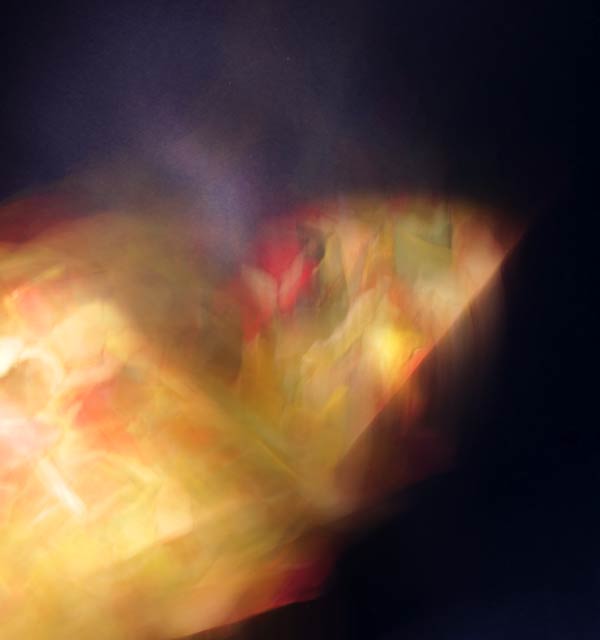
You can start with a blank paper, but end up with painting with light.
Creating art is not only about mastering techniques or imagining things. Artistic exploration is where freely practice both.
Torn Paper Collage – Where Did This Idea Come From?
The oil painting that I am currently working on, is influenced by my artistic explorations. And, it’s also vice versa. When I looked at the painting that is still in progress, I felt the need to tear some paper, and so the torn paper collage was born.
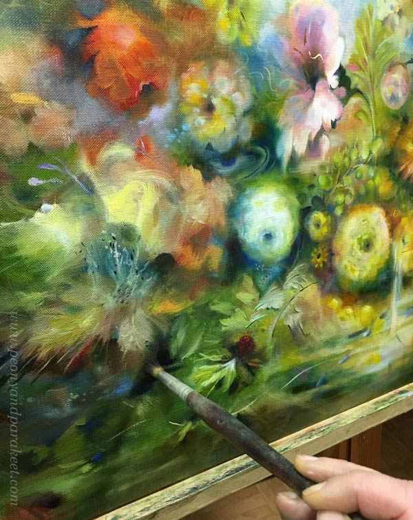
I like to explore movement, so moving the collage under the camera produced an image that is related to this painting. That photo will inspire me when I am adding finishing touches to the painting.
I believe we have to explore to move forward in the path.
What do you think?